Guide to Character Design
Hi! I am Hues&Rogues or Andrei :D
Character design is an important part of developing games, drawing manga, or simply creating avatars, so I hope I can show you what is relevant for you to think about when making characters and putting your thoughts into paper (or screens)!
1- Before you draw...
1.1- Purpose
What is the purpose of this character and what will it be used for?
All mediums have different requirements, so it is important to establish this as soon as possible.
While when making illustrations for a book (excluding comics) you need only to have the body and style designed for the most part, as clothes can change, when turning characters into 3D models, you want to have much about every detail well defined and with different angles.
Vtubing models (2D) are also a special case, as you only need a single image from whatever angle you want it to stay as permanently, though expressions can be added to guide the rigger.
1.2- Target Audience
Who is this character for? Who will see it?
Characters might differ a lot in many aspects depending on their target audience.
For example, different cultures have different meanings for colors, and some see colors differently from the rest of the world! (You can search about the Himba tribe in Namibia, it’s pretty interesting 😁)
If you want a culture differently from yours to understand secret details about your design, you need to research it first and maybe talk to someone of that culture.
1.3- Get to know your character
Who is this character? What is their story, and their objective?
It’s time to think how you can show it without words!
Things like social class, job, culture, family and background story all shape your character from both the inside and outside. Usually, you would want to show it, without having to explain it. A good character design tells a story!
You can also use this to your advantage and instead trick your viewer, by having a character who looks like an innocent civilian of low class, but is actually the big villain of your story! 😁
1.4- Color theory
What meaning do you want to portray? What colors would they have?
Now that you have decided on the medium and target audience, it’s time to put it to use!
Here, it’s when you start thinking about your limitations. With most physical books, you have only black and white to work with, and if you’re making a character for a game that already exists, you would want to follow the pre-existing color palette. But, when having the chance to make your own, you want to put your previous research to use, and try to match the new color palette with both your character’s story but also the feelings you want to portray with it.
In general, you would want to have about 2 or 3 main colors for the character, and add them in specific focus points to catch the viewers attention without overwhelming them.
Also, if for instance, you are working with a reddish color palette but need something green, you can instead make that green more yellowish, and darken/lighten it as well as lowering the saturation to fit better.
1.5- Shapes
What shapes represent this character? How can we use them?
Shape language is a very important step in creating a character.
Although it is more clear to see shape language be applied to western cartoons the most, it can also be applied to more realistic styles to a certain point. Not only can you mix and match different shapes, but these can also be added to details as clothes, patterns and even hairstyle.
As a simple rule of thumb, this is how you can use shape language depending on your characters personality:
- Circles for approachable and harmless;
- Squares for inflexible and reliable;
- Triangles for unpredictable and dangerous.
1.6- References
What can you learn from other artist’s failures and successes?
References are not cheating, claiming someone else’s work as yours is!!
Using references when drawing can be a little of a tough subject, but the truth is that artists are expected to learn from other artists! No one can remember every detail of anatomy, especially of things they aren’t confident in, without looking up references in drawings or photography!
Always try to make a moodboard of images you want to use as reference, and especially from different artists and real-life pictures. This will allow you to think outside the box and find new and creative details for your character you have never considered!
2- Drawing your character...
2.1- Silhouettes
Can you recognize your characters as a simple shape?
Making an original and clear silhouette for your characters means you can control the amount of detail and be able to recognize your characters much easier.
You’ve officially got past the research phase, and now its time for the fun part!
This is when you start thinking of how this character would pose in a natural way, and you can start testing shapes as body, hair and clothes before you get too attached to any of them! The point if to have a single color filled shape without any lineart, and I would very much recommend the Clip Studio Paint’s lasso fill tool for this!
You know you have achieved a good result when the different parts of the body are recognizable and the shape is original!
2.2- Focus points
How much detail should the character have?
Never too much, unless you’re trying to make an multi-dimensional eldritch horror/Harajuku fashion kind of character.
The main rule is to not have more than 3 focus points in a character design. Too many details, big or small, can confuse the viewer and break the silhouette. If you still want to keep all the elements you want, try making the less relevant over smaller and simpler, while upping the detail on the most important details!
Remember, you want your character to be more clear than a blob of many colors when viewing it from afar!
2.3- Pose and angle
What is the best pose for drawing this character?
This heavily depends on their purpose and the amount of detail.
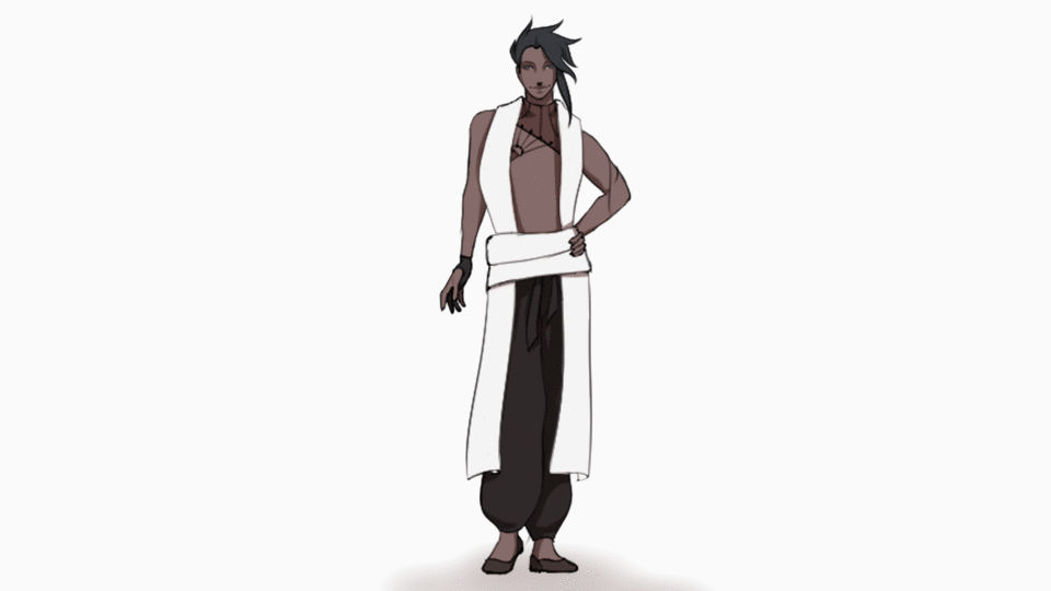
- When making 2D Vtubers, usually you would only draw them from the angle and pose they are going to be seen, which is in most cases front or 3/4, in a straight standing up pose.
- When making reference sheets to later make the character as a 3D model, you would want front, back, side view as well as a close up to any other relevant details and objects. The pose can be the same as for 2D vtubers or a symmetrical T-pose, but also asymmetrical, if there is a need for it.
- When making characters for books, comics and others, you are free to chose what you think it’s best for your needs.
2.3.1- Clip Studio Tools to help with posing and angles
Symmetry ruler - This ruler is probably the most important part of creating a character sheet, since it alleviates the amount of work you have to do, as well as giving you direct feedback on how the mode looks without having to constantly flip your screen. I struggled a lot with the fact that you cant automatically attach the ruler to the center of the screen, but there’s also a pretty easy way to do this manually!
3D models - Both the full body, face and hand models can be of great help when making character sheets, because not only can you pose them and change their proportions to fit your character, but you can also rotate them easily, which allows you to make very quick turn-arounds of characters. Just don’t forget to disable the perspective completely, so that it’s more accurate!

2.4- Layering and uncovering
Can you see everything you need to?
Sometimes you have to lift the side bangs and show the other eye!
While layering clothes and making Sadako kind of hairstyle is nice, if you need to see the details under that it might be tricky. This is why sometimes artists might opt for drawing the characters twice, and removing those covering details off to better visualize the character. This is especially useful for riggers and modelers, who need a proper reference sheet to make your character.
2.5- Lineart
Vector or raster?
There are 2 ways you can go about this in Clip Studio Paint, vector and raster layers.
Vector layers are normally the go-to for lineart. Being able to upscale and edit lines without loss of quality is always very useful, and the erasers for vectors make it even better to work with. Click HERE for a detailed description of all the features for vector layers.
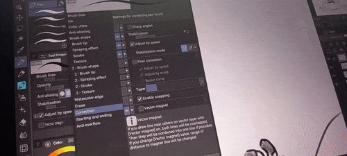
When working with vector layers, don’t forget to enable Vector Magnet in the brush settings! It’s on the bottom of the Correction settings.

The second and most common layer type is raster. This layer is all about the individual pixels rather than lines that can be easily edited. While at first this seems like the least useful layer for lineart, that does not mean it can’t be the preferred option for many. This kind of layer makes it easier to blend lineart into color, and add blur easily when needed. Lines can also be edited just as much when knowing how to work with other tools. Raster layers are also more intuitive for artists, especially those who previously drew traditionally.
If you want to edit line thickness in your layer, you can use the liquify tool in pinch or expand mode. Try doing this in your sketch layer instead of creating a new lineart layer!
No matter what tool you use, if you’re drawing final art (that isn’t just a reference) don’t forget to add different line weight with thicker and thinner lines!
2.6- Color and Patterns
Flats, shading, patterns?
The amount of colors and style needed for the drawing depends on its purpose.
While adding many gradients and strong shading is visually appealing, when designing character sheets for reference it’s best to keep it simple and go with flat and patterns that can be easily drawn later.
2.6.1- Special tools for coloring from Clip Studio Paint
Clip Studio Paint gives us 3 great tools to uses: Auto select invert, lock transparent pixels and lasso fill tool.
The auto select tool can be easily found by clicking “W” or on the left side of your screen in the tool window. Here you can decide whether you want to only reference 1 layer or multiple of your choice. By adjusting the tolerance and area scaling, you can achieve a good selection that will do the work for you. Simply select the empty space around the character lineart and then invert the result. Then you can simply fill that area with a single color!
The alpha lock or lock transparent pixels setting is on the top center of the layer window, together with the transparency slider. This setting makes it so you can’t draw over the shape you have previously made, so paired with the previous step of filling the character silhouette with a flat color, this makes it many times easier to add extra colors. Clipping a new layer to the one below has the same end result, but it can contribute to a huge amount of layers that are hard to keep up with.
The 3rd and final tool for adding flat colors is the lasso fill tool. You can find this by clicking “U” or going to the Figure tab on the tool window. This is also where you find lines, curves and other preset figures. After selecting lasso fill, the only thing you have to do is to select a color and start selecting areas! This tool will immediately fill the area with color as soon as you let go of the pen.
2.6.2- Downloadable tool for staying within the lines of your drawing
There is this popular tool made by pharan called “Erase Along Edge” that might be very helpful to you during this stage. Check it out!
2.6.3- After flat colors…
There are many tips and tricks when it comes to patterns, wrap-arounds and gradients, but today I am solely giving you quick tips that can easily be added to your design, without much overthinking the process!
For both patterns and gradients, the safe way is to just choose a similar color to the base, but tweaking both the hue (circle on the color wheel) and the light/saturation. You can also clip these to an existing base color
If you have a pattern you need to wrap around an arm or leg like fishnets, you can use the mesh transformation tool in Clip Studio Paint!
3- Tips for character/reference sheets
- Add facial expressions and different angles of the face! This will help you long-term when having to draw the character multiple times or animating it.
- Teeth! They can be very expressive and are details you often only see when they’re smiling.
- Add dynamic poses and mid-actions! These are as useful as facial expressions long-term , to explain how their body moves, their posture and flexibility.
- Items! Any items they use or accessory details might be relevant to keep in the sheet, as you might need them later.
- Different set of clothing and hairstyles! Unless you want them to have the stereotypical closet full of the same set of clothing for every single day :0
-Pattern preview! Adding a square with a part of the pattern that can be repeated into a bigger version might be much more useful than you think! Just make sure you use the right colors, or a high contrast version in black and white.
- Add the color palettes with notes for smaller details and gradients! You will thank your past self if you have to later redraw this character or make a model of it.
3.1- Layer Comps - Ver.3.0, EX only
If you want to have a single body base for your character with multiple clothing sets (for example) rather than placing them along the image, then this is for you. With this feature from Clip Studio Paint, you can do just that!
Click here for more information about Layer Comps.
3.2- Cloud Sharing - tablet/phone/Ibispaint/PC
Personally, I love working on character designs on the go, rather than dedicating time at home to make them. Because of this, I make use of the Cloud Sharing feature a lot. I both like to use Clip Studio Paint for Tablet, as well as Ibispaint, and I love how I can easily send drawings over to my computer at home once I need to work on a bigger file without any lag.
3.3- Review time!
You should always seek to have someone look over your art, especially if you’re trying to make art and character design into your job one day. The trick is to choose 4 people total, 2 artists and 2 people who understand little about making art. While the latter is often not considered, they are the ones who often notice the most obvious things without being blown away by how rendered your piece is or how clean the lineart is.
Tweak your art to fix any errors or add anything that is missing and you’re set!
End of guide 😁
And that’s it! I hope you found some inspiration and good tips to make your own character sheets or just new OCs in general!
I shall continue to work on mine, but if you did find this guide useful, a like would be very much appreciated, or if not, I am open to some tips myself!
Anyways, thank you for reading this post and see you next time!


Kommentar