
Hello guys! It's me, Grace again! With the newest and 𝐫𝐞𝐢𝐧𝐢𝐭𝐢𝐚𝐥𝐢𝐳𝐞𝐝 addition to Clip Studio Paint Monthly TIPS!
In this tutorial we will learn how to create a portrait, a selfie with 𝐕𝐢𝐧𝐭𝐚𝐠𝐞 𝐏𝐨𝐩 𝐀𝐫𝐭 𝐈𝐧𝐬𝐩𝐢𝐫𝐞𝐝 𝐒𝐭𝐲𝐥𝐞 inside Clip Studio Paint.
To perform this tutorial, you can use any photo, so why not make a self-portrait or selfie in the Pop Art Style?
📌 Please note that I'm using my 𝐩𝐞𝐫𝐬𝐨𝐧𝐚𝐥 𝐭𝐞𝐱𝐭𝐮𝐫𝐞 that can't be shared anywhere because some people might think the otherwise; unless I will post into my upcoming tutorial about 𝐡𝐨𝐰 𝐈 𝐜𝐫𝐞𝐚𝐭𝐞 𝐦𝐲 𝐨𝐰𝐧 𝐭𝐞𝐱𝐭𝐮𝐫𝐞 𝐩𝐚𝐜𝐤. Please enjoy this tutorial and hope you'll learn something useful in the end.
❗ Let's get started ❗
➊ - ℙ𝕖𝕣𝕤𝕠𝕟𝕒𝕝𝕚𝕫𝕖 𝕐𝕠𝕦𝕣 ℙ𝕙𝕠𝕥𝕠
As an example reference, we will be using a photograph — a portrait of myself.
It is a pleasure to work with a portrait of your favorite person too, such as your mom and dad or even your special someone then make it as a gift for their birthday!
Of course, you can take your picture and create a self-portrait.
➋ - 𝔻𝕣𝕠𝕡 𝕒𝕟𝕕 ℂ𝕣𝕠𝕡
After drag and drop your photo to Clip Studio Paint (but be sure the photo is clear enough for you too see and trace later), you might need to crop it a bit.
For this tutorial purpose, I use 𝐑𝐞𝐜𝐭𝐚𝐧𝐠𝐥𝐞 𝐒𝐞𝐥𝐞𝐜𝐭𝐢𝐨𝐧 tool then 𝐇𝐨𝐥𝐝 𝐒𝐡𝐢𝐟𝐭 on my keyboard before dragging the Rectangle to maintain its size as square before cropping.
See the icon on the "Before" image, it's the 𝐂𝐨𝐩𝐲 𝐚𝐧𝐝 𝐩𝐚𝐬𝐭𝐞 function from selection tool. Click on it and it will automatically create a duplicate but cropped version of your pic.
After you click it, see on the "After" image; you will have the cropped version of your original pic.
Please note: I turned off my Ori layer, so you could see the cropped version better to understand the result.
Also by doing this, you still have access to your original pic; whether you think you need to continue making the Pop Art style with the original non-cropped version or not; it's your choice and you'll save plenty of time.
Now it's time to 𝐂𝐫𝐨𝐩 my entire pic to desired square image.
Using the icon that says "Crop" will cut entire canvas into the selection area of square, so be mindful by doing so; because it's really useful to remove unnecessary parts of image that you think might bother you later - but somehow the process can't be undone.
See the difference with two images above. The left one still have the transparent background, the right one already cropped fit into the square (dark grey is my Clip Studio Paint default interface background).
➌ - ℝ𝕒𝕤𝕥𝕖𝕣 𝕒𝕟𝕕 𝕍𝕖𝕔𝕥𝕠𝕣 𝕃𝕒𝕪𝕖𝕣𝕤
➊ On top of my Cropped layer, there's an icon of "𝐍𝐞𝐰 𝐑𝐚𝐬𝐭𝐞𝐫 𝐋𝐚𝐲𝐞𝐫" (marked by red box). Click on it, in my case it will create a new layer as usual with the default name of Layer 1.
➋ If you're checking the 2nd icon besides the New Raster Layer, it's called "𝐍𝐞𝐰 𝐯𝐞𝐜𝐭𝐨𝐫 𝐥𝐚𝐲𝐞𝐫" (marked by green box). Clicked on it, in my case it's default name is Layer 2. Note that I also reduce its opacity by 50% and fill it with white (using Alt + Backspace).
➌ As you can see, you'll be having the 'iconic' vector layer (green circle). That's usually the mark of 'special' and specific layers such as 3D layers & also layers with rulers. Raster layers (my original photo & Layer 1) will have no attributes on them.
By following steps below, you should 𝑟𝑒𝑝𝑟𝑜𝑑𝑢𝑐𝑒 𝑡ℎ𝑒 𝑜𝑣𝑒𝑟𝑎𝑙𝑙 𝑝𝑟𝑜𝑝𝑜𝑟𝑡𝑖𝑜𝑛𝑠 𝑜𝑓 𝑡ℎ𝑒 𝑓𝑎𝑐𝑒; it is not necessary to go into all minor anatomical details of the image. Remember, we are creating a stylized portrait, not a copy of the photo.
👇

First thing first, we'd like to trace the face with 𝐃𝐢𝐫𝐞𝐜𝐭 𝐃𝐫𝐚𝐰𝐢𝐧𝐠 tool. As you can see on GIF above; I choose 𝐂𝐮𝐫𝐯𝐞 to make some of the curvy vector lines.
🛈 𝐀𝐓𝐓𝐄𝐍𝐓𝐈𝐎𝐍 :
🗹 You need to 𝐋𝐞𝐟𝐭 𝐂𝐥𝐢𝐜𝐤 + 𝐃𝐫𝐚𝐠 the Curve line before bend it over.
🗹 You can edit those lines later, so don't worry too much for the perfect tracing.
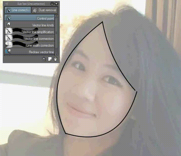
Now it's time to edit the curves. You need to find the 𝐋𝐢𝐧𝐞 𝐂𝐨𝐫𝐫𝐞𝐜𝐭𝐢𝐨𝐧 tool.
🛈 𝐀𝐓𝐓𝐄𝐍𝐓𝐈𝐎𝐍 :
🗹 Choose 𝐂𝐨𝐧𝐭𝐫𝐨𝐥 𝐏𝐨𝐢𝐧𝐭 to add some (+) vector joints with 𝐑𝐢𝐠𝐡𝐭 𝐂𝐥𝐢𝐜𝐤.
🗹 𝐂𝐨𝐧𝐭𝐫𝐨𝐥 𝐏𝐨𝐢𝐧𝐭 tool can also be useful to 𝐦𝐨𝐯𝐞 𝐭𝐡𝐞 𝐭𝐢𝐩 of your curvy lines.
🗹 You can bend those lines with 𝐕𝐞𝐜𝐭𝐨𝐫 𝐋𝐢𝐧𝐞 𝐊𝐧𝐨𝐛 after adding some (+) to several lines.
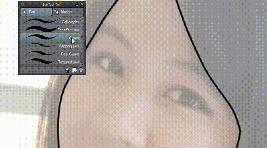
The good thing is; in vector layer; you'll be able to use another tools or brushes. But 𝑏𝑒 𝑣𝑒𝑟𝑦 𝑐𝑎𝑢𝑡𝑖𝑜𝑢𝑠 𝑎𝑏𝑜𝑢𝑡 𝑖𝑡; since if you're doing it with any brushes like watercolor or oil; they'll look messy and uncontrollable.
🛈 𝐀𝐓𝐓𝐄𝐍𝐓𝐈𝐎𝐍 :
🗹 Choose 𝑎𝑛𝑦 𝑃𝑒𝑛 to add some (+) vector joints with. Note that it will gives a lot of 'dots'.
🗹 You can check with 𝐂𝐨𝐧𝐭𝐫𝐨𝐥 𝐏𝐨𝐢𝐧𝐭 for those dots.
🗹 𝐕𝐞𝐜𝐭𝐨𝐫 𝐋𝐢𝐧𝐞 𝐒𝐢𝐦𝐩𝐥𝐢𝐟𝐢𝐜𝐚𝐭𝐢𝐨𝐧 tool can also be useful to 𝐬𝐢𝐦𝐩𝐥𝐢𝐟𝐲 those many dots.
🗹 You can bend those dots with 𝐕𝐞𝐜𝐭𝐨𝐫 𝐋𝐢𝐧𝐞 𝐊𝐧𝐨𝐛 just fine.
So there are many ways to do the 'tracing' within vector layer, but I suggest to pick 𝐏𝐞𝐧 or 𝐃𝐢𝐫𝐞𝐜𝐭 𝐃𝐫𝐚𝐰𝐢𝐧𝐠 tools as you'll be having a clean result.

You need to find the 𝐋𝐢𝐧𝐞 𝐖𝐢𝐝𝐭𝐡 𝐂𝐨𝐫𝐫𝐞𝐜𝐭𝐢𝐨𝐧 tool in order to make the lines thinner or wider.
🛈 𝐀𝐓𝐓𝐄𝐍𝐓𝐈𝐎𝐍 :
🗹 Choose 𝐋𝐢𝐧𝐞 𝐖𝐢𝐝𝐭𝐡 𝐂𝐨𝐫𝐫𝐞𝐜𝐭𝐢𝐨𝐧 and check its 𝐓𝐨𝐨𝐥 𝐏𝐫𝐨𝐩𝐞𝐫𝐭𝐲.
🗹 Before 'brushing'; please change the width with Thicken or Thin around 1.0.
🗹 Change the brush size (green strokes) with either " [ " or " ] "hotkeys.
🗹 You can make the tip of each strokes sharp with 𝐕𝐞𝐜𝐭𝐨𝐫 𝐋𝐢𝐧𝐞 𝐂𝐨𝐫𝐫𝐞𝐜𝐭𝐢𝐨𝐧.
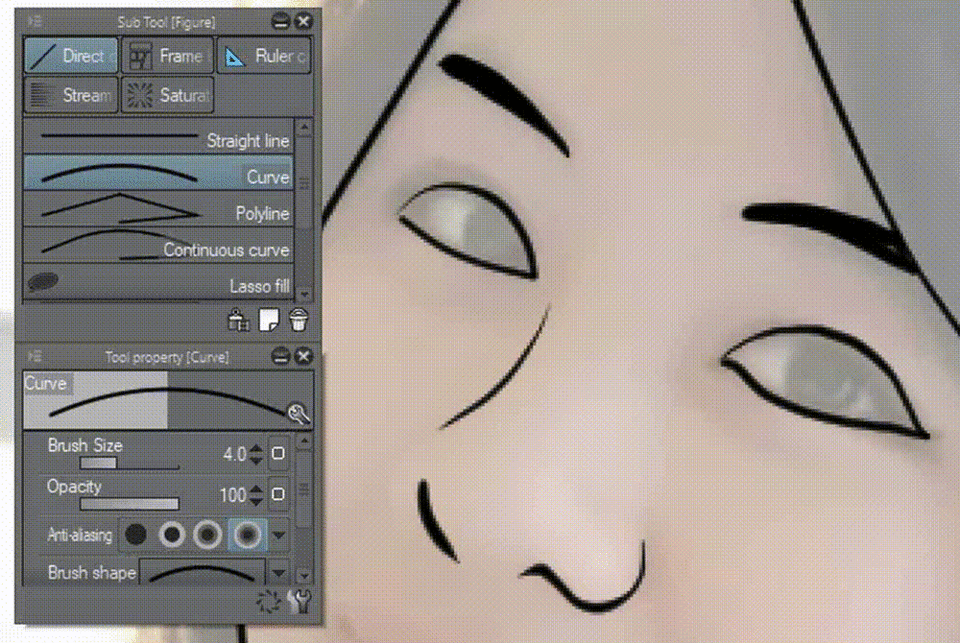
Now we're adding more 'paths' with curves to create the eyes. This method can also be used to other things like hairs as well.
But I recommend to use this method 𝐎𝐍𝐋𝐘 𝐢𝐟 𝐲𝐨𝐮'𝐝 𝐥𝐢𝐤𝐞 𝐭𝐨 𝐦𝐨𝐝𝐢𝐟𝐲 𝐭𝐡𝐞𝐢𝐫 𝐭𝐡𝐢𝐜𝐤𝐧𝐞𝐬𝐬 using powerful tool: 𝐋𝐢𝐧𝐞 𝐖𝐢𝐝𝐭𝐡 𝐂𝐨𝐫𝐫𝐞𝐜𝐭𝐢𝐨𝐧, if you'd prefer to do it with raster layers; modifying them later on would not be possible.
Not every paths or lines you'll have to do it with vector layers, because it's time-consuming to do so. Image above represents a new 𝐑𝐚𝐬𝐭𝐞𝐫 layer that I use with 𝐍𝐨𝐫𝐦𝐚𝐥 Blending mode to show you other things I made using only 𝐆-𝐏𝐞𝐧.
🛈 𝐀𝐓𝐓𝐄𝐍𝐓𝐈𝐎𝐍 :
One of many reasons I'm doing this because vector layers can 𝐍𝐎𝐓 fill colors using 𝐅𝐢𝐥𝐥 tool.
👇
So that's why I'm using another 𝐍𝐞𝐰 𝐑𝐚𝐬𝐭𝐞𝐫 𝐋𝐚𝐲𝐞𝐫 (𝑟𝑒𝑛𝑎𝑚𝑒𝑑 𝑖𝑡 𝑡𝑜 𝐵𝑎𝑠𝑖𝑐 𝐶𝑜𝑙𝑜𝑟𝑠) then with 𝐒𝐭𝐚𝐧𝐝𝐚𝐫𝐝 𝐂𝐨𝐥𝐨𝐫 𝐒𝐞𝐭; I choose standard skin tone to fill the outter lines of my face.
Please note that I create a group (Folder) to keep my layers organized. Inside the Folder, there are Vector Lines & Raster Lines. So I lowered my Folder's opacity around 25% before using 𝐓𝐮𝐫𝐧𝐢𝐩 𝐩𝐞𝐧 tool.
It's wise to use limited choice of colors. My suggestion; it should be 𝐩𝐫𝐢𝐦𝐚𝐫𝐲 𝐜𝐨𝐥𝐨𝐫𝐬 such as blue, red, and yellow. But you can put whichever colors you'd like. Even for pastel! I put dark pink, dark yellow and dark green to achieve retro look.
My original hair is black, but I put gray so the outlines would become visible.
Pop Art Style 𝐭𝐞𝐧𝐝𝐬 𝐭𝐨 𝐡𝐚𝐯𝐞 𝐭𝐡𝐞 𝐡𝐚𝐥𝐟𝐭𝐨𝐧𝐞 𝐞𝐟𝐟𝐞𝐜𝐭𝐬 and little to no gradation. Next chapter, we will 𝐭𝐮𝐫𝐧 𝐜𝐨𝐥𝐨𝐫 𝐠𝐫𝐚𝐝𝐢𝐞𝐧𝐭𝐬 𝐢𝐧𝐭𝐨 𝐡𝐚𝐥𝐟𝐭𝐨𝐧𝐞.
➍ - ℍ𝕒𝕝𝕗𝕥𝕠𝕟𝕖 ℙ𝕒𝕥𝕥𝕖𝕣𝕟 𝔼𝕗𝕗𝕖𝕔𝕥
Image above represents how I blend my blue with 𝐖𝐚𝐭𝐞𝐫𝐜𝐨𝐥𝐨𝐫 tool -> 𝐏𝐚𝐢𝐧𝐭 𝐚𝐧𝐝 𝐚𝐩𝐩𝐥𝐲.
Please note that I'm using 𝐀𝐩𝐩𝐫𝐨𝐱𝐢𝐦𝐚𝐭𝐞 𝐂𝐨𝐥𝐨𝐫 while choosing my gradients. Two circles represent V (values) and S (saturation) sliders that can be modified from 0% to 100%. You'll notice that color range would change subtly.
By doing so, you'll having a quite range of colors to pick out. And the color separation has dynamic variations which probably will confuse you.
🛈 𝐀𝐓𝐓𝐄𝐍𝐓𝐈𝐎𝐍 :
Below is my modified setting to make the numbers of colors show less and more functional:
👇
➊ This is my initial (default) 𝐀𝐩𝐩𝐫𝐨𝐱𝐢𝐦𝐚𝐭𝐞 𝐂𝐨𝐥𝐨𝐫 setting. (Just slightly modified its S and V)
➋ Left click on the icon (red circle) and It will open another dialog box: check ✔ 𝐅𝐢𝐱 𝐰𝐢𝐝𝐭𝐡 𝐨𝐟 𝐭𝐢𝐥𝐞: 𝟏𝟓𝐩𝐭 (green circle) and see the tiles change dramatically.
➌ You can also check ✔ 𝐅𝐢𝐱 𝐧𝐮𝐦𝐛𝐞𝐫𝐬 𝐨𝐟 𝐬𝐭𝐞𝐩𝐬 𝐝𝐢𝐯𝐢𝐬𝐢𝐨𝐧 𝐢𝐧𝐭𝐨 𝟏𝟎 𝐩𝐚𝐫𝐭𝐬 (𝐋) to create the tiles even much better to show.
👍 Now it will be much easier for you to pick colors, the tiles of color range won't be displayed too small. I just curious why do the default setting shows too much tiles (30) for us. 😅
Using only subtle 𝐖𝐚𝐭𝐞𝐫𝐜𝐨𝐥𝐨𝐫 tool -> 𝐏𝐚𝐢𝐧𝐭 𝐚𝐧𝐝 𝐚𝐩𝐩𝐥𝐲, I tend to create soft blends between colors as shown by image above; for skin as well as hair.
You can experiment with adding hard edges using 𝐆-𝐏𝐞𝐧 then soften the edges by watercolor again or 𝐂𝐨𝐥𝐨𝐫 𝐌𝐢𝐱𝐢𝐧𝐠 tool.
Find 𝐋𝐚𝐲𝐞𝐫 𝐏𝐫𝐨𝐩𝐞𝐫𝐭𝐲 then click on the ▓ icon as image above.
You can change 𝐍𝐮𝐦𝐛𝐞𝐫 𝐨𝐟 𝐬𝐜𝐫𝐞𝐞𝐧 𝐟𝐫𝐞𝐪𝐮𝐞𝐧𝐜𝐲 as you wish, but for me; I choose 𝟏𝟓.𝟎. Note that frequency numbers will depend on your document pixels size. The less number you choose will results in bigger dots of 𝐇𝐚𝐥𝐟𝐭𝐨𝐧𝐞.
🛈 𝐀𝐓𝐓𝐄𝐍𝐓𝐈𝐎𝐍 :
To achieve the 𝐜𝐨𝐥𝐨𝐫𝐞𝐝 𝐯𝐞𝐫𝐬𝐢𝐨𝐧 𝐨𝐟 𝐬𝐜𝐫𝐞𝐞𝐧 𝐡𝐚𝐥𝐟𝐭𝐨𝐧𝐞, I suggest to copy your layer and paste it below the screen-toned layer. Then modify the top layer mode to 𝐎𝐯𝐞𝐫𝐥𝐚𝐲.
There are various types of 𝐇𝐚𝐥𝐟𝐭𝐨𝐧𝐞, image above shows you some types of halftone with 𝐃𝐨𝐭 𝐬𝐞𝐭𝐭𝐢𝐧𝐠𝐬 (red box): 𝐂𝐢𝐫𝐜𝐥𝐞, 𝐒𝐪𝐮𝐚𝐫𝐞, 𝐋𝐢𝐧𝐞, 𝐞𝐭𝐜 that would become cool if you could modify and choose them wisely. Diversity in design will boost up your whole artwork!
I choose 𝐋𝐢𝐧𝐞 (green box) for the cloth and hair. 𝐂𝐢𝐫𝐜𝐥𝐞 for the face/skin. Also please notice that I'm using different layer mode, for example 𝐌𝐮𝐥𝐭𝐢𝐩𝐥𝐲 for my hair layer.
In 𝐋𝐚𝐲𝐞𝐫 𝐏𝐫𝐨𝐩𝐞𝐫𝐭𝐲, usually I differentiate the settings such as 𝐍𝐮𝐦𝐛𝐞𝐫 𝐨𝐟 𝐬𝐜𝐫𝐞𝐞𝐧 𝐟𝐫𝐞𝐪𝐮𝐞𝐧𝐜𝐲, for the cloth; I use 𝟐𝟎.𝟎 and for the hair 𝟐𝟓.𝟎.
Also you could change the 𝐀𝐧𝐠𝐥𝐞 for some dot settings, with 𝐋𝐢𝐧𝐞; I choose to make the angles 𝟏𝟐𝟎 and 𝟒𝟓.
Of course you could play with any styles and everything to suit your desire 🤣
➎ - ℝ𝕖𝕥𝕣𝕠 ℂ𝕠𝕞𝕚𝕔 𝔹𝕠𝕠𝕜 𝕋𝕖𝕩𝕥 𝕊𝕥𝕪𝕝𝕖
In this chapter, I'd like to give slightly 𝐟𝐢𝐧𝐚𝐥 𝐭𝐨𝐮𝐜𝐡 to the Pop Art Style portrait of myself.
First things first, you need to find the perfect font to fit the whole 𝐨𝐥𝐝-𝐬𝐭𝐲𝐥𝐞 𝐜𝐨𝐦𝐢𝐜 𝐛𝐨𝐨𝐤 feel and look. My suggestion for you to look into websites for free downloadable fonts with clear end user agreement that stated free for commercial use or just ask the permission later from the creator.
Please 𝐜𝐫𝐞𝐝𝐢𝐭 𝐭𝐡𝐞 𝐚𝐮𝐭𝐡𝐨𝐫 of the typeface and kindly giving any amount of donation if you find it useful to your (preferably commercial) projects. 🤗
Now we're going to add the title of our image using Sub Tool 𝐓𝐞𝐱𝐭.
You can adjust the initial 𝐒𝐢𝐳𝐞 of the font, mine initially start with 𝟐𝟎.𝟎 but mind you; the size will be different for every document size. And the initial 𝐅𝐨𝐧𝐭 of mine is Engravers MT.
Now with 𝐁𝐚𝐝𝐚𝐁𝐨𝐨𝐦 𝐁𝐁 (𝑦𝑜𝑢 𝑛𝑒𝑒𝑑 𝑡𝑜 𝑠𝑒𝑎𝑟𝑐ℎ 𝑖𝑡 𝑜𝑛𝑙𝑖𝑛𝑒, 𝑏𝑒𝑐𝑎𝑢𝑠𝑒 𝑖𝑡'𝑠 𝑛𝑜𝑡 𝑦𝑜𝑢𝑟 𝑠𝑦𝑠𝑡𝑒𝑚 𝑓𝑜𝑛𝑡 𝑤ℎ𝑒𝑡ℎ𝑒𝑟 𝑦𝑜𝑢'𝑟𝑒 𝑜𝑛 𝑃𝐶 𝑜𝑟 𝑀𝑎𝑐), and playing around with the size: 𝟗𝟓.𝟎; I'm having a good font for my Pop Art Style tutorial which satisfy me and close to what I want to achieve retro look.
Just try to have fun with your chosen font and wording, using 𝐉𝐮𝐬𝐭𝐢𝐟𝐲 to place the font on the left, center, or right composition. For me, actually I just leave it like that.
For the 𝐜𝐨𝐥𝐨𝐫, I suggest to put 𝐚𝐧𝐲𝐭𝐡𝐢𝐧𝐠 𝐭𝐡𝐚𝐭 𝐯𝐢𝐬𝐢𝐛𝐥𝐞 𝐚𝐧𝐝 𝐫𝐞𝐚𝐝𝐚𝐛𝐥𝐞. White for instance, a neutral color to be modified later.
Find 𝐋𝐚𝐲𝐞𝐫 𝐏𝐫𝐨𝐩𝐞𝐫𝐭𝐲 then click on the 🞇 icon as image above.
Change the 𝐓𝐡𝐢𝐜𝐤𝐧𝐞𝐬𝐬 𝐨𝐟 𝐞𝐝𝐠𝐞𝐬 to fit your desires. For me, I make it as bold as 𝟐𝟎.𝟎 so you can clearly see the border of our text.
𝐇𝐨𝐥𝐝 𝐂𝐓𝐑𝐋 + 𝐋𝐞𝐟𝐭 𝐜𝐥𝐢𝐜𝐤 on the blank layer just like image above, it will bring out the marquee or selection parts of the Text layer.
Create New Raster Layer on top of your Text layer, then using Sub Tool 𝐆𝐫𝐚𝐝𝐚𝐭𝐢𝐨𝐧 and choose whichever gradient you'd like; for me it's 𝐆𝐥𝐨𝐰 𝐨𝐟 𝐬𝐮𝐧𝐬𝐞𝐭.
Then start using it from below (start) to above. The direction of your gradation will follow the starting and ending points or where you click.
Please note that I'm copying the color layer (Layer 10) before applying the Halftone.
The settings of Halftone just modify the 𝐍𝐮𝐦𝐛𝐞𝐫 𝐨𝐟 𝐬𝐜𝐫𝐞𝐞𝐧 𝐟𝐫𝐞𝐪𝐮𝐞𝐧𝐜𝐲 as you wish, but for me; I choose 𝟏𝟓.𝟎 as my personal preferences to see the dots clear enough.
Using 𝐋𝐢𝐠𝐡𝐭𝐞𝐫 𝐂𝐨𝐥𝐨𝐫 as the blending mode of copied layer, I have the effect of inverted Halftone as white dots on top of layer with gradient.
➏ - 𝔾𝕣𝕠𝕦𝕡 (𝔽𝕠𝕝𝕕𝕖𝕣) 𝕄𝕒𝕤𝕜𝕚𝕟𝕘 𝕋𝕖𝕔𝕙𝕟𝕚𝕢𝕦𝕖
Now create a new Folder (or I call it Group) with 𝟒𝟎% of 𝐎𝐩𝐚𝐜𝐢𝐭𝐲.
Put everything inside the folder then click on the 𝐂𝐫𝐞𝐚𝐭𝐞 𝐥𝐚𝐲𝐞𝐫 𝐦𝐚𝐬𝐤 (red box).
Using 𝐓𝐫𝐚𝐧𝐬𝐩𝐚𝐫𝐞𝐧𝐜𝐲 from 𝐂𝐨𝐥𝐨𝐫 𝐒𝐥𝐢𝐝𝐞𝐫, you could see the result of 𝐆𝐫𝐨𝐮𝐩 𝐌𝐚𝐬𝐤𝐢𝐧𝐠! It's like erasing, but actually it's only hide some parts of the Text.
But wait, if you ask me: 𝑤ℎ𝑦 𝑑𝑜𝑛'𝑡 𝑦𝑜𝑢 𝑝𝑢𝑡 𝑡ℎ𝑒 𝑇𝑒𝑥𝑡 𝑏𝑒ℎ𝑖𝑛𝑑 𝑡ℎ𝑒 𝑝𝑜𝑟𝑡𝑟𝑎𝑖𝑡?
The answer is simple: to show you 𝐭𝐡𝐞 𝐭𝐞𝐜𝐡𝐧𝐢𝐪𝐮𝐞 𝐭𝐡𝐚𝐭 𝐜𝐚𝐧 𝐛𝐞 𝐝𝐨𝐧𝐞 𝐞𝐯𝐞𝐧 𝐰𝐢𝐭𝐡 𝐟𝐥𝐚𝐭𝐭𝐞𝐧 𝐢𝐦𝐚𝐠𝐞, assuming you'll add Text or other images into the JPG file. You can't edit the layers, right?
❼ - 𝔸𝕗𝕥𝕖𝕣𝕨𝕠𝕣𝕕 - 𝕆𝕝𝕕 𝕓𝕦𝕥 𝔾𝕠𝕝𝕕
Last but not least, let's modify our image to vintage look & feel!
Right click on top of your layer -> 𝐂𝐡𝐨𝐨𝐬𝐞 𝐍𝐞𝐰 𝐂𝐨𝐫𝐫𝐞𝐜𝐭𝐢𝐨𝐧 𝐋𝐚𝐲𝐞𝐫 -> 𝐆𝐫𝐚𝐝𝐢𝐞𝐧𝐭 𝐌𝐚𝐩
❶ Choose 𝐄𝐟𝐟𝐞𝐜𝐭 on Gradient set, then pick 𝐒𝐞𝐩𝐢𝐚.
❷ Play along with 𝐏𝐨𝐬𝐢𝐭𝐢𝐨𝐧 to get the right result, it will affect ℎ𝑜𝑤 𝑚𝑢𝑐ℎ 𝑡ℎ𝑒 𝑐𝑜𝑙𝑜𝑟 𝑡𝑟𝑎𝑛𝑠𝑖𝑡𝑖𝑜𝑛𝑠 to be applied at your image. I choose 𝟏𝟓 to make the dark brown more.
❸ Choose 𝐒𝐩𝐞𝐜𝐢𝐟𝐢𝐞𝐝 𝐜𝐨𝐥𝐨𝐫, click on the box then choose any dark colors, mine is dark brown.
❹ Check 🗹 𝐌𝐚𝐱𝐢𝐧𝐠 𝐫𝐚𝐭𝐞 𝐜𝐮𝐫𝐯𝐞, play along with the balance within Left node and Right node. You'll notice the change on your image once you adjust the values there.
After done with the correction layer, choose 𝐀𝐝𝐝 for your 𝐁𝐥𝐞𝐧𝐝𝐢𝐧𝐠 𝐦𝐨𝐝𝐞. Decreasing its 𝐎𝐩𝐚𝐜𝐢𝐭𝐲 to 𝟓𝟎%. And voila: the colors toned down to slightly gold version.
We're almost finishing our creation, now here I go: using my own texture to finish the artwork piece: for anyone who wondering what happens to my texture pack; I can't share it anywhere because of CSP policy although it's mine but next tutorial I will show you how to do it using mix media and combining with default CSP tools. Please stay tuned!
Last thing I do, using my own created texture (𝐰𝐢𝐥𝐥 𝐛𝐞 𝐞𝐱𝐩𝐥𝐚𝐢𝐧𝐞𝐝 𝐨𝐧 𝐮𝐩𝐜𝐨𝐦𝐢𝐧𝐠 𝐭𝐮𝐭𝐨𝐫𝐢𝐚𝐥 𝐚𝐛𝐨𝐮𝐭 𝐓𝐞𝐱𝐭𝐮𝐫𝐞); then set the 𝐁𝐥𝐞𝐧𝐝𝐢𝐧𝐠 𝐦𝐨𝐝𝐞 to 𝐌𝐮𝐥𝐭𝐢𝐩𝐥𝐲 with 𝟔𝟎% 𝐎𝐩𝐚𝐜𝐢𝐭𝐲 and...
Congratulations, You're finally done!
In this tutorial, you learned how to create Vintage Pop Art Style of your portrait simply in Clip Studio Paint from scratch, tracing using only default tools and bunch of different layer properties as well as adding text with group/folder masking applied; in the end with correction layer and a bit of texture to finalize the whole old but gold style.
Hope you'll enjoy this tutorial, I tried my best to put everything so easy to understand for you guys to follow, please excuse my technical words or anything in between.
♨ Special thanks to Clip Studio Paint Admin & Team, for your consideration and wise decision to give me another chance to correct my mistakes 𝑡ℎ𝑟𝑖𝑐𝑒 then fully update it with fresh new look of vintage style and a promise of upcoming tutorial about 𝐡𝐨𝐰 𝐈 𝐜𝐫𝐞𝐚𝐭𝐞 𝐦𝐲 𝐩𝐞𝐫𝐬𝐨𝐧𝐚𝐥 𝐭𝐞𝐱𝐭𝐮𝐫𝐞 𝐩𝐚𝐜𝐤. God bless your soul! 😇
Users who liked this post


Comment