Character Design with a Full Background
This tutorial will show the process of creating a character and background from scratch.
INTRODUCTION
o Before I begin the drawing, I think about a short description of the character’s personality. For this character, I wanted him to be confident, rebellious, and calm.
This is the result of the tutorial.
FILE SETUP
o To begin I will set the width of the canvas to 8.00 inches, and the height of the canvas to 10.00 inches, with a resolution of 300dpi. I will also have the Basic expression color set to [color]
ROUGH SKETCH - BLOCKING OUT
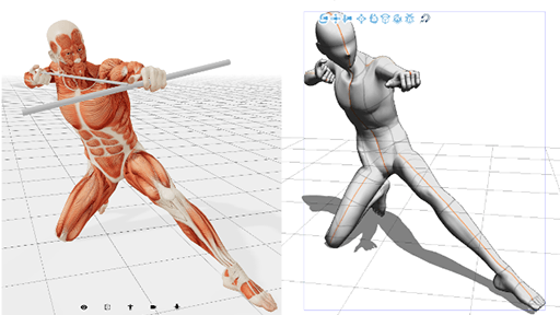
o I begin by drawing the basic shape of the character’s pose. Guidelines are important to maintain the correct proportions when drawing characters.
SKETCH -ADDING DETAIL
o I create a new layer new on top and set the rough draft layer to 52% opacity to be able to reference.
o Now I can draw the detailed sketch, which plans out the entire drawing. I don’t focus on the details too much since it is still early. Now is the time to draw the basic background details.
o I repeat the same step to add even more detail to the sketch. At this point, I am ready to draw the line art.
VECTOR LAYER- CREATING THE LINE
o I create a new vector layer for the line art. I use thick lines for the general shape, then thinner lines for the smaller details like folds, and the face. Vector layers are important because when you are filling, there are more options.
CREATING FOLDERS FOR MASKING
o When It is time to color, use folders to organize the file, which allows you to go back and change specific parts of the drawing. To do this, go to the Layers tab to create a new folder under the line art layer. Next Click on Select > Quick Mask. Use the Fill tool to fill the outside of the line art but to also include the Vector path (line art).
o Clicking outside of the line art makes masking the whole character easier.
Example:
o Now Click on Select > Quick Mask. Then Click on Select > Invert selected area. Now the character Is masked inside the folder.
Example:
CREATING AND MASKING LAYERS INSIDE THE FOLDER.
o Now begin to mask the layers inside of the folder to further organize the file and make coloring a lot easier. To do this, I click on Layer > New Raster Layer. Then I use the Figure tool to fill the different sections of the drawing, beginning with the skin. I use the Figure tool because it makes filling though lines within the area easier (eyes, eyebrows, mouth, nose).
- You can also use the fill tool, but you would have to also fill in the details within the shape and some parts would not be filled in. (It is quicker though.)
o I will now create a new layer under to mask another part. (Repeat until all parts are masked)
o Now that all the layers inside the folder are masked, you are ready to add the grayscale shading to the base. Doing the values first can help in adding contrast to the drawing before adding the color. Go on each layer and shade your character. I use a simple circle brush with the density set to 71.
Example:
ADDING COLOR USING TONE CURVE
o The tone curve is a powerful tool that allows you to quickly color a grayscale layer. You can create any color using the Tone Curve tool which allows you to combine the red color, green color, and blue color to the mid-tones, highlights, and shadows. It is personally one of my favorite tools. To use the Tone Curve tool, click on the grayscale layer, open a new folder, and drag the grayscale layer into the folder. Now right-click on the grayscale layer and click on New Correction Layer > Tone Curve. Use these settings to get the skin color for this drawing. You can use it to create vibrant and colorful colors.
Here is the result:
o Now do this to all the layers inside the mask folder. I chose to keep most of the colors black to match the character’s personality, but you can make any color you want.
Example:
ADDING DETAIL OVER THE COLOR
o Now that the character has color and value, it is time to add the details using a new layer on top of the tone curve to add more detail to the coloring. Do this by simply creating a new layer over each tone curve (all separate folders). Color in the highlights and shadows to refine the colors.
Example:
o The character design is now complete, and we are now ready to draw the background.
DRAWING THE BACKGROUND
o For the background, start by putting a new layer under all your current art. That way, everything stays behind the character.
o We can start with a simple gradient for the sky, then we will begin to draw the clouds (note that we are painting from the farthest things away, to the closest.
THE SKY
o We are now drawing the clouds using a circular brush with low density and imagining the shape of the cloud. Here is a quick guide on how I paint clouds. Draw the outline of the cloud first.
1. Draw the outline of the cloud first.
2. Now fill the cloud with the top being a higher density than the bottom (we will add details there).
3. Now add the details like smaller clouds in the faded area and the edges of the cloud. Adding shadows under clouds helps with depth, especially when there is a cloud in front of another.
o With these steps you can create any style of clouds you want. Here is the result.
PAINT BUILDINGS FROM THE FARTHEST TO CLOSEST
o Using the beginning sketch layer, we will block out the buildings. To me, it is best to begin from the farthest object to the closest.
o We will use the perspective tool to set up the guides for the rest of the background.
o First, we will right-click on the layer > Ruler Frame > Create Perspective Ruler >. The background will be a 2-point perspective so we will select that option.
o The perspective ruler is important when you are trying to draw accurate scenes with straight lines such as rooms, buildings, and even cities.
o Now we will start with the next sets of buildings. These are a little more detailed, so I added the basic textures and ridges to the building. Note that they are a little bit darker and more saturated from the farthest buildings.
o We will now paint the closest building. This one is relatively darker and has the most color to it. Also, the textures are of a higher quality. We have placed all our structures correctly and are now ready to go over it with further details using new layers.
ADDING TEXTURE AND DETAILS
o We now have the building placed and we will begin with texturing and adding details. Adding the details at the end is helpful in keeping the same basic shapes from the beginning.
o Continue to add in the details such as the windows, more ridges, light sources like neon lights and final color and shading corrections. We are still paying attention so that the closest object is generally more saturated and darker. To add neon lights simply create a new layer, use the figure tool to draw the square (the perspective ruler will align it to the scene), set the blend mode to Glow dodge, and lower the opacity to 42.
Here is a sequence of the steps of the front building.
FINAL CORRECTION
o We finished the details of both the character, the background, and the final painting is nearly done. To complete the painting, we will do some final corrections such as sizing and tone.
o First, we look at the size and position of the character based on the perspective of the background. The character is a bit too big on the painting, so we are going to slightly shrink it.
o Next, we want the whole painting to have a tone that matches the sky. To do this, we’ll use a tone curve layer above the entire painting and adjust the colors, adding a slight hue all around.
o The painting is complete!




Comment