
Introduction
Hello! I’m yuzhouu, usually I’m active on twitter (& to an extend tumblr)! This is my first time creating a tutorial and I hope you guys can understand & learn something from this 😊
I’ve done a few speedpaintings in the past few years and the most important thing for me is time management. Of course, to have good time management we must first establish a general idea of what to draw. This time, I was inspired by photographs of city trams in Portugal. I will try my best to explain my thoughts & processes using some pictures below.
Before starting I set a timer for 2.5 hours.
1. Sketch (45 minutes)
When doing full illustration on a very limited time, it is important to not add too many details. Usually I do a small focal point & big simple background so my illustration still looks full and coherent. Here I did 2 sketches of trams:
In the end I picked the 2nd one. Then I expanded the rough sketch roughly to the size desired.
A small tip I found useful is to divide your file into 9 squares then put the focal point on the middle of each intersection. This is the easiest way to make the viewer's eyes instantly focus at the focal point. I usually do this to make a quick composition for my illustration.
Then I did some really rough shapes according to a reference photo I got. On speedpaintings you don’t need to emphasize details – do rough, general shapes first then add more details as you go.
This is the finished rough sketch.
This is the final sketch. To cut time, I did the sketch as neat as possible so I don’t need to either do lineart or paint over.
2. Background (25 minutes)
After sketching, usually I add some colours first to know what kind of mood I'm leaning to. Choosing colours may be hard for some people, so I usually looked up to photos with colour palettes that I like as a reference - this time it's a photo of a night sky. But how to choose the colours from a reference photo easy and fast?
On the file of the reference photo (opened on a smaller window), we use the option: Layer > New correction layer > Posterization. I set it to 5. We'll get limited colours on the photo we can use for our illustration.
Block some colours on the page. It's okay if it's a bit messy because it will only serve as a general idea.
I wanted to do some sky with clouds and stars all over. I used custom brush that we can download on the clip studio asset:
Then add the stars using another custom brush:
Using custom and/or textured brushes is a fast and practical way to make backgrounds. It is especially beneficial for those working under time pressure.
3. Foreground (30 minutes)
Last but not least, we need to colour in the foreground/main point. I like to do it greyscale.
First, block all the foreground part in a single colour:
Then making a new layer on top and clipping it to the blocked colour layer underneath. On the clipped layer, do basic shading and then paint it a bit so it looked more neat:
Merge both layers, then make another layer and clip it to the layer underneath. On this layer block the colours we chose:
Set our clipped layer on Multiply, then proceed to do colour and lighting adjustments by making other clipped layers, then add details:
4. Colour adjustment (25 minutes)
Then I did some colour adjustments. I used these two to make both foreground and background colours more cohesive:
Layer > New correction layer > Color balance
Layer > New correction layer > Level correction.
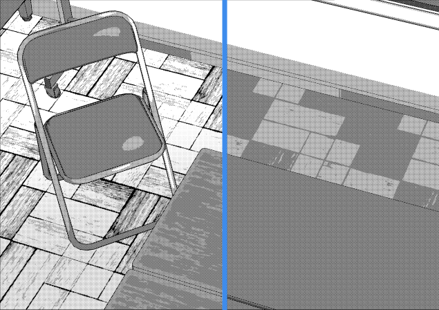
Then paint things over and use Filter > Blur > Motion blur.
5. Finish!
That's all! I hope some of my tips are useful :) I'd be happy to receive some feedbacks & answer questions you may have on the comment section!
Users who liked this post


Comment