Process! How to come up with visually interesting characters
Hi hi!
Just a little process and a ton of tips for composition, colors, and character design!
I will try to make this clear and not complex!
Conceptualization!
Ok so first you need to come up with your drawing!
People stress over this part and try to come up with complex ideas
But you don’t need to worry! A simple base can make great results!
Here are some ways to make eye-catching design!
Make it asymmetrical! Making it asymmetrical will help convey realism and a more natural/organic character. Some ways to add asymmetry: randomized moles, freckles, two different colored eyes, unusual features, unique hairstyles, tattoos, and in my illustration, stickers!
Another thing to help make the drawing easier on the viewers eyes would be to turn the character from a straight on view to a turned angle, for example: I turned the character 3/4 to the right which is a great way to get less intimidating character output!
You can change the angle as slightly above, below, right, left, etc!
Flats/base colors!
Next up is coming up with color schemes!
Again, don’t stress over it!
Some things that can help with coloring:
Contrast! You can contrast through value (the darkness or brightness of the colors) so in a relatively light drawing, you can add a dark element and in a darker image, a lighter element ^^
Another way to add good contrast is through the tone of the colors! If you have a warmer drawing, you can add a cooler element and vice-versa!
I added contrast by giving the hair a brighter tone than the skin, thus distinguishing the two from each other !
Coloring the sketch/lineart!
So something I find extremely helpful for preventing muddy blending or colors is coloring the lineart!
I usually tend to color the lineart with a color that is darker and more saturated than the base color ^^
Like I mentioned, if you are painting, this helps reduce muddy colors opposed to using a black lineart.
Black lineart will automatically darken and deaden the image.
Begin rendering!
Now I start rendering and adding lighting!
A quick and easy way to add beautiful lighting to an image is to use an orangish color with an airbrush on a separate layer! Then, set the layer to overlay!
(you can adjust the opacity until you find what you like ^^)
This can also add some saturation :)
Finishing touches
I don’t really have anything to say on this point, as it’s all up to you how you’d like to render!
When I paint I tend to add a lot to the illustration if I feel anything is lacking! Bring out the parts you appreciate and lose the ones you don’t ^^
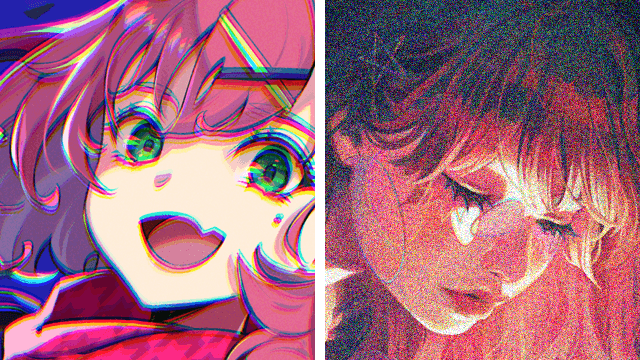
I adjust the colors and add some particles and noise !
Video timelapse
If you would like to see the full process, check out my YouTube video!
Thank you!
Thank you for reading until the end and I hope you found this helpful!
Let me know in the comments any tutorials you would like me to do!


Comment