
Introduction
In this tutorial, I'll be sharing a knowledge on how to come up with a concept for a cyberpunk fashion character and some color theory as well, and also some few techniques on illustration that can be useful in this kind of situation.
Youtube Video
For visual representation, you can watch this video and will also see some speed process of the drawing.
Planning
The first thing you have to do is to plan out the details of your character.
Search everything you need in the internet. Pinterest and google is the good place to go.
The Idea is to steal like an artist and not completely steal everything.
Get little ideas and mix it with different ideas. It is important to collect the feeling of each idea and make sure you get exactly what you wanted.
As of me, I like putting a bunch of circle lights around and I am also gonna use it as light to lit the dark areas.
The other ideas I am looking for is a little rockstar and punk. I also tried to gather some steampunk reference (but not that much) for the cybernetic arm.
I am also into turtle neck and long collar as well so I added it up, you're free to add anything you want as long as you make it look futuristic.
Make sure to study your anatomy to make everything more effective.
As of the composition, I want the color to be part of it by using Color Theory.
I am sure you are very familiar with the Complementary Color Combination. Warm and Cool Colors is very popular.
Color theory is a great guide on using color combination to achieve an appealing colors for our illustration.
You can use either 6 of these similar color combinations. You don't necessarily need to copy the colors on the picture, you can rotate it a little just to get another combinations.
To get a lot of creative freedom of colors, I am going to pick the "Square" Combination.
You don't exactly need to balance all the colors. Maybe 2 of the color options dominates most of the canvas and add the other colors as accents.
You don't necessarily need to trap yourself to these colors. You can still add the other colors as long as it's not that much that will distract the entire composition.
So this is the rough composition I got into.
Blue-Green is for body lights
Purple is for background (But of course, it is a city so you still have to add some little random lights on it)
Yellow is the main light
Orange is for some Environmental Lighting.
The original plan is supposed to be on the front window of a booth but I ended up into something else so let's find out.
You can also change it later if you feel something is off to it but make sure to adjust it correctly and keeping the balance of the main subject and the background.
Applying the rough detail
Step A.
draw the sketch properly and making sure that everything is right.
I also include those thin strokes as my guide for details. It may look ugly at first but we'll just gonna cover some of it anyways.
Step B.
Apply the base silhouettes. Can be very useful later on for easy selection. Also, add all the details of the design of your character.
Step C.
Add the rough details of the background. For me, it is important to start with the background.
It will be easier to match the colors of your character to its background if you do the background first.
Refining the Background
Step A.
The object closest to camera has finer details.
My plan here is to blur the background and only focus to the character so it is not necessary to put a lot of details to it.
Step B.
You have to blur the farthest
On the Menu Bar, go to Filter > Blur > Gaussian Blur
Then just type the exact amount you needed.
C. Adding some city lighting and more details. This isn't final yet so make sure to add layer everytime.
Adding Character Rough Colors
From this part, we'll be only adding colors that we need before starting to render it.
Make sure to use the silhouette of the character and add a layer on top of it then...
Right Click that layer
Choose Layer Settings then Clip to Layer Below
This will help you to avoid the colors go out from the silhouette.
Color your character on that layer, just flat and no gradient. It is fine to color it in one layer.
Now add another layer on top of it, still need to use the "Clip to Layer Below"
Color the entire layer with Blu~ish gray. (Press "Alt + Delete" to fill a color the entire layer)
Set the Blending Mode to Multiply
Create a Layer Mask on it.
Select that Mask
Select the transparent color, lower left from the palette.
Then use your pen to reveal the lit areas of the character.
Like this would be fine.
Now let's add those lights from his clothing.
Add another layer on top of that and still gonna make it Clip to Layer Below.
This time, you gonna use the Lasso (M for the shortcut key), and use Airbrush (Soft)
Select the area you want to put the lights using the Lasso and apply some soft brushing to it.
Note: At first, it will be hard for you to control the Lasso but once you get use to it, you'll realize that it is very powerful tool to speed up your process.
So this is how I ended up doing it.
So starting from here, you're on your own and try to make it better with shading.
This is a good start. Once you already have all your colors applied, it will be easier for you to get the right colors further.
You have 2 option from here.
Option A.
A1. Include the Line Art in the silhouette by using "Clip to Layer Below", same method as before.
A2. Then again, add another layer on top of all those layers and "Clip to Layer Below".
A3. On that layer, you can overpaint everything and covering the line art as well. If you want to get rid of the line art, you can minimize it's opacity.
Option B.
Do the A1 instruction
Select all the Character Layer (including the line art)
Right click to it
Select "Merge Selected Layer"
This will flatten all the layer
Then Activate the "Lock Transparent Pixel" Below the Blending Modes
Use brush or pen to overpaint
The "Lock Transparent Pixel" effect is the same as the "Clip to Layer Below" but you're only working on a one flat layer. If you think you're confident enough not keeping all those layers, this is a way to do it.
I choose option B for this and quickly render it.
This should be fine but if you still want to continue from here, you're free to do it, I know you can make your work better.
I should stop from here but before I end it, I want to share a little finishing touches for it.
Finishing touches
1st Touch: Blooming Effect
I'll add another layer on top of all the layer with the Blending mode "Color Dodge" and add some bloom to the lights of the character.
Adding lens flare to the elbow for some little dramatic effect.
I realized that I have to change the background dominant colors
It's good to know that I kept the layer of so I can change it easily.
I went to the layers of the buildings
Then go to Edit > Tonal Correction > Hue/Saturation/Luminosity
2nd Touch: The Blurring Effect
Now, you can add blur effect on sides.
Group literally all the layer in a folder
- Select all the layers and press "Ctrl + G"
Copy it (Press F3) and paste it (press F4)
Select the copied folder, the right click and Merge the Selected Layer
Go to Filter > Blur > Gaussian Blur
then add a little amount of blur to the entire layer.
then
Add Layer Mask to it (same as what we did to Multiply Layer)
then use soft brush to erase large area on the middle and leaving some little blur on the sides.
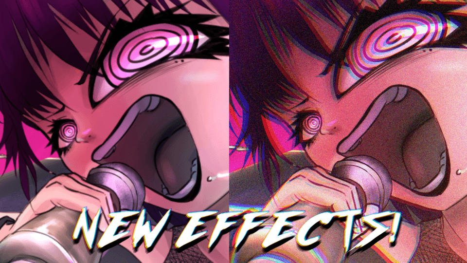
3rd Touch: The RED Channel Effect
Now let's add a RED channel subtle effect.
Something you might want to see and can be use on different illustration as your finishing touches.
First, Select the 2 layer (the Blur and the Folder)
Then put it inside the folder, same thing as usual, Ctrl + G
Then repeat the F3 and F4, Copy and Paste
Then Flatten that Duplicate Folder
It will look like this now. Folder within a folder.
I named the new layer into RED
Select this layer and Go to
Edit > Tonal Correction > Level Correction
Once you see the settings
Click the RGB and select Green
Then slide the left slider way goes right
and do the same with Blue, leaving only Red.
That layer, change it into "Lighten" Blending Mode
Now if you zoom it in, nothing is really happening
On that layer, Go to
Edit > Transform > Scale/Rotate
and use your "Arrow Key" to move the image to Right or Left.
Once you move the image multiple times, it shows you like this.
Now this should show you some subtle changes to your entire illustration
Now it is up to you if you want to keep it that way, but for me, I only apply this on the sides and use soft Airbrush to erase the facial area or do the same steps we did on Gaussian Blur Effect.
So the Final Output looks like this!
Final Words
The finish product might not be satisfactory but I tell you, all the needed information is already there to complete a great output. If you can spend more time overpainting it, covering all those black lines, blending all those hard edges of the shadows, it can turn out into a better result.
A good art needs patience. A good art requires time. If you still have a lot of time, go ahead, make a use of it and produce something might be the greatest art of your life!
Users who liked this post


Comment