Designing clothes for characters
When we want to design an outfit, there are several aspects that we can consider to try. It is important to explore variations to find the perfect model!
Since I have studied Set Design at the University, I have experience designing clothes and costumes for all kinds of staging. Let's see some resources that we can use to make any type of clothing and accessories for our characters, even when they are not intended for a stage!
I will first talk about some general considerations and then some guidelines to start designing. Keep in mind that almost everything that I will say later also serves as a guideline for character design!
(By the way, I also notice that the photos and drawings that appear in this tutorial are my authorship, they do not come from the internet!)
First general considerations
- The appearance of a character can be used to EMPHASIZE some specific aspect of the character; For example, if a character had some ability that depends on his head / face, this concept could be supported by using elements that expand the size or importance of the head ... or perhaps you can also think of the crown of kings, that identifies them instantly!
- Think about the HIERARCHY of the elements that you include in your design. The characteristic that is the most dominant (by size, complexity, material, style, etc.), depends on the tastes and objectives of yourselves! What characteristic do you want to be more noticeable and how can the other elements of the outfit accompany it?
In this example for the character of The Queen of the Night, from the opera "The Magic Flute" by Wolfgang Mozart, I needed first of all to show which character it was clearly (based on the concepts "Queen" and "Night"); but I also wanted to subtly emphasize his influence and his need for control over his daughter, associating this character with a huge spider web.
- Think about the USES AND OBJECTIVES of the outfit you are designing. Who uses it (an office worker, a king, an animal, someone rich, poor, clumsy, elegant, etc.)? What do you use it for (party, work, costume, camouflage, defense, magic, etc.)?
- Balance the filled SPACES with the empty ones. Whether in terms of texture, quantity of elements, sizes, colors.
- Unless we are talking only about fashion, it is very difficult to separate the clothes from the CHARACTER who wears them. A better result is obtained if the design matches the character's personality and style! In this example, could the character wear any other type of clothing and still be the same?
On the moodboard or reference board.
The ideal and first thing is to get all the information you can on the subject or reference element for the design. Create a folder, Pinterest board, panel with magazine clippings, or whatever you need to have all the references you may need in view. Gather pictures of body or clothing shapes, textures, colors, flowers, plants, characters…. everything that helps them to stylistically define the design they are going to do. Also make small studies drawn on one side of the elements that need to be more present or that serve to understand the forms before applying them to the character or final position. For example:
This reference board is used to EXTRACT the characteristics that most want to transmit to the design, as a development in the following point:
About references:
When working with references, the important thing is to "EXTRACT" the main characteristics of what we are referencing in order to apply it to the design. Considering these aspects helps to know how much of the reference is needed for the other person to understand what is being referred to. In many cases, only a part of the thing helps to interpret the whole thing; so that you do not need to see the whole thing to know that it is there ... for example, if you want to draw with tigers in mind, their characteristic fur is probably enough to associate the character with that animal, without the need to add more information. Even the distribution and tone of the colors can help you see the reference!
These characteristics can be very general, so the role of the outfit designer is to achieve clothes that give a clear message but at the same time original or unique for that character.
Notice in these examples how the points that refer to the original animal can be reduced and simplified.
One way to easily study the balance within a design is the triangle that is formed between Utility; Fidelity or Closeness to the reference; and Aesthetics.
Keeping this in mind helps us design considering how accurate, functional or how fanciful we want the design to be.
Let's study an example with this triangular scheme, which has “Aesthetics” * at the top end, “Reference” at the left end, and “Utility” at the right end. In this case, the trigger concept will be Armors.
Their usefulness is usually measured by how invulnerable they are to attack, although this also depends on the design goals. If the artist wants to draw a stealth fighter, a metal armor would make it loud and clumsy, rendering it useless. Think about this before designing !! What will that outfit be used for? Who uses it? In what context?
- (Of course, the concept of "aesthetics" is totally subjective and cultural. These studies are based on my taste and are not a rule)
In this case, the reference is a historical item. So, we can say that "Closeness to Reference" speaks of its fidelity to the real object and its uses. Notice how in the example on the right, the armor leaves the most vulnerable parts of the body exposed to attack!
However, the reference does not have to come from an existing garment or style.
Let's observe and study examples with an animal and a fruit!
Tiger:
Currency:
In these examples, we can see how the closeness to the reference takes on a very different meaning than the armor! When accuracy can become an impediment for the character, this is where they have to be most attentive to capture the important points of the reference and to be able to convey them with more subtlety in a design that is less obvious and more comfortable for the character.
On balance
Balance in a design is very important, although it depends mostly on your own taste and goals for that outfit. When I speak of balance, I mean the balance of design elements by size, quantity, complexity, position, and material.
Size, position and quantity can generally be more easily verified by viewing the design in a small size (no more than 5cm in height), to more clearly see the silhouette and weight of the elements of the outfit. In this example I tried to design outfits based on soft, circular shapes. Of course, the choice of where to emphasize is a matter of your taste or your goals!
In addition, the same design can change completely just by modifying the size of its elements!
Consider that the largest or most detailed part is probably the most striking; although a specific part can also be highlighted by contrast, in such a way that if the entire costume is very voluminous or detailed but a smooth or non-voluminous part is left, it will be seen first (and vice versa!) (See the example of La Reina de The Night above, in its version with the wide dress, the skirt weighs so much that the attention goes directly to her torso).
I also want to highlight the balance regarding the materials and style chosen. An artist can choose many, many elements and mix them into a single outfit, but it will only work correctly if those elements are balanced within the design. Too much mixing brings clutter and makes the design difficult to interpret. Let's look at an example combining the stereotypical Aboriginal American elements (such as feather ornaments), a traditional Japanese kimono, a European armor, and robot parts.
1) In the first sketch, the biggest drawback is that the elements are not integrated with each other. Also, some are hardly visible. The thing is then to achieve an integration that shows all the elements that we want to show.
2) In the second sketch the elements are integrated a little more, I combined the feathers with the robotic part of the character. In turn, the armor part can be easily combined with the robotic part. The kimono has not yet been fully integrated.
3) In this case, I minimized the tribal and European armor elements, to include them directly within the robot part. This simplification and reduction of elements also makes the figure better read.
However, all these elements that I have been using are very difficult to combine and it is very true that sometimes it is better to KEEP IT SIMPLE. Choosing only two fundamental elements, and perhaps a third for details, is enough to achieve an original design and it will not be so difficult to get your elements to integrate.
And even more IMPORTANT: if any element or set of elements of the same theme can be completely removed from your design, and the design WORKS well the same; means those items were NOT REQUIRED!
An easy example of this can be the concept "Sirena Punk". The trick here was to adapt the Punk aesthetic to a character who lives underwater. What materials would you use? And also, in the mermaid part, which fish best corresponds to the Punk aesthetic? It is in these types of questions that the intersection between costume design and character design is most seen.
About the color
Color is one of the first elements we perceive and it has a lot of MEANING in itself. When looking for references, it is vital that they select the colors that best represent the thing or concept they are using as a reference. Always bear in mind that each culture has a collective imagination that makes sense of colors in particular ways, and that trying to change those established rules can be very risky. For example, if you wanted to design something based on Fire, although there are fires of very different colors (even green!), It is more likely that it will be understood faster if orange or bluish colors are used, because we already have this concept incorporated with those characteristics.
In this case, although the image is the same, fire can be interpreted in the one on the left but, by changing the color, the one on the right could be more interpreted as poison.
On the other hand, put together a COLOR STRUCTURE that helps you think of a coherent hierarchy of tones. The ideal is to assemble reduced color palettes and establish them according to their dominance.
Find one dominant color, one subordinate color, and one for accents or details. The dominant color is the one that is found in greater quantity in an image and somehow “frames” or puts the other colors in context; the subordinate color is found to a lesser extent than the dominant color but to a greater extent than the accent; the accent is the color that is in smaller proportion and that helps to mark the important points or the details of the image, indicating a route.
Each of these color categories can be made up of several similar tones, the trick is that they are not too far from each other to maintain harmony.
When viewing the reference images, choose and apply the colors based on this scheme. For example:
Now that we know what and how to search for reference, let's see how to use them!
From flowers and plants
Here the most important thing is to take into account the shape of the petals and leaves, textures, spots and colors. Remember to do several tests to be able to better choose how "plant" you want the outfit to look, and also consider what type of character is wearing it: elegant, fairy, flower seller? Let's see some examples!
From animals
Here the most important thing is to consider the elements that make a certain animal that animal and not any other similarity. What parts are the most representative? For example, if we want to draw a character based on a moth, the type of antennae, the texture and location of its “fur”, the shape and size of its wings and eyes, will be the most representative elements that differentiate it, for example, from a butterfly Remember also the example of the tiger above!
From existing styles (fashions, pictorial styles, architecture, etc.)
Here too, it is essential to note what are the main characteristics of each style or historical moment ... what colors are used? what kind of shapes? what themes are reflected in that work?
For example, if you wanted to base an outfit on one of Mondrian's iconic paintings, you would use straight lines, primary colors, smooth texture ...
If you want to make the outfit for a specific time, you should study very well the cut of the clothes, the types of fabrics, the accessories ... The following example is a design I made for the opera "La Traviata", based on the book by Alexandre Dumas "The Lady of the Camellias" from 1848. For this I had to study very well the clothes and hairstyles of that time, to be able to faithfully represent a young woman of high society at that time, and I also linked it with the flower mentioned in the book (Camellias). And be careful with taking references from series or movies! many times creative licenses are taken quite apart from the accuracy.
From simple ways
If designing from a more defined reference is not your thing, you can start directly by trying simple geometric shapes. Combinations of one or more of these forms make the outfit that is being made simple but easy to read, while it is difficult for it to result in something unharmonious.
From a sensation (pointy, dangerous, kind, sweet, happy, harsh, etc.)
In this case, the important thing is to identify what shapes, colors and materials are generally associated with each sensation or feature. Look for references to real people or characters that you associate with the feeling you want your design to convey.
For example, if you want to give a feeling that the character is elegant, in general you associate fur collars, hats, formal and well-cut clothing, cleanliness, inconspicuous accessories, etc. References to this could be Cruella de Vil (Disney's 101 Dalmatians), Beth from “Queen's Gambit” (Netflix series), White Diamond (Steven Universe) or Miranda Priestly (movie “The devil wears Prada”). In this variety of so different characters, the question that must be asked is what are the characteristics that are repeated in all of them and that convey elegance?
In this example, I also reinforced the character's idea of elegance with an oval frame, which is often associated with historical portraits of high-society people.
From an existing character (description, adaptation to another style or body type)
This case is closer to character design, but be very careful not to steal someone else's design! Respect the creations of others! As long as they are inspired by others, GIVE CREDIT.
The idea in this case is to take inspiration from another character and take advantage of his characteristics to make his own design as a tribute. There are different triggers in this section, let's study some examples:
A) Based on written description: in this case the designer's job is to interpret that description and convey it in his style. As an example I have theater sketches of the character Papageno, from the opera "The Magic Flute" by Wolfgang Mozart. This character is described as a bird man, simple, comical, romantic and of a kind nature.
B) Adaptation of a character already designed to a body, style or time different from the original. In this case, I used the iconic elements of Sherlock Holmes (Sir Arthur Conan Doyle's character) to characterize (i.e. disguise or give the look of) a mermaid. Remember that in these cases the gesture and posture of the character is also very important!
C) Adaptation of a character from one species to another species! For example, when artists make human versions of pokémon, or even human versions of flags! In this example I show you an adaptation of the characteristics of the pokémon Sylveon to the girl's clothes.
From the points that you want to highlight from the pose
Despite all this I have said, many times my drawing begins as just a posture, and then I must focus on the type of clothing that best accompanies it. At this point it is very important to identify which elements of the posture we do not want to be lost when hiding with the outfit, while we must consider what type of clothing would best favor the sense of posture or movement. (I marked with orange the lines that I was most interested in maintaining and reinforcing with clothing) It is very useful to consider the silhouette, so that the clothing does not get in the way of reading the posture.
If you look closely, each costume fitting respects the silhouette of the lines that I marked with orange in the base drawing.
Starting from a concept
The word "concept" is a bit broad, but I mean when you take a concrete and defined idea to start designing. An idea that also speaks a lot about the character, especially when talking about interests and occupations that he has.
For example, the following design is created from the "Ninja Cat" concept. Which already gives me a guideline for the type of clothing and skills that the character will have, as well as guidelines for the design of their body. Based on this, I did research on traditional ninja outfits and applied that to the character design I had in mind. Also, in this case, the outfit complements the shape of your body.
The best thing in these cases is to make several sketches that help make decisions. In this other case, my initial concept was "Magic fox whose outfit has bows and ruffles."
I HIGHLY recommend drawing the body of the character you are making as a mannequin to be able to perform various costume design tests! These tests gave me enough variety to achieve a design that combines several elements from different proposals and arrive at the following result:
About the design process
So, let's review what we've seen so far and see how and when to apply each concept. This is the method that has been the most useful and efficient for me. Remember that this also works for character and creature design in general !! I am going to show you as an example of the complete process one of my works for the University.
1) Define the source of inspiration (photos, drawings, poses, characters, etc). In this case, the first starting point was the work of the 19th century artist: William Morris. This artist worked a lot with wallpaper and upholstery that mostly combined flowers and fruits. I wanted to incorporate fantastic animals into this formula.
2) Select the most representative or most interesting aspects of that reference for you (shapes, colors, details, textures, etc). The result of my research led me to produce this pattern for fabrics, taking advantage of the stains to look for figures. This canvas was what served as the inspiration and basis for the outfit and character design.
3) Make several small sketches combining the elements of the previous point in different ways. The ideal is to make a minimum of 3 versions, to have a choice. They can take advantage to design very different characters, or different outfits for the same character!
4) Select the sketch that you like the most and enlarge it; or choose and combine the elements you like best from the sketches to create a new, larger and more detailed one. In this case, after selecting the elements I wanted from the original reference, I concentrated on drawing different types of characters.
5) Carry out several color tests on the design you have chosen. I took my favorite sketch and made color tests very quickly, wanting to convey nature and mystery at the same time, and also taking advantage of the colors of the original fabric (The photo is not very good quality, but I used black, green, red and purple ink).
6) And after all that, we are ready to make the final drawing, with the elements well defined! I made two versions as Concept Art for the character. I have already abandoned the pose that makes the garment shape perfectly visible, and concentrated on showing the movements of the character when wearing it.
- Drawing made from a complete sketch:
- Drawing made from the combination of sketches:
Helpful Clip Studio tools for designing and drawing outfits.
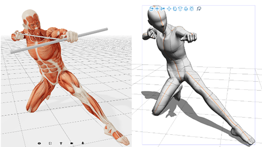
1) 3D Models: Don't forget this is available! Before drawing the final pose, which can be very confusing, we can save time by designing the outfits with Clip Studio pre-made 3D models. Follow the following numbered steps to locate the 3D models included in the program. To incorporate them into the canvas, you have to click on the chosen model and drag it to the canvas.
Remember also that you can modify the shapes and proportions of these models even until they look like fantasy characters! To make these modifications, they must select the icon “Adjust the shape of the body and the size of the figure in 3D in detail” that appears to the right in the bar of modification icons of the 3D model.
This is the perfect mannequin to design without even worrying about posture or proportions! And, of course, it also serves as a mannequin for the position of the character itself ... If you need more details on how to modify, apply and save these changes with more precision, you can see it much more developed in my Tutorial "Fantasy Character Design", available on my Clip Studio profile!
You can achieve results like these and much more extreme too !:
2) Predesigned brushes: chains, ruffles, bows.
Clip Studio has many of these types of brushes already built in by default. However, these brushes have a stiff and artificial look that is difficult to integrate with a more personal drawing style. I recommend its use to be able to draw more easily without losing, for example, the size relationship between one link in the chain and another. Of course, do not forget that in Assets you can download other types of brushes, such as to make zippers or bows!
3) Patterns for fabric: Clip Studio has incorporated several designs, very useful to give variety to clothes without going crazy with geometry! In Assets you also get many beautiful patterns for clothes! You can see the Tutorial "Assets Brushes for fabric, backgrounds and watercolor" available in my profile to see my favorite pattern packs! However, what I am interested in highlighting right now is that each pattern is inserted into the image as a smooth plane, without wrinkles or deformations. I think that accompanying the wrinkles and position of the clothes with the pattern is important to give more realism and a sense of volume. I recently discovered a way to help achieve this! With the area you want to modify selected, go to the "Edit" menu and look for the option "Transform" and then "Mesh Transform". This can be done on any size selections!
Keep in mind that working by selecting smaller areas gives more control and realism.
- Remember that you can create your own patterns and brushes to your liking!
Thanks and contact:
And these are some (many) considerations that can help to design more varied and versatile outfits!
Thanks for reading and I hope it has been useful !!
Do not hesitate to tell me in the comments if this information if you have any criticism or suggestion to help me improve.
If you like my work, you can find me on my social networks:
Instagram: @barbara_brutti_ilustraciones
Furaffinity: @barbara_brutti
Deviantart: @Attaroa
And I also have a Patreon, where you can support me and see my work processes for only 1 dollar!
https://www.patreon.com/barbarabruttiilustraciones
I also want to thank my friends who helped me correct everything!
Malvina, on Instagram @malvilustra
Nevan, at Furaffinity @ Nevan12
Owlieta, on Instagram @owlieta




Comment