
Presentation
Hello!!! Welcome, today I am here presenting you a new tutorial. On this occasion I will explain how I paint some jewelry accessories. In general, painting jewelry is easy, you just need to control the lights and shadows along with the reflections. By following these tips you can make jewelry with different degrees of detail; from the simplest to the complex such as realism. I hope this is useful to you, so let's get started...
► Jewelry structure
To begin on the path of jewelry we have to address a topic of extreme importance, the architecture of jewelry. We have to understand its three-dimensionality, its geometric composition. This way we will know how to draw them, make the sketches and then go on to color them. Give them life. Knowing this you will be able to create gems without the need for a reference.
• BASIC SHAPES / CUTTING GEMS
We normally use gems as accessories, to be used in this way in some cases they are treated, in a more developed way, these gems are given shapes with respect to basic geometric figures such as the square, triangle and the circle; This makes them more elegant, since they highlight their shine, this is what is known as cut or size. Regarding the cutting of jewelry, it can be generalized into two types: the one that softens the corners giving it a round finish, while the other leaves the corners pointed giving a more aggressive look. Below are some examples of cuts.
In conclusion, to draw a gem, you can choose any of the geometric shapes (square, triangle, circle, oval, rhombus and polygon) to which you can choose to leave them in their original shape or transform them by rounding the corners or simply creating structures with them to that accompany any landscape you paint. Later I will explain about the types of gem cuts, but first of all I will show how to use the Clip Studio Paint tools to make these shapes.
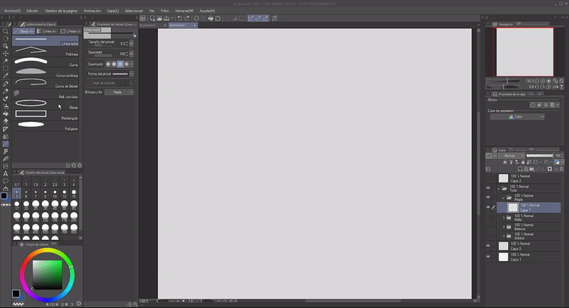
In the tools section you will find the "Figure (U)" function. Here you will find the subtools that will allow you to generate any figure, whether just the line or the figure with a fill. In the properties part you can see that the subtool can be modified.
Each of the choices has its specific options in the "Tool Properties", but what I want to emphasize is the sub tool with which the polygons are created. Here you can indicate the number of vertices, the maximum that can be generated is 32. You can also round the vertices with the "Roundness" option and adjust the proportion. This explanation may seem insignificant, but for those who don't know, these options will make their lives easier.
• TYPE OF CUT/SIZES
Jewelry is linked to minerals, minerals usually generate forms of Platonic solids that are regular convex polyhedra. A polyhedron is a three-dimensional shape that has flat faces and straight edges. So the 5 solids that are considered Platonic polyhedra are the cube, the tetrahedron, the octahedron, the dodecahedron and the icosahedron. Knowing these structures helps us know how to give three-dimensionality to gems. The figures below are already starting to take on volume with just the structural lines, right?
Now we are going to see the types of cuts that can be drawn in your jewelry illustrations so that you know how to correctly give three-dimensionality. Based on the geometry of these polyhedra, these cuts are shaped, which can be: heart, brilliant, oval, baguette, princess, marquise. In general, to illustrate these cuts the only thing done is to draw the overall shape of the gem, leaving a smooth space in the center and a mesh of united triangles around it externally. For squares/rectangles it is easier, you only need to draw rectangles inside rectangles and join them at their vertices.
A Clip Studio tool that allows us to make these structures more easily is the "Symmetric Ruler" subtool found in the "Ruler" tool section. This function serves as a mirror, what is drawn on one side of the ruler is simultaneously drawn on the other. This helps us make the figures more symmetrical and saves us time.
Among the properties of this tool we find that the number of lines can be modified, the maximum number of lines that can be placed is 16. By changing the angle and/or increasing lines you can create wonderful configurations for your gems.
► Light direction
It is easy to know how to add lights and shadows to jewelry, since they use a simple principle. The first thing you have to remember is that gems are a crystalline structure that reflects light in various directions and for that it is necessary for light to pass inside them, it is for this characteristic that gems are considered shiny, and the brighter they are the more worked they are.
The principle is that if, for example, we choose that the direct light source comes from the upper part, then that part will be the one that is painted with a pure white color or close to it. On the other hand, the lower part has a bright color compared to the base color that is close to white. This is because the light enters through the top and as it goes down the gem it ends up losing intensity, degrading to a saturated color.
As can be seen below, if the direct light comes from above, consequently the other illuminated part will be its lower parallel, if it comes from below, its upper opposite will be the one that shines with a garish color. In the case of lateral light the same concept applies, the light travels diagonally from one end to the other.
As for the cuts that the gem has, these must also have a slight shine. Look at the example below. What do you notice? On the right side is the structural diagram that is sectioned into blocks numbered from 1 to 4, see that section three has luminosity, but section four does not. This is to contrast the sections, to create the feeling of volume.
In short, if there is a section with any type of brightness, its immediate will have to be a shadow to give contrast and therefore volume. Look at the example below, follow the sequence 4, 2, 4, 3; being four shadows and two-three shines. They alternate between light and shadow.
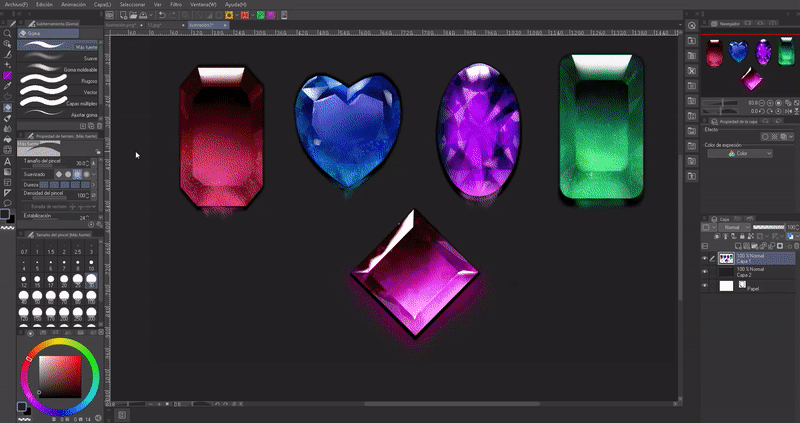
Light is reflected in all directions to where it is refracted, that is why the following characteristic has to be taken into account so that your gems have more depth. As you can see at the bottom, in the image, the gem gives off a shine in the lower part outside the limits, this shine is the light being projected by the structure. They also project light to nearby objects, as denoted by the oval gem with that small green glow.
In the image below it already has textures, but that will be seen in the process part.
► Creation process
Making this type of gems is very easy and only requires a couple of minutes, they really are not very complicated, we will check it out below.
To begin we have to give it the shape through a sketch, in this case I advise using the figure tools, since they facilitate symmetry. We create the geometry of the future gems to our liking. In this case I will use a rectangular shape and a heart shape so that the process in any gem is clear. The procedure is the same, but those that have a triangle mesh have some additional steps that we will see below.
Since you have the shape, I advise you not to paint on that layer, it is better to do the following on a layer above it. Now, yes, the next thing you have to do is color the figure with a solid color, I filled it with the "Paint Bucket".
The next thing you should do is create the gradient palette that you will use on each gem and then paint each section separately, this is so that when it comes to adding the highlights and shadows everything is easier. Now, on the layer where the figure is with the base color, we are going to place, with the help of the "Airbrush" tool, a color darker than the base color in the area where the direct light will come from and we will blur it with the "Blur" tool. . To avoid getting out of shape you can use the "Block transparent pixels" function, and thus paint over what has already been painted.
To do most of the lighting and shadows I'm going to use the "Airbrush" tool which is "Soft".
Another important tool is "Color Mixing" where we find the "Blur" sub-tool, this will be important to mix the color so that it does not cut so abruptly between one color and another.
To continue with the creation of the structure, it is the turn to make the central part of the figure, we will do this in a simple way; We will only duplicate the initial layer where we had the shape with the base color and reduce its size with the "Transform" function. We will place it in the center and, like the previous one, we will make a gradient with lighter and darker colors than the previous ones.
To put the direct light in, create a layer that was above the base layer and below the small rectangle layer. On this layer, select the top of the figure with the "Selection" tool known as a lasso, joining the vertices of the larger rectangle with the smaller one. Within this selection, paint half the distance with the "Airbrush" with a pure white and then blur the lower part with the "Blur" tool, thus leaving that upper shine.
For the heart, what is done is to fill the triangle mesh with different colors within the color gradient, in this case blue. Don't forget to place the colors according to the lighting source in the way I explained before; The shadows are close to and opposite the direct light.
This is the "Selection" tool and its many sub-tools; Use it wisely and it will be your best ally.
To finish giving shape and volume to the rectangle we are going to select with "Selection" by joining the four vertices of each of the corners forming trapezoids. We will blow these trapezoids with small touches using the "Airbrush", those close to the source light are darker and their opposite light. As before, to illuminate the sides we first have to select them and using the "Airbrush" with a light saturated color, give small touches and blend gently to mix the color.
Regarding the heart, only a new layer will be created above the previous ones to create colorful lines that go from the center to the perimeter, filling the entire figure.
In the same way as before we are going to select the different parts of the gem and with the "Airbrush" highlight the dark and light colors. You have to blend them so that the colors mix.
With the new heart layer that had been created with the lines, what we will do is lower the opacity so that the lower layers can be seen.
With respect only to the heart, we are going to create a new layer above the others and with the "Selection" tool we are going to select the central shape which is a heart; We will paint it with some opaque tone. Now we will generate another layer in which with "Selection" we will create shapes in the parts where direct light will fall and we will paint them with the "Airbrush" in a pure white color, we will blur them a little. This will give it shine.
Now that we have the shapes, lights and shadows, now it's time to place textures. Doing this is easy, all you have to do is apply a splash or stain brush with which you can modify the size of the particles, create small dots and stains ranging between light and slightly dark colors.
These are good brushes to do the particle effect...
To highlight the lights and shadows more, to reaffirm the volumes we are going to create a layer below where the stains were placed, with the help of the "Airbrush" we will illuminate or shadow the parts that we consider without losing the shape. In my case I highlighted the lower part of the heart with a more saturated color and darkened the lower part of the central rectangle a little.
In another layer below the stains we are going to create various figures with a medium color that will be opaque shines.
Once these opaque glows are created, we are going to lower the opacity of that layer to the level we consider. We can also generate some central reflections such as those of the rectangle or the heart and lower the opacity.
It looks better now, doesn't it?
To create the back shadows of the gems shown in this case, we will first join all the layers into one and then duplicate it. In this unified layer we will use the "Tonal Correction" function.
In the options we are going to lower the luminosity to -100 so that the duplicated figure is completely dark. Arrange the figure behind the gem, make it larger so that it is noticeable.
To make it look even better we are going to give it a "Gaussian" blur, so the black silhouette will look a little diffuse.
In a layer between the gem and the black shadow with the "Airbrush" we are going to gently paint a reflection with the top saturated color to create the sensation of the shine of the gem reflecting on the surface. To make small sparkles you can use the "Fingertip" tool, so it will look like downward sparkles.
To finish we will do the sealing that gives firmness and life to the gems; This involves using the "Brightness/Contrast" function found under "Tonal Correction."
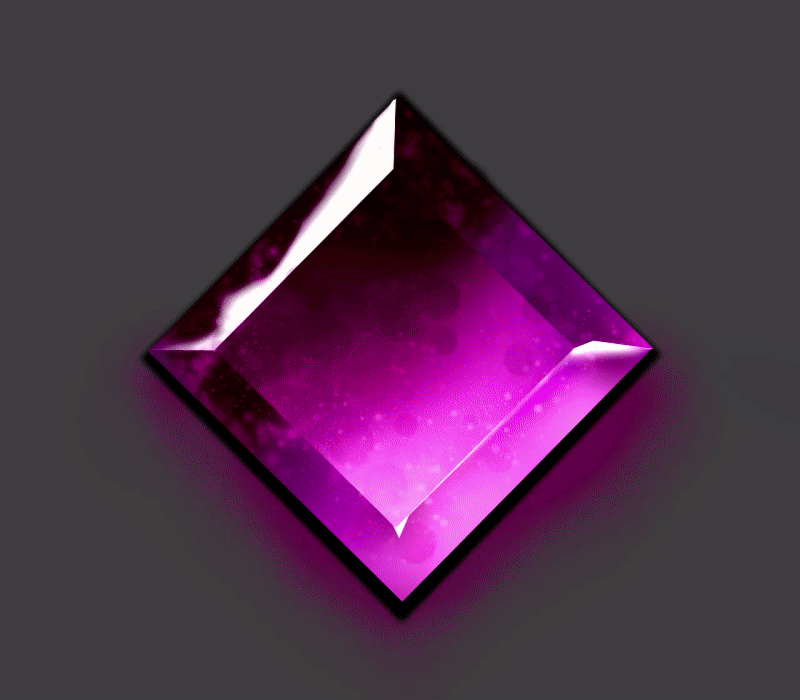
Modifying this option gives this beautiful finish to the gems... with this we come to the end.
• EXTRA
So that you don't have to make gems of different colors one by one, you can use the same structure and join all the layers into a single layer, go to "Tonal Correction" and use the "Hue/Saturation/Lightness" function, here you can change it the tone to the gem and adjust the other parameters so that everything looks uniform.
► Timelapse
I'll leave this timelapse so you have a better idea of how these gems are painted. All gems follow the same principles and steps to follow. I hope they are of help to you.
Farewell
Gems are very easy to make and are full of possibilities due to their versatile geometric structure and wide variety of possible colors. Here we come to the end of this journey.
Well, without anything to say, thank you for coming this far! ପ(๑•̀ुᴗ•̀ु) ॣ৳৸ᵃᵑᵏ Ꮍ৹੫ᵎ ॣ
Vibrate high!!! We won't see you another time ( •⌄• ू ) ✧
Users who liked this post


Comment