
presentation
Hello! Welcome to this new Tip. On this occasion the topic to be addressed will be futuristic cities. There are many techniques and styles to paint them, the one I will use will be based on vector art, this will allow us to make neon backgrounds of futuristic cities in 3D in a very easy way, only using 2D illustrations. In addition, this is a technique that does not require a graphics tablet at all, the very tools used in the process below have the wonderful feature that they automatically stabilize the lines to make them straight and wobble-free. I hope these Tips are useful to you, without further ado let's begin...
► Perspective and basic composition
• COMPOSITION
Let's start with a couple of composition rules to harmonize both this vector art and any illustration we do. It should be noted that these are not strict rules, you can always take licenses, but they are recommended for better results.
If you want to know more about this subject, leave another tutorial where the different rules of composition are explained more and better ▼▼▼
• BALANCE
When you have a huge object somewhere, either on the left or right, then you should use something to offset the side you put on the object. Balance is another way to check if the illustration is good or not. Be sure not to put too many things on one side of the illustration.
Let's see an example with buildings (boxes). As you can see in the image below; on the right side there is a huge box, while on the left a couple of small boxes. What do you see? How does it feel to see them? You feel that there is more weight on one side, right? You feel a certain restlessness and your gaze is only focused on the big box. Well, these are some of the reasons why it is advised that both on one side and the other find the same amount of weight. Calms the viewer's eye.
Some more appropriate ways to distribute the buildings in the illustration would be the following:
1.— The first would be to place what is on one side also on the other, although it looks very simplistic, don't be fooled, wonderful things can be done using the same objects.
2.— The second would simply be to have the same weight on both sides, even though the figures are different. Practically, it is the same, it is the same rule of having the same visual weight on both sides.
• PERSPECTIVE
Now it's time for a complex issue such as perspective, but in order not to mess with all its rules I'm going to use a Clip Studio function that allows me not to do so much acrobatics with the perspective rules. I personally like this feature as it saves valuable time, but if you want something more laborious and on your own terms, then I'd advise using perspective rulers manually with as many vanishing points as you like.
This function consists of automatically setting the vanishing points (you can set 1, 2 or 3). To use this automatic tool, all you have to do is right click on the layer where you want to have the ruler. When clicking, an options bar will appear where the “Ruler/Vignette” option will be chosen and then “Create perspective ruler”.
This box will appear where you can choose how many vanishing points you want to use.
➜ One Point Perspective
Using a perspective point, cities can be made in a line like the following. If you want to draw something without the limitation of the rules, you just have to deactivate the function and then activate it again.
As seen in the image above, the vanishing point appears by default in the center, but it can be moved wherever you want. In this case I decided to lower it a bit to make the city. It is recommended that when drawing the buildings, make them all facing the same direction.
The result was the following; First I made a sketch of how I wanted the city and later I highlighted it with a darker pencil. This part is an easy drawing, without details, just the outline. The details will be placed in the 2D part.
To draw the city in this linear way is achieved simply by not passing the blue axis of the perspective ruler, so you can make angled buildings in a linear and automatic way.
As seen in the GIF, I just followed the perspective that the default point gives me. There is no need for anything else, the lines come out straight and at the correct angle. Try it and check it out.

The process that I followed for this city was firstly to draw the buildings from the center to the left part as seen in the GIF above, then I duplicated that layer and inverted to later move it to the right half, in this way the right part is the reflection on the left side. This is an easy method to make your illustration look symmetrical.
Another way to place the buildings would be for all the structures to face the same direction. As in the previous one, duplicate the layer where the buildings on the left side are drawn; I just swept them to the right. In this way the buildings all face to the left. Buildings can be made to face right by inverting the layer.

Another perspective that can be achieved with a point is one in the shape of a hill, the most traditional. In this case, what is done so that the buildings are on a hill is simply to follow the purple axes of the perspective ruler, the same ruler delimits where to draw.
To save a bit of time and make the scene look symmetrical, I made use of the symmetrical ruler. This ruler acts as a mirror, this means that what is drawn on one side is automatically and instantly drawn on the opposite side. This rule is found in the "sub tools" of "Rule".
Place the «Symmetric Ruler» on top of the vanishing point vertically. As seen in the GIF below, the job is easy and symmetrical with this ruler.

➜ Two point perspective
The process is the same as above. This time there are two vanishing points that are located one at each end horizontally. To draw these buildings, all you have to do is draw following the direction at an angle to the vanishing points, as exemplified by the pink arrows.

► Neon colors
At first I didn't know how to choose colors that look saturated, but using a bit of logic I realized that getting neon colors is so simple; the only thing necessary is to choose colors that are in the upper part having a tendency towards the right vortex. The colors in this part are very saturated, while, on the other hand, those tending to the white vortex become dull compared to the right part, as seen in the color wheel above.
For the shadows I recommend choosing colors that are towards the black, but not too far from the right fringe, as seen in the color wheel below. Colors that tend towards gray are not welcome in the neon group.
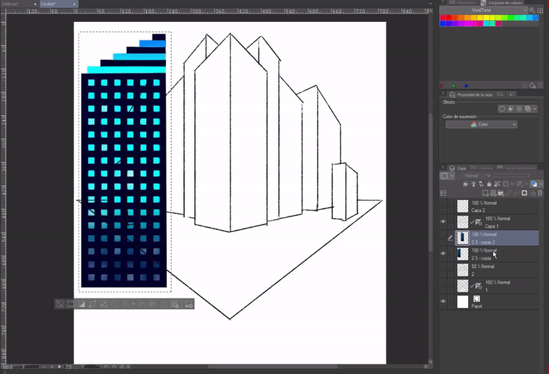
► 2D buildings
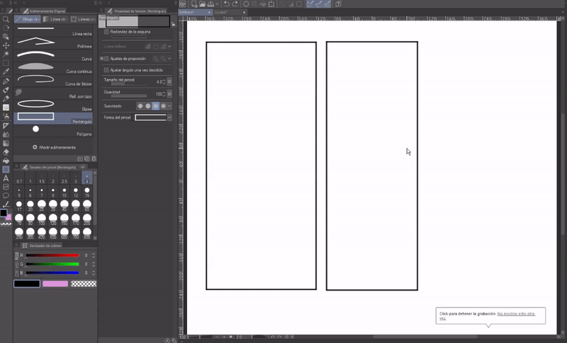
To make the buildings in 2D we will use the option to create a "New Vector Layer", in order that by using this option we will not lose quality in the illustration when we scale it to put it in perspective and it has easy ways to edit the lines created . This option is located next to the "New Layer" option.
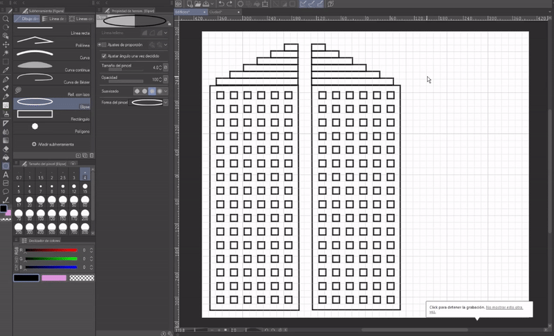
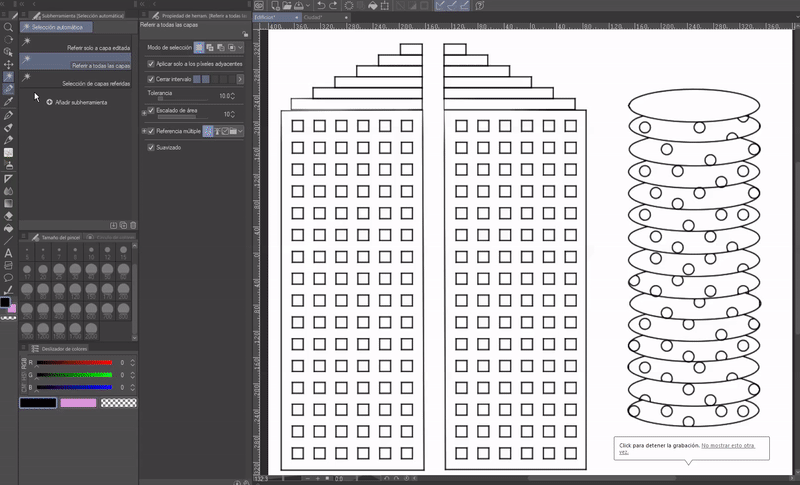
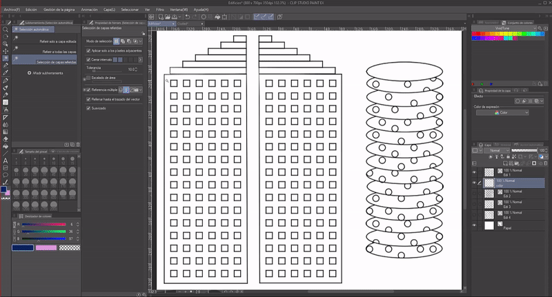
In this Vector Layer we will draw the buildings that we need to complete the architecture. I recommend using the vector layer because they are easy to edit the lines that are drawn on them. Two views will have to be made for each building, the frontal and one from the side. Below is a graphic example for clarity.
As you can see, the buildings are just structures built from basic shapes, made with the “Shape” tool. For figure 2, a lateral counterpart is no longer necessary, since the line itself gives it three-dimensionality.
The Vector Eraser tool erases entire lines up to intersections with other lines.
In this style the buildings have this graphic construction; one tool that can help make your creation easier is the Grid function found in View > Grid. To edit the characteristics of the grid, such as the size of the boxes, we must access the following option path: View> Ruler/Grid settings.
The buildings can be of various shapes, of everything you can imagine. At this point it is advisable to visualize the buildings in 3D to be able to make the side view correctly.
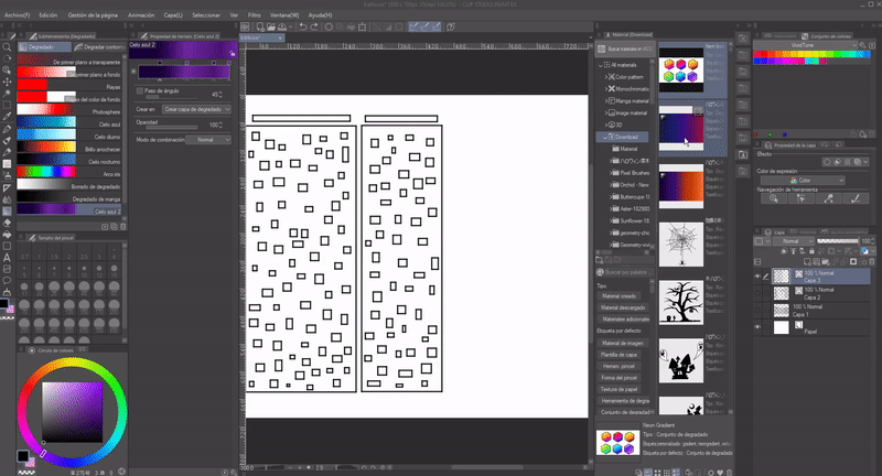
► Degraded
To put the colors to the buildings and some parts of the background we will use the gradients in Clip Studio. Using them is very simple, it gives color in an easy and fast way to the illustrations.
In the Clip Studio store you can find an endless number of gradients, or you can also use the already created gradient maps and they can also be created manually.
First, to add a gradient that has been downloaded from the Clip Studio store, one way to add it would be to drag the downloaded material onto the Gradient tool.
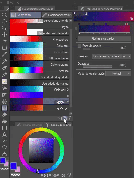
As for creating your own gradient, the method of doing so is simple. It is only required that within the "Gradient" tool, click on the "Create copy of sub tool" option, a new window will appear where you can choose the name of the gradient. Once generated you have to go to the properties of the tool and in the section to specify color, in the boxes that are at the top, when you click on them the color will be transformed to the one that is currently selected in the color circle .
With the arrow at the bottom of the "Gradient specification" bar you can move the level of participation of a color or by clicking between the arrows you can make a new square appear where you can add a color.
➜ Buildings
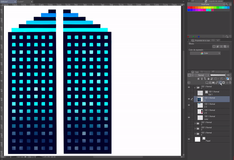
Now comes the most important thing, which ends up giving our futuristic city its final shape, and not only that, but it is also the easiest thing to do. We will color the buildings using gradients.
To place the colors we will have to create a new layer at the bottom where the buildings layer is located.
The next step is to choose the colors, and once chosen we will go on to select the parts of the building that we want to illuminate with the gradient using the “Automatic selection” and/or “Selection” tool depending on the situation. Gradients can be placed in different directions by clicking a reference point and dragging the popup line in the desired direction.
To put the gradient we will place ourselves in the previously created layer and once the figure is selected we will select the desired gradient, in the tool properties section in the "Create in" section we will change the option to "Create gradient layer" and finally we will place the degraded.
Every time we want to put a color in a certain section, we will go through the steps of placing ourselves in the color layer and once the area is selected, we must apply the gradient. The gradient has to be applied properly in such a way that when making the line layer invisible the colors of the gradient must be united without any white spaces between them.
Each gradient is automatically created on a new layer above the selected one, so I advise not to merge the layers until you have the final colors.
► Coupling of buildings in perspective
Now it's time to couple the buildings in the perspective created at the beginning. This is an extremely easy step. What we have to do is unify all the color layers in one without including the vector layer that contains the lines and later transfer them to the perspective file if you did it in different files. If they are in the same file, skip this step because you already have it done beforehand, just blend the color layers together. It should be noted that the Sketch of the perspective and the buildings have to be on separate layers.
Once we already have the building in the perspective layer, now we are going to use the “Transform” and “Free Transform” tools. You can access the Transform function using the Ctrl + T keys, for the Free Transform function you must first access the transform function and once inside you have to right click inside the transformation box where several options will appear, one of them is Free transformation.
To dock we will select the front part of the building, then we will access Transformation> Free transformation. Using its qualities we will couple the building to the shape of the sketch. First a view of the building, either the front or the side. Both must be coupled in an aligned manner between them.
I advise separating each part of the buildings, each on separate layers, as that makes it easy to edit without damaging the work.
We will do these steps for each building we add.
► Bottom
When we already have all the buildings coupled to the perspective comes the final step. For this part we will also use gradients and the opacity of the layers that we are using.
Now, let's start by placing a total background to the painting. In my case I will use a gradient of a dark blue color. For this step we will create a layer below all the layers where the gradient will be placed. I'll bring this gradient down to the vanishing points so that the final lighter blue colors of the gradient aren't lost.
Then, in the part of the ground, place a purple background and in a new layer, paint with the help of the grid a green grid that I put in the part of the floor to differentiate the horizon of the sky and the ground.
As the next aspect I made a copy of each building and rotated it so that it was upside down with respect to the original so that it was like its reflection; merge all the layers of the inverted buildings together and lower their opacity to 50%
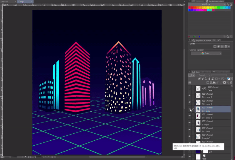
Finally, I put some pink, yellow, blue and white dots in the sky to simulate stars. The final result was the following:
farewell
The future is so enigmatic and full of possibilities; even if we are not sure of anything about it, even so, we can always imagine how it could be.
Here we come to the end of this journey on the future.
Well, nothing to say. Thanks for coming this far! ପ(๑•̀ुᴗ•̀ु) ॣ৳৸ᵃᵑᵏ Ꮍ৹੫ᵎ ॣ
Vibrate high!!! We don't see each other another time ( •⌄• ू ) ✧
Users who liked this post


Comment