
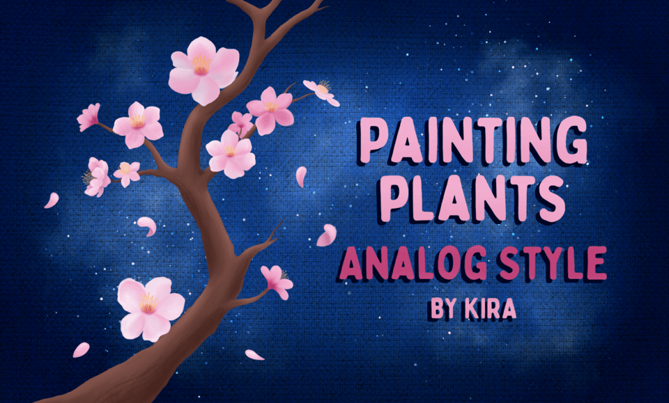
-Intro-
Hi everyone! I’m back once again with another post!
Flowers are always something I’ve loved drawing. They add so much into a drawing and can be used in so many ways to enhance the mood and atmosphere of an image. However, they can be tricky to draw sometimes and can seem scary to beginners. So, in this tutorial I will be showing the basics of how to draw a flower and 3 ways you can add flowers into your drawing.
1. Basics
To begin, let’s start with choosing a flower! There are many types of flowers to choose from and it could be overwhelming, but how do you choose a flower?
First, start by thinking about what kind of atmosphere you want your drawings to be. Is it a romantic image? A happy one? A sad one?
By deciding the atmosphere, you can narrow down your choices a lot. Different colors of flowers can express different types of emotions. For example, red roses can convey the feeling of love and passion while yellow ones look bright and cheerful.
Another way to choose is by thinking of what message you want to say through your drawing. Some flowers hold different meanings and symbolisms in different cultures or are used for certain ceremonies.
For example, white lilies are often used in funerals and they traditionally symbolize purity and peace.
While flowers like cherry blossoms bloom in Spring and are associated with that season, and as a respected cultural icon, they could represent a time of renewal.
Or you could choose random flowers to brighten up your piece and add more aesthetics to it.
Choose flowers that you think best would fit your piece! There are many options and different combinations to explore!
Basics: Forming a Flower
For this section, I'm using this brush to draw the flowers:
Before you start drawing, look at your flower.
For this part, I will be using daisies and forget-me-nots as an example.
Take a look at your flower, one of most the defining parts of a flower are its petals. How many petals does it have? What's the shape of it?
Daisies have long petals that looks like a stretched tear drop, compared to forget-me-nots that have a shorter and rounder petals.
Petals don't come in one exact shape, they are usually different from one another! Some of the petals from the same flower might be wider than the petals next to it and some might be rounder than others. Make sure to have a variety of petal shapes in your flower.
Another thing to note is from which angle you are drawing your flower. Petals closer to the eye appear shorter because of the perspective.
Drawing petals might look challenging, but it's actually quite simple!
When you draw your petals, think of them like paper. An easy way to draw petals when you're confused is to draw a rectangle and bend it around like a piece of paper and then erase the edges to make it rounder.
Next, think of how the petals are placed. Petals tend to overlap each other in some ways. With forget-me-nots, the overlap is quite simple and it's just one petal on top of the other, but with more complicated flowers like daisies, you can think of it like there are two sections of the petals: the top and the lower ones.
i. Basics: Daisy - Front View
When I draw my flowers, I like to draw them from the center-> petals that are on the foreground -> petals on the back.
Flowers like daisies can be complicated because it has a lot of petals overlapping each other. So when I draw the front petals first, it becomes easier for me to place and adjust the petals on the back.
ii. Basics: Daisy - Angled View
iii. Basics: Daisy - Side View
iv. Basics: Forget-Me-Not - Front View
v. Basics: Forget-Me-Not - Angled View
vi. Basics: Forget-Me-Not - Side View
Basics: Rendering
Now that you have your lineart and base color, it's time to color them!
When I add shading to my flowers, I prefer to use the default Dense watercolor and Watercolor brush. Using the Watercolor brush makes the petal look textured.
First, I add the shadows.
I use an airbrush on the center of the flower and then I erased the parts that would get hit by the direct sunlight. Instead of erasing an airbrushed area, try use masking instead. You can undo when you didn't like what you erased.
If you're not a painting person, separate the layers. Then you can have easier time adjusting the colors/value later on.
Then, airbrush the light color near the top to show the direction of the light source.
By using the airbrush, you can create an illusion that the flower looks volumetric.
And add the final shading to the petals.
For light colored flowers like this daisy, I prefer to use a base color with the brightness around 80%-90%.
For the lighting, I prefer to use colors with brightness above 90%, and the shadows are colors with the brightness setting around 30%-40%.
Next, we'll take a look at forget-me-nots.
Unlike with the daisy, I prefer to color the underside of the petal on a different layer.
Then, continue with the same steps as before.
For darker colored flowers, I prefer to use a base color with the brightness around 50% to around 65%.
For the lighting, I prefer to use colors with brightness around 70%-85%, and the shadows are colors with the brightness setting around 30%-40% like before.
Another thing I like to do when choosing colors is to slide the hue around. Instead of staying in the same hue, try using a different color.
For example, instead of using white for the light source, use yellow instead. This way, the flower may look warmer and give off the illusion of being placed outside under the sun.
When you shift the hue around, the colors end up looking more interesting than using the same color hue (which can make the flower look flat). If you're not sure on what colors you want yet, use separate layers and experiment with the colors to see which color combinations you like best!
I will be using these steps to color all the flowers in the next sections, so please remember them well.
2. Flowers as Accessories - Flowers in the Wind!
Now that you know the basics of how to draw a flower, let's start learning how to add flowers into your art!
The first method is adding flowers as an accessory to your piece.
This method is to add a flower into your image to enhance the emotions. The flowers aren't the main focus of the art, but it exists alongside the main focus to tell a story or to convey an emotion.
For the following sections, I will be using this brush:
Flowers as Accessories: Storytelling Using Motion
Prepare your character. For this, I will be using this person looking up towards the sky and reaching out.
There are many ways to convey a story through the flowers, the first case is through the motion of the character and the flower itself.
For example, this character is looking up in surprise, but that surprise can be because of different things depending on the motion of the flowers.
In this case, let's play around with the wind in the picture.
Flower petals aren't heavy, so they can flow around when hit by a strong gust of wind.
When the petals are flowing around the character, it looks like he is surprised by the sight of the flowers blooming in front of him, and it gives off a warm feeling as he is surrounded by the petals.
If the petals fall straight down, the atmosphere changes.
Rather than it being a warm image of flowers blowing in the wind, it has more tension to it. As if he is shocked because the petals are falling when it isn't supposed to.
Despite there being no difference in the character itself, the scene changes because of the motion of the flowers. Both pictures are okay, it all depends on what story you want to tell.
In this case, I will be using the first image of flowers blowing in the wind.
Once you've finished shading your flower, add some final adjustments so that it would fit the pre-existing drawing. In this case, I used an 'Add(Glow)' layer, a 'Screen' layer, and a 'Multiply' layer to add the final adjustments.
This way, the flowers won't look out of place in the final image.
Flowers as Accessories: Changing Moods
Another way to change the mood of the drawing is by the state of the flower itself.
Flowers can come in different states, and each state can be used to tell a different story.
A budding flower can be used to convey hopefulness, a blooming flower can give off the atmosphere of happiness and warmth, and a wilted flower can show a sad scene.
Let's use the previous character and use a wilting flower instead.
When drawing wilting flowers, the main areas to focus on are the colors and the shapes.
An unhealthy plant usually appear more brown in color compared to the normal healthy plant, and their petals appear shriveled up and limping downwards.
Let's adjust the previous sketch to fit this.
Next, choose a less saturated color and make the flower look darker. Continue on with the same shading process like before.
By changing the state of the flower, the atmosphere of the image transforms drastically. Where it was a warm scene before, now it is filled with sadness and terror just by changing the flowers.
3. Flowers as the Centerpieces - Making a Bouquet!
The next method is using flowers as the centerpieces of your drawing. There can be many ways to do this, but the easiest way is by making a bouquet!
Flowers as the Centerpieces: Planning Your Bouquet
First, let's start with preparing your art first.
For this, I will be using this girl holding a bouquet. I start by drawing the image and leaving a gap to place the bouquet later on.
I prefer to separate the layers so that I can easily add in and adjust the bouquet later on.
Flowers as the Centerpieces: Drawing Flowers
Unlike in the precious section, let's draw the flowers a different way this time. I will be using lilies and orchids for this bouquet.
First, prepare your flowers.
Flowers as the Centerpieces: Putting the Bouquet Together
Now that you have your flowers, separate each flower into its own layer.
Then, right click on the layer to open up this tab and click on 'Convert Layer(H)'.
On the Type(K) setting, select the 'Image Material' option and click ok. There should be an icon on your layer once you've done this.
Do this for all of the flower layers.
The reason we should convert our layers is so that we can adjust and scale/rotate the drawings without it looking blurry afterwards.
If you keep it in the normal raster layer, it may end up destroying the image and making it look pixelated and blurry.
Now that we have our flowers, copy and paste your flowers and use them to place your flowers around.
This way, we don't need to draw each flower, but instead we can use the same flowers but adjust it around to create the full bouquet.
Keep each layer separate so you can edit around to find the placement you like best.
Once you're done with making your bouquet, create a 'Multiply' layer to add shadows on your new arrangement.
Now, we add it to the picture of the girl from before.
Do some final adjustments using a 'Screen' layer and a 'Multiply' layer like before and you're done!
Flowers as the Centerpieces: Bouquet Variety
There are many different variations of bouquets! Some depend on the seasons and colors, and some might even use things like dried flowers.
Feel free to experiment to see what combination you like best!
4. Flowers as the Background
The last method is adding flowers as the background. This way, the flower is not the main focus of the piece but is there to support the character in it.
I start with drawing my character. I will be using this girl sitting on the ground for this section.
Do the same steps as before and draw your flowers. For this, I will be using ranunculus flowers in different colors.
Roughly shade the flowers, don't worry about texture or details.
Merge the layers into one.
Because the image is in the foreground. it may appear out of focus.
To make it look out of focus, blur the flowers using 'Gaussian blur'. I also use a blurring brush for some of the other flowers.
After blurring the image, I used a 'Screen' and 'Multiply' layers to adjust the flowers to fit the lighting of the overall image.
Flowers as the Background: Simplifying Details
For the background flowers, look at the flower you've chose.
First, notice the overall silhouette of the plant. This flower's shape is a circle, so on a new layer, draw a circle in a dark color as the base of the flower.
Then, focus on the petals. In this plant, the petals are half circles stacked on top of each other.
Add those half circles onto your base and roughly shade them. You don't need to focus on it being clean as we will blur it again later.
And add some final shading using an airbrush to simulate lighting.
Just like with the bouquet, I made a few versions of the flower from different angles. Since the front flowers had different colors, I made different colored versions as well.
Add the flowers into the background. Feel free to adjust the size and the angles of the flowers.
Then, I drew the leaves.
Because the main focus is the girl, I once again use Gaussian blur to blur out the background flowers.
Finally, I used the following brush to draw the grass on the ground.
And you're done! By blurring the flowers, the focus of the image is being kept on the girl. This is a good way to add color into your art without it losing focus on the centerpiece!
-Conclusion-
That was a long post! Thank you for reading until the end!
I hope that I managed to explain everything clearly and that you are able to learn a few things from this tutorial!
Users who liked this post


Comment