Lo-Fi Art Process
Video
Intro
Well hello there, this is Tamil! I will share my process for how to make Lo-Fi art. I hope it will help you to get inspired!
What is Lo-Fi?
Let's break down what is lo-fi genre in general as simple as possible. There are similar names for it as well: hip hop lo-fi, chillpop, lo-fi beats.
It is a music type that was emerging in the late 20th century. It became recognizable in the 90-s. Strong characteristics are low fidelity sounds and harmonic distortion. The quality is not crisp, but it is a deliberate choice.
A lot of times it has vintage sound with strong beats and piano in the background. There are many variation, but it's easy to find them on youtube or any music platform really. In most cases there are no lyrics though.
So what makes for a good lo-fi art?
The music brings relaxation and nostalgia feeling. A lot of people use it for studying or having background noise. As artists, we want to compliment that feeling.
Colors
Looking at 90-s aesthetic is a nice starting point to create Lo-Fi art. Especially if it is connected to that era of anime. There could be a lot of different color variations for this, but generally speaking, these are the colors that you want to use.
Generally, I see a lot of purples and red. Dark blues and cyan. Sometimes orange, but never green as the main color. A lot of Lo-Fi paintings are usually during golden hour, sunset, or night. Sometimes rainy and whatever will bring nostalgia. Dramatic light is a good choice for it. If you have a room, then think about small wall lights and a soft studying lamp.
If the painting is outside, then go for sunset or sunrise. There are not that many example of day paintings for Lo-Fi, but you can always try!
Always try going for small thumbnails before starting a painting. It's fun to noodle around and just come up with different color combinations.
It does not have to be detailed and exact. Make them small and focus on colors/values. Find a picture you like and try to simplify it to see what you can extract from it. Maybe place a small character shape to see where you can put them in. At the very end, you use a little bit of color dodging to enhance the contrast.
Locations
There are many many locations that can be used for a Lo-Fi drawing. Here are just a few to name:
Train or a bus ride
Winter street with a bus stop
Cozy room in the woods
Rooftop stargazing
Roadtrip on a minivan
Mountains and city far far away at night
Being under blanket with a night light
Coffee shop
Busy night street with neon signs
A lot of different themes. Think about how you can come into the scene and relax in it. Listen to some music and don't be bothered by anything at all. This is what the feel should be like. Ambient silence with nice scenery.
If you are going to paint the outside, there are LOTS of fluffy clouds usually. The fluffier the better. Lo-fi art is great to practice some clouds
Make a few thumbnails to see what you can come up with. Do not focus on details and just have fun.
I wanted to convey calmness and establish big shapes. I have not done any coloring or anything. Some I got carried away with details, but just keep doing what feels right. At this point, I rarely use references because it slows me down and it helps me to push myself as to what I know. Helps me see what I need to study in the future.
Character
There are many characters that are associated with Lo-Fi these days. The most common one is a lo-fi girl: green sweater, red scarf, and headphones. The original artist is Juan Pablo Machado! You can check them out and see more of their work if you search. It's great.
I think the most important part are the headphones and being cozy! The sweater brings sweetness to the character and the headphones bring out the fact that they are listening to music. Being consumed by the music is the key to the character. You can create more character designs based on that.
Keep the clothing vintage and the headphones close to 90-s. Play around with colors and shapes.
Decided to go for an outside type of clothing for this. most of the details will not be in the final painting, but it's good to have a character sheet nonetheless. What if in the future you will draw more of your OC in different poses.
Colors can bring out so much in your artwork. Especially if you going to change your character style a lot, the color can stay the same and they will still be recognizable. Sometimes the colors and general shape are more important than the final detailing. I really like to focus on that when creating art.
Style Suggestions
There are many different styles for Lo-Fi art. One of the main things to follow is the painterly background, while the character is cell-shaded. The character should have some line work and not too many details. While the background can be complex and have lots of slight variation.
Of course, you can do more and expand on that if you want to.
There are usually not a lot of texture brushes and the feel of the art can be light and simplified. I use bigger brushes to establish better shape language.
For the format of illustration you can always go with 16:9. 1920x1080 is a good start for the canvas. If you want to get even more nostalgia, you can always go for 4:3 format. It used to be standard filming back in the day when wide screen was not invented yet. A lot of movies use that format to bring oldschool feeling to it. I like both and see how it works better with each while in my process.
Step by Step
I finished my exploration phase. I wrote down what I want from my finished piece. Explored colors and style preferences. Sketched general ideas and my character. After gathering everything, I can decide which one I like best and what works for my initial idea. Don't be afraid to change it up.
Started out with a simple sketch of a car.
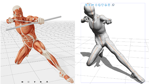
Using 3D model for reference to see how the character will be sitting there.
Finishing foreground sketch and adding details.
Adding more details and trying my best to follow perspective.
Blocking out colors with trying to fix values.
Finishing up the render and flipping the canvas for a better read :)
Outro
This art was a lot of struggle for me xD. I did not expect it to be this hard. Thank you for reading and let me know if you have any questions. I will be doing a youtube video with the timelapse and more commentary :)
Make your own and let me know how it goes!
Here are my links




Comment