
This tutorial is about making your profile pictures and making your brand stand out
And yes If you use social media even just for fun you are a brand, that's because you want people to see what you post
What size icon should I use?
Depends on where you are wanting to post, here is a list of pixel sizes for different platforms.
let's start this off with the dimensions you’ll want for your icon canvas,
For instagram = 320 x 320px
Twitter = 400 x 400px
Facebook = 170 x 170px
Linkedin = 400 x 400px
Pinterest = 165 x 165px
Tumblr = 128 x128px
Tiktok = 20 x 20px
But the dimensions I suggest are the dimensions for YouTubes icon which is 800 x 800px I suggest this because it would allow you to use your icon for any of the other social media accounts as well
Here is a link to where I found this data, and this article also has information for other canvas sizes for all these socials as well
Now with such a small canvas size, you’re going to want to simplify what you use for your icon, for example, if you want to use a character, draw your character in the most simplified way you can, take away as much detail as possible, using basic shapes can be helpful as well, squinting at your piece or shrinking it will also help you in knowing if you executed it properly
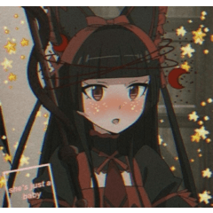
It can also be helpful to scroll through social media and look for the social icons that not only pull your immediate attention but also the ones that are the most immediately recognizable.
Like these for example.
Making your brand
When making your brand you will need to decide the main focus for your brand, will it be you as a person or the products or things you do
If you are simply a professional business owner, and your brand is more centered around the product you sell, whether it be that you sell art, make comics, or sell bathwater your icon should be something related to your product or a logo you’ve made for your company
consider using basic and recognizable shapes
pay close attention to the readability of their silhouettes
For a more personal brand, a photo or caricature of yourself would work best, make sure when using a photo or drawing that the image has fewer colors and is not cluttered, a good way to make it stand out is by having the space behind you be a bold single color and for the image, you chose to have a recognizable silhouette.
Another idea that would work for both types of brands is by making a personalized character with a funny relatable personality, lots of other companies have done this, for example;
Darkiplier
Pillsbury
pringles
And an endless list of others ranging from all different sorts of businesses
Make it meaningful
You should also consider the colors you will use and the meaning of those colors
Red = seems powerful and attention-grabbing but also dangerous
Orange = is comforting and warming but can be overwhelming
Yellow, = bright yellows make you feel good but darker tones can give you a negative feeling
Green = can feel fresh, and eco-friendly but also greedy
Blue = feels trustworthy and intelligent but this color can also feel cold
Purple = is associated with royalty and healing but you should use this color sparingly
Pink = is known for love and sexuality but men will find it emasculating
White = simplicity and cleanliness but use other colors as it can feel empty with too much white
Black = elegance and wealth, too much, will feel dark or bad
Brown = can feel earthy and warm however this color can be very difficult as brown used wrong can make something feel dirty
Metallics = seem glamorous and sophisticated, these colors can be hard for anything not digital so keep that in mind
Choose a color pallet that fits your style yet reaches out to your intended audience.
Simplicity is key
The things to avoid for your icon are words, clutter, and too many colors, for a quick and easily recognizable icon simplicity is key
Some socials will also allow you to use an animated icon, which is some you may want to consider but don't have to. It will take more time but will catch peoples eye.
But best practice is simplicity.
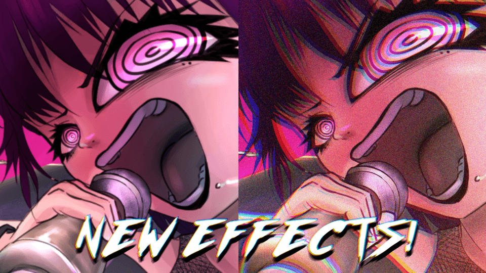
Here is a few examples of what to avoid in your icon.
Thank you for reading this tutorial :)
If you enjoyed it please leave a like. :)
If you want to check out my social I post short clips of my art and tutorials on tiktok that you can check out
Users who liked this post


Comment