All About Eyes - How to Make Unique and Interesting Designs
-Intro-
Hi everyone! I’m back again with a new post! This time, it's all about eyes!
Eyes are always something that is fun to design and draw. They can be used to quickly introduce a character's personality and to convey emotions. In this tutorial I will be showing the basics of how to draw eyes and how to make your own unique designs!
1. Basics
There are many eye shapes, but before we start discussing those, let's review the basics first. In this part, we'll go over the basic structure of the eye and how they change depending on factors such as age or drawing style.
i. Basics - Structure of Eye
Let's start with the structure of the eye.
Let's look at the eyeball from the side. The eyeball is a sphere composed of cornea, pupil, iris, lens, etc.
The black part in the center is the pupil, which is a hole located in the center that lets light in by changing its size.
The iris is the colored part of the eye, and it is covered by the cornea - which is essentially a transparent dome that reflects the color of the iris.
Seeing all those names may look scary, but the most important thing to remember are the following features:
When viewing the eye from the front, the most striking and noticeable feature is the iris, but the other parts such as the pupil and sclera are also distinct features that makes an eye recognizable.
We're not aiming for an ultra-anatomically correct drawing, but those features are the most noticeable when it comes to eyes.
Even then, you are free to stylize it! For example, whether you want to show the caruncle or not is up to you. Similarly, when it comes to the eyelashes, you are free to draw however you want, perhaps you want to draw them realistically and detailed; or perhaps you prefer to group them into one thick line. Whether or not you add these details will help accentuate certain character traits.
ii. Basics - How to Draw Eyes
Eyeballs are essentially a sphere. Visualizing it as such helps a lot in placing the iris and pupil.
Since it is a sphere, it is not a flat structure. It is volumetric and has planes. The flesh around the eyeball wraps around it. Imagine it as a ball with some of its outer layer cut off, the yellow part is the skin and the sphere inside peeking out represents the eyeball.
Because it is predominantly a sphere, when you render it, just imagine how you would render a ball.
Let's try drawing an eye. First, decide which angle you want to draw it from! Drawing eyes from different angles may seem tricky at first, but it is actually very simple.
Let's start with a sphere and draw some guidelines in the center to indicate which angle you want to draw it from.
With those guidelines, you can now place your pupil and draw the rest of the eyes as well.
Now that you have those, you have a base that you can refer to when you want to draw eyes from different angles!
Now what if you want to draw it using a different style? You can simply just lower the opacity of it and use it as a reference on where to place the features.
For example, I've been using a mixture of semi-realistic and anime style so far. But what if I want to turn it into an anime style?
First, lower the opacity.
Then, on another layer, use the drawing underneath as a guide on where to put the eyelashes and eyelid.
Now you can turn off the guide layer.
And you're done! You've successfully turned it into a different style!
You can also use this method for other styles as well, whether it's for a more realistic style or a cartoon one, etc.
Tip - Coloring and Pupil
When drawing something, there is no one correct way of doing it, but something I notice is that sometimes, people draw the pupil like this:
While the eye might look like that from certain angles, I find that the position of the pupil may be hard to place when you draw it on the center of the eyeball where the cornea should be.
The structure of the iris and pupil is actually slightly flat that is covered by the curved cornea. When drawing the cornea, iris, and pupil in layers, it creates a depth in the eye that makes the eyes shine.
For coloring, I prefer to color the top part of the iris dark due to being covered by the eyelashes.
However, instead of making it completely black, I add a slightly tinted reflection to show how the light is being reflected from the surface of the cornea.
I make the lower part of the iris brighter to indicate that the light passes through the cornea and hits the lower part of the iris and brightens it, and this adds a depth to the pupil - which is slightly tinted from the way the iris shines.
iii. Basics - Age
Another thing to note about eyes is how aging changes their appearance.
As people grow older, the eyes start to appear smaller because the body develops. A reason for eyes looking smaller with age is because eyelids loose their fat layer under the skin and makes the skin sag.
This change doesn't only happen to the eyelids, but also to the skin around it as well. This is because the skin becomes less elastic and causes them to hang loosely. And as the fat in the deeper layers of the skin diminishes, the skin starts to have more pronounced lines and crevices.
Knowing this and applying this information to a character design can affect how they are seen. Characters with larger, childlike eyes can appear more innocent and friendly while characters with older eyes seems calmer and more mature.
iv. Basics - Different Styles
Something to consider before you start drawing is what style do you want to draw in? This may determine things like how detailed your drawings need to be, or the kinds of colors you choose.
For example:
Realistic style relies a lot on drawing the little details. Things like the strands of hair in the eyebrows or the eyelashes, or the folds, or details such as the caruncle/tear duct.
Compare the realistic piece to the anime or the chibi piece. With the anime and chibi pieces, there are so many details that are simplified or left out. Eyelashes are combined together to make one line, the caruncle isn't included in the drawing. Not only that, the colors are more vibrant and the highlights on the eyes are much more exaggerated than the realistic piece.
It all depends on what style you want to go for and what you're trying to portray with your drawing.
Perhaps you want to draw a detailed portrait, then maybe the realistic and semi realistic style is the one you're looking for.
Or maybe you want to convey an emotion, then perhaps using an anime style is more suitable as you can exaggerate more.
Or maybe you want to draw something cute for a decoration, then you can use a chibi style.
There is no 'better' style, it all depends on your tastes and needs.
2. Types of Eyes
There are many ways eye shapes can differ from one another. One of this factors is the race of the person.
Ethnicity of the character will influence the eye shape.
For example, when comparing eye shapes of Westerners (for example: Europeans) against Asians (for example: Chinese), there are some differences in the skeletal structure around the eye area.
Westerner's skeletal structure tend to be more pronounced than Asian's. Not only that, the brow ridge also protrudes more.
When rendering, it might be a good idea to apply darker shadows on certain planes when drawing Westerners and softer contours when drawing Asians.
i. Types of Eyes - Shape
Other than ethnicity, the shape of the eyes also differs, and they can influence a person's first impression on a character.
I'll provide a step-by-step on 5 different eye shapes which I think are most common: Almond, Upturned, Downturned, Rounded, and Hooded.
a. Almond
Almond eyes are an oval shape that is pointed in the corners. There is also usually a visible crease on the eyelid that is visible.
b. Upturned
Upturned eyes may also be known as 'cat eyes'. They are similar like almond shaped eyes, but the outer corner is tilted upwards.
c. Downturned
With downturned eyes, the corners point downwards and the bottom lid have a more rounded shape.
d. Rounded
Round eyes are larger and rounder than almond eyes, and because of this, the sclera is more visible.
e. Hooded
With hooded eyes, there is a crease that makes the eyelids less visible.
ii. Personality
Of course, they don't dictate what a character's personality is like, but they can have an effect on what people think when they see the character for the first time.
For example, let's compare a set of round eyes with upturned ones.
Because it is rounder, the round eyes look softer than the upturned one that has a sharpness to it. The upturned eyes look fiercer, and the sharp corner gives it a sense of danger that is missing in the round ones. This makes the round one look more approachable and kinder.
To see how an eye shape can change first impressions, let's change to an anime style. The benefit of using an anime style is that you can exaggerate the features of a character without it looking out of place or weird.
Here I have a character to use as a base. I will be keeping everything the same and focus on the eye shapes.
Let's give him a pair of round eyes.
After giving him a pair of round eyes, the character looks friendly and soft. This is because the base of the eye shape is a circle, and a circle is generally associated with cute and soft things. This makes him look younger and innocent.
Next, let's try giving him a pair of upturned eyes.
This pair of eyes makes him look sharp and cool. Unlike the round eyes, this one gives a more mature feeling and almost dangerous feeling.
What about a pair of downturned ones?
With a pair of downturned eyes, the character looks softer and kinder, yet they don't seem as childish as the same character with round eyes. Because of the eyes, the character gives off a calm - almost lazy or sleepy - feeling to him that is missing from the other two.
Finally, let's exaggerate the eyes and make it sharper eyes, almost looking like the character is squinting.
This pair gives the feeling of playfulness but also a sense of mystery. Even more so than the upturned eyes, the character looks more dangerous despite the corners being more rounded.
This is because of the lack of visibility of the eyes. People have a tendency to look at other's eyes, and having it be partially hidden like this gives a sense of distrust. Of course, this can also convey a different set of feelings, such as playfulness or smugness.
iii. Personality vs Emotions
One thing to note is that emotions are not the same as personality.
You can borrow aspects of an emotion to get a character's personality to shine through. For example, giving furrowed eyebrows to a character can make them look determined or angry or serious.
Like the previous section, let's start with a base and see how personality and emotions differ.
Let's start by giving him a sad expression.
Let's note down some characteristics of the emotion.
For example, the eyebrows are lowered and pulled close together. They tilt downwards. Next, there are more highlights in the eyes, this makes the eyes look wetter as they are crying. Finally, there are wrinkles around the eyes and mouth that are used to indicate the face being scrunched up as if the character is trying to hold back his tears and failing.
Now let's take some of those characteristics and apply it to the character to make him look sad. I decided to only give him the low eyebrows that tilt downwards.
This makes the character look sad, however it doesn't mean that the character is expressing the emotion of sadness. Instead, he looks like a character who worries too much or is indecisive and weak.
Let's look at another emotion, anger.
The eyebrows are also lowered and pulled close together but unlike the sad expression, they are tilting upwards. A similarity with the sad expression is the wrinkles around the eyes that indicate the face being scrunched up, as if he is squinting.
Now once again, let's take some characteristics and apply them to the character. Just like before, I decided to only give him the eyebrows, but this time tilting upwards.
By borrowing some features from certain emotions, you can express a character's personality. For example, the character now looks impatient and serious. He isn't expressing anger, but there is a sense that the character is not a calm person.
Now let's add some expressions to those faces. First off, I'm taking the sad look and giving it an angry expression.
By combining the two, it adds to the character and tells a story about the character. The mixture of the sad look with the angry expression makes him look conflicted. As if he can't decide between two decisions. Or it could look like he's holding back his emotions.
Next let's try the opposite and give an angry looking character a sad expression.
The furrowed eyebrows and the tears make him look frustrated. As if he is angry and sad over a decision he doesn't agree with. Or it could look like he's trying hard to hold back his tears.
These little combinations are what makes a character distinctive and adds a layer of storytelling to their face.
There are other combinations to choose from and the possibilities are endless. For example, to make a character look creepy, you can give them an extreme expression but give them a blank pair of eyes that are devoid of emotions.
The contrast between the emotions and the calm eyes makes the character look unsettling, and that itself can be used to show a character's personality.
3. Stylizing Your Eyes
And for the last part of this tutorial, stylizing your eye designs!
There are many ways to stylize eyes and make them unique. Here are some methods that can be useful to think about when you design your own!
i. Colors
Let's start with the most simple method. Colors.
Let's color in the sclera first. For the sclera, I prefer to not use the color white. Instead, I tend to use a similar color as the skin, but desaturate it a bit. This is because I prefer to have it in a color that doesn't stray too far from the surrounding skin tones as I find the contrast between the white and the skin to be jarring.
Next, let's continue with the iris.
Since the iris is the colored portion of the eyes, there are ways to make a character look more memorable.
The simplest way is to choose a distinctive eye color. For example: for this character, blue eyes may look more interesting than brown because the character's hair is already brown.
Another way to make the eyes look more interesting is by choosing different hues.
Take a look at this pair of eyes. The eyes here are still in the same hue range.
Now let's exchange one of the colors with a yellow color.
Just changing one shade to a different hue makes them look interesting.
What if we were to change the reflection of the iris as well?
By combining different hues together, you can make a unique eye design without even needing to add extra details. For example, pairing complementary colors together like adding red to green; or using a combination of 3 colors together can make a striking design!
ii. Coloring Style
Another thing that can add to a design is the coloring style.
For example, let's color the same pair of eyes using a cell shading style.
And now let's color them with a soft shade style.
When you compare the end result, there is a difference between the two. The cell shaded one looks flatter and simpler. Meanwhile, the soft shaded one has more depth to it. There is no correct version, it all depends on which you like better.
Another thing you can do is add texture. These are some examples of how texture can add to an eye design.
For the first one, I used an image material from the following asset and set the layer to Overlay mode:
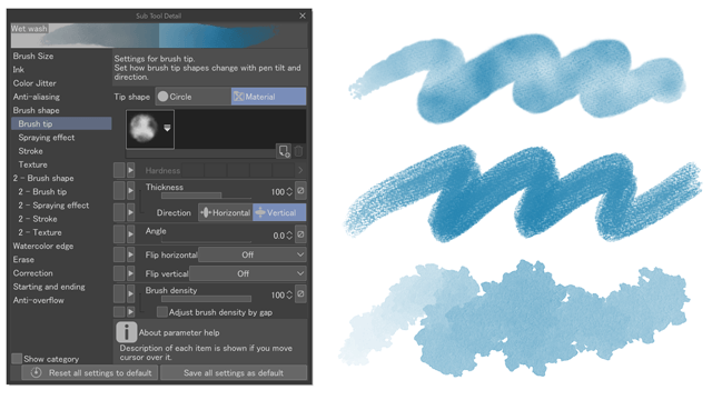
For the second one, I used this brush and set the layer to Multiply mode:
And for the last one, I used this brush and also set the layer into Overlay mode:
Using textures can give the eye more detail that might be hard to do with a regular brush, and it may add some depth depending on the color combinations and the layer modes. Adding textures may be able to make your eye designs look like jewels, or maybe it will allow it to have a myriad of colors.
iii. Unique Designs
The last method I'm going to discuss is changing certain aspects of the eye to make them more unique.
When it comes to anime, you don't need to keep things realistic. In fact, by exaggerating and changing some parts, you can create some really unique eyes. Here are some ways to do it:
1. Changing the size of the iris
Since you aren't bound to the rules of realism, you can change the size of the iris. For example, larger iris can make the characters look cuter, while smaller ones can make the characters look creepy or wild.
2. Changing the eyelashes length
The length of the eyelashes can make the character more interesting. For example, a character can have very thin eyelashes, or they can have long eyelashes, or even only long lower lashes.
Characters that have longer eyelashes can be considered effeminate or even elegant.
3. Changing colors
By changing colors of things like the pupil or the sclera, you can have a visually striking contrast!
4. Pupil design
This is one of the most common ways to make a design unique. You can do something simple like change the pupil into designs like a diamond or a heart, or you can make your own designs!
5. Eyelids design
Even something as simple as this can make the character look different. For example, you can make the characters look like they either have a monolids or double eyelids
6. Eyebrows
Eyebrows are an easy way to change up your character design. You can make a character have no eyebrows, or you can make them have small ones, or really thick eyebrows.
7. Markings
Another way to make interesting designs is to add some markings around the eyes. Perhaps the character has eyebags, or a scar, or maybe even some facepaint. There's no limit to what you can do!
8. Adding non-human characteristics
The final change I'm going to share is about how you can make a character look different by giving it characteristics of non-human things, such as animals.
By using a non-human trait, you can make a character look interesting or weird. Using bases like a wolf or a cat can make the character look scarier, or you can use something like a rabbit as a base to make them look cute and non-threatening.
For the example below, I'm using a snake as a base. (The brush I am using is the default airbrush 'Running Color Spray')
Giving the character a set of eyes that looks like a snake adds a hint of the character being threatening and inhuman, almost like a beast waiting to strike. Of course, feel free to experiment with all sorts of animals!
Extra - How to Tell a Story Through the Eyes
Here's an extra tip, you can add little things to your character's eyes that can be used to tell a story.
Maybe the character you're trying to portray is feeling emotional. Instead of drawing them with tears, you can draw them with glassy eyes. As if they're so emotional that they're starting to tear up, but they're trying to hold the tears back.
Or you can play around with the light source. Instead of having a normal circular highlight, why not make it rectangle? As if the character is looking at a computer screen and the light of the screen is reflected in the cornea.
Or maybe, you can show the reflection of an event. For example, a character may be witnessing a fire and be surprised. You can add the image of the fire in the character's eyes, and change the highlights into a bright orange to show that the main light source is a fire.
-Conclusion-
Thank you for reading until the end! I hope I explained everything well! There are other ways to design eyes, so feel free to experiment and find your own ways to make unique and interesting designs!


Comment