
Presentation
Hello!!!, welcome to this new TIPS, on this occasion I will present to you the most important concepts that make the creation of flat illustrations possible, because, although it may seem easy, like everything in life, it has its level of learning. Today we will unravel its secrets. Without more to say…
Let's get started!!
1. Choose colors
To start with any type of illustration, whether from the flat style to realism, you have to know certain composition concepts that will make an illustration striking, focusing the viewer's attention, directing their gaze to emotional sensations.
• OTHER TIPS ABOUT COLOR
Some time ago I made a TIP entry where I explain color theory; This knowledge is useful for any style of drawing. Address technical data that I will not explain here, such as where the colors and their models come from; so if you want to know more, I invite you to take a look. Additionally, in that entry I explain the tools that CLIP STUDIO PAINT has to create color palettes, I leave the link below:
Recently, I made a TIPS where I show different tools and methods to add colors using CLIP STUDIO PAINT, it is quite extensive and above all it is useful for any style, I leave the entry below:
► Color psychology
Color psychology teaches us how colors affect human behavior. Colors have a great influence on us, on our mood and mental state. With them we can stimulate or create joy, sadness, etc. Some colors produce calm or compassion, which are usually found in cold colors like blue; But, on the other hand, there are others that induce anger or feelings of discomfort; we find these in warm ones.
Knowing the psychology of color, the places and emotions with which people relate colors, we can generate meaningful illustrations, full of messages; telling stories without the need for words. Now, let's look at its characteristics.
• CLASSIFICATION OF COLORS
Colors can be classified as cold and warm, depending on what they transmit to us. They can be easily identified because they are visually associated with a low or high temperature; They allow us to subtly express emotional or atmospheric ideas.
1. WARM COLORS
These colors range from red to yellow. They transmit to the viewer the sensations of high temperatures, enthusiasm, passion, joy, love, energy, warmth, etc. Also, they can represent a time of year such as spring, autumn, a desert, etc.
2. COLD COLORS
Cool colors go on the color wheel, from purple to green. It is the color blue that is most related to cold tones, which, if present in other tones, helps them be perceived as colder. The bluer a color is, the colder it will be. Cold colors are related to low temperatures, they are the tones of winter, of the night, of the seas, lakes, tranquility, calm, solitude, serenity, sadness, the night, and winter, etc.
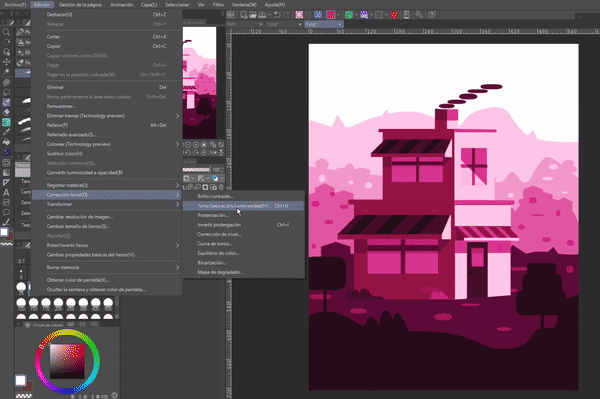
- SATURATION
Saturation is the degree of purity of a color, it defines its intensity. It is determined by the amount of gray it contains, the more gray the lower its saturation and the less gray the more saturated it will be. But what relationship does saturation have with color psychology? Well, it turns out that poorly saturated illustrations convey sadness, melancholy, decay, and emotions of desolation; while the saturated living and vibrant emotions of enthusiasm, hope, joy, etc.
A tool that allows you to modulate the saturation of our illustrations is: “Tone/Saturation/Lightness”. This tool can be found by accessing the following path: Tonal correction > Tone/Saturation/Lightness.
► Methods for choosing colors
Instinctively, we are attracted to compositions of similar or contrasting colors. Color harmonies allow you to choose colors, it is a color theory technique to combine them. The four best-known color harmonies are explained below, also knowing that we can choose colors following emotional logic (conveying feelings of joy, sadness, anger, love, etc.) or place (an eternal futuristic, a sunset, a dusk, an aquatic atmosphere, etc.) as we saw in the psychology of color; Now with harmonies we will have the weapons to create the perfect color structure telling complex stories or simply harmonize an illustration with colors that complement each other.
1. COMPLEMENTARY
Complementary colors are those that are opposite on the color wheel, this combination causes a contrast. This harmony can be used to contrast the figure in the background, also, to contrast opposing ideas.
2. ANALOGUES
Analogous harmony is formed by the implementation of colors that are close on the color wheel. Due to their proximity, they combine well with each other. Like blue, purple and pink that are sequentially close to each other. For example, landscapes in nature usually have this characteristic, they are made up of sequential colors.
3. TRIAD
To create a harmonic triad, three equidistant colors are used. As you can see in the illustration below, the color yellow, red and blue are three colors apart from each other.
A while ago I made a tutorial on how to make this futuristic city using only flat figures and the perspective ruler; I leave the entry below:
4. MONOCHROMATIC
To create palettes with this harmony, all colors are derived from a single color from which the various variations of lightness and saturation are used. You can also add different neutral grays.
2. Flat designs
Flat design is characterized by the use of flat and bright colors, geometric shapes, large typographic sizes with simple messages that provide clear understanding. It is striking for its simplicity and attractive messages, in addition to not having a lineart like other illustrations, instead, contrast is used to differentiate the outline of one figure from another. In simple terms, the flat style uses graphic elements, the use of geometric shapes with bright colors. The concepts that we will see below will help us create flat illustrations.
► Abstraction
For the flat design we will take into account abstraction using geometric shapes. Abstraction is simple, we just have to lower the level of complexity of the object we want to recreate, convert it to its simple geometric shapes; In these cases, the primary geometric shapes are used: triangle, square and circle.
Let's look at an example: A bear can be simplified to a series of circles and triangles; We can also alter the structure of the figures to give more dynamism to a character. Deforming figures is useful for creating curved objects.
Essentially this is abstraction, which we use for any kind of illustration, but in flat design it is essential. The best way to improve abstraction is to take an object or person and try to recreate it using only geometric figures and some deformations of them.
► Build characters using geometric figures
Knowing the language of shapes we can create characters that tell us stories with their design, for example, if we want an affectionate character we will use circles, but if we also want it to be agile we will add triangles to its structure. Next, let's look at a method using geometric shapes that will allow you to design an infinite variety of characters.
• STEP 1: SHADOWS
To start with the design we will place the basic geometric figures in such a way that they form the silhouette of the character. For this we will vary the sizes.
This exercise is also good for developing creativity; It motivates us to believe so many variations that seem impossible to finish.
- STEP 2: SKETCH
When we have our character in shadows, what we will do is lower the opacity of the layer so that in a new layer above it we can draw a sketch with more specific characteristics of the character such as the hair, the shape of the eyes. or even clothing following the structure of the shadow, but without being so strict; Going out and giving curved shapes to the finishes is better.

- STEP 3: COLOR
In this step we will abandon the shadow layer and focus on creating a layer below the sketch where we will dedicate ourselves to placing the flat shapes with color. In the next section we will see the tools that Clip Studio Paint has to facilitate the creation of flat characters and environments.
For the shadows we will use contrast. Color contrast is the difference between two or more colors. This means that we will take a color, with different saturation/luminosity or tone we can create a contrast between the shadow and the base of the color. For the girl below I used her base skin color, but lowered the lightness so that it acted as a shadow.
3. Flat designs using Clip Studio Paint
There are tools within the program that will allow you to create a wide variety of flat works without the need to use brushes, in a practical and, above all, fast way.
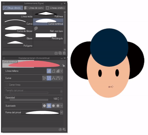
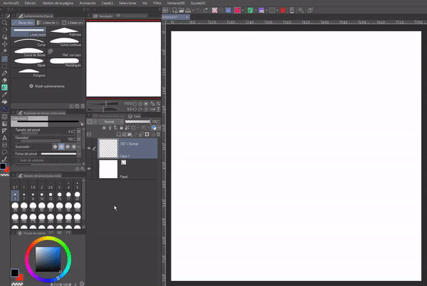
► Figures
Making a perfect circle, triangle, rectangle or any other figure by hand would be very complicated, but this difficulty is why this function exists. With this tool we can create any figure.
It is located in the “Tools” bar, its default shortcut is the key (U).
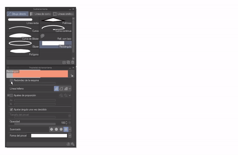
All figure subtools have properties that add more practicality. Below I will explain some of these sub-tools; I will omit straight and curved lines for their intuitive use.
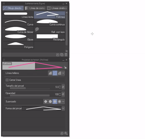
- POLYLINE
The polyline allows you to create continuous lines and if we check either of the two filling options, the internal structure of the figure will be filled with a solid color with straight edges. The line/fill functions have three options, the first creates structures filled with a chosen solid color, the second only continuous lines and finally the last also fills the shape, but with two colors, the line of the secondary color and the fill of the color major.
The size of the brush, the opacity, the softness are self-explanatory.
- CONTINUOUS CURVE AND BÉZIER CURVE
These two are similar, they share functions between them, in addition, other functions are the same as the previous one, the only thing that differs from the previous tool is the curve options, the four “Curve” options are divided into: Straight line, Spline, Quadratic Bézier and Cubic Bézier.
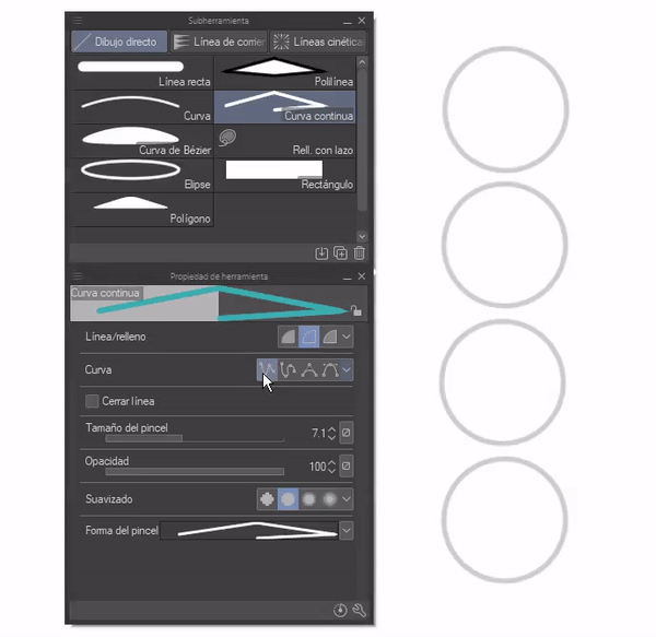
I use this tool to make shadow details or fill in spaces where basic geometric figures do not cover due to their structural limitations.
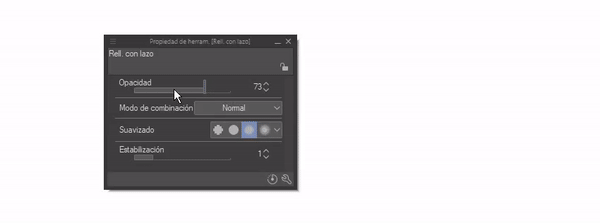
- FILLED WITH BOW
Of all the figure subtools, this is the most versatile because it allows us to draw freely and when we close the line the interior is automatically filled. One of the properties is the stabilizer, which will allow us to have more precision.
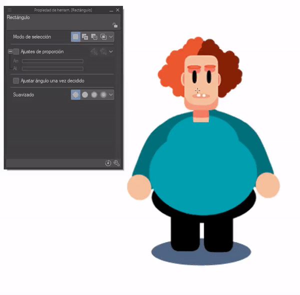
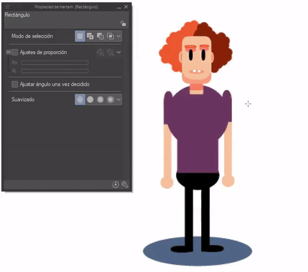
- ELIPSE/RECTANGLE
With this tool you will create, as its name says, ellipses or circles. To form a perfect circle we will use the SHIFT key while determining the size of the circle. On the other hand, if we want to modify it manually we can do so with the “Proportion adjustment” option.
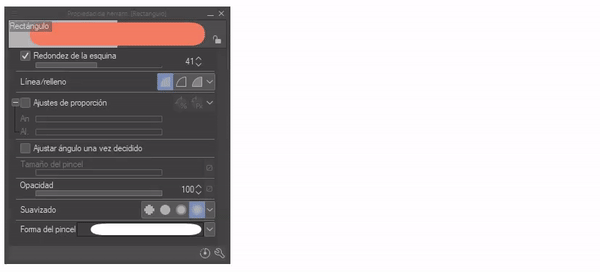
The options are the same for the rectangle, except that an option is added that allows the corners to be rounded.
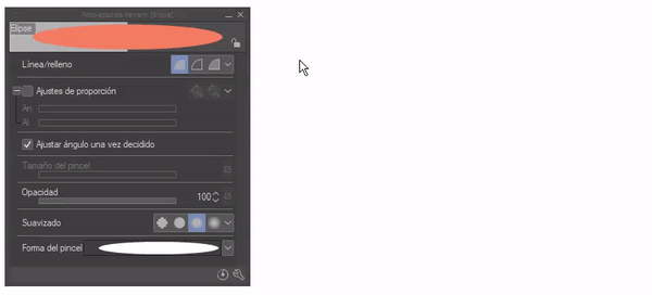
“Adjust angle once decided” allows us to change the angle of the circle, this change is more noticeable when the proportions are not perfect.
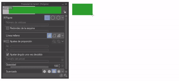
- POLYGON
Polygon allows you to create figures with different numbers of vertices, as first we have the square and circle by default, but polygon is the option that allows us to change the number of vertices to form triangles, pentagons, etc. Another important function is “Corner roundness”, as its name indicates, it rounds the corners.
WHAT CAN WE DO WITH THE FIGURE TOOL?
With these figures and the correct color combination we can recreate any structure, character, landscapes such as those exemplified in the color or object section in a simplified way, in a flat style. What we need that we can only have and develop ourselves is our creativity; You have to practice to improve the combination and transformation of basic shapes.
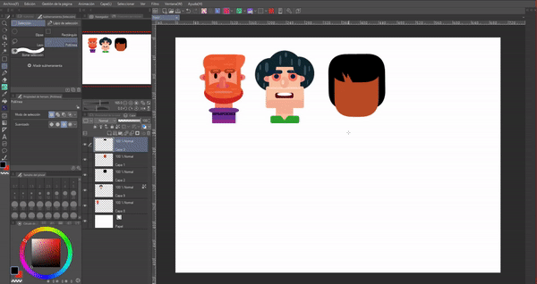
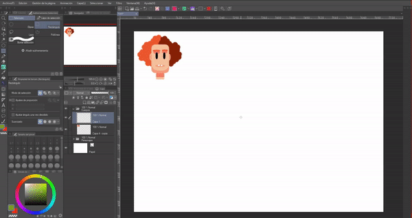
The first is a GIF where it is more widely observed how a face is constructed; while in the second I cover all the faces to show that the process is repeated for each character.
We can also create all kinds of bodies. The three examples below are made from pure circles and rectangles with rounded edges, but remember that this is not limited to the circle, with the other figures we can generate an endless number of body structures.
► Layers
• FIT TO BOTTOM LAYER
We find this function in the layer options, it is the immediate icon on the far left. Extremely useful because it provides a non-destructive method for applying colors, so you can modify specific parts without damaging the rest, but of course, for this you have to have everything separated by layers.
Its function is to create a false cutout, that is, what is drawn on it will only be visible with respect to the limits of what is drawn on the layer to which it refers (the lower layer). If you remove the clipping, everything made will become visible, you can also apply multiple clipping layers with respect to the same layer.

- BLOCK TRANSPARENT PIXELS
We find this function in the layer options, it is the square icon with a small lock.
It is similar to the previous one with the difference that this is a destructive method. With this function, new layers are not created, but when activated on that same layer you can only draw on the pixels that have color, the transparent ones are completely ignored.

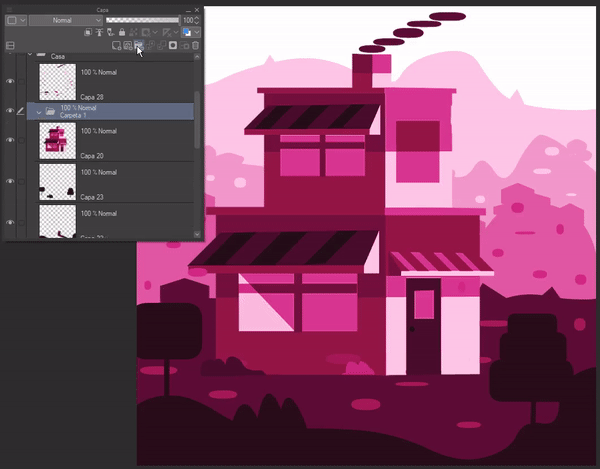
- LAYERS FOLDER
This function will help us to have order between the layers, something that flat has is that it generates many layers by having to create one per object to modify, in the end there are too many and it becomes difficult to find what we want, but if we put some in one folder (by clicking and holding and dragging it towards the folder) we will maintain an order.
Example: Put all the layers of the house in one folder and the landscape in another.
► Transform
Transform reduces/increases the size of the selection or changes its location. To use this function, you must first select the part to modify, then press the “Ctrl plus T” keys or access the following path: Edit > Transform > Scale/Rotate.
If we access the tool properties window we can find various options that allow us to change the mode, change the center of rotation, preserve the original image, the scale, rotation angle, adjust the position and the interpolation method.
The free transformation, on the other hand, allows you to change the perspective of the object in order to couple it with the general perspective, it is accessed by pressing the keys “Ctrl plus T”, later we will right click within the bounding box of the transformation, In this way, a menu will appear where we will find the option “Free transformation”, another way is by accessing the following path: Edit > Transform > Free transformation, or, in the properties of the transform tool, change the mode to “ Free transformation".
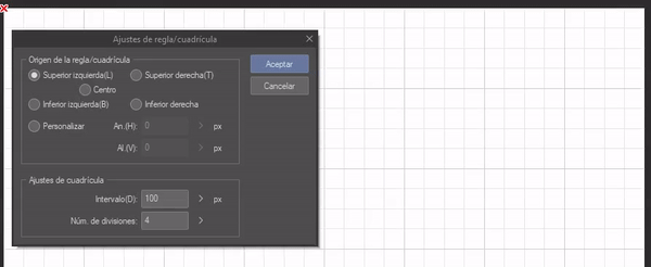
► Grid
The grid is a tool that will allow us to draw geometric figures more precisely, with it we will have a better idea of the proportions. Grid is located at: View > Grid.
To edit the grid characteristics we will have to access the following path: View > Ruler/Grid Settings. In this window you change the size of the squares and the origin of the ruler/grid.
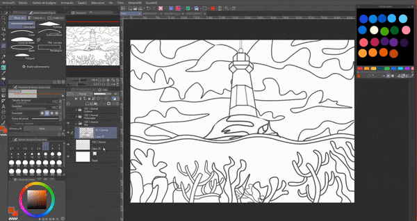
► Illustration: Lighthouse
With the knowledge explained above we can create flat illustrations that look more complex. In the case of this illustration, I started by making a sketch of the idea I had of a lighthouse, to do this I looked for references that inspired me. Then, using the continuous curve and the grid I made the final lineart.
Using the palette tool “Mix colors” that we can find in the following path: Window > Mix colors, in it place the colors that you would use in the illustration. With it, colors can be mixed to generate new ones completely manually, just as it would be done in traditional analogue media.
NOTE: At the beginning I left the entry to the TIP "How to create color palettes" where I address this palette and "Color slider" that I will use later.
As a next step, create several layers below the lineart where with the help of the continuous curve, polyline, rectangle, circle and lasso fill subtools add the shapes with the colors following the lineart with them; while the opacity of the lineart layer is lowered.
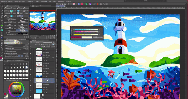
After having the shapes defined with the color, use one of the two functions “Fit to bottom layer” or “Lock pixel” to add the shadows; I also formed the shadows with geometric figures, mainly circles, ellipses and rectangles following the shape of the object.
In the GIF you can see the process and all the tools used, which are: Figure, transform, grid and the G brush.
The final result is the following.
► Textures
As a last point to address, we will talk about textures. In order to give a better finish to our illustration we can add textures to it once finished; Doing so is very simple. To do this we will need a textured brush, we can get these by downloading them from CLIP STUDIO ASSETS. In this type of illustrations, grainy brushes are normally used like the ones I leave below:
As a second step, we create a layer above where we will paint, either with a lighter or darker color than the object we want to add the texture to. A tool that will help us choose colors more easily is: “Color slider”. We can access this function through the following path: Window > Color slider.
From this tool you can extract the luminosity and saturation of a color that has been selected from the color wheel. The first color icon corresponds to the primary color, the second to the secondary color and the third is transparency (if used it acts as an eraser). To use it we will choose a color, then we will move the sliders to obtain the different saturations and luminosities of it. Now all that's left is to paint.
If we take the time to do each thing in the illustration on separate layers, it will be easier to add the textures, since we can create a layer above and adjust it to the layer below or block pixels, this will allow us not to go outside the limits of the object, avoiding staining the rest and then correct it. The GIF shows the texturing process.
As a final result we have this illustration, you can add as many more details as you want, but that depends on each person's tastes.
NOTE: We can also use any type of brush to give texture. We don't have to simply use filled figures to add color to an illustration like me with the lighthouse. The illustration below is a desert night landscape created solely with the tempera brush.
Farewell
I hope that what you see in this tutorial is to your liking and that it is helpful to you. Well, without anything to say, thank you for coming this far! ପ(๑•̀ुᴗ•̀ु) ॣ৳৸ᵃᵑᵏ Ꮍ৹੫ᵎ ॣ
Vibrate high!!! We won't see you another time ( •⌄• ू ) ✧
Users who liked this post


Comment