
INTRODUCTION :
Hey guys in this tutorial I'm gonna talk about flat illustrations and some important things you need to know while drawing one. Many people assume flat illustration is rather easy especially compared to 3d art but flat illustration needs to a strong color palette, your characters need to stand out while everything is flat, and your character design and silhouette need to be strong.
Even skipping one of these important steps can affect your path great perfect illustration. So lets talk about some important factors that you need to know while drawing flat illustration.
Know your character / character design :
When doing an illustration for a storybook we’re obviously going to have a character to illustrate that can be a human, animal, or some kind of creature but the toughest part is to actually design that character and give it some unique appearance to make it easily recognizable.
Since this is a flat illustration a lot of emphasis goes to the shape language of the character. Each shape has its own subconscious meaning and has a certain impact on how we perceive them. When a character is introduced even before knowing the personality of the character we subconsciously assign certain traits only by looking at a combination of shapes. Any character can be broken down into simple shapes.
So let’s look at some of the universally used shapes and how it impacts a character. So you can have an idea of how to build your character.
CIRCLE: Circles/ovals are organic and neutral shapes. Most of the main protagonists are built around the shape circle because the shape ovals are recognized as friendly, safe, innocent, and outgoing. They evoke a warm and welcoming feeling.
When I say using shape language in your character it doesn't necessarily just have to be used as character body shape or face shape. You can experiment by putting the shapes in different parts like the hair, or big doe circle eyes to further push the friendly and innocent trait of a character or even the accessories.
SQUARE: Squares are often perceived as strong, stable, and trusting. Commonly used on superheroes or physically strong characters like warriors. These shaped characters often come out as confident and dependable so If your character traits are similar to that try using the square shapes to build your character.
TRIANGLE: Triangle, the shape of evil. Designers often use the shape triangle for their villains. As triangles represent dangerous, sinister, and dominant characters. Amplifying the size or length of the shape can intensify fear and how dangerous the character is.
You can insert this triangle shape anywhere in your character be it a witch’s hat or the horns of a monster.
[note: Remember that looks can be deceiving too. Take it to your advantage if you’re creating a misunderstood character who is opposite to what they look like. For example, A triangle-based character is just a misunderstood villain who is actually harmless.
Or to create a surprise character like a circled-based innocent and harmless-looking grandpa who is secretly badass strong and flexible. ]
[note: We can also create characters by mixing different shapes too to get a combination of certain traits. For example, A square based character who look big and with a circular face that adds friendliness
[Note: remember that these shape language that we just saw can be applied on animals and creatures too ]
THUMBNAILING:
This is the step where we plan out our whole illustrations layer out and decide on the placement of the characters. Thumbnailing is basically sketching out the different ideas you have for your illustration.
Write down the character that you will include in the illustration, the background setting, and any props you want to include.
Now sketch out all the different ideas you have. Try different compositions, the close-up shot, and the wider full-picture compositions. While drawing the backgrounds I usually try out the opposite effect method and the center of interest method.
The opposite effect is the contrasting color which is achieved when opposite-colored elements are arranged together. for example, this thumbnail has a light background setting and a dark character, which gives us a solid silhouette and the whole flat design more interesting to look at.
The center of interest is basically when we draw our character in the middle and create the background around it. This is a pretty straightforward method because When we Scan an image our attention is naturally drawn toward the center object.
Once we’re done, eliminate the ones that you don't like and choose the one that has a proper composition and clear silhouettes for a flat illustration
SILHOUETTE/POSTURE:
Now that we have decided on what exactly we’re drawing let's talk more about posing your character with a good silhouette. remember that flat illustration is minimalist so it's really important to have a clear silhouette of your character to make it recognizable and create a better pose . Assuming that you did a good job with building your character design with excellent shape language it might already have a favorable silhouette but you can make it or break it while posing,
For example, look at this character‘s silhouette. You cant see the pose properly or figure out the action of the character same goes here the cape is hiding most of his body.
Now look at this, automatically you can recognize the action of the character and here just by moving the cape of the character the silhouette is more interesting
This is why silhouettes are important, especially in flat designs.
One can be a good silhouette when you can read the action and understand the emotion of the character just by looking at its silhouette.
EXPRESSION:
Expression in the flat illustration is rather easy compared to 3d illustrations where we have to do a lot of details. Remember how we talked about shape language and how it can be used to create facial features too? Well, when drawing expressions we just have to exaggerate or understate that shape. Try to look at the individual as a shape and it will be much easier to draw.
PROPS:
Flat illustrations are known for being quite stylized not just your character but also the background elements. This is to make your illustration more interesting to look at. For example, look at this tree, it looks good but now look at thisz. We can automatically see this as being better looking because of its unique shape.
COLOR/TEXTURE:
Choosing a color scheme for your illustration is gonna depend on what kind of mood you want to portray your illustration. If you’re drawing something warm and happy mood choose colors like yellow, orange, and pink.
If you’re going for a sad or calming setting use colors like blue, purple, or even dull muted colors. Blue is often said to be a color of grief too.
A combination of warm and cool tones will create a more neutralized happy and calm feeling.
But if you’re looking for expressing certain emotions like anger or danger you can portray some red color in the illustration.
If you’re really bad with colors cant pick colors that go well together. Here’s what you can do start with picking 2 - 3 colors that you definitely want in your illustration. I have chosen red, mustard, and purple.
Then from the color wheel select the colors opposite to the 3 colors you have chosen. Basically the contrast colors.
Now create a new layer and clip it to the layer where we have our colors. Convert the layers mode to color. Now If you're going for a cool-toned illustration apply blue color to the layer and lower its opacity to 30 -40%.
But If you're going for warm toned illustration apply an orange color to the layer and do the same lower the opacity.
Now you have a unified color palette.
Let's move on to applying the colors, for the flat illustration I love to use these two brushes. They have this texture that makes whatever you're color interesting. When you draw with these pens you might not get a smooth outline and that's the beauty of these brushes they create these imperfect textures.
For the illustration I'm creating I have decided to use cool tones for that relaxed feeling. I have two characters a little girl and her dog in the center of the picture. I use the texture pen to create almost everything from the mushrooms to the mountains. I try to add some kinda shade If I feel like the color in an element looks dull or plain. Once I'm done with the base colors I create a layer above and convert its layer to multiply and draw some shadows in blue color.
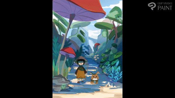
Final result:
Users who liked this post


Comment