Memorable Avatars! Practical Tips and Tricks
Video version:
Text version:
Hello!
I’m .avi. I work as a professional game illustrator and creating comics and webtoons is my hobby.
In this quick tutorial I’d like to share tips on creating memorable avatars. It’s intended for both people designing their own avatar and illustrators creating a set of avatars, icons or symbols for games.
People (me included :D ) usually just crop out a part of their illustration to use as avatars, and sometimes it works out, sometimes not.
Often you see pretty pictures but they’re so complicated that a viewer’s eye has a hard time identifying what’s in the picture and just moves on without bothering to remember.
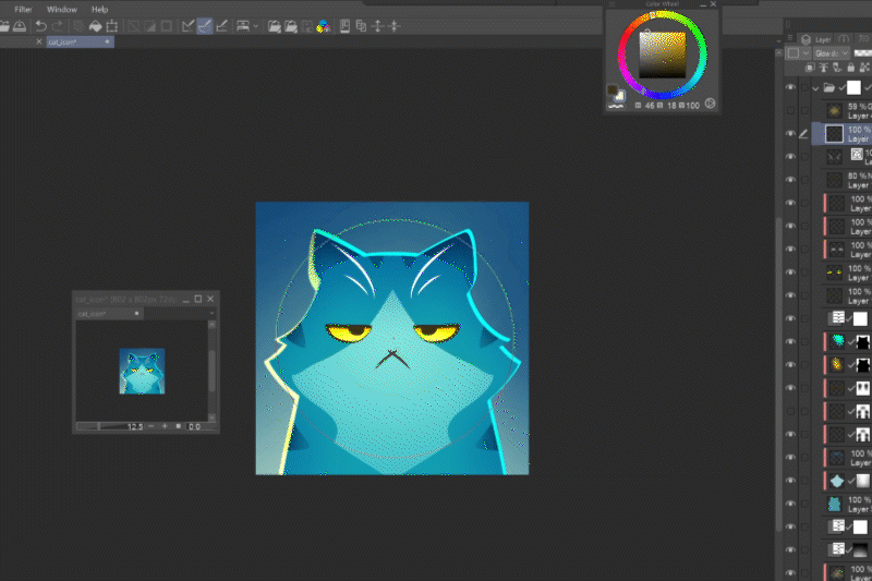
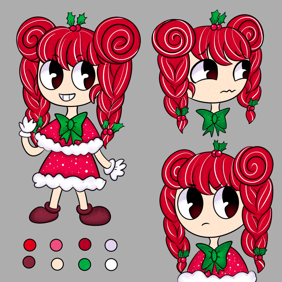
But, if a viewer sees a list of new posts and immediately thinks “Oh, it’s the bored cat guy!” or “Yay, the red flower girl updated!”, then you know that your avatar is well-made!
Remember that an avatar’s main purpose is to be easily recognizable among other avatars. You can achieve that by keeping the following tips in mind.
Eyes
Eyes are what people subconsciously look for first. Make sure that the eyes of your character are clearly readable, even if they are winking or wearing glasses.
Eye contact
Remember those classic portraits that make you feel like you’re being watched?
Making eye contact with the viewer is one way to get subconsciously remembered.
Simple shape
Compact shapes help tell the viewer’s eye what is part of your avatar and what is not. If the shape is too complicated, it may not even immediately recognize it’s one picture…
Shapes that work best are:
Circles
… Since they’re close to a human face :)
Also, they work great with round avatars like flowers, stars, snails, etc., or abstract designs.
Squares
… Since they fill up the available space.
Triangles
… since they’re the base shape of most animal faces.
Symmetry
The human mind tends to search for symmetry to identify animate objects, meaning that a symmetrical avatar is the easiest to recognize.
But a ¾ angle where both eyes are visible, hinting at symmetry, works as well.
Profiles are better suited for things and animals people generally recognize from the side, like an elephant or crocodile.
With humans and animals it’s better to keep the vertical angle to angles humans are familiar with; avoid views from top or below as it creates an unnecessary obstacle to the processing and you risk the viewer’s mind just ignoring it.
One main color
Just like with the compact shape, keeping to one main color helps the viewer’s eye define the image of your avatar.
But even more importantly, the main color works as your primary identifier.
Details in moderation
Of course, you can add as much detail as you want, but keep checking if the new additions don’t break up the compactness of the overall design.
A good way to keep track of it is to open a new window of the document where you keep your canvas zoomed out.
Post-production tricks
There are various easy tricks to aid the avatar’s readability, like adding a thick border to help define the shape.
Another trick is to make the center of the image brighter than the edges. You can achieve that by a radial gradient, or a simple soft brush blob of a near-white color in overlay, soft light or some of the add modes.

Unique avatar
Now that you know what to keep in mind, it’s only up to your imagination to design your ideal avatar!
Choose what best represents you, what you want people to remember about you.
Are you a hamster lover?
Does your name refer to a flower?
Are you a nocturnal person?
All of these little things can be used to make your avatar unique and memorable!


Commentaire