
Working with Concept Art or Pre-Production Art requires the Artist to develop work processes that are efficient and can be replicated over and over again; this ensures a visual unity in the produced assets.
After participating in several Game Design projects creating Concept for Characters (please visit my portfolio to see the examples), I synthesized my Digital Painting process in the following sequence of steps.
The result is a simple, yet efficient, style. It shows the important volumes of the Design, as well some suggestions of Colors and Materials.
In this tutorial I'll be using Clip Studio Paint from Celsys:
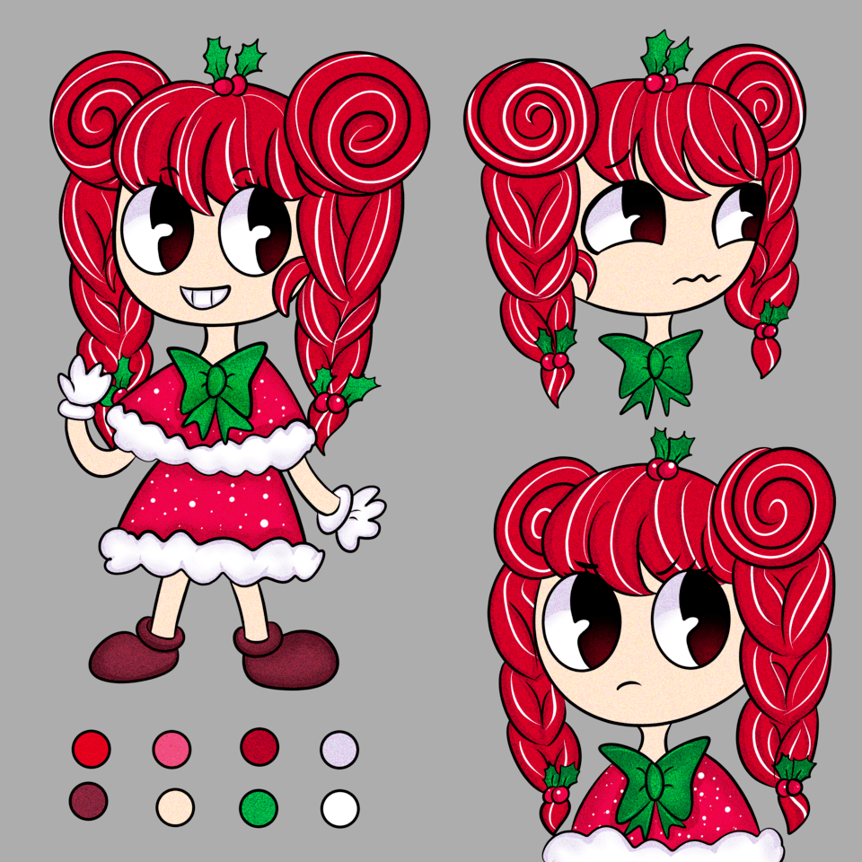
This (above) is what you will come across when it comes to Concept Art for Production: several approved designs that need a Color, Light and Shadow treatment.
In years of doing this kind of work I have discovered that the best thing to do is to work on Batches and using a sequence of steps that, at each stage completed, the art can be delivered to the Client so he can start using it on Production asap.
Starting with the Line Drawing, the first step is to make all the white areas Transparent - this happens a lot when you work with scanned drawings on paper.
A scanned drawing that needs to be prepared for coloring
In Clip Studio Paint you can convert Bright/White areas to transparency using the function: EDIT - CONVERT BRIGHTNESS TO OPACITY.
The linedrawing is fixed. You can now paint colors on the Layer below.
First step to start the rendering process is to create FLAT, base colors.
There´s a plenty of methods of working with selections on CSP; the quickest is to use the MAGIC WAND tool to select the outside area of the drawing, than INVERT and FILL.
**IMPORTANT: at this point, reduce the opacity of the Linework as much as possible; make it visible enough for you to judge the forms and volumes.
Starting with a faint linedrawing helps achieve the Rendered/Painterly look.
I know it´s not 'fun' but get used to have (at least, try) a pristine Layer management on your file.
It will save you a lot of time when doing Selections in the following steps.
Here´s I create a Layer for each part of the character that has a different Material/Color.
Notice also how the color bleeds below the lines. This method is faster than Colored the linework after all the rendering is done.
TIP: you can CTRL+CLICK on the Layer to automatically create a Selection.
Colors are important, but VALUES are even more important.
As soon you finish to add the base colors, do the following.
Create a New Layer on top of Everything; Fill it with Black; Change the Blending mode to Color.
You'll see the following:
Notice how the Values are a bit unbalanced: the dark spots on the skin are way to dark. You can barely see the arrows on his back and the image lacks a 'Point of Interest'.
With that in mind; adjust the composition of the Values on your image using the Levels, Curves or adjusting the Value property on the Hue Saturation adjustment.
Here´s a balanced image: focal point is clearer the face/eye of the character.
Step two is about the Lighting process:
Create a new Layer and fill it with White/Grey. Working the lights with a single color is easier for the brain.
The first pass of the Lighting needs to simpler as possible.
Think in a Binary state: Lit or Unlit; 1 or 0.
In the image below you can see how I imagine the lighting coming from the Top and, every shape that is not totally facing the light, I shade with my Shadow Color.
You can pick any color for your Shadows; but a Desaturated Purple seems to work well if you want a well balanced image (Warm Light vs. Cool Shadow).
Avoid using the pure Grey and Blacks for the shadows.
Light or Shadow, Lit or Unlit - in this stage remove the complexity of midtones.
A lot can be achieved with two tones (Light and Dark) only; there´s a tip for when 'designing' the shapes of your shadows:
Avoid cutting the form in the midpoint (left sphere); it´s boring and it automatically adds too much shadow to the form.
See in the example (right sphere) how it should be better to leave more light to represent the roundness of the sphere. The design of the shadow is also more pleasant/dynamic.
Notice that the contrary also works: if you want a dark scene, prioritize the shadow shapes.
In the second pass of Lighting you'll be creating the Occlusion Shadows - those are areas where the light can´t reach. Think holes, crevices, the contact between two forms, folds...
Do this pass on a separated Layer so you can easily adjust the opacity. I used the Airbrush to create a soft gradient.
At this point you should be able to turn off the Linedrawing and see the forms reading.
In this third pass of Lighting you can combine both passes: direct light and ambient occlusion.
I like to add the Ambient Occlusion Layer on top of the Direct Lighting Layer using the Multiply effect. Reducing the opacity to aprox. 50% I make sure the effect is not too strong.
Two lighting passes combined. Use the Opactity of the Layer to adjust the effect.
At this point the design has already an sculptural feel that have great utility for a 3D Modeler eg.
But we can push this render further, blending some edges and transitions.
**IMPORTANT: paint in the Middle-Tones; don´t add complexity to the shadow areas. Pick the shadow color and paint the light areas - not the contrary.
When Painting the Mid-Tones (transition between Light and Shadow) take in consideration the type of Edge you can use to portrait form:
There´s SOFT edges and HARD edges;
A soft edge (left sphere) is a gradient that shows the form 'turning' away from the light.
A hard edge (right sphere) happens usually when there´s an object blocking the passage of the light, creating a Cast Shadow.
This edge is harder the closer to the form casting a shadow and soften gradually.
To paint Soft Edges I use the Airbrush. The Hard Edges I paint using a Default, Round brush.
At this point you can also paint some variety on the form; textures are more visible on the Mid-Tones area; in the example below I quick scribbled some lines to 'break-up' the plain surface of the skin.
The third step of this technique is to combine the Flats Colors with the Lighting.
Here you'll learn a very cool tip:
The common method to combine those Layers is to put the Lighting Layer/Group above the Flat/Base colors Layer and use the Multiply mixing-mode.
But here´s the result:
Lighting Layer ABOVE the Flat Coloring Layer; dark and muddy result.
To add the colors back to the mixture without losing the form you can do the following:
Create a copy of the Flat/Base colors Layers.
Add on top of Layer stack
Change the blending mode of this Layer to GLOW DODGE.
See in the image below my Layer stack.
See how the colors are more Vivid *while* the Lighting still reads.
To push the Lighting/Color further you can repeat the process and add another Layer in Glow Edge mode to brighten/saturate the image a bit more.
Here´s the result without adjustment:
The result should be way too strong;
Now you can create a MASK on this Layer, Fill it with a Transparent Color (hide) and Paint in the mask to show the highlights.
This sounds harder than it is. What this technique does is to remove the decision factor from your head "what colors should my lights/shadows should look like?" -
See how I use the technique to bring the highlights and accents for the forms (head, eg.)
Oh. Important. If you're presenting characters PLEASE add a ground plane using a Shadow.
It´s helps 'ground' the design on the page.
We're getting close to the final.
You can push further the textures and reflection of some surfaces further using a Round, Hard Edge brush.
Some speckles on the skin to show it´s roughness or a shinny, long highlight on the horn/eyes to show it´s a smooth surface.
IMPORTANT: don´t add too much highlights to the image. It'll break the illusion of a soft, diffuse light.
When it comes to Highlights, the lessen you use it, the effective is the result.
Last, but not least here´s another trick:
Create a copy of the whole image (without the background) using the option MERGE VISIBLE TO A NEW LAYER.
Use the filter FILTER-BLUR-GAUSSIAN BLUR to simulate a Out-of-Focus effect. ..
Now use a MASK to Hide and Paint back in the blurred image; with this technique you can simulate a Depth-of-Field effect leaving some parts of the image sharpen (the one closes to the camera FOV, eg.)
See the final result below:
It´s a subtle effect but it adds a layer of realism to the rendering.
That´s it.
It looks 'complicated' now because it´s maybe the first time you're seeing this breakdown, but I'm sure as soon you put in PRACTICE you'll see the steps can be applied very fast and in a logical fashion.
THANK YOU very much for the reading and don´t forget to check my Site/Portfolio for more examples of this technique being applied in various of Game Design projects I worked on.
Every single image on my Portfolio was made with Clip Studio Paint.
You can follow me on social media:
@dadotronic (twitter)
@dado.tronic (instagram)
Les utilisateurs qui ont aimé cette publication


Commentaire