
Layers are a powerful feature of Clip Studio Paint, but it's also one that could easily get out of hand, making the process more complicated than it needs to be, and also is open to so many possibilities you end up wondering how many layers are enough? or how many are too many? Does this merit its own layer? Should I fit all my page in a layer, or have one for each panel?
I've been using Clip Studio Paint for several years now to create my comics, from roughs to lineart to inks to color to lettering. And after a lot of trial and error I have been able to find a nice balance to using layers for organization, saving time in the process and still allowing for iteration and revision of works, an aspect critical but often overlooked in process tutorials.
What follows is a description of my method. The sample page is from ongoing project Femdom Inc, currently being published as a webcomic on several platforms.
Roughs
Before anything, you need to know what will happen in page. This includes page composition, panel shots, reading direction... Be sure to work out all these before you get any actual line work done, so you don't need to throw away anything later. Some artists even prefer to work these roughs out in paper, and bring them into CSP later by scanning them or taking a photo. I prefer working them as thumbnails, using very low resolution (72 dpi) and a big pencil.
Regardless of the method, make sure you don't overwork it, the only point of this step is get a general feeling of the page, the action pace, the camera positions... at this point don't care about anatomy, perspective, proportions, or anything about proper art really. It's all storytelling at this point. I even like to try two or more rough versions of the same page, to be able to compare and choose the one that works better.
Regarding panel borders, I draw them using line tools in a different layer (depicted in blue) so I can get a general idea of page composition in one quick look. I keep this blue "Panels" layer below all other layers, and I will adjust the panels size by selecting both the Roughs and Panels layers until I'm happy with the composition.
Even though we'll add the texts later, this would be a good moment to at least make a good estimation of how much room you will need to fit the text balloons and captions.
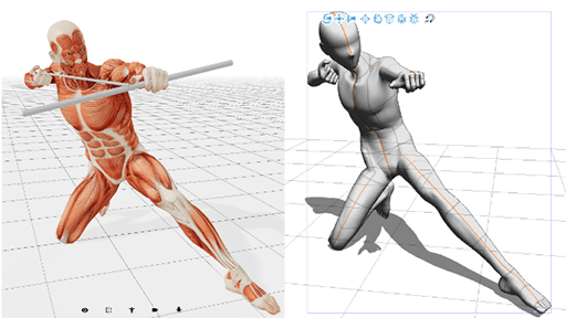
On top of these rough pencils, I create a new layer for Anatomy. This is a step I used to skip for a long time, and jump directly to the pencil step. That's why my older comics have a lot of anatomy inconsistencies on their figures, that now I make sure to work out before going to actual drawing. This is the step to use mannequins (real or virtual), apply what you've learned of figure and gesture drawing. Remember, it's all anatomy at this point, so your figures need to be completely naked. Even if you plan to dress them up in full gear later, this is the point to ensure proportions, sizes, body shape all fit together.
Bonus tip: try to draw your full figures even if they are not fully visible within panels. This way you can ensure the visible part is fully consistent. If these figures overlap from a panel to the next, use as many anatomy layers as you, but make sure your figures are anatomically correct, and feel alive before moving forward- don't hesitate to sketch the poses in a separate file, or even in a sketchbook. I promise the improvement will show in your final result.
If you need more than the naked anatomy to get a clear impression of how your characters aro going to look, add another layer on top for Clothes and Props. Characters can change their looks a lot once you put them in suits, dresses, armors and whatnot, or put stuff in their hands. If your character is holding a sword, a gun, a phone, or whatever interaction they're having with objects and people (like punching, kissing, hugging, etc), you want to sketch this along with the Anatomy, to make sure that not only the figures are correct, but that they fit correctly the physical elements around them.
Next, sketch your backgrounds. Don't use any rulers at this point, but make sure to get them in before moving forward. Too many times backgrounds are an afterthought, and feel like not much more than a painted curtain in a stage play. Backgrounds are not places behind your action, it is where the action happens. As Scott McCloud once wrote, a good background is the difference between knowing where the story happens and being there.
Depending on your style and how detailed your comic is, you can think of your background as 2D (flat) or 3D (with depth) which is the most usual. Whatever the case, make sure you get a good sense of place and space before moving forward. Proper perspective and references will come later, but in this step make sure you make the background a part of the scene.
This example scene, where the character is moving across several locations, is heavy on background work- it's especially important to make the backgrounds a part of the narration.
この投稿を「いいね!」したユーザー


コメント