Some background tips for watercolors style works.
Hello Everyone! Qsan here again!
Thank very much to all of you for your support in the previous tutorial.
I’m so happy you liked it!
Today I want to suggest some trick to do simple backgrounds for your characters.
Specifically for those who use light colors techniques like the digital watercolor/copic, sketch styles and others. It’s always better to do simple backgrounds to stand out the main figures (or characters).
Let’s go!
First tip. Make a simple watercolor background
Let’s use our pre-made subject( character, etc.)
[Here you can read a little extra with all step by step of the Girl with grapefruit basket
->uploading ]
Create New Folder “BK01”
Go to the “Girl Def”. With the right click of the mouse select “Duplicate Layer”.
Move the character inside the folder, so we don’t lose the original file.
Create a New Layer. [Normal 100%]
With the Soft Waterbrush,
[ This is customised brush. Read my previous tutorial to see how I created it ]
Draw stains around her vertically, using a single color, in this case green.
In tools,
To Decoration -> Vegetable -> Foliage
With the same color and on the same layer,
draw some small foliage around the border of the stains.
This helps to emphasize the nature element.
It’s a trick I use in general when I do backgrounds like this.
The granular effect, some parts defined and some fading away, is typically used with the watercolor technique.
Create a New Layer. [Normal 100%]
Click Clip At Layer Below.
With the Soft Watercolor Brush, create some stains, blending yellow and blue colors with the green drawn before.
To adjust the border
Go again to tools,
Decoration -> Vegetable -> Foliage.
You can use two solutions:
1) Create a New Layer. [Normal 100%]
With the brush foliage set to white, refine the outer edges.
Or
2) Merge background layers,
with Right click -> Convert Layer (H) (or Merge with Layer below)
And use the non color (or transparency) to refine the outer edges.
For both the final result in appearance will be similar. But if you need to keep the background transparent, my suggestion is to use the non-color (transparency) as method.
Create a New Layer.
Change the Layer option from Normal to Soft Light
With a light Gray correct the tones of the background.
The first background is finished!
Second tip. Pattern background with double colored border. [Sticker Effect]
Go to the “Girl Def”. With the right click of the mouse select “Duplicate Layer”.
Move the character inside the folder, so we don’t lose the original file.
Create a New Layer. [Normal 100%]
Go to tool. Figure -> Rectangle -> Create Fill
Create a colored rectangle. I chose green again.
[Alternative: You can create the rectangle by:
Go to Selection Area -> Rectangle,
creating square or rectangle selection,
going to the tool, Fill -> Refer Only to editing Layer,
and coloring the selected area.]
Open Materials window.
Go to color Pattern.
Use the pre-installed materials from the Clip program!
Searching, I decided to use this dotted pattern. “ Retro Style _ IS.”
I found it really fun and playful. It’s similar to the dot decoration I made in the hat ribbon.
Drag and drop it over the working area
and move / size the pattern, with the tool.
Operation -> Object tool.
You can zoom in/out, shrink, rotate as you prefer, without ruining the pattern, because this material is a vector layer not a normal layer. In this case It won’t be necessary to rasterize it.
Personally I zoomed in the pattern, and rotated it obliquely to match the angular structure of the character, emphasizing the movement and the guideline of composition.
But the colors are too strong,
so changed the Layer option from Normal to Screen
with opacity 100%.
Satisfied with the background.
I want to make the character stand out more.
I decide to create a border with a technique that I call the Sticker effect.
Before doing this step, duplicate the drawing so that you have a clean version always available in case of a mistake.
To create a border,
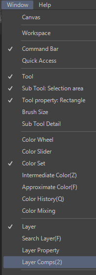
go to Window -> Layer Property.
Click the first white/dark dot icon called Border Effect.
In the Border effect property, click again on the white /dark dot icon.
Here you can decide the size of the border and the color.
In this first part. I left it white, with 30 px of size.
Keep marked the option Anti-Aliasing on border effect.
Expression Color -> Color.
For a second border,
Create a New Layer.
With the Right Click-> Merge at Layer Below
with the “Girl” Layer where you applied the first border.
This will merge and rasterize the “Girl” Layer with the white border
It will now be possible to add a second border.
Again Go to Window-> Layer Property-> Border.
Click the first white/dark dot icon called Border Effect.
In the Border effect voice, click again on the white /dark dot icon.
Create a green line with 9px of size.
Keep marked the option Anti-Aliasing on border effect.
Expression Color -> Color.
As a finishing touch,
create a colorful shadow.
Take the previously saved backup “Girl” layer and duplicate it again.
Right Click on the layer -> Duplicate Layer.
Move the layer below the girl with borders
Create a New Layer [Normal 100%]
Clip at Layer Below.
Go to Fill-> Refer only the editing layer
And color the layer as you prefer.
I used the orange color to create a contrast between the main character and the background.
With right click -> select Merge with layer below.
Go to Move Layer.
And move it in the direction you prefer.
Completed!
Consider using this method for characters or subject who have a dynamic , fun and playful personalities, or for chibi works. The use of the pattern definitely helps to tell his/her personality and the outline emphasizes the figure.
Third Tip. Flower Materials.
I often use this last suggestion to make harmonic and amazing background effects,
use flowers as background.
In the previous tutorial, I made some flowers materials to use as background for characters and floral compositions. In this case, I’ll use the sunflowers.
Create a New Folder “BK03”.
Go to the “Girl Def”. With the right click of the mouse select “Duplicate Layer”.
Move the character inside the folder, so we don’t lose the original file
Go to File -> Import -> image
And import the two images of sunflowers. They must be without background.
Click [Ok].
Initially the images format will be vectors.
You can fix them as you prefer [zoom in/out or rotate] ,
without ruined them.
If you want to keep your materials available in the program without having to have to import your files again and again, add your drawings to Materials.
[How to save materials in Clip Studio Paint.]
Go to File -> Open
and select your image ( or multiple images).
Click [OK].
Both will be uploaded separately.
The following process must be repeated for each image.
Go to Materials -> All Materials.
Right Click and -> select Create new.
Then, create a custom folder, “Custom Materials” where you can save your images.
In tools,
select Selection Area -> Rectangle
and select the whole drawing.
Go to Edit -> Register Material -> Image
If necessary, in the new window you can
change the name of your file ( I kept “Sunflower 01”).
-In Paste Operation,
activate Scale up/Down -> select Adjust after Pasting,
so when you’ll drag and drop your image, it will adjust automatically.
In Location to save material -> select your custom folder (“Custom Materials”).
Click Ok.
Now you can use your images.
Drag and drop the objects in your work.
The images will act like vectors.
In tools,
select Operation -> Object -> Tool Property.
You can trasform the image as you like.
For example:
In Image Setting -> Click the second icon “ Flip Horizontal at center of rotation”
Horizontally flip your image.
Or, using the third icon “Flip Vertical at center of rotation”,
vertically flip it.
In Scale Ratio,
you can zoom it/out your materials by changing the value.
Keeping Keep ratio of original image,
will make the image will scale up/down proportionally.
When deactivated, you can change the width or height separately.
In Rotation Angle,
rotate your image as you like, back and forth.
In Adjust Position,
you can adjust your image to fit the canvas.
In Tiling option,
you can repeat your image, reverse or flip it.
In case you want to reset all options
go to Image Setting -> Click the first icon “Reset current trasformation”.
and everything will set to the default values.
Once you’re satisfied of the composition and the quantity of flowers, rasterized the layers.
The main idea is to surround the girl with sunflowers.
there is no need to make many flowers. Two, three drawings will be enough.
Go to each layer,
Right click -> Rasterize
Create a New Layer.
Change the Layer option from Normal to Overlay
Opacity -> 100%.
Go to Fill -> Refer to editing layer
Color the layers with a light orange, to harmonize the flowers with the character.
The background is ready.
Go to the “Girl def” Layer.
Let's make the figure stand out more.
Go to Window-> Layer Property -> Border.
Click the first white/dark dot icon called Border effect.
In the Border effect property, click again on the white /dark dot icon.
With 3px size and brown color, add an outline.
Let's work on the foreground.
Make some sunflower petals.
Create a New Layer.
With the Gpen draw the main linework.
Once their position is decided,
create a New Layer “Base”
and move it below the line layer and put the yellow color.
Create a New Layer.
Select and Clip at Layer Below.
With Soft Waterbrush, add a shade of white.
Once they’re completed,
right click -> select Convert Layer(H)
and adjust their position with
Move Layer -> Move Layer or
Selection Area -> Lasso.
[ Note* With the selection it is possible to rotate, copy and transform the object]
Let’s add a white border.
Go to Window -> Layer Property -> Border
Click the first white/dark dot icon called Border Effect.
In the Border effect property, click again on the white /dark dot icon.
Create a white border 6px wide.
For the foreground objects, it is better to use a white border, as it gives it a more realistic feeling.
Finally enrich the composition with a few drops of water, using the same method as my previous tutorial
Create a New Layer. [Normal 100%]
Go to Window-> Layer Property -> Border Effect
Click the first white/dark dot icon called Border Effect.
In the Border effect voice, click again on the white /dark dot icon
With 3 px of size and black border,
use the Gpen with white color to create some drops on the drawing.
With a second color (which can change depending on the location of the drop.)
make an inner reflection.
Finished!
These are 3 simple techniques to do simple backgrounds with the watercolor/soft style coloring i usually use.
Which of the 3 versions do you prefer?
I hope they can be useful.
Feel free to share with me final results.
I can’t wait to see them.
Thank you very much for reading.
See you the next tutorial
Qsan
Portfolio: qsanfolio.com
Deviantart: qsan90.deviantart.com
Pixiv ID: 3629457
Instagram: @qsanworks
Twitter: @qsanart


댓글