Layers for confused Artists

-
 MVP ◆질문에 적절한 답변을 많이 게시하고 커뮤니티 운영에 크게 공헌한 사용자입니다. MVP는 3개월에 한 번, 그 사이에 획득한 포인트를 바탕으로 결정하고 표창을 실시하고 있습니다.
 -
 NVP(New Valuable Player) ◆MVP 다음으로 커뮤니티 운영에 공헌한 사용자입니다. 이제까지 MVP 수상 경험이 없는 분 중에서 획득한 포인트를 바탕으로 결정하고 표창을 실시하고 있습니다.
 -
 공식 엑스퍼트 ◆뛰어난 응답자의 증표인 MVP수상자 중에서 선택된 커뮤니티에서 가장 뛰어난 응답자의 증표입니다. 심사를 거쳐서 저희 회사에서 의뢰할 경우 취임되십니다.※ 옛 명칭 '에반젤리스트'
 -
 셀시스 공인 모더레이터 ◆모더레이터는 일본어와 기타 언어를 말할 수 있는 셀시스 공인의 스탭입니다. 소프트웨어나 창작의 전문가가 아니기 때문에 직접 의문을 해결할 수는 없지만 여러분이 순조롭게 소통할 수 있도록 언어나 커뮤니케이션 측면에서 지원합니다.
 -
 셀시스 공식운영에 관련된 공식 계정입니다.
Intro
This doesn’t want to be the “perfect” guide with all the options of CSP, but just a basic introduction on how layers work inside CSP.
This doesn’t want to be a tip that you read in ten minutes, and you’re done. This wants to be an easy to navigate guide with a precise structure and if you need something you can easily find it. You need a quick reference? Click on the section you need and read it.
If you’re starting out in the digital art world, especially if you come from traditional art, you can be a little bit confused. There is a lot of stuff to learn and to do, and when you open up Clip Studio Paint (CSP) for the first time it’s seems like an impossible task.
And this will be probably your face.
But trust me as someone who use Clip Studio Paint (CSP) for 7 years and is a CSP expert, quoting Blenderguru, you will need 20% of the tools for doing 80% of the work. Yes, there are a lot of tricks an tips. But 80% of your work will be done in those palettes.
____________
We will concentrate on the right side, where the [ Layer ] palette is located. The Left side is for tools and tool properties,
The [ Layer property ] palette, the top one palette, requires another tutorial on it’s own.
But the short version of what you need to know is this, [ Expression color ] have three modes Color, Grayscale, Monochrome. You can convert automatically the colors of your layer using this option. Color is the default one, grayscale will remove the colors and keep the values, monochrome will convert everything in black and white pixels. Grayscale/monochrome mode will add an option that will remove automatically all the black or white pixels, in the grayscale mode it will create a transparent gradient, you can decide which one to select just by pressing on the black or white square.
Now the [ Layer ] palette is where you will live and breath and die as an artist. This brings us to a simple question. How can you use it?
What can you do with the layers?
Now let’s take that little illustration put at the beginning and let’s see the layer stacks.
Pretty nice and clean, no? A layer is nothing more than a transparent acrylic sheet, like the one used in old school animation, used whenever you want to create an object separated from what you’re working on.
In the old days of animation, you would have an acrylic sheet for the static background, another for the animated background and another one for the characters.
There are no hard rules on how many layers you can create, or you will need. Just remember the more layer you create and use the bigger your file will be.
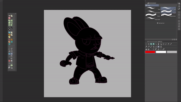
In the layer stack I’ve used for the simple bunny face I’ve 4 layers.
1. Inks
2. Shading
3. Colours
4. Silhouette
The Paper layer is a special kind of layer, it’s practically your default background. It’s created automatically whenever you create a file.
Why I’ve used 4 layers, when I can do something like that in a single layer?
Let’s use the colours layer as an example. Do I need to change the colour of the shirt? I will not need to change the colour, shade it and redo the lineart. I will just need to change the shirt colour and I’m done, meaning that I don’t need to spend half an hour but just a couple of seconds.

_____
With this I hope you can understand how using different layers can give you a pretty flexible workflow. Just don’t go overboard and create a layer for everything okay?
Now that you understand how much powerful layers can be, if I did a decent job, let’s start looking at some techniques.
The [ Layer ] palette interface
Well first thing first is… How to create a new layer?
You have two options. Go to the menu in the top bar go to Layer>Create new layer> Create new raster layer, or just click on the button (1) in the [ layer ] palette…
Or another method is by right clicking inside the [ Layer ] palette and select the layer you need.
Near the aforementioned button you can find the button (2) [Create new vector layer]. Vector layers are a special kind of layer that gives a couple of advantages, you can recognize them because of that little cube near the layer preview.
• Being able to change the stroke you make as you would in a vector software
• Using the vector eraser, that let you erase the whole line or up until the intersection with another line
• The fill and auto select tool have special options in which they will select up until the middle of the vector line, the [ Fill up to vector path ] option.
So, a vector layer is useful when you need speed, and you know the layer will be used a lot as a reference for fill and selection tools…
About that… button ( 5 ) is [ Set as reference layer ], this will set the selected layer as a reference layer. Meaning that the tools that have the [ Refer multiple ] box checked in the setting will use the reference layer and not the active layer in which you’re drawing.
Next to that there is another powerful option [ Clip to layer below ] (4). If I remember correctly in Photoshop is by pressing Alt/Option on the layer you want to clip, while in the Affinity series it’s a click and drag mechanic. But in Krita and CSP it’s a button in the layer palette, in Krita it’s the α symbol near the layer while in CSP it’s the two squares highlighted as button 4, dark purple.
This option it’s simple, in the shown layer stack, the shading and color layer are clipped to the silhouette layer. What does it mean? It means that even if I color outside of the silhouette in the Color layer it will not appear.
If I unclip the color layer appears a little friendly cat, hidden by the silhouette. How do I know if a layer is clipped or not? By that little red bar on the left. If there is a red bar the layer is clipped to the one below, if not it’s a normal layer.
A similar behaviour is shown with the [ Lock transparent pixels ] option ( 7 )
_______A simple folder stack it’s an ILLUSTRATION folder and on top of that an ADJUSTMENT folder, like in the image.
________ATTENTION:
Using the [ Clip to layer below ] option with folders can give two different errors. Because CSP have a [ Blending mode ] called [ Through ] that will preserve the blending modes of the layers inside the folder. The [ Through ] blending mode when you clip a folder can create two errors.
____________
This brings us to the next argument, [Blending mode].
As you can see the SHADING layer have [ Multiply ] written on the right. Why only that layer? Why all the other layers have [ Normal ] written on the right?
You can consider blending modes ( B ) as “automatic” adjustment based on a series of calculation. Multiply as an example shift the colours toward black based on the brightness of the colour I’ve selected, meaning that all my colours will have the same shift towards black without me worrying about hue/saturation of the colours.
I’ve created a free folder stack that you can use as a reference to know what to expect from the various Blending modes, you can find it here
The last remaining useful option it’s on the right of the [ Blending mode ], the [ Opacity ] of the layer, a.k.a. how much the layer is transparent. 100% means it’s opacque, 0% means that it’s completely transparent.
The A option just adds a color on the left of the layer, where the eye is located. By the way that eye is the button to show/hide the layer.
Now that you know where to look and how to navigate the layer palette… we can talk techniques…
Layering “techniques” debunked
You’ve 4 actions, your 20% for 80% of the work, for practically all techniques regarding layers:
• Create a layer
• Clip to layer below/Masking
• Change Blending modes
• Organize the layers in folders
All the techniques you can encounter are variation of those four actions. If you’re starting out what overwhelms you is not those 4 actions but the answer to those four questions:
• Which layer I need to create?
• What I need to mask?
• Which Blending mode I need to use?
• How I organize my folders and layers?
If you’re starting out you don’t know how to answer those questions because you still don’t have a precise workflow or you don’t have enough experience (as an artist or with CSP).
What I can do is helping you answering those questions.
Which layer do I need to create?
Types of layers
In CSP you have three types of layers, based on how you interact with them:
• Raster layers, your standard run of the mill layer.
• 3D layers, everything inside here is a 3D object
• “Editable” layers (An unofficial term created by me)
The last type of layers is the one the creates more confusion, those layers are layers that you can edit later, by double clicking on their preview, using the [ Object ] tool or going to the [ Layer property ] palette. I group them as editable because simply you can edit them in a non-destructive way. As an example a Vector layer is an “Editable” layer, because you can change whenever you want the brush size, color, opacity etc. Of the strokes inside the Vector layer.
Under Layer>New Layer we can find the first group
We know [ Raster layer ] and [ Vector layer ], [ 3D layer ] is already explained and it’s something that is created automatically whenever you use a 3D object. So, we remain with
• Gradient layer
• Fill layer
• Tone layer
• Frame Border folder
The last one it’s the more elaborated. It creates a special folder for comic frames, in which you can edit interactively the borders, like brush size and width/length of the border.
The other three are the same thing. No really… The Gradient/Fill/Tone layer are the same type of layer, they just have different options…
If you want to convert from Gradient to Fill or vice versa you just need to use the [ Object ] tool and in [ Tool property ] palette you can choose which type you want using the [ Fill settings ] option.
To change from a Fill/Gradient layer to a Tone layer and vice versa, you just need to go to the [ Layer property ] palette and check/uncheck the [ Tone ] effect option.
_____________
Useful beginner friendly tone tips
Before going to the tips we need to be on the same page on what two terms means, [ Frequency ] and [ Density ].
• Frequency = It tells you how many instances of the point of your tones there are in a space, meaning that with high [ Frequency ] value you will have more points in the same space
• Density, in simple terms how big your points will be. In other terms it means that the bigger value you put the darker the tone will be.
Here’s a little image to show a little bit better what I mean.
Second point we need to be on the same page is that tones are bitmap layers, meaning that they’re monochrome layer and are faking grey values using those little dots.
Now we can start with the first tip!
|Creating editable tones
This is a straightforward process:
1. You create a black [ Fill ] layer
2. Now in [ Tool property ] palette just activate the [ Tone ] option
Now we just need to change some options:
1. The [ Effect range ] option, which will decide how the [ Density ] of the tone layer will be applied. [ Image ] means that the density will be unrelated to the to the mask linked to the tone layer. We need [ Mask image ] , this option will link the density of the tone to the opacity of the mask.
2. Now we need to change how the [ Density ] value will be calculated.
Why doing this? Because [ Use color of image ] will link the color you’ve used to a precise density value. So it’s useful if you need to convert a colored illustration to a monochrome illustration, while keeping the values. The [ Use specified density ] option will let you put a precise value for the [ Density ].
[ Use brightness of image ] links the density to the brightness of the layer. If you have black you will have a density value of 100% if it is white you will have a density value of 0%. Here’s a little image to let you understand a little bit better.
So, with the previous black fill here’s the result
Well… it’s not so good… First thing first let’s use [Clip to layer below] to clip it to the silhouette layer.
Still not so good… But here’s where the magic happens. We just need to select our [ Tone ] layer mask, the green marked area.
Now we take our friend [ Eraser soft ], and let the magic happen
With this method you can decide how much “dots” you want using the mask, and by using the [ Frequency ] setting in the [ Layer Property ] palette you can decide how big you want those dots.
To learn a little bit more how masks works go to the [ How masks works? ] section
Here’s an example with various Frequency values.
For this example I’ve used a single [ Fill ] layer but you can use how many you want, based on how much tones you need and how you feel comfortable. Remember that the brightness of the fill layer let you decide your base tone density. So for an example here’s the result of a 50% grey
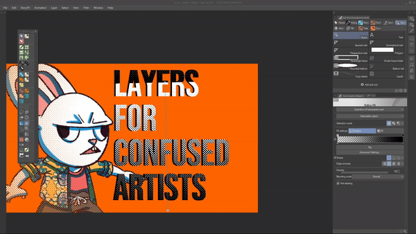
The next tip it’s practically how I’ve created the effect in the title of the tutorial.
|Creating a tone gradient
As stated before Gradient/Fill/Tone layers are the same thing but with different settings. The main difference between a [ Gradient ] and a [ Fill ] layer is this little option
So what happens when we select in the [ Tool Property ] palette, while having selected the [ Object ] tool, the [ Gradient ] option?
We will have a gradient tone layer. Easy no? So how can we use it to create this effect?
It’s shamelessly easy once you know what to press…
Firs we need to clip our gradient tone layer to the text layer. Like this:
Now we go to the [ Tool Property ] palette, while having selected the [ Object ] tool, and we just need to find the [ Edge process ] option.
Now we just need to select the second option, [ Repeat ], this will repeat the same gradient everytime. Like this:
Just for the sake of it, the third option will reverse the gradient and the last one will not let repeat the gradient.
Now we just need to use the Gradient handle to align it to our text. Remember the little cross change the position of the gradient, the little blue sphere changes the “length of the gradient.
Now with this you have some beginner friendly tone techniques that can help you in your workflow
Correction layers
So, with this we have covered everything inside the [ New Layer ] section… Now we have the Correction layer section, guess what we have? Layer used for correcting the colors or the values of your work
Regarding correction layers… It’s al based on what you need. I never used them so much, except for two of them, so I can’t be extremely precise. My recommendation it’s just use them and see which ones seems more useful to you. More or less this is my flowchart on how to use them:
• You need to change values?
o Brightness/Contrast
o Level Correction
o Tone Curve
• You need to change colours?
o Hue/Saturation/Luminosity.
o Color Balance
• You need an editable filter?
o Reverse Gradient. It will shift EVERYTHING to the opposite side of the color wheel and convert black to white and viceversa
o Posterization, this will transform a gradient in a precise number of colours. If you have for an example a gradient of three colours (red, magenta, purple) every pixel will be one of those three colours. Wanting to ultra-simplify it.
o Binarization, this will transform any color in a black or white pixel.
o Gradient Map, this will convert your work in a grayscale and will apply the colour you select on the left to every black pixel and the colour on the right to every white pixel.
If you’re starting out probably you will need only the [ Hue/Saturation/Luminosity ] and the [ Gradient Map ], those two are the correction layers I will use in almost every work. The [ Gradient Map ] to decide colours or a colours scheme, and the [ Hue/Saturation/Luminosity ] to retouch if needed.
So, to answer the question:
Which layer do I need to create?
Here’s the answer/flowchart.
• Do I need a normal layer? I will add a Raster layer
• Do I need full control on my strokes and I will use this layer as a reference for selection and fill tools? Vector layer
• Do I need to fill a good portion of my work? Fill/Gradient/Tone layer
• Do I need to use 3D? 3D layer…
• Am I making a comic frame? I will use the create Frame Border folder option
• Do I need to make a correction? I will use a Correction layer based if I need a value/color/filter correction.
I've created a free printable pdf flowchart at this link, it's an A4 size
This brings us to the second question
What I need to mask?
How masks work?
Simple, you’ve two options.
• Using the [ Clip to layer below ] option
• Creating a mask
We talked already about the first option, so I will cover the second one.
Let’s say I want to add a texture to the shirt of my illustration and I’ve Completely tasteful flower decoration™ in my materials.
Now as you can see the flowers have invaded my work… So I’ve two solutions, painstakingly erase everything that is outside the t-shirt. Or selecting the shirt and clicking on the button [ Create Layer mask ]
This will create a mask over the Completely tasteful flower decoration™, that will be shown in the [ Layer ] palette as a little black and white squares. Everything white is the part that will be visible, everything black will be hidden.
_____
Here’s the final result.
Now… when to use masking and when to clip. There are no hard rules. But more or less here’s how this work. Big chunks of work, like characters or a series of buildings? Clip It. Details over the figures, like the the Completely tasteful flower decoration™? Mask it
Being done with the concept of masks let’s go with the next question.
Which Blending mode I need to use?
Which Blending mode I use?
TL;DR version
Use my tool… And see what you need… And use that
___________________
For the rest just experiment and see what you like.
Now we have the last question:
How I organize my folders?
How to organize your work?
It’s simple if you’re unsure if you need to put something together in a folder ask yourself:
“Do I want to batch edit those layers?”
If the answer is yes group them in a folder.
As an example, for this print, the buildings afar, the castle/water, the buildings in the front, the characters and the clouds are in their separate folders. Because I needed to batch edit them sometimes.
The general rule on the order of the folders it’s simple, you put them in order of perspective, so the folder stack of that illustration is:
1. Clouds
2. Front buildings
3. Characters
4. Castle
a. Bridge
b. Castle
c. Water
5. Buildings in the distance
In this way you don’t loose time in masking your folders.
The rest is based on your experience or your client… Marvel and DC’s gives you a precise folder stack that you need to follow, as an example.
With this I hope I’ve given you a framework that you can use as a base for working in the Digital world.
Self – promotion chapter
Yeah…yeah… this is the favourite part of everyone… sponsor time… Guess what? It’s myself!
First thing first, if you liked this tutorial, I’ve created a whole manual on how to use Clip Studio Paint using my experience as a beta tester and as an artist as a reference. It was reviewed by Celsys, for reviewing all the contents. It’s not the official manual but you can be sure that all the information is 100% true.
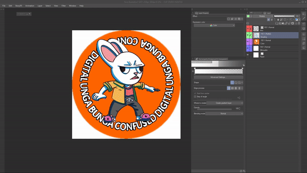
In case you want to buy the Confused Digital Unga Bunga sticker, you can find it on my Gumroad together with all my merchandising.
With this I bid you farewell loving you all and hoping you will create a lot of Art.
이 게시물에 '좋아요!'를 누른 사용자


댓글