
0. Introduction
When shading we often consider the atmosphere we want to create, whether it is a romantic sunset or a tranquil morning scene. But what if you rendered a morning scene but then wanted to change it to a sunset setting without redoing all the shading?
In this tutorial, I will show you how to quickly and easily change the setting and mood of your illustration while keeping your original illustration intact using correction layers.
1. Creating a Morning Scene
We will start by making a morning time illustration and then change it to other times of the day with the help of correction layers.
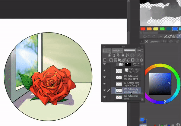
First, create the base your illustration with line art and base colors.
For the shadows create a new layer that is below the line art layer but above the base colors layer. Switch the layer mode to [Multiply].
Before shading according to the direction of the light, we will add some essential shadows to overlapping areas where it is hard for light to penetrate. Since my subject is a rose, this will be mostly at the intersection of its petals.
Now, I will add more shadows according to the light’s direction, which is coming in through the window.
Next, I will add highlights with a [Hard light] layer and adjust the opacity depending on the intensity I want for the highlights. Lastly, I will add sun rays in a [Add (Glow)] layer.
With the basic shading now complete, we will make some adjustments to make it feel more like a morning scene.
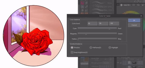
Using Color Balance:
The [Color Balance] correction layer lets us add the color tints to our illustration’s original colors, making it great for changing the illustration’s mood. We can separately adjust the tints in the highlights, half-tones, and shadows with this correction layer.
To open the [Color Balance] palette, right-click on a layer, then click [New Correction Layer] and then choose [Color Balance].
Since I want to create an early morning vibe, I will shift the half-tones and shadows more toward the blue and cyan, while shifting the highlights slightly towards the yellow. Apart from the general direction in which you want to go, experiment with the sliders to check multiple possibilities.
These are my final settings and their result:
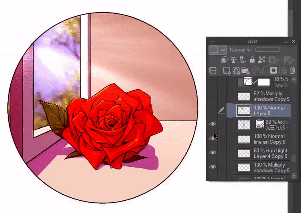
Since shadows are soft in the early morning, I lowered the opacity of the shadow layer. I finished off by making the sky bluer as it indicates that the sun is not too high in the sky yet.
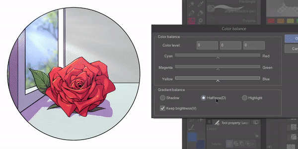
2. Converting to a Noon Scene
For an afternoon scene, we will again start with a [Color Balance] correction layer, but this time we will move the highlights and half-tones more toward yellow while shifting the shadows toward blue.
We can adjust the intensity of the effect by changing the opacity of the correction layer.
If the saturation gets intense in the results, turn off [Keep brightness] in the [Color balance] palette and continue slider adjustments for desired results.
If you want stronger shadows, you can duplicate your shadow layer and adjust its opacity as you see fit.
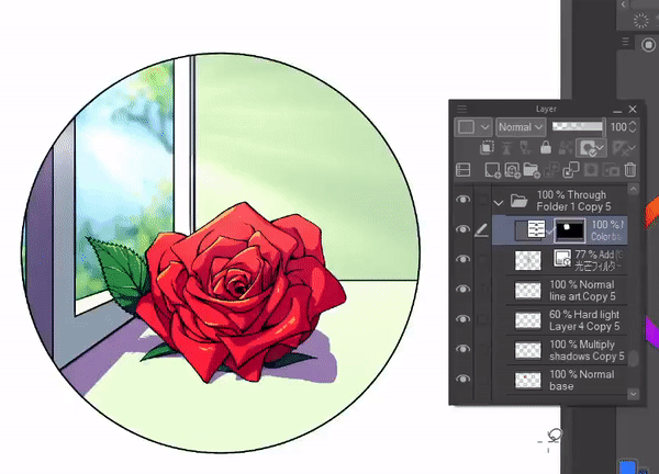
Here is the complete conversion to the afternoon scene:
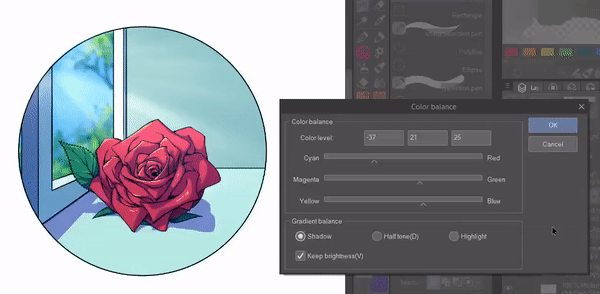
3. Converting to a Sunset Scene
Sunset moods lean toward magenta, purples, and oranges, so we will move our [Color Balance] sliders mainly towards red, magenta, and yellow in all three sections of shadow, half-tone, and highlight.
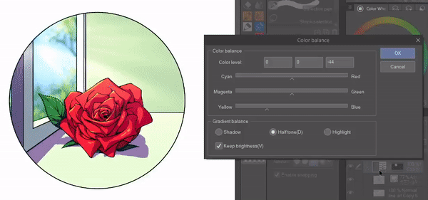
The light rays are too white so I will add orange streaks to a new layer and clip it to the light rays layers.
Lastly, I have adjusted the sky color to better match the scene and increased the opacity of the highlights layer for a greater sunset glow.
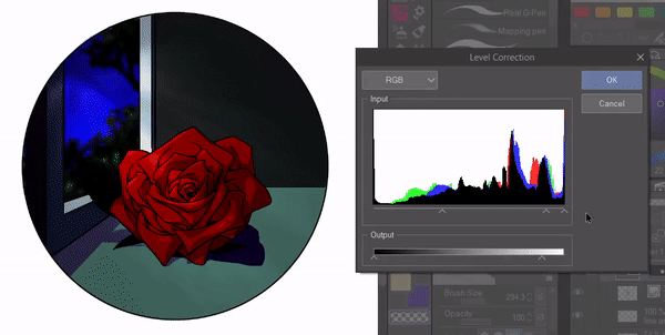
4. Converting to a Night Scene
For the night scene, we will need a level correction layer to lower the luminosity and contrast in the illustration to match the nighttime. To open the [Level Correction] palette, right-click on a layer, then go to [New Correction Layer] and then select [Level Correction].
The following window will pop up:
The top three sliders control the values of the shadow, half-tone, and highlight from left to right respectively. Sliding them to the right makes their controlled area dull or darker while sliding them to the left makes it brighter.
The below two sliders control and limit the value range, so you can adjust how dark the darkest areas can be or how light the brightest areas can be.
For the night scene, I will decrease the maximum light value to lower the luminosity of the entire illustration. I will also drag the shadow and half-tone sliders to the right to darken the image further by lowering the contrast.
While the result gives a nighttime vibe, green has increased in the half-tone area although I wanted blue to be dominant. To correct this, I need to adjust the levels of green and blue separately in the [Level Correction] palette.
For this, I chose [Green] from the drop-down menu and shifted the half-tone slider to the right to dull the green. Then, I selected [Blue] from the drop-down menu and slid its half-tone slider to the left to enhance the overall blue tint.
I also slightly dulled the red in the [Red] menu since colors appear more desaturated at night.
To finish up, I added some stars and a moon to the sky and lowered the opacity of the shadow layer to soften the shadows.
Final Thoughts
I hope you found this tutorial useful and that you will experiment with correction layers since they are such a powerful tool. Hopefully, the information here will make things easier for you when you want to change the time of the day or mood in your illustration or webtoon next time.
Thank you for reading!
對此投稿按「讚!」的用戶


留言