
Hello! Today I want to show you how to make watercolor illustrations digitally in easy steps.
First, we should know the basics of watercolor painting. In traditional media, due to the transparency of watercolor, it's important to lay down your light colors first and work towards the darker colors.
Sometimes you can have good reason to begin with darker values. But it's generally easier to start with light, then build up more color from there to emphasize the transparency qualities of watercolors.
1. Preparing the base texture
Texture is used to give the illusion of depth or making a piece seem more realistic. To make the watercolor feature stand out, we can use these paper and watercolor textures.
You can download the material for free here on CSP Asset
Always put your layers with same purpose in one group. An organized group layer will make it easier to navigate and find other design elements as you create your art.
Make a group folder for the texture papers and set the blending mode as “Through”so it allows any Adjustment layers inside the group to affect all the layers below it, including layers not inside the group.
Set the paper texture layer mode as Multiply and the watermark texture as Overlay
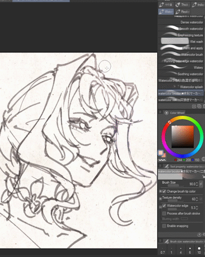
2. Drawing the lineart
i use a pencil brush from this one “カモミの机の奥のゲルインクペン” with opacity of 60% so the lineart will look like real pencil sketch
3. Coloring the art
You might be asking if it is okay that the pencil lines show through the finished watercolor painting?
The golden rule of art is "there's no rule," so the answer is yes, it's absolutely OK to have your line art appear prominently on the finished piece and vice versa.You can paint in many ways that suits you the best
For this tutorial, I want to aim the dreamy,soft pastel look so I put the lineart layer below the color folder group and the line art will blend well to the watercolor brush stroke.
Coloring the skin
I use this brush “■水彩マーカー/二色” from this watercolor maker set to color the artwork.
The opacity of the brush might be light when you try your first stroke but it’s ideal because you can gradually build up the color. If you want more prominent color in one stroke, you can adjust it by giving more pressure.
The brush is using dual color . Use a lighter color on the foreground and darker color on the background
As you paint through the portrait from light to dark, your first stroke will be your lightest values. Since i want the lightning source coming from her left side, I only paint half of her face and leave the the other part white.
Make several strokes or more pressure on the cheek and lips area .
Coloring the hair
since there’s many crease and holes on the hair part, it’s better to create layer mask for the hair so the brush stroke won’t be all over the place.
First “Set as Reference Layer” on the lineart group layer and then “Create Layer Mask”
on the hair layer like shown below
After you have satisfied with the result, make a new Layer and set it to Multiply to give more details on the dark parts
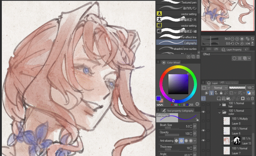
Background
for the background, i draw some flower petals and i use “/カモミ色混ぜ透明水彩” from previous artist21 brush and put a few dab on the corner of the canvas.
Finishing
Lastly, to make the color pop I’ve added Tone Curve and Level Correction layer which you can find from Layer > New Correction Layer > Level Correction
A tone curve is a diagonal line that represents the tonal range of an image.
The bottom left represents the shadows or darker tones of a picture, the middle of the tone curve represents the mid-tones of an image and the top right represents the highlights
You can drag the line in certain areas to change the brightness and contrast of your image in that particular tonal area. Some tone curves allow you to place anchor points to create sharper, more pronounced curves which produce stronger contrast and a unique look in the tones of your image.
Then I add Level Correction layer which you can find from Layer > New Correction Layer > Level Correction to add some contrast
then add some highlights as necessary with new Layer and set it to “Add (glow)” and you’re done !
Congratulations on making it this far!
I hope my tutorial can help you on your art journey
If you have any questions please do let me know in the comment 🌸
Thank you for reading my tutorial 💖
Until next time
對此投稿按「讚!」的用戶


留言