Digitally Traditional : Watercolor Plants and Flowers in CSP
Introduction
Hello everyone, I’m Cherry, a digital and traditional landscape artist.
In this tutorial, I will be showing you how to draw plants and flowers in watercolor in Csp.
I will explain how the brushes work and how to achieve the traditional watercolor look from start to finish on this illustration.
> Clip Studio Interface
I know that most of you are already familiar with Csp and navigating it, but just in case you’re not :
Let’s start with the basics : How to make a new “Drawing” Canvas :
Once you open Clip studio paint ➪ Go to “file” ➪ click “New” ➪ a tab will show ➪ choose “illustration” ➪ then adjust the canvas name, the width, length and resolution… Once you’re done click “ok”.
So once you have made a new canvas, it will automatically have a white background (unless you chose otherwise) and a new layer where you can start drawing.
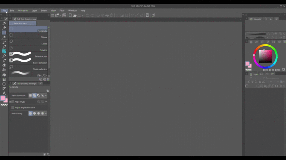
You have the tools bar on the side, color wheel, layers tab and everything you need.
you can re-arrange them as you wish by simply clicking the tab and dragging it.
Ps : you can find small arrows on the side, if you press them, it will show another tab for material.
you can also hide the other tools by clicking their arrows.
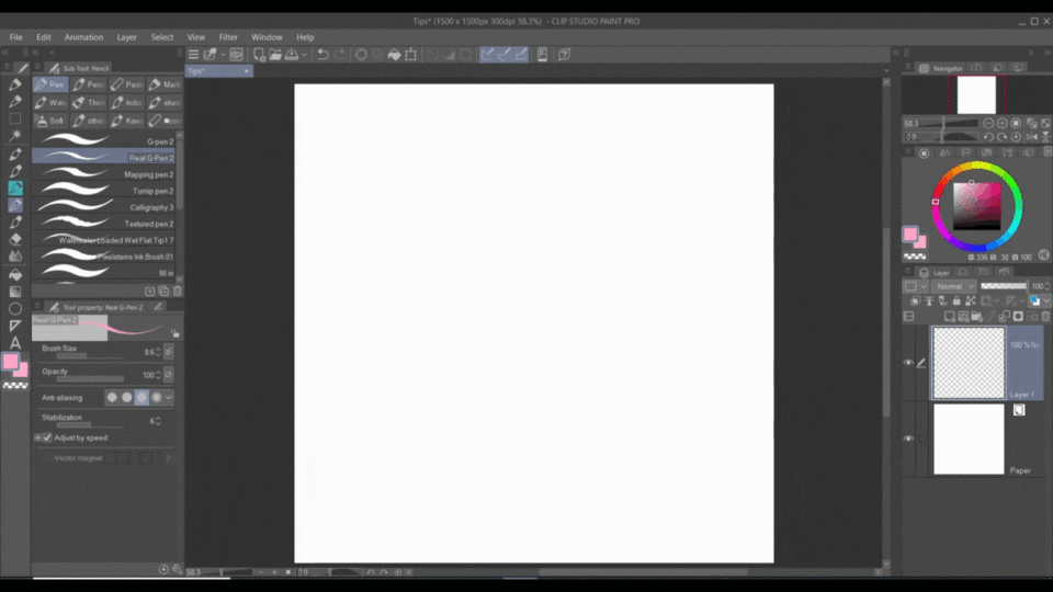
Whenever you need to make a new layer ➪ go to layers tab ➪ press the little icon that shows a “plus” sign ➪ and there you have a new layer.
And you can rename the layer by “left” clicking twice on the layer title and you will be able to change it.
> Csp Materials
Now let’s talk about how to download the brushes and other materials from Csp libray :
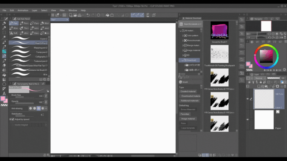
Simply type the title/name of the object/brush you want to download in the search bar (it can be filtered by popularity order old/new and other types of filters like 3d, gold material and clippy). Click on it and it will lead you to the download page of the asset.
Or (for what I used) just Click on the links I provided for the brushes and it will lead you to the download page of the asset.
Click on download and it will open Clip studio to start downloading.
then Clip studio will open and start downloading.
Ps : this CS window can appear differently depending on which version you have, but the keywords are essentially the same).
Once it’s finished downloading, open Clip studio PAINT, and go to materials.
You can find the last thing you downloaded at the very top or you can look it up by typing the name in the search bar.
Click on the brush and hold, drag it onto the tools bar and drop it.
Now you can use it.
Here’s another example
> How to draw Plants and Flowers
I have previously made a detailed tutorial on this same topic so please check that out for a more in depth explanation.
As for our tutorial, you can take a picture of a plant or a free to use (with granted permission from owner) image reference and simplify what you see in your own style.
Here’s an example :
I personally took a picture of a plant from my own, and used it to draw some guidelines (the overall arrangement of the leafs).
I didn’t trace the leafs line by line but rather used them as a guide to arrange my own leafs, so no need to trace the details because real references are more often than not, too complicated and too complex for a drawing.
So first open Csp, go to file, click “Open” and a window will show where you can select your folder and choose your available reference to import. (Or you can simply drag the reference image to the canvas and drop it)
go to the layers tab and make a new layer by clicking the “new raster layer” icon, and draw your guidelines.
then turn off the reference layer by clicking the little eye icon.
Then finish drawing your guidelines according to your preferences.
once you’re done, lower the opacity (opacity tab on the layers bar), then create a new layer and draw your actual sketch (more about that later).
In short :
The point of a reference is to be used as guidelines, so it doesn’t have to be a perfect reference.
and as you can see, I didn’t use all the leafs as guidelines, and I also added some where there wasn’t, so you can take what you need from the reference and leave the rest.
And from there you can add other things that might not be in the reference such as flowers, a better pot and so on.
After you have your basic sketch, from there you go on to “actually draw” a better sketch with details that you acquired from learning how to draw flowers and plants.
Digital Watercolor
> The Brushes
For the overall drawing, we will only be using one brush.
We might need a pencil, a G-pen or a blending tool for some points but I will mention them when needed.
For now let’s explain how our main watercolor brush works :
Ok, so this following link has a wide variety of brushes, all amazing, but I will only be using the ●水彩マーカー/二色 Brush.
So this brush has a watercolor texture and a watercolor edge that helps sell out the traditional look.
It also has a feature that combines both the Primary and Secondary colors.
So if you want to paint with one color, either make them both around the same range, or directly choose the secondary color to draw.
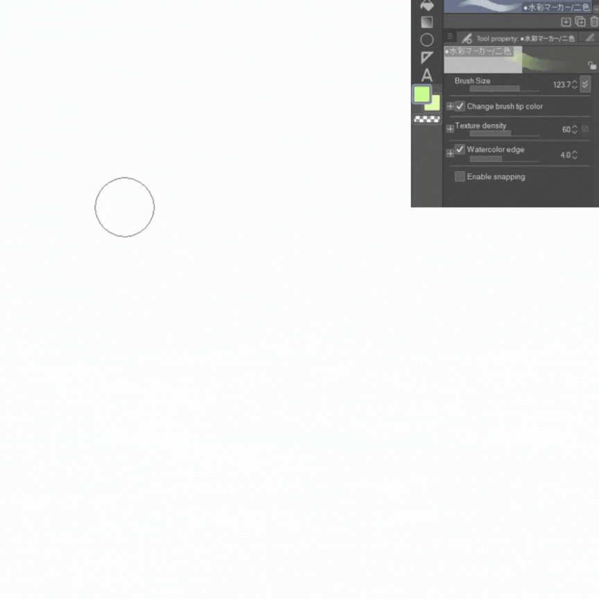
you can adjust the size like shown in the brush tab, but also, you can adjust any other aspect (watercolor edge, texture…) by clicking the small clue icon.
Though I would suggest leaving in default because it already woks well.
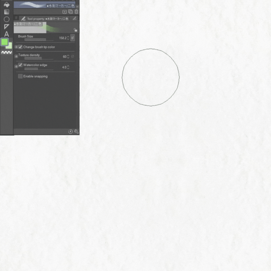
When drawing with this brush, like I mentioned, there will be a watercolor edge at the end of each stroke. So If you use repetitive brush strokes, you will have too many spots with a watercolor edge.
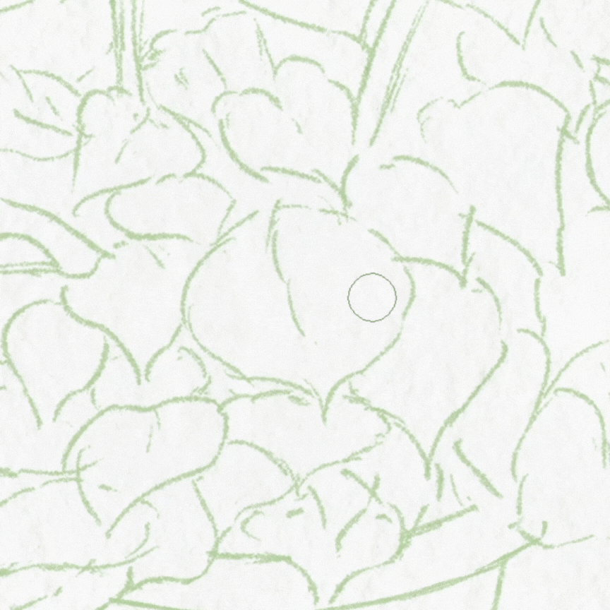
Instead, if you make a continuous brush stroke without lifting your pen, it will be something like this.
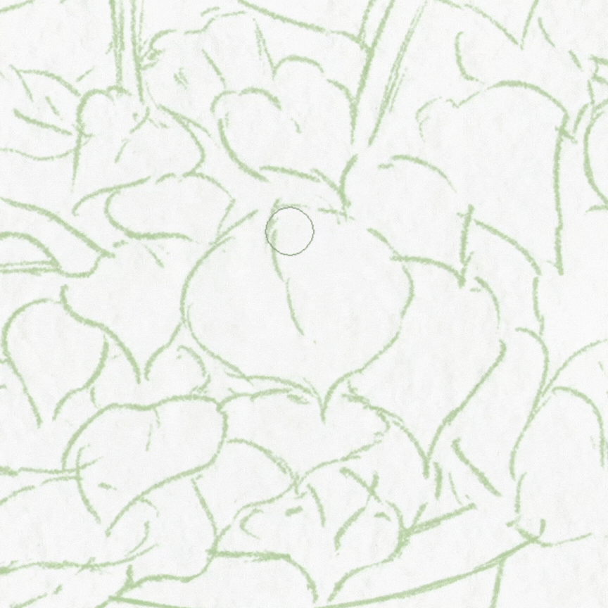
and as you can notice, the color is more opaque where I use a lot of pressure on the pen, and it gets lighter where I use less pressure til it almost fades out.
> Canvas Texture
Besides the brushes, one of things that would help improve watercolor drawing digitally, is the surface’s texture.
Adding a texture layer will give a more traditional look to the drawing.
There is a wide variety of Canvas texture in Clip studio paint library that you can choose as a watercolor base.
I used this following texture (Which can be downloaded from the following link) for my painting and it is sufficient enough.
I’ll be explaining more about it later in the tutorial.
> Watercolor Drawing
There are several approaches to watercolor drawing :
1-Loose Drawing : This one is a free style with loose strokes and without line-art for the most part, where the artist starts the drawing directly by laying the colors in loose shapes according to what they want to draw.
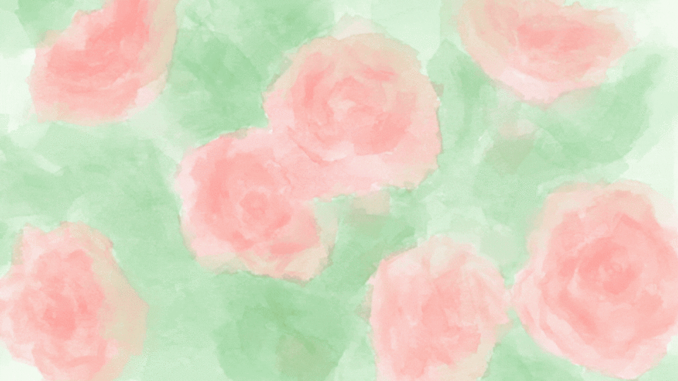
2-Detailed Drawing : This one includes all steps of normal drawing, from sketch, line-art, base color and rendering, and it mostly turns out pretty defined with fine details, respecting the line-art and edges.
3-In between : what I mean by this is a watercolor drawing that combines the two previous styles, a drawing not too loose and not too precise, somewhere in between, where the artist shows details but is not afraid of going over the sketch or losing some edges while doing it, therefore combining the two previous styles.
And this will be the style that I will be demonstrating in this tutorial since it includes everything.
Sketch and Texture
> The brush
I used Csp default “Pencil” to draw the sketch.
Go over to the tools bar and look for ➪ Pencil.
The thickness of the lines changes depending on the size and the pressure you put on the pencil.
It goes from a thick dense color when you apply too much pressure to a light texture suitable for sketching when applying medium to light pressure.
You can adjust the size and opacity in the tool property bar like shown in the picture.
If the pencil doesn’t figure in your tools bar :
-Go to the top of the tools bar : press on the little icon that shows 3 horizontal lines
-Select “add from default”
and this (following) window will appear :
-Select “pencil” and there you will have it in your tools bar.
(same thing goes for the other default tools that showcase in the bar).
There it is (a new pencil) in the tools bar.
Now let’s get to the sketch.
> The Sketch
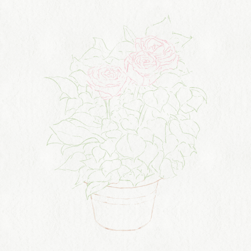
So, I first drew a sketch in black.
Then I lowered the opacity of the sketch layer to 50% (or less) so that it doesn’t overwrite the the texture of watercolor later on.
you can adjust the opacity on the layer bar like shown in the picture.
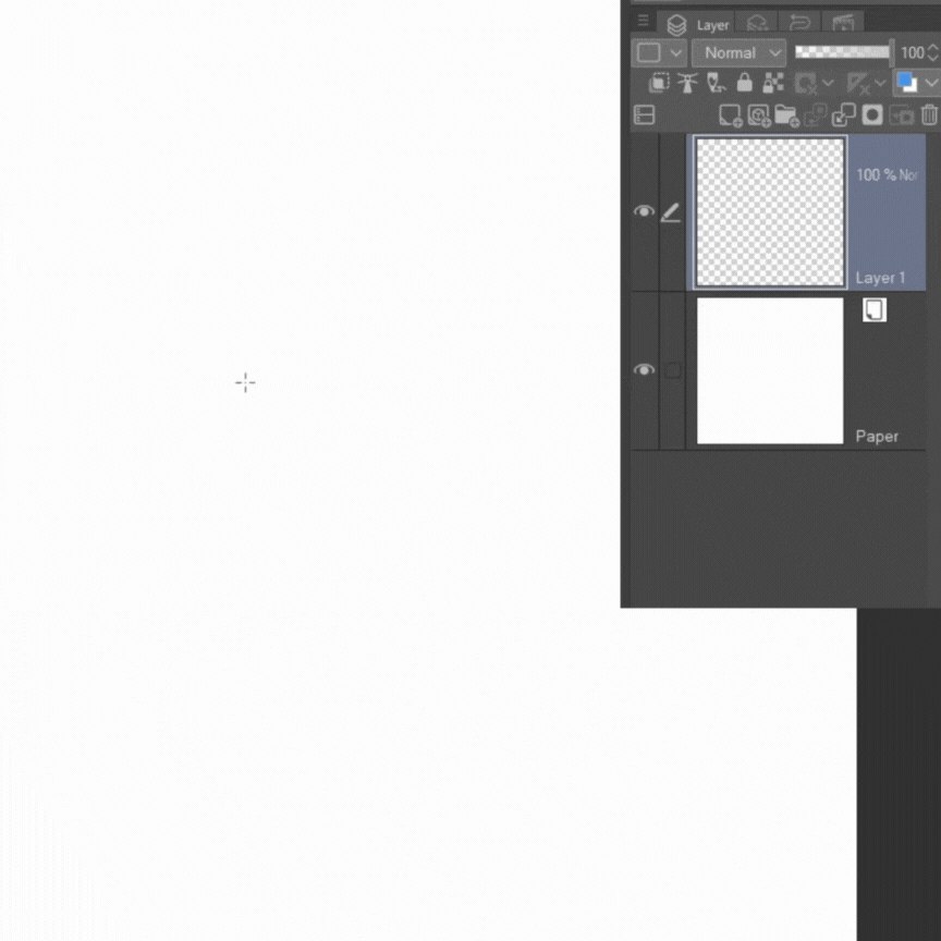
Then I created a new layer on top of the sketch layer and clipped it to the sketch layer (so that I can color my sketch lines to blend well with the watercolor later).
Let me explain the Clipping mask :
Clipping one layer to the layer beneath it means that the drawing on that first layer will be limited to what is drawn on the layer beneath it.
To use the clipping mask, click on the small icon in the layers bar.
let me explain better in pictures :
here’s a random drawing on a layer
now that I clipped this layer (by clicking the clipping icon), the drawing is limited to the circle on the layer beneath :
Back to the sketch!!
Since I will be drawing a green plant, I used a green color for the plant, pink for the flowers and brown for the pot, so that it blends well with the watercolor that I’ll be using later.
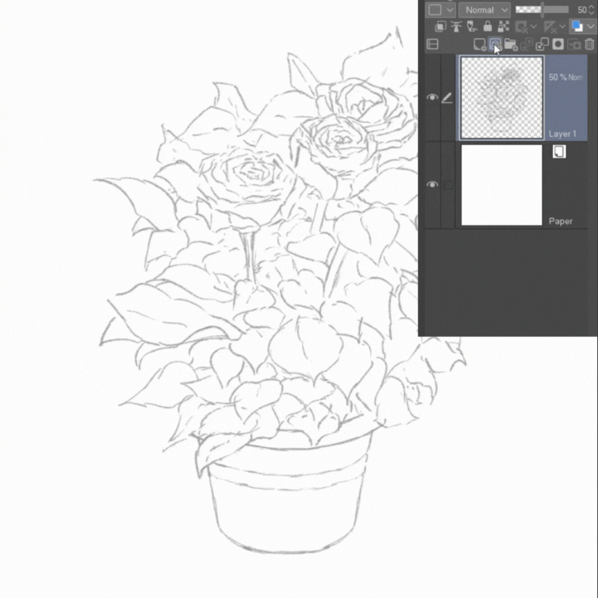
Ps : you can simply just use the right colors from the start. I only added this step to explain more about the clipping mask for beginners since we might use it later on.
There is not much more to explain with the sketch.
If perhaps you are not satisfied with the initial sketch or you want a better line art, then go to layers tab ➪ the sketch layer ➪ lower opacity ➪ create a new layer on top ➪ make a better sketch by referencing the first one.Then delete the first sketch by clicking on the right side of the mouse ➪ Delete.
> Canvas Texture
I already explained how to download materials from the assets library (please check that section above).
and after you have downloaded the canvas texture you want, find it in the material bar (or look for it in the “Download” file by typing the title of the material in the search bar).
Then grab it, drag it to the canvas and drop it.
once you dropped it, it will be on a layer on its own.
select that layer, lower the opacity to around (30-50).
Go over to layer modes : select “Multiply” , this layer mode lets the texture show on the layers below without obscuring it.
ps : make sure this layer stays on top of the other layers.
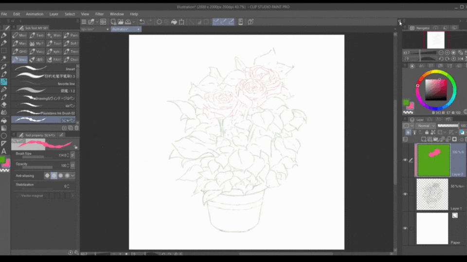
Ps : you don’t have to limit yourself to one texture layer, and you can experiment with the different layers mode as well, just don’t over use them.
and so after these steps, the drawing will go from this :
to this :
Here’s the link for the canvas texture I used :
(Texture n.4) but you are free to use any other watercolor texture.
Base Color
First, go over to the layers tab and create a new layer (like I had demonstrated in the beginning).
Then place it below the sketch layer : click on this new layer (keep holding) and drag it below the sketch layer, then drop.
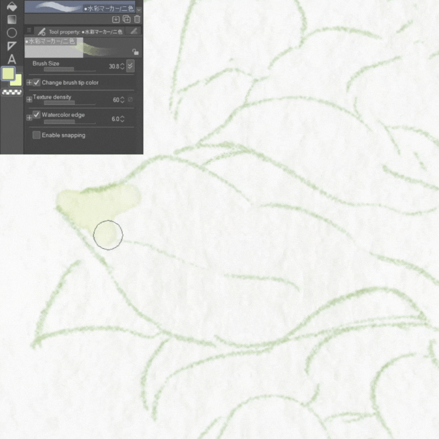
Ok, so with that out of the way, here’s how I drew my base color :
There are two ways to lay out the base color :
1- use the lasso tool, select the area you want to color and color it using your watercolor brush.
This first method gives clean and defined edges.
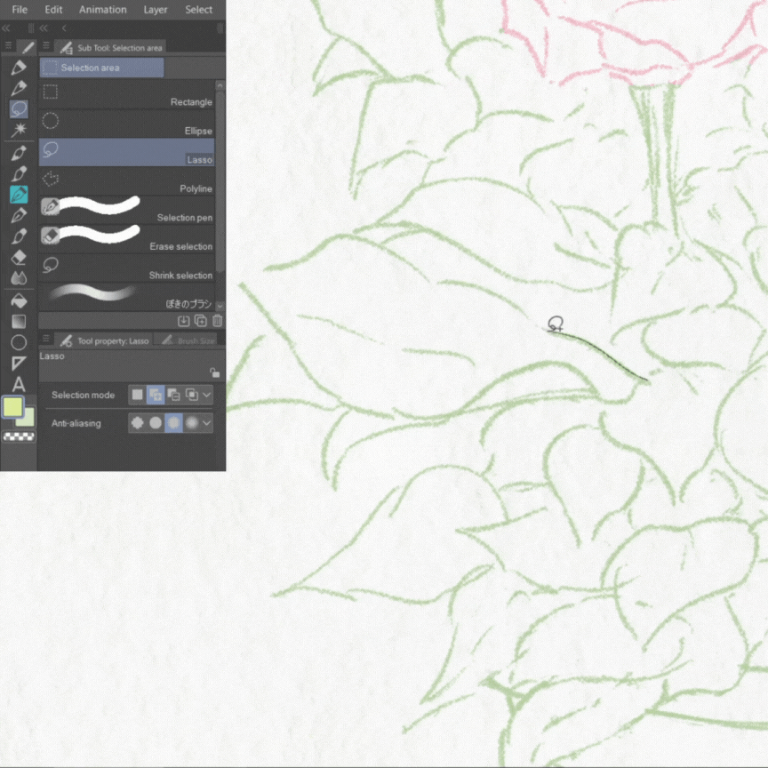
2- just free coloring, only limited by the sketch lines.
I personally use this method because I like to manually shape my edges and I also like that not all edges of my drawing are sharp so this is how I will be coloring in this tutorial.
> The Brush
Like I have already mentioned above, I will only be using one brush from the previous set I provided.
It is titled : ●水彩マーカー/二色 : copy paste this title in the search bar in your download file to find it.
Or go directly to this link :
I’ve already explained how it works in "The Brushes" section above, so let’s move to the base color :
> The Process
I used one continuous brush stroke to fill the shape and then went back to add more.
Because once you lift your pen and then paint again it will create a watercolor edge, so use it only where you want the water color edge to appear.
It’s nice to see the watercolor edge but too much will ruin the painting, so keep it minimal at this stage.
also, make sure to chose both primary and secondary color of the same range if you don’t want another color intruding, or directly select the secondary color to draw with :
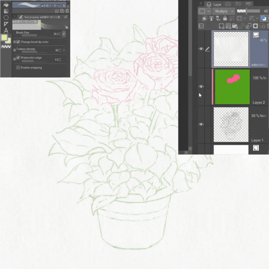
Then I repeated the same coloring processing adding several layer of color, gradually building the opaqueness and adding shadows.
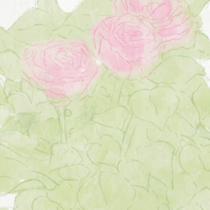
As I was coloring, I noticed my sketch was too thick so I lowered the opacity of the sketch layer even more.
and I continued building my layers of color using the same brush, while applying light pressure in light areas and heavy pressure (to get more opaqueness) in shadow areas.
see the difference :
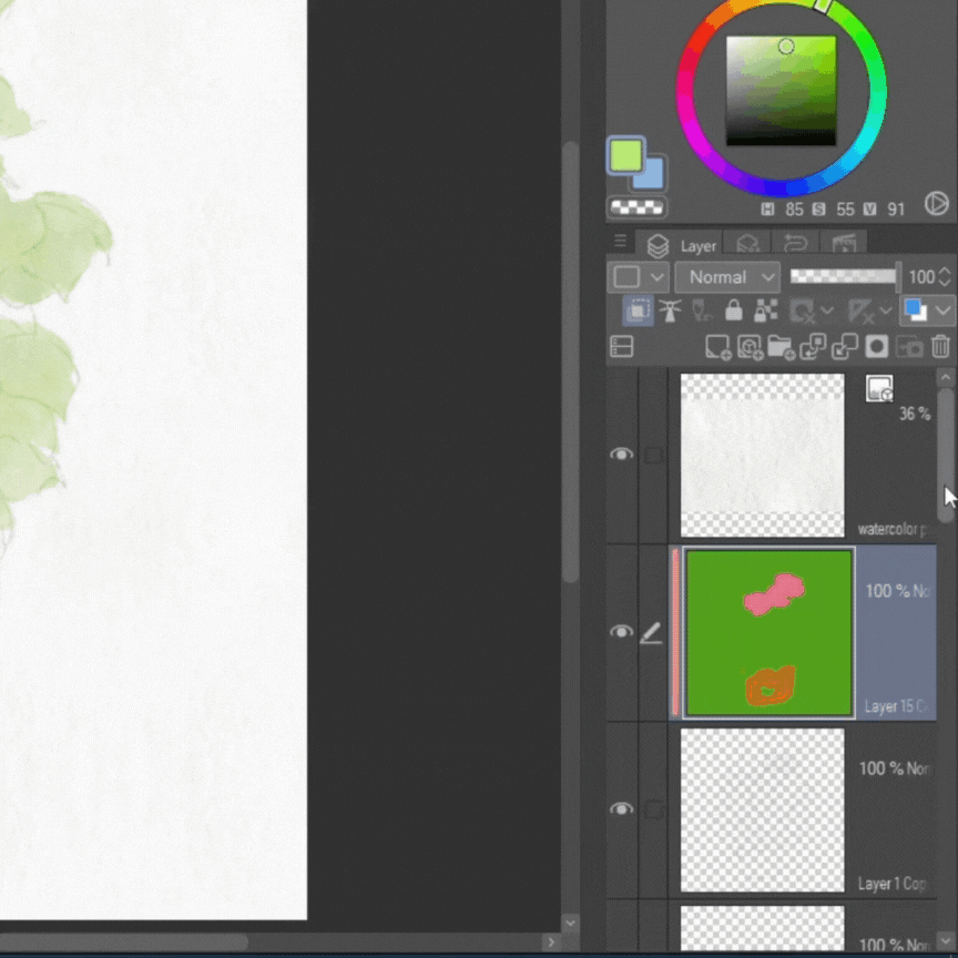
Now that I had my base color, I will merge all layers together with my sketch to start rendering.
So first select all layers (except the white background and the texture layer, do not select those), then click on the folder icon in the layers tab.
This will gather all the layers in a folder.
then click “right” on the mouse, and select “duplicate layer”.
This will duplicate your folder so that you can keep working with one and keep the other one in case you need it (just make sure you turn it invisible by clicking the eye icon next to it)
(Ps : this step is not necessary but just in case you need it later for a tutorial or something else).
now select the folder you will be working with, click “right” on the mouse, and select “merge selected layers”.
and all of your layers (except background and texture layer) will be merged in one layer so you can start rendering.
Rendering
> The Process
I first started refining the edges of my leafs, all while blending the sketch lines with the base color.
For this step, you can use the regular Csp default blender which you can find in the tools bar.
or the blending brush that comes included in the previous brush set I provided :
This one is called : 引きずり伸ばし.
Or any other blender (preferably textured).
Blend ever so slightly and then refine with the “kneaded eraser”
Csp default kneaded eraser : you can find it in the tools bar ➪ eraser (if you can’t find it, look the above for the steps we used to find Csp default pencil).
I like this one in particular because it has a little bit of texture, but don’t over use it.
let’s see how it goes :
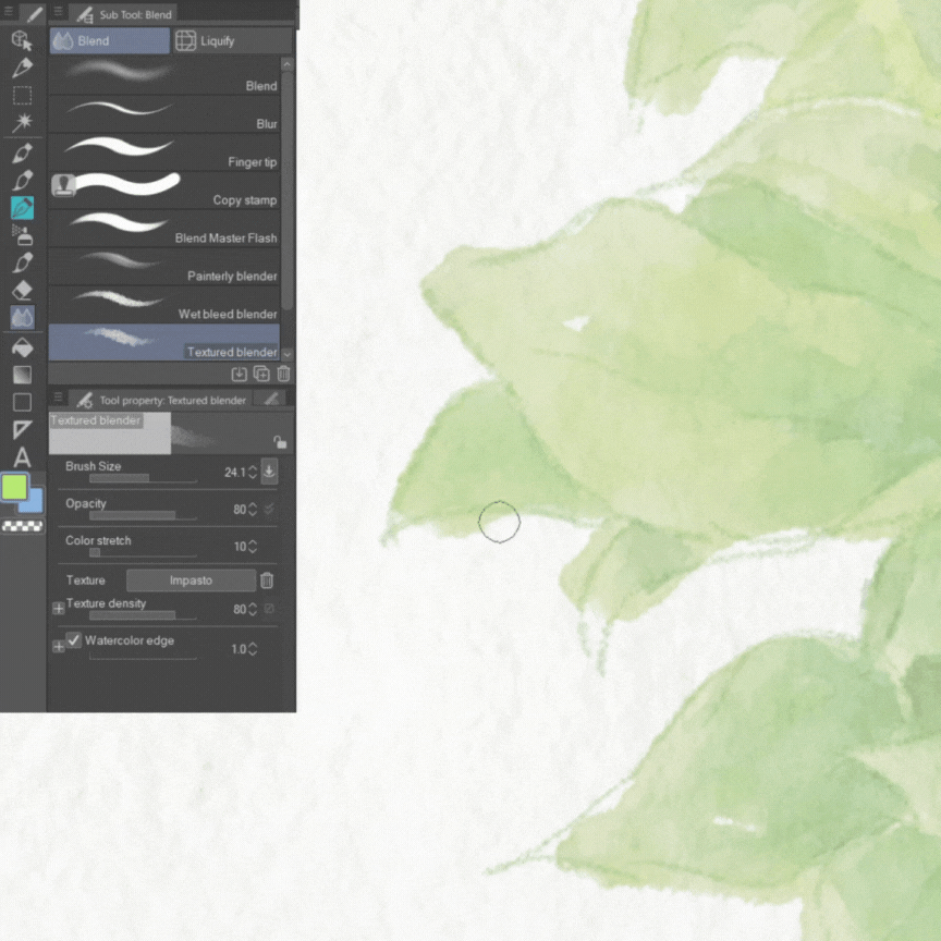
I didn’t make them too sharp nor too loose, I deleted the ‘obvious’ extra and blended some edges to fill the shape and blend the sketch line with the colors.
I didn’t do this all around the drawing, just some edges, to keep the raw traditional look.
Not too sharp, not too smooth.
Then I added some red (of the same value) to break the overall green.
This step depends on the artist’s style, I personally like to include a lot of colors in my drawings but you are free to skip this step.
In order to so, I went in with my watercolor brush (the same one we used with the base color).
I chose my primary color as green and the secondary color as red and it will have such an effect like shown in the following image :
I only used it in some areas because the plant is supposed to be, after all, green.
then with the same brush, i decreased the size to draw the stems and margins of the leafs.
Then I increased the size again (always same brush) and went over it again with the green as primary and blue as secondary color in my shadows.
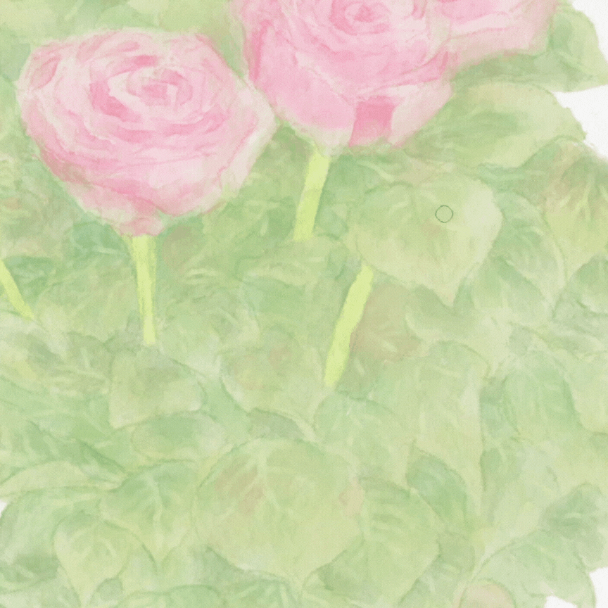
Then I went over it again one last time.
I didn’t go over all the leaf, but traced along the stem to keep the edge of my watercolor.
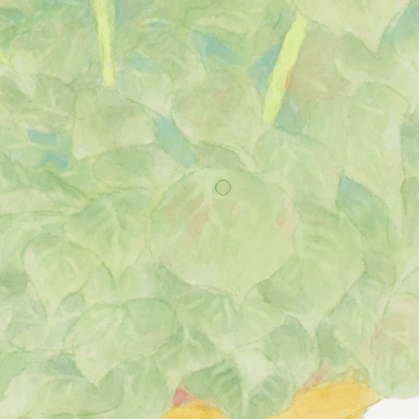
and I did the same thing with the pot.
Here’s a brief time lapse of the process on one leaf :
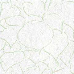
> Flowers
Of course because the leafs were the biggest part of the drawing, I was so focused on them and neglected my flowers a bit, so after I was done with the leafs, I went over my flowers adding another layer of color, same brush, same technique.
then, on a new layer, I went in with Csp default pen (real G pen) and added some highlights (you can find it in the tools bar or like I showed you earlier).
If the highlights are too strong then lower the opacity of that layer and then merge it with the drawing like I explained earlier in the tutorial.
then I went ahead and added some shadow in blue.
> Final Touches
After I had finished my drawing, there was still something missing… my flowers were too blended in with the leafs and they needed a little pop to make them stand out.
So I made a new layer on top of my drawing, went to layer modes, selected “Add (Glow)” which as titled makes a glowing effect, and lowered the opacity to around 29.
Then with Csp default airbrush (you can find it in the tools bar like I had previously demonstrated), preferably big size, and I lightly tapped my pencil on the flowers with the color pink to add that little glow.
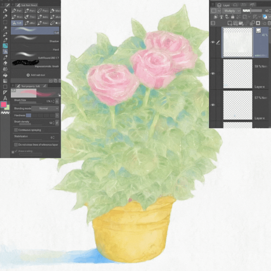
I also tapped a bit with the color green on some leafs, just slightly.
> The illustration
and this is how my illustration turned out in the end :
look at the details up close :
After you have finished your drawing, all that is left to do is export and save :
and there you have it, I hope you enjoyed my tutorial.
My Instagram :




Comment