
Hi guys! This is FalyneVarger again with another Clip Studio Tips.
I love 80's chrome and super shiny metallic surfaces. They're just so pretty to look at.
In this tutorial I focus on a more physical or realistic rendering of chrome because it is something that I've had trouble finding tutorials on the past.
I hope that you enjoy this Tips and gain some knowledge from it!
About chrome and other reflective metals
Chrome can be difficult to paint, and there's not a lot of information out there on how to tackle it. So how do you handle coloring it then?
I've found that one of the best ways to learn about something is to observe it. This works for just about anything in the art world. Muscle, cloth, faces, animals, metals, and more. It does not actually have to be chrome plated to be a useful reference!
If you're not sure about the way light bends on chrome surfaces, take some reference photos! Most of us have silverware, pots, pans, and other highly reflective household fixtures.
Below are some photos that I took in my kitchen of a few common items. You can see the way the reflection distorts over the different shapes.
It helped me immensely to realize that a "reflective metal" was a lot like a mirror. This might seem obvious, but it eluded me for awhile. I try to think of chrome as a "fluid mirror" or a mirror-like cloth that I can drape over a surface to apply it to the shape of the object I'm painting.
The object ends up reflecting the surrounding environment to varying extents. The most obvious reflections are the environment's light sources. In my photos these are the windows/sunlight and light fixtures. You can see how even these lights get "bent" along the 3D shape of the object they bounce off of.
It's important to note that you can't see every detail of my kitchen clearly in the reflection. You mostly see "lines" or "rows" of colors stacked up against each other in bands and loops. This is something you'll need to pay attention to more than the exact details of the environment reflected.
Painting a Basic Chrome Sphere
Let's start with something simple. A "3D" sphere. I put 3D in quotations because we are, of course, painting a 2D image, but we want to give the impression that our sphere has real dimension by our rendering.
I begin by creating a layer for my sphere's line art. I named this layer "outline".
For the line art I used an ellipse tool and held shift to make it a perfect circle. You can also lock the aspect ration of your ellipse in the shape "tool property" window instead of holding shift.
For the lower layer, I use the paint bucket, and fill the line art. In order for the bucket to only see the lines and not fill the entire canvas, you can set the line art layer as a "reference" by checking the little lighthouse icon in the layer window, and by changing the fill settings on the paint bucket to see to "refer" to the reference layer in the tool properties window.
Another way to only fill in the circle is to check "see all layers" in your bucket settings. This looks like a stack of paper. This option is most often what I use because I do not need to set a reference layer for this setting to work.
Paint the Local Colors
Next, I lock the transparency of my filled circle. This looks like a checkered square with a white padlock near the top in the layers window. If you hover over it, it says "lock transparent pixel".
Once locked, I paint in a soft blue color at the top using an airbrush with no hardness.
Then, on the same layer, I airbrush in a light sandy yellow color. These are the local colors and will be the base of my metallic surface.
Why these colors? I'm keeping this first example nice and simple so I chose a barren terrain with an empty blue sky to be reflected off of our sphere. This way we don't have to worry about distortions of different objects on our surface. Yet.
I just use a basic airbrush that I've adjusted, but if you'd like to use the same brushes I use in this article, you can download them below.
Now it's time to add some shading.
Add Shadows
I create a new layer, and change the layer mode to "multiply". I then "clip" it to the layer below by clicking the icon that looks like the two circles stacked over each other.
When hovering over it, the icon reads "clip at layer below".
From this layer I will start adding the shadows to the sphere.
TIP:
I recommend naming your layers. I actually remembered to do this from the start this time! You can see my layers are named in a logical manner, "outline", "shadows", and "color base".
I use a mid-grey blue color for my shadows. I use a harder brush (the sketch brush in the previously linked material set) and paint around the edge of the sphere.
I also paint a shadow curved over the middle.
I also blurred the edges to soften the shadows. I use a default "blur" brush for this entire tutorial. It's good for helping colors vanish smoothly.
SIDE NOTE:
So why not just use a soft brush to start with? With chrome, there tends to be dark gradients that start with a hard edge, then transition out to a smooth, soft, edge. It's a lot harder to add a hard fully opaque border to an already softly painted area. You could achieve this, of course, using different methods like erasing the entire soft edge to "harden" the transition, but it's much less accurate, and is more time consuming. There is no wrong way to paint though so if you prefer something else, feel free to apply your own spin to how you render your sphere!
TIP:
If you use the blur blender with a transparent color selected, it will behave differently than with a solid color selected. Test both out to see which method suits you best!
Paint the Specular Highlights
Now that I have the beginning of my shadows painted, it's time to add some specular lights.
Specular is a way of describing how reflective, or mirror-like a surface is. If a surface is very matte, then it's not reflective at all. Given that our chrome ball is incredibly specular, being almost a mirror, our highlights will be much more intense than that of skin, dirt, unpolished wood, etc... In this instance, it's ok to "blow out" your highlights.
I create a new layer on top of the shadows layer, and change the the layer mode to "add". I choose an olive color and paint in the highlights. I paint a soft large reflection near the top, and a harder bounced light edge at the bottom.
With those highlights added, it's already looking a lot more metallic, especially when zoomed out. It's still pretty rough though.
Paint the Details
We're almost done with the sphere! It just needs some finishing touches.
I create a new multiply layer in between the specular layer, and the shadows layer. I forgot to name this one, but I would have named it "deeper shadows" just to help me tell the difference between the two and to let me know that this is where I'm painting the darkest parts.
With that in mind, I choose a darker grey blue. I add in a few "shrubs" along the horizon line and the silhouette of a tree. I try to keep in mind the geometry of the sphere as I add to my barren environment and let the shapes curve along the surface. This is another spot where it's good to check your references.
On the same layer, go use both the hard and soft brushes to darken the area around the top specular highlight.
I originally used the olive color because my main light source for the environment was the sun, but everything felt a little too yellow to me.
I then switch over to the "add" layer and use the darker grey blue color to "whiten" some of my yellow highlights.
I blur edges as needed with the blur blending tool throughout this step.
I keep adding more shadows, shaping the edges of the sphere and connecting where it meets the horizon line in the center.
The finishing touch is to ad the "whitest" whites. For this I chose an almost white blue and painted some spot lights with the hard brush.
Consider the Geometry of the Shape
Let's consider the geometry of our sphere.
In some fields this is referred to as the "topology" of the shape.
By adding a grid stretched over the sphere I was able to understand the circle as a 3D shape instead of a 2D shape and this helped me to think about how light might bounce off of the surface.
It's pretty easy to find references for spheres though. What about other shapes?
Let's do something less basic next.
I drew a kind of lopsided bean and tried to envision how it's topology might be. I drew the contours along the surface to think about how I would light this object.
TIP:
If you are not sure about how something will look and can't find a good reference on hand, then look for references online! Even if it's not the same object you are painting, you will probably be able to find something in a similar shape, or shapes, and combine those references to make something unique!
I have my topology lines drawn on a new layer, and clipped to the color base layer, as I did with the shadows and specular layers for the sphere.
Now I lower the opacity to about 50% so I can see the topology lines, but not be distracted as I work underneath on new layers to do my shading.
I follow almost the exact same steps here as I did for the sphere, except that I bring in some greens and more yellows for the local colors, or base layer, because our environment is more complicated this time.
I keep everything very loose and unrefined here because I did not want to focus too much on the small details and just wanted to get the general "flow" of the reflected environment over my shape. There's a yellow blob for a truck, some trees, a concrete parking lot, fence, and of course the sky.
Once I had my base colors in place, I worked in the deeper shadows on another multiply layer.
I used the same blue-grey colors again, but you are not limited to these at all! Use whatever colors make sense for the surface you are painting.
TIP:
Stay organized! If you have a lot going on in your layers, it's probably a good idea to sort things with folders. Keep in mind that if you have a layer mode that affects things outside of that folder, you'll have to set the folder's layer mode to "Through" so it has the intended effect!
I continued to render my silvery bean, adding an "add" layer for highlights, and an additional "multiply" layer for deeper shadows. I refined the environment slightly as I went, giving the truck wheels, and the tree a deeper shadow, some lines for the fence, etc... but I kept everything simple.
I also added a new layer underneath of the color base shape this time, set to multiply, and painted a soft shadow with an airbrush. This just helped the shape pop and"come off" of the canvas more and feel more 3D.
That's it for our bean! This one made me think a lot of a drop of liquid silver, or even mercury that pooled on the ground.
These two shapes are pretty good for getting familiar with the properties of Chrome and mirror-like surfaces. But they are more "study" or practice pieces.
Make it Chrome
I was very tempted to do a "chrome dog" or another animal but wanted to keep this section approachable for most skill levels. So this time we are going to take a 3D model from Assets, and "Make it Chrome" without redrawing it or using it as a reference.
Here is the link to the 3D material on Assets!
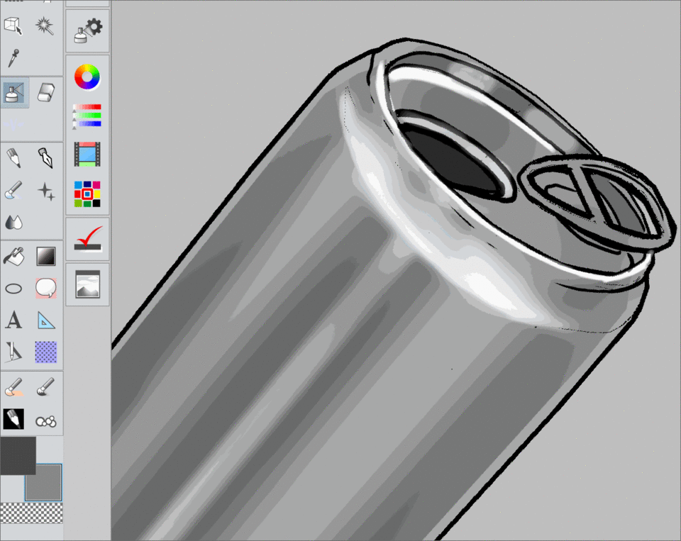
After creating a new file, I drag my can onto my canvas.
Then I change my "paper" layer to a medium grey color. I switch back to the can and begin extracting the lines of the model.
Because I have Clip Studio Paint EX, I was able to use the "extract line" feature in the layer property window. If you only have Pro, however, there are a lot of different ways to get the lines from a model. Tracing it is the most straight forward. If you want something quicker, however, there is an auto action that extracts lines from 3D models pretty nicely.
The action is called "3D in line" and you can download it from Assets at the URL above. The auto action has two actions, an "extract line" option, but also one that works without that feature. Even though I have EX, I sometimes use the action that doesn't need "extract line" because I like the results. I have even combined both the auto action and the regular extract line EX feature to get better lines from the models.
Ok, let's move on to preparing our can!
I edit my can's lines, removing artifacts and odd bits, until I'm happy with it. For this, I simply erase and redraw things with a default pen tool. I alternate "erasing" with white, and redrawing with black.
I then create a new layer, fill it with a darker grey than the background, set it to "darken", and clip it to my filled can layer. Because of how my lines extracted from my model, the can image was flattened. I could have separated the white fill or removed it from the lines, but it wasn't needed this time.
I also darkened the inside of the can opening because almost no light will reach this area.
I created a new layer underneath of my can layer, left the mode on "normal", and painted a cast shadow to show the direction my light would be coming from.
On a new multiply layer, I create the shadows. The can is a cylinder and the reflections follow the shape in straight lines. The shadows bend more toward the top where the can tapers.
To create the straight shadows, I use the polyline marquee tool and select the areas that I want to paint. Once selected, I brush over the selection with a large airbrush.
I soften the edges of the shadows with the blur tool.
Now I paint in the highlights. I hold shift at the bottom of the can, and click near the top before it tapers. I place this band of light inside of the middle band of shadows. I paint around the top edges of the can with a hard brush, and the bottom. I soften the highlights near the tapered edge.
Painting the small details and highlights can be a bit tedious. It's ok to take your time.
Now that I have a better idea of my lighting, I go back to my multiply layer and paint in the darkest edges. Very little light will reach under the rim of the can and underneath of the pop tab.
I keep in mind the direction of light and place my darkest bands of shadow to the left.
I paint in some soft highlights over most of the surface, always following the flow of the object.
At this point I looked up some references of real soda cans, and corrected the lighting on the tapered top edge.
I created more, smaller, bands of light and shadow and the shading for the can is done!
It's very grey though and unless our can really was sitting in a grey box, it would have more color to it.
Just as I've done in my other Clip Tips articles, I create a new layer above my black and white layers and change the mode to "overlay". I clip this layer to the shape of my can, same as the shadows and highlights layers, and lightly airbrush different colors. This time I choose a "ground color" that will reflect off of the bottom of the can, a yellow "sunlight" color that reflects off of the top face of the can, and some purples and blues for the sky that reflect off of the outer and upper edges of the cylinder.
Almost done!
I organize all of my "can" layers, including the hidden 3D model layer, into a folder and name it "soda can".
Next I create a new layer underneath of the folder.
With the rectangular marquee selection tool, I select the top half of the canvas. I lightly airbrush the selection with a 2 colors of blue. This creates a smooth gradient for the sky. I do the same for the ground, inverting my selection, and choosing de-saturated browns.
And with that our "chrome can" painting is done!
The steps for this object were a little different than with the sphere and the bean, but the thought process behind all three are the same.
Painting a Chrome Robot
If you've made it this far, congrats! I'll be doing one more step by step for this article. I know it's been rather lengthy, but there are really so many ways to approach painting metal and I wanted to show a few different techniques. Maybe I should have made it a series and separated out each object into it's own article, I dunno. Feel free to let me know if you prefer a longer read like this, or to have it broken down into parts!
For this last section, I'll be doing a metallic humanoid character. Most of the time, chrome does not have a color, but sometimes, it will have a tint. You can also apply these techniques to ANY reflective metal. It doesn't actually have to be chrome.
For my character, I'll be using a stylized 3D model as a base, and will give it a "gold" surface initially. Later I'll show you how to easily change the colors of the metal.
Above is the specific character model I used, but you can really use any model of your choice, or draw your robot from scratch. I just liked the proportions of this 3D character and felt they would translate nicely into my robot.
To start with, I place my character. I kept a basic standing pose because I wanted to focus on the rendering and design of the character.
As you can see, my character is pretty green. That's because I was not sure if I wanted to paint my robot with crazy rainbow colors, or if I wanted to go with something a little more predictable.
I forgot to take screen shots of how I changed the lighting while I was working on my robot, but I've recreated it below.
If you'd like to apply different lighting to any 3D model all you have to do is select the "operator tool" and open the "tool property" window. At the bottom of the window you'll see a little wrench. Click this to open the setting for the model. This window is called the "sub tool detail" window and most tools in Clip Studio can be edited in this window.
NOTE:
You have to have the 3D model selected, or have the layer that the 3D model is on selected and active.
Once you have "sub tool detail" window open, go to "allocate". From here you'll see a list of things in your scene. This includes the lights, called "parallel light" 1 and 2. By default 2 is turned off.
If you click on the white color swatch, you can change the color to anything you like. From here you can also adjust the intensity via the slider bar. In this example I changed my color to red and left the intensity alone.
The higher the intensity, the "brighter" the light is and the more washed out things look.
I clicked the eyeball to "show" the second parallel light and changed the color to a green and brought the intensity up a bit.
That's how you change the lighting on 3D models!
I realize it's not terribly pertinent to painting chrome but I didn't want to leave any steps that I took while creating my robot out of the tutorial.
In the same "sub tool detail" window you can also go to "preferences" and change other display settings. One other thing I did was that I unchecked the texture option on my model because I didn't want to be distracted by the model's original eye placement.
Now that my reference is lit and I know what I want to create, it's back to drawing our metallic character.
Using the 3D model as a base, I create the line art for my robot. I googled a lot of different robot designs, but I wanted to keep something with an childlike and anime feel so I kept the face stylized with a big head, round cheeks, and drew a small "mouth".
I used my "sketch brush" for the lines.
Using the bucket I fill a layer that I created underneath of my lines to make my "flats" or local colors. I won't be airbrushing in different shades here because I'll be using this layer to create selections from.
The first thing I begin working on is the body, leaving the visor for last.
I use the "auto select", or magic wand tool, and select the color for the body. I create a mask from the selection. This is where I'll be painting for the majority of this section.
I look up plenty of references of gold plated objects, spheres and cylinders mostly since that's what the majority of my character is made up of, and start contouring the shapes.
I try to think about the direction of the light, and this time I take into account changes in hue and saturation.
The tools I use for this are the soft airbrush, my sketch brush, and blur tool.
I pick my colors directly from the color wheel while I am establishing my palette.
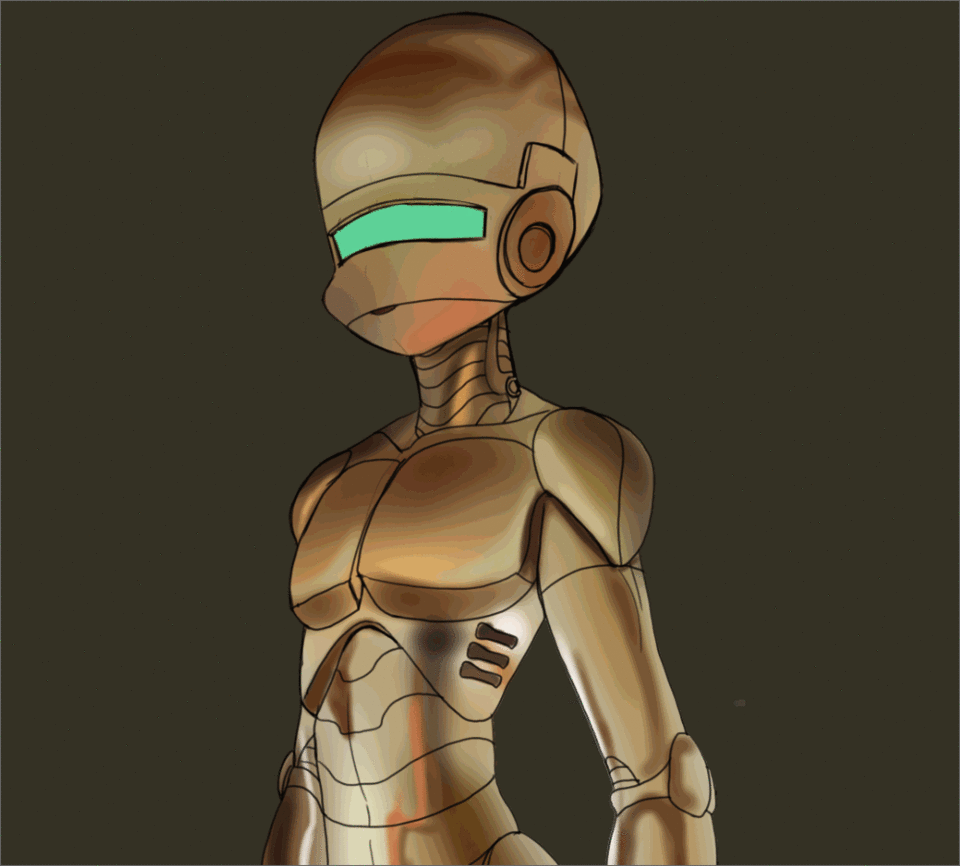
I paint both shadows and highlights simultaneously. Once I have several colors in place I now color pick from the body directly instead of choosing new ones.
I treat each part of the body as its own object. Because the parts are facing different directions, they will reflect different parts of the environment. I also try to pay attention to the crevices and apply the darkest colors in those spaces.
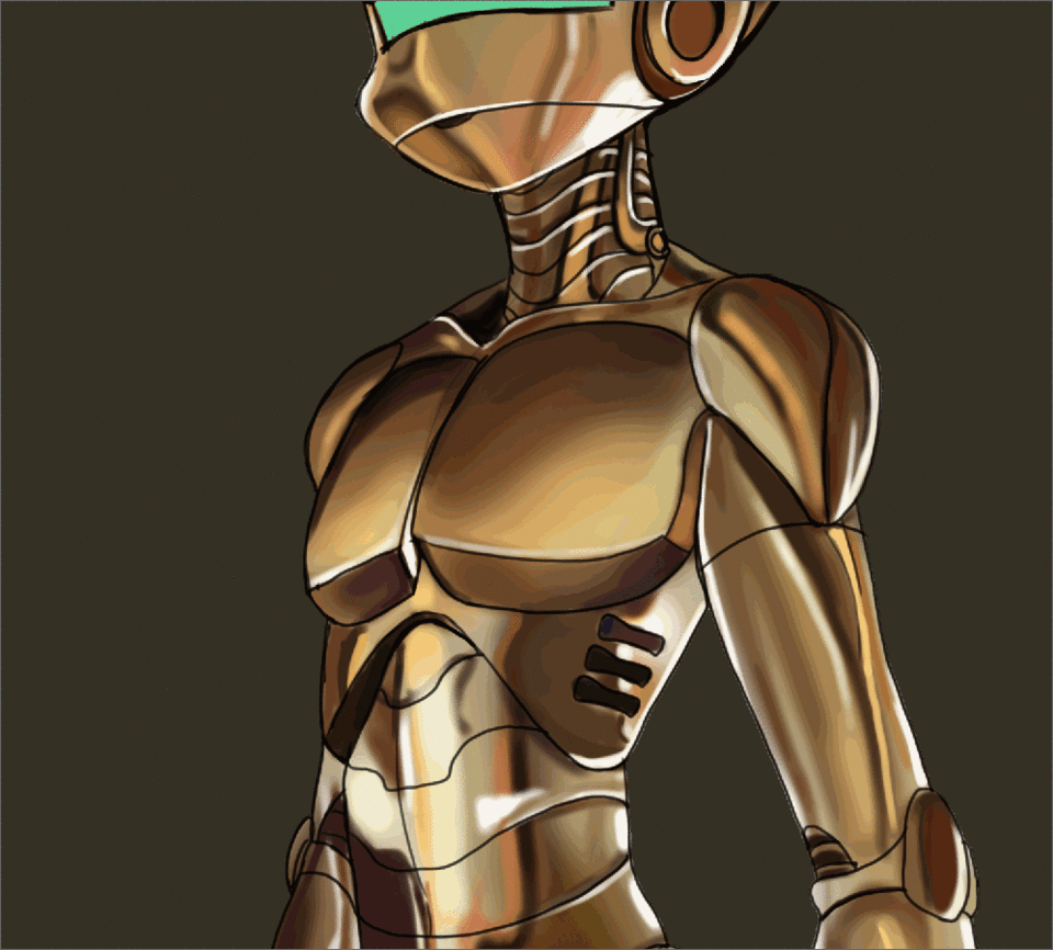
Just like I did with the can, I use the blur tool to soften the transitions between the shadows and highlights. Since everything is painted on one layer this time, it is quicker and I do not have to blur the shadows and light separately. The downside to this is that you can accidentally blur a color that you did not mean to.
I continue rendering until I'm satisfied.
Now that I'm happy with the painting of the metal, I still feel it needs a little more shine.
I create an "Add Glow" layer and mask it to the metal body. I color pick some of the mid, and darker, tones from the body and brush in some very bright, crisp, highlights. I also lightly brush over most of the body with a soft airbrush.
I follow the same steps for the glass visor. I paint the basic shadows and highlights in, then create another add glow layer and punch up the highlights making some of them even brighter.
TIP:
It's good to brighten the highlights last so you don't get overzealous with it as you are initially shading your forms.
With that last detail, my robot is done!
I just spent a few hours painting a very shiny gold robot, but what if I don't want it to be gold anymore? Let's explore how to easily change the color of our metal while still keeping the contrast.
Use Gradient Maps to Alter Colors
I started with a metal that is a relatively common, but let's try something a little more alien.
This final section outlines one of my favorite post processing techniques that I've developed in my own work. I play with different layer modes for various effects, depending on the result I'm looking to achieve.
I "merge visible to a new layer" by right clicking on the topmost layer, and then mask this new layer to the robot's body color again. I do this because I only want to change the metal color and not the visor.
I open the gradient map menu by going to Edit-> Tonal Correction-> Gradient Maps...
I played around with several different gradients that I had previously downloaded from Assets, and eventually decided on a nice purple and blue color change.
I liked the way it contrasted with the green visor, but it was too drastic on it's own.
I changed the layer mode to "Pin Light".
Note that I still have my gold colored robot visible underneath of the purple layer so the result depends on the interaction between these two colors.
I merge everything again by clicking "merge visible to a new layer" again, and then use the hue and saturation sliders to shift everything to a more blue tone. This time I did not mask out the visor so you can see a change has been made to it as well.
Hue and Saturation can be found in the tabs under Edit-> Tonal Correction-> Hue/Saturation/Luminosity...
I also use color balance to slightly increase the red shadows.
Color Balance can be found in the tabs under Edit-> Tonal Correction-> Color Balance..
With that, the color change is done!
You can use gradients, along with merged copies, and layer modes to create all kinds of cool effects! (my favorite is changing the time of day)
Closing Thoughts
Painting chrome and other reflective metals can be pretty complicated. I did my best to keep everything nice and concise, but I feel like I may have rambled a bit. Still, I hope that you are able to apply some of the techniques I cover to your own work, or that it has helped you to think about the materials and textures you are painting more actively.
If you would like to show me your work, feel free to tag me on social media, or message me on any of the websites I'm a member of. I'd love to see your shiny metal paintings!
If you still struggle at all with painting chrome I highly recommend checking out the works of Boris Vallejo and Julie Bell, or of Hajime Sorayama. They are the masters and there is a lot to learn by studying the way they paint chrome on characters and creatures!
About the author
My name is FalyneVarger. I have been drawing for most of my life. I started working commercially about 10 years ago and have created artwork for books, games, comics, and more non-commercial commissions than I can remember.
I'm @falynevarger in most places, but you can find me online at any of the links below!
Users who liked this post


Comment