

Starting your own webcomic is now more attractive than ever thanks to the popularity of pages like webtoon, that's why many of us go headlong into our first project, which leads to very long periods of time for very poor results that will leave you a little sad .
But do not worry! In this post I will teach you everything I have learned in my process creating comics so that you survive your first comic.
Or if you prefer, you can see this post in video format here;
(If eng subs are not yet avaliable, please wait a couple hours/days)
1.-Return your photos backgrounds
If I have learned something in my process, it is that the funds will take the most of your time. But did you know that there are ways to cheat?
No one has time to spend 4 hours painting the background of a panel that your readers will likely see for just a second, so don't feel bad about using that trick. Of course, very important! Remember to only use photos of yourself or to which you have rights and avoid google photos as much as possible or you may get in trouble with copyright.
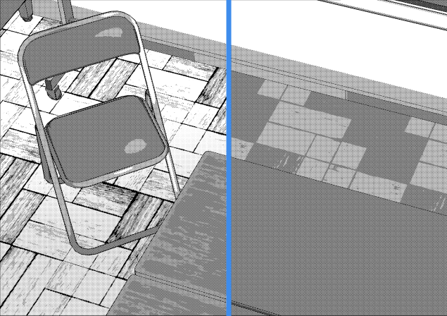
We are going to return this image to a single line that we can also color later if our comic is not in black and white. I have two ways to do it, the first is for Clip Studio EX only, but the other is the version for PRO users.
For EX users:
This process is the easiest. Below the color wheel and the browser is "Layer property" in the EX version, the symbol of two circles is added, if you click it, the lines are automatically transformed. You only need a couple of clicks, move a few bars and you can create a fantastic result like the one below in png, which will allow you to continue working on the image with transparency.
For PRO users:
Unfortunately, for us this is going to take a little more work and we will have to work a little more, but even so, I am sure it will speed up your work process.
IMPORTANT: Before starting duplicate the image you are going to work with.
To create the lines I go to: filter> effect> pictorize
Once there, use the "line" mode. You can change the parameters as much as your image needs, the only important thing is that the opacity of the line should be 100 and that everything under Line Smoothing will do nothing.
This gave me a result like this:
Since there was too much information at the top, I went back to the initial image that we duplicated earlier. This time, before applying the effect, I was going to blur the image, that happens, I went to Filter> Blur> Gaussian Blur.
Raise the blur carefully until the lines are no longer sharp but are still visible, and then repeat the filter> effect> painterly process above. It will take longer to start drawing lines, but the result is much cleaner, as you will see below:
Color images
For photos to be converted into color drawings, the process is similar. For this image, we will also duplicate the photo layer.
In the first one, we will go to effect> pictorize and and use only the "color" mode.
In the second, we will apply blur> Gaussian blur and then effect> painterly in "color and line".
Choose the parts of both that you like the most and put them together like a puzzle. Once that's done, go to selection> select color gamut and pick the shadow colors. In a new tab in multiply, paste a blue, lilac or pink almost white color. I used roses. Repeat this process as many times as necessary.
Then I added three color gradients, one from the sky and the other from the ground. And an internal one that separates the plane of the cars with that of the buildings. I replaced the sky with a drawn one and ta-dah, the result would be something like this.
Use 3D for repeated scenarios
Clip Studio It offers 3D scenarios, to download them, you can download them simply by dragging the one you like the most to your canvas and waiting a few seconds. Very convenient, right?
In case you want to start one from scratch or add new objects to an existing one, the process is the same. Drag the objects from the 3D folder onto your canvas and arrange them to your liking. You can rotate, move, and resize them. In case you need more, you can easily download them in Clip Studio Assets.
Once you have everything placed, click on Edit> Register Material> Template. Give it a name, choose where to save it, and voila!
3D to save your life
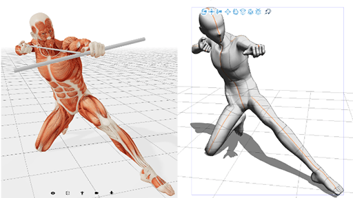
3d is very useful when you have to draw a character in a position that you do not quite understand or from a very difficult perspective. I also use 3D when I have to draw a lot of extras in very small sizes.
It is very fast, but remember to use it as an aid and not as a replacement or you will never improve your skills in drawing anatomy.
You can also use it for objects that are repeated many times. For example, I drew a chapter with many ships, so in order not to die trying, I downloaded ship models to put in my backgrounds:
Color samples
This is super simple to do, but trust me this will speed up your coloring. Possibly in the same tab where the color wheel is located are the color samples. They are a lot of squares with a lot of colors.
Click on the wrench and select "Add new settings" put the name of your project to recognize it easily and register your colors. The order to do it is: click in the space> select the color> add color (a drop with a +).
Not overflowing (not going out)
Painting and not going out of your lines sounds like a dream, but believe me it can be done.
First, select the layer with your lineart, it must be all in it. Then select this icon (if you don't have it, update your clipstudio):
Now create a new layer. That is where we will apply the color.
Choose your preferred brush and copy the specs from the image below, and voila! If you don't believe me, try it, it will save you hours of work.
Layer effects for shadows / highlights
Using the color swatches you've chosen above is very helpful, but there are times when the backlight is completely different and the colors are very out of place. Don't worry and leave the same colors.
In a new layer and with a clipping mask over our colors we will use a multiplication layer with the main color of the background turned to white (it goes up in the color square). If the multiplication is still too strong, lower the opacity.
In the video I show how I create a scene under the sea with a multiplying blue and a yellow in vivid light to create the lights. If any of the colors you have chosen doesn't convince you, you don't have to start over, don't worry! Use ctrl + u on your keyboard and modify the colors until you like them.
Super fast and easy.
If your computer allows it, upload to a minimum of 350px
Pixels are very important in creating a webcomic. The format is too long at the bottom, but not that wide. Therefore, many times when we zoom, it is impossible to draw small details without being attacked by a lot of pixels.
The more pixels we add to our image, the more we will prevent our panels from ending up as the first and will give us much more freedom to work on our project.
Line-art in vector layer
This is as simple as it sounds. The next time you do your lineart, you may want to do it on a vector layer. This allows it to be edited very easily by dotted lines, change the thickness to a thinner / thicker one if you need it and above all, suffer less in case you increase or decrease the size of your image.
Plan and cut your comics
Some of the things I will mention below are for Clip Studio EX only, but I have also attached some free resources that may help.
(EX) Next time you start a new chapter, choose comic> webtoon 3 and set the number of pages to over 20. Don't worry if there are too many or not enough, you can change it later. This will give you some columns, if you don't like them, you can change them in View> Fit to screen and it will appear like a webcomic reading.
These divisions allow you to load 3Ds and other materials without fear of the computer crashing due to too much weight. I don't know if their purpose is another, but they seem like an advantage to me for that. To select one and start working, double click.
Selecting the Area displayed on the screen (webtoon), an area will be created in which to see what a reader would see when scrolling from top to bottom through our comic, this can help us to set the spacing of our panels and the size of the panels displacement.
It's easy to control once you understand details such as that in a square there should be a maximum of 2 panels and that a scroll panel is at least one and a half.
It is a bit complicated to explain it in text, so I recommend you watch it in the video for more graphic examples.
Once you finish your chapter, if you have used the details above, you can easily export it by clicking on file> export webtoon and copying the specifications below:
If you haven't followed the steps above or you don't have EX, don't worry! There is a solution for you too.
Below is the link to Croppy, a page that cuts your chapters for you. You just have to choose if you want to upload to covers, to webtoon, or both, choose a png or psd file and that's it!
A .zip file will download, unzip it and you will have a folder with images ready to upload. If you don't have an unzipping program, you can download winrar from the internet.
Use Assets more than the library
This may be the most obvious point, but it is no less important.
I can't count the number of times I've needed something strangely specific and found it in assets. Many times our projects need many details that we simply cannot draw due to lack of time or that we do not know we need.
Check back often, but remember: be smart about your downloads. You do not need 200 brushes, and downloading so much will not only slow down your pc, but also your work process by having to search through a lot of materials that you do not need.
And that's it, I hope it has been useful to you!
Users who liked this post




Comment