
INTODUCTION
Cuckoo ! I'm purple stary / Pink uyu, webtoon artist for a few years. And here, with this tutorial, I will explain to you how it is possible to use the new clip studio filters. But first of all, what is a filter?
Quite simply, it’s a feature that allows you to modify an image to give it a specific style.
You certainly read the title so XD, spoiler alert, I'm going to talk about chromatic aberration (my favorite lmao), noise, Argentinian photo and pencil drawing. Okay, let's go, even if many are already no longer at the intro lol.
I. CHROMATIC ABERRATION
has. It's what ?
So this thing is an effect that accentuates the unwanted colored fringing that we often see in photography, a bit like a color distortion. You know, those kinds of red and blue colors that don't look on the right axis. And that’s it. There are two types: linear and radial
b. Exemple
The most interesting part: practice xD. But first, to access this filter, you must click on the filter menu (effect (chromatic aberration.
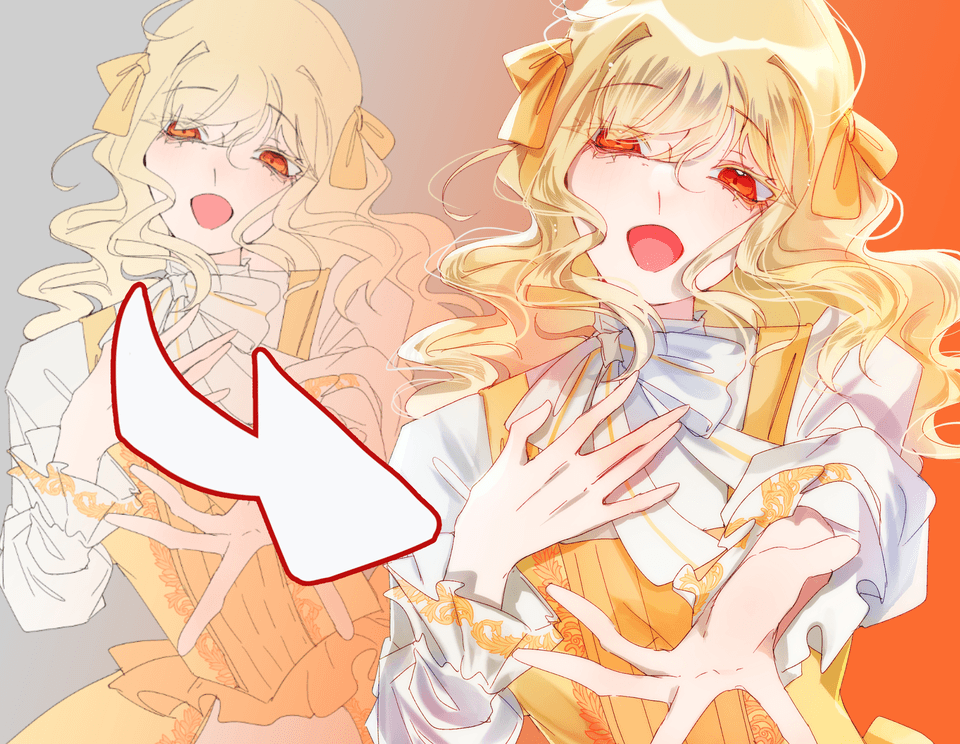
— Give some pep to your webtoon box
Do you see these beautiful webtoon boxes in hero mode saying something interesting/really striking? You know those boxes where all the brush budget goes? XD well this filter can help you give them even more shine, without overdoing it.
1. Duplicate the character layer, hide it and merge the duplication.
If you ever want to modify something even after adding the effect, this allows you to do so since the original is intact
2. Activate chromatic aberration (filter -> effect -> chromatic aberration) you never know, I'll put it back just in case
3. Adjust just right.
Well yes, you need precision. This is precisely what allows us to see the effects. First we will set the type to linear. Then Angel level we leave 90 and intensity you will set it between 4 and 8 (that's my way of doing it eh everyone dose as they feel. Personally, I'm at 5) . And there you have it, you have this little effect, a little blurry, a little colorful.
—Give a psychological atmosphere
So here it is a question of showing that our character is undergoing a mental shock or an internal crisis, in short, something really violent.
1. Have line art and a single color:
Basically just put a single color on the layer.
2. Duplicate the character layer, hide it and merge the duplication.
If you ever want to modify something even after adding the effect, this allows you to do so since the original is intact
3. Activate chromatic aberration (filter -> effect -> chromatic aberration) you never know, I'll put it back just in case.
4. Adjust just right.
So once again, linear at 90 haha. But for intensity, we are at 50 – 100 depending on the intensity.
II. NOISE [Filter]
has. It's what ?
Here, the filter adds an effect that looks old camera. Like with little dots everywhere. It is possible to adjust the color of these tasks or leave them monochrome, it's very nice.
b. Exemple
So here, we are going to use noise to give different renderings to the box, depending on what we want to express.
— Give an interesting effect to your webtoon boxes:
I know it's not very explicit lmao. But what I mean is to give this effect where it looks a bit like the drawing is done on a canvas or with gouache. Even if, normally, we start with an effect more like an old XD cathode ray tube television with this effect but trust the process!
1. Duplicate the character layer, hide it and merge the duplication.
If you ever want to modify something even after adding the effect, this allows you to do so since the original is intact.
2. Activate noise (filter -> effect -> noise) you never know, I'll put it back just in case.
3. Adjust just right.
The interesting part. Here, it is a question of adjusting the intensity so as not to overdo it but so that it is still visible. So I leave it in “color” and I adjust the intensity between 8 and 15 because it depends a lot on the light of the lines and the atmosphere.
c. Bonus Tips
You can also get a good result by:
— Creating a white colored layer on top of everything else
— Set the intensity to 100 and the mode to color
— Put the layer in overlay and player mode with opacity.
This allows you to process an entire section of your webtoon without repeating the action each time.
III. ANALOG PHOTOGRAPHY
has. It's what ?
So this filter is a lot of filters at the same time Xd. Just look at the interface to understand. Or rather, not understanding anything lol. It adds color but not only that. It also removes noise and chromatic aberration.
I see you coming, no that does not make the other two filters obsolete, because this one above all allows you to avoid overlapping the filters. Instead of, for example, doing a chromatic aberration then adding noise before putting a brown tint for a sepia effect, everything is in one easily adjustable filter.
b. Exemple
This part is going to be complicated because there are a lot of ways to do what I'm going to illustrate using this filter, so it's going to be compact.
— Give a souvenir effect to your webtoon box
So the memories in a webtoon are often in sepia and noise. But with this filter, you can really do whatever you want. From a cool bluish tint to warm sepia XD so here are examples, you just need to change the mode.
1. Duplicate the character layer, hide it and merge the duplication.
If you ever want to modify something even after adding the effect, this allows you to do so since the original is intact
2. Activate the Argentinian photo (filter -> effect -> Argentinian photo) you never know, I'll put it back just in case.
3. Adjust just right.
So, the settings are clearly self-service, but however, you must avoid falling into the interval given above (8-10 in noise level intensity). Otherwise, it's free style. I'll give you the combinations for the images below, that said.
Here is what the given options do:
The presets: these are configurations already made to give a vintage, modern or warm effect
The effects: it's a bit like extra coloring. Even if this is not the case, I invite you to test them for yourself
Intensities: to manage the intensity of chromatic aberration
Noise intensities: to adjust the noise, you know the
Basically, have fun even if I personally have a big preference for sepia.
IV. PENCIL DRAWING
has. It's what ?
This filter, as its name suggests, gives the drawing a pencil style. It can also be used to illustrate memories, but this functionality seems ideal to me for illustrations.
b. Exemple
We're going to get straight to the point, so here I'm going to present the features and their effects to you, it will be up to you to judge which works best with the desired effect!
— An illustration in paint mode
Here, we want to give this pencil drawing effect, so once again, it's really freestyle. I'm going to post different settings again but it's cool to play with.
1. Duplicate the character layer, hide it and merge the duplication.
If you ever want to modify something even after adding the effect, this allows you to do so since the original is intact
2. Activate pencil drawing (filter -> effect -> Pencil drawing) you never know, I'll put it back just in case.
3. Adjust just right.
So we have several options in the bar:
Show outline: The illustration now looks like a simple pencil drawing because the colors are removed.
Show hatching: here, the lines are put in hatching form and especially the colors
3 and 4 Hatch Sizes and Hatch Hardness: As the name suggests, this focuses on the size and hardness of the hatches. This one being much more interesting with examples.
Hatch Angles: This is the direction you want to orient the hatches.
Grayscale outputs: allows you to render your artwork in black and white.
CONCLUSION
So we are at the end of this tutorial, don't hesitate to leave me a comment if you have any questions! Thank you for follwing me !
Users who liked this post


Comment