
1. Introduction
Hi everyone, it’s me, Yunika. Today, I will show you my process of creating a character from the brainstorming stage, to develop initial concept, and paint a full illustration for your character. Along the way, I will show you some helpful tricks and tips in Clip Studio Paint to help speed up your process. I also included the materials I used at the end of this article.
Let’s get started.
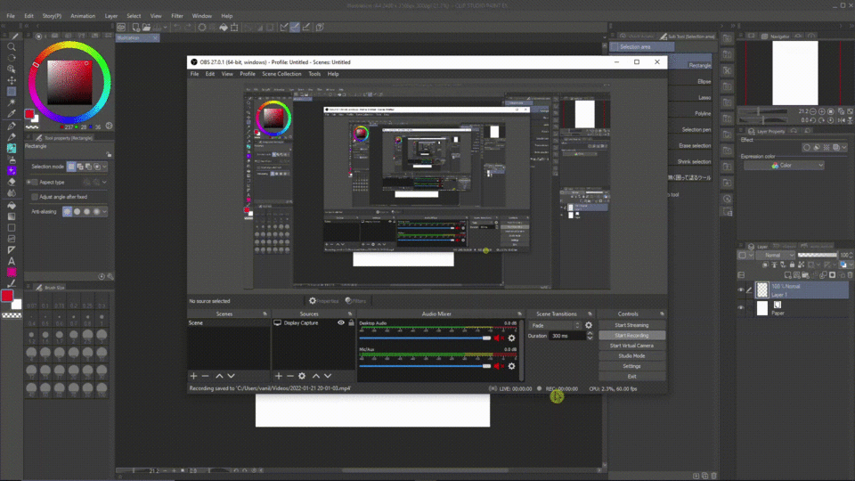
2. TIPS Video
Below is the explanation video if you prefer watching over reading.
3. The Brainstorming Stage
Before starting to open the program and dive into drawing, you have to think of the general idea of what characters you want to do first. In this case, I want to create a combat character.
There are 3 steps I followed:
| Step 1: Story/World that the character lives in
For concept art, the important thing is to know the setting of your character. Ask yourself: when does the story take place? Where? Relation of the character with the story. It doesn’t matter if your story is fictional or not, but you have to get a general idea of what direction you want to go. You don’t have to think of a whole story, just a general idea is good.
For example, my story takes place in a futuristic setting, in a war zone between 3 kingdoms. In there, humans have developed high technology mechanics and robots that can understand and interact with humans.
|Step 2: The direction of your design
After you have a general idea of the world that your character lives in, you can start thinking about the design.
Ask yourself: What kind of costume does your character wear? Do you want it to be based on some culture? Or historic clothes? Or just some costume that you like in general?
This stage is when you start to do research. If you choose a culture to base the design on, you need to research to understand their costumes, what is appropriate to change, and what is not.
For example, my story is in the future, an alternate universe, so I don’t really base the costume on any culture. But it is still helpful for me to explore the different type of clothes that works in battle.
I recommend you to use Pinterest to gather a board of reference that you want to use.
|Step 3: Character Appearance
What do you want your character to look like? Think about the shape. In design, shape is an important element in design that can convey a lot of information about your character.
Alright, so this is the first stage. During the exploring process, you can drop down notes about your character on the sketchbook. Now you get the general idea of what you want your character to be and look like, let’s move on to the next stage!
4. Explore different designs
In this stage, you can do it either in your sketchbook or straight digital. I prefer digital because I can edit things quickly.
Open a new file in Clip Studio Paint. I usually use the default A4 or A5 paper size, 300 dpi. Portrait or landscape both works.
First tips: start with BIG shapes! At this stage, what matters is the readability of your design, not the small little details.
It is helpful to pull up your Sub View and open the mood board (reference board) that you saved.
1. Make sure [Sub View] is enabled.
2. Drag the [Sub View] out and enlarge it → then open your reference image.
Now, you can explore different designs for your character. Since I want my character to be a robot with an appearance similar to a human. I’m going to let some parts be artificial and some parts will look like human. A combat robot doesn’t need to wear long and saggy clothes because they would get in the way when moving around.
Here are several designs that I came up with:
Right now, it is a good idea to test the visual clarity of your character. You can do this by making a selection and filling in the character with black. Now you can see the silhouettes of your designs.
After filling in the silhouettes, you will immediately recognize which design is better. A better design has a clear silhouette. If you can tell what’s going on about the character with just the silhouette, then your design is good.
5. Character Reference Sheet
After going through the designs, I choose this one to be the design of my combat robot:
Now, I’m going to explore the backside, as well as props that she carries. In here, you can see that I make notes directly on the canvas to describe the function and information about each part so that later I can refer back to this design and understand what’s going on. You don’t have to do this step. I just personally find it helpful!
Finally, I’m going to make a character reference sheet. Which includes the concept design of my character with basic color ideas. At this stage, it is helpful to create a separate file or folder to store your lineart and coloring.
Now, I’m going to export this image to use as a reference during illustration.
Go to [File] → Export (Single Layer) → .png (PNG)… → choose your saving location → I’ll just use the default export option, make sure to choose "RGB color" mode and "For illustration" option.
6. From Concept to Illustration
Alright, now I had the designs and basic ideas about my characters, I’m going to make an illustration of her. Why? It is a good idea to illustrate your character after you finish with the concept to test how everything looks together. Sometimes, the design looks great, but the setting of your story does not work well with the design, then you’ll have to redesign and come up with something else.
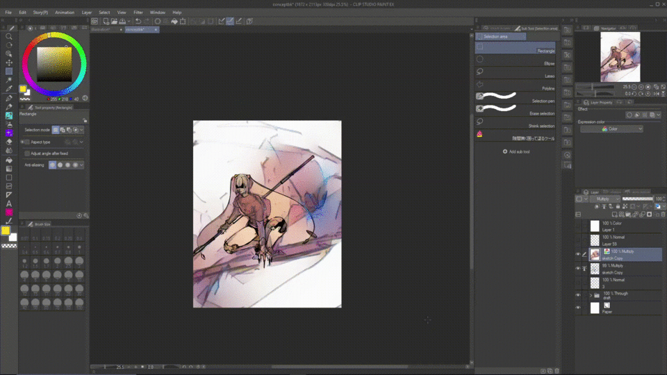
| A. Sketch
As I told previously, my story setting is in a war zone in a futuristic alternate universe. So here, I’m trying to show a ruined background, and my character’s role in that background.
Below is the initial sketch. I used the default Design Pencil and Darker Pencil for the sketch.
For character pose, if you have a hard time visualizing anatomy, I recommend using Clip Studio Paint 3D Models.
1. Make sure to turn on the [Material] palette: Windows → Material → choose “Material (Pose)” (or click on any material on the list would work).
2. Click on the dropdown menu for [3D] → [Pose] → click and drag the pose into the screen. After this, you can modify the pose to your liking.
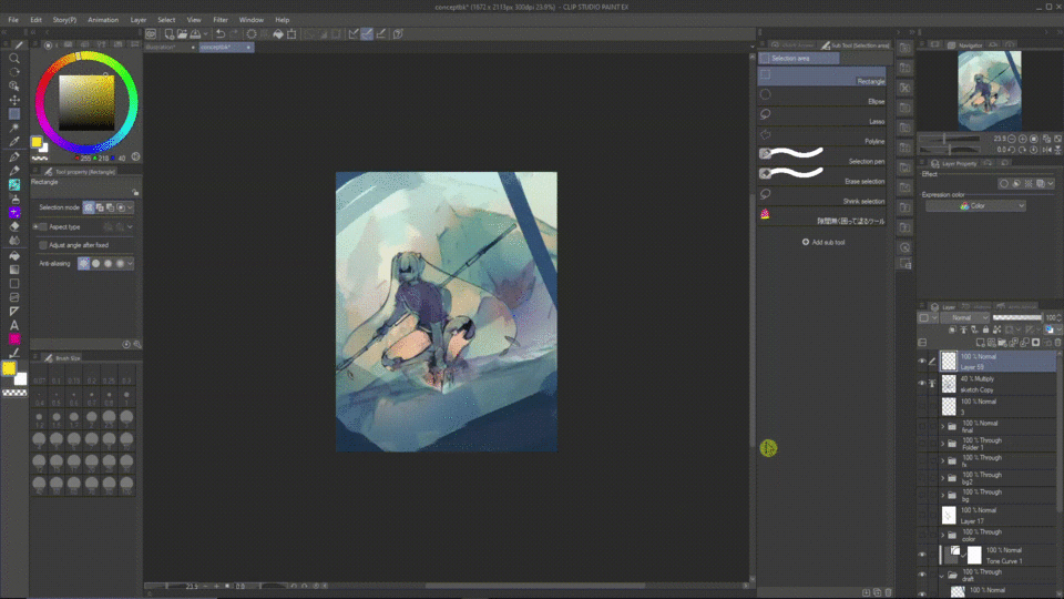
| B. Color Draft
I already had a color in mind for this illustration, but this time, I will show you a trick that I often use when I couldn’t come up with color (or having a hard time picking color):
1. Merge your sketch into 1 layer → Set it as a reference layer.
2. Choose [Edit] → [Colorize] → Colorize all. What it does is that AI will automatically pick a color for your piece and shade it.
Of course, sometimes you will not like the color, but it’s ok. Here’s the cool part:
Choose [Layer] → [New correction layer] → Gradient Map. Gradient map helps change the tonal range of your image according to the gradient fill range. Play around with the gradient that you like! I included some gradient sets in Clip Studio ASSETS that I used at the end of this article.
Optional: you can change the blending mode of the correction layer for different results. I usually go with “Soft Light" or "Overlay”.
Optional: Create a new Layer with “Color” blending mode. Use a soft brush (Airbrush) to pick the color you want and paint on the part of the piece to adjust the color.
| C. Composition Notes
Right now, I feel that my composition is a little weak. There are too many open spaces in my drawing. So, I decided to “frame” my drawing.
Here, I add the ruined fences with darker values to contrast with my character and the background.
Adding the fences also help with the flow of my work. I also use the rule of thirds to decide the placement of my character in the scene. You can see that all the arrows lead to my character as a focal point.
It is a good idea to constantly check the thumbnail of your artwork via the [Navigator] palette. If you can tell what’s going on through that small thumbnail, then your art is going in the right direction. If you can’t tell what’s happening, then you probably add too many details and distractions, you need to rework that!
Make sure you displayed the Navigator by going to [Windows] → place a checkmark next to [Navigator].
Another tip: Values are important when doing composition. Create a new layer above all layers by: choose [Layer] → New Layer → Fill… → then choose white color, and press “OK” → set the blending mode of the layer to “Color”.
By doing this, you can always toggle the visibility of that layer on or off to check the values of your artwork as you paint.
| D. Render
After drafting my color, I don’t often turn off the visibility of the draft and color the piece again, but instead, I paint directly on top of it. This is just my preference, however.
1. I merge the drawing into 1 layer and set it on top of the draft. You can do this by: Right-click on a layer → choose “Merge visible to new layer”.
2. Create another folder on top → starts rendering the character.
Some TIPS:
When render, you have to define the light source first in order to shade! Try to break your complex image into simple forms such as cubes, spheres, and cylinders. After that, use your knowledge of how to shade those and apply them to your work.
Also, the shadow is rarely/never black. Keep in mind the ambient color from the surroundings and apply it to your shadow. It will help make your drawing looks better!
For light, I usually use the “Soft Light/Hard Light/Overlay” blending mode to add light.
For shadow, use “Multiply” blending mode. You don’t have to use this all the time, I just find it convenient.
Remember to set the blending mode of your FOLDER to “Through”. Otherwise, these blending modes won’t take effect on layers outside of the folders.
For background, remember to put the layers/folders for background under your character render’s folders.
I like to use rough dry brushes and brush with a lot of texture for the background to mimic the textures of real-life environments. I included all the brushes for painting at the end of this article. Below are some of the brushes:
| E. The Powerful Lasso Tool
For painting without lineart, the lasso tool is the most powerful tool for me.
After I finished rendering the character, I will:
1. First, press [Ctrl] (or Command if you use Mac), then click on the folder. The program will automatically make a selection around the character for you.
2. Then use the lasso tool → hold down [Shift] while selecting, it will add the new selection to your selection. Hold down [Alt], and it will remove the selected part from your selection.
3. Now I can paint and make adjustments to my character without fear of it getting to the other areas.
4. Optional: I want to save this selection so that I reselect it again in the future without the trouble of doing everything again. So, with your selection active → go to [Select] → “Convert to selection layer” → the selection will fill with green, but don’t worry, you can turn off the visibility of the layer.
Next time, if you want to reselect, simply “Right-click” on the selection layer → choose [Selection from layer] → choose [Create selection].
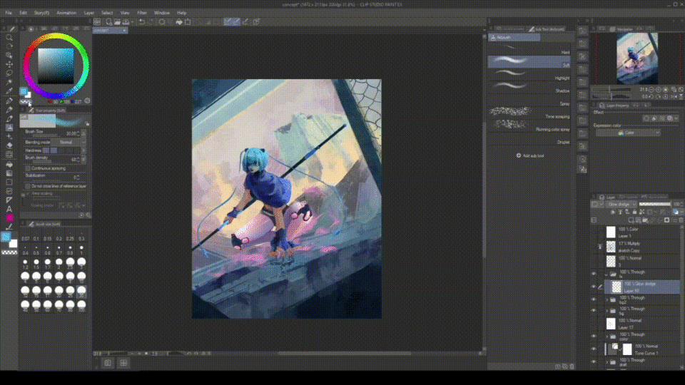
| F. Final Step: Color Adjustment
Here, my image is a little dull. I want to highlight a certain part of the image to make it brighter or more saturated to capture attention.
1. Create a new folder. Name it “Color adjustment” → Set the folder blending mode to “Through”.
2. Add a new layer → Set blending mode to “Glow Dodge” → then use the Air Brush to pick the color you want and brighten the area of your image.
3. I also use “Overlay” to increase the saturation of the dull parts of my image.
Utilize Correction Layer to make color adjustments. There are 2 ways you can do this:
1. Go to [Layer] → “New Correction Layer” → pick the type you want.
OR:
2. Right-click on the topmost layer/folder → choose "New Correction Layer" → choose the type you want.
Here, I used “Color Balance” to push my image to Cyan, Blue, and Magenta color range. What Color Balance does is it helps change the overall mixture of colors of your image.
I also use a glow dust brush to add dust particles to my drawing. I included the link to the brush at the end.
Add texture to the final image: I like to add a grains texture to my finish art. Just my personal preference.
1. Create a new layer → then go to [Filter] → choose [Render] → choose “Perlin noise…” → Decrease the “Scale” value to 1 → press “OK”.
2. Change the blending mode to “Soft Light” or “Overlay” and change the opacity of your layer to your personal taste!
| G. Completed Artwork
Tada! Below is my completed illustration:
7. Final Words
Alright, that is my completed process of creating my character from start to finish. Thank you for coming along and reading until the end! I hope that my tutorial can help you learn something new. Until next time, have a great day!
Also, here is a bonus process GIF:

8. Brushes and other Clip Studio ASSETS
Below are the brushes as well as materials I used for this painting:
Sketch brushes: Default Design Pencil & Darker Pencil.
Line art brush: Ball Pen 2 (ざらだまペン2)
Painting brush (for coloring when I did the character reference sheet):
Major painting brush sets:
1. First set
2. Second set: This set is Marc Brunet’s brush pack. It’s not in CSP Assets. When you download, the file is in .abr format. But thankfully, Clip Studio can read .abr. You can just drag the file directly into the brush sub tool and the program will import it for you!
Dust Brush:
Gradient Maps (some sets I recommend):
Users who liked this post


Comment