
introduction
Splash Arts are known from games like League of Legends and other similar ones
Computer games. But how is it actually possible to produce an image in this style? I will answer this question in this tutorial.
I'm not a professional splash artist, but I'm very interested in the subject
and am doing this tutorial as part of a Matura thesis. I work with an iPad, an Apple Pencil and the Procreate app. I'll explain a lot about the general process of creating splash art, so don't worry if you use another program. But I will also mention a few Procreate settings that make my work a lot easier and that I work with regularly.
If you are a complete beginner with Procreate, I'll link a tutorial for you here. A basic knowledge should already exist before you start with this tutorial.
In the graphic below I have illustrated how the tutorial is structured and what you will learn in each step. I accompany you from the idea of your character to the final product.
1. Character & Prep
The very first step is to get to know his character. What and who am I actually going to draw here?
Splash Arts are images in which the respective characters are staged
and in which their story is told. A good splash art reveals details that say a lot about the character.
Try to write down keywords that are somehow related to the character. Does he have a backstory? Then elements from this are perfect. Imagine scenes that make your character come alive and that are unique to them.
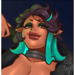
I show it here using my own character as an example. This is the character design of Delia, she is a soul catcher on behalf of the Greek goddess Hekate.
Since she is a soul catcher, I want to portray her in a scene where she captures a soul or takes a captured soul to the River Styx where the ferryman Charon then takes her. I can also include attributes of the goddess Hekate.
If you have suitable ideas and scenarios, you can start with the sketches!
2. Sketches
Now you can start to give form to your collected ideas. I recommend making at least three different sketches. Whether you present a scene three times or three different ones is not so important. Try playing with different perspectives and compositions so you have a better choice of concepts later.
I first sketch with a hard brush and then roughly shade the light on a layer below. I recommend installing at least two light sources when sketching.
The size of the canvas is 3840 x 2190 pixels. This is the same format that most splash art is in, but at a lower resolution. This is simply because Procreate can't perform as well on the iPad as Photoshop can on a computer, but I find the size to be sufficient for drawing.
My goal here is to determine the composition and light sources for each image so I can get a good idea of what the sketches might look like when finished. For the composition, I used a grid of thirds to put important things on the intersections.
I finally settled on scene C, where Delia takes a soul to the river and Charon can be seen in the background. It is night and full moon, as this is also often associated with Hekate.
3. Color scheme
Once you have decided on a sketch, the question arises as to how the colors in the picture should behave. You try out which colors could work well together in the picture and then decide on the most appealing one. Just like with the sketches, it helps to try different options, because the first one isn't necessarily the best.
But what are the possibilities?
Here I have created a complementary contrast with orange and blue in A, a quality contrast with a strong and a weak blue in B and a warm-cold contrast with blue and red in C.
I colored the sketches with a Color Dodge filter on a new layer. In Procreate you can also change color, brightness and contrast under Adjustments. There is also a feature that Procreate uses to display the complementary colors on the color wheel.
Even if the colors in the end product do not have to look exactly like this, this step helps to have an overview of what contrasts and coloring you want in the picture. Here, too, I recommend making at least three colorings and only then deciding what you want to continue working with.
4. References
Splash Arts have a realistic style and therefore require a lot of detail work. Working with many references is therefore very worthwhile. Look at all the elements you have in the picture and look for suitable reference pictures. Sometimes references from other splash arts are also very helpful as they can show you how other artists have done things in this style.
I always have my references on the phone next door so I can quickly switch from one reference to another and it doesn't bother me on my workspace. However, it is also a good idea to use Procreate's reference function itself.
For example, I used Yone-Splash Art as a reference for the sky here.
I also use a precise reference for the pose of the body and the proportions. Because you can't easily find such exact poses on the internet, you have to recreate them yourself. You can either take a photo of someone recreating the pose, or use an app that can be used to do this. I use the free MagicPoser app.
The app is very simple and costs nothing. You can even set a light source and use male and female models.
5. Technology and Tools
Finally, I explain my technique, how I process the splash art to get a style similar to the original images and the tools I use to do so.
Brushes - I use soft airbrushes, hard airbrushes, and a thin, weak brush. The airbrushes are already included in Procreate and the other brushes I use are customized. Basically, I only work with different airbrushes!
Layers - I paint the base shape of all things that have their own color (e.g. hair, skin, pants etc.) on their own layer and then on a clipping mask layer paint the shading. If you want to slightly change the color of the shading, you can use the Alpha Curls layer and paint over it with an airbrush.
Groups - I combine all levels that belong to one thing (e.g. all levels that form the woman or all that form the tree) into a group. So I can move or hide the whole group. Another important tool is Liquify, which can be found under Adjustments. With this tool you can change the shape of things and "fix" them.
Sharpness - The Motion Blur and Gaussian Blur tools can also be used partially by applying them with a brush. Things in motion can be blurred and things further ahead or behind can be blurred.
Filter - For bright stuff and glitter I use the Add filter, to darken the Multiply filter and to make colors more saturated I use the Color-Dodge filter. Everything else is unfiltered for me.
Light - This isn't a Procreate tool, but it's important nonetheless. Try to include at least three light sources to give the picture more depth. Even just a slight shimmer from the side can look very good.
Finally, I show a video of how I proceeded with the rough concept and then videos in which I add details to individual elements.
If it doesn't look good at first, that's okay. The detailed work takes a lot of time and work. I just couldn't get some things the way I wanted to. Have fun trying!
Users who liked this post


Comment