
Hello!
In this TIPS i will show you many fun ways you can make your lineart more interesting and more appearling to both you and your audience. The whole idea is that you feel comfortable with it, as lineart is often seen as a chore.
We will see and examine:
・Line Confidence - Are you confident about doing lines with a single stroke? This will help prevent trembling and messy lineart.
・Line Thickness/Weight - The more the better, you can add weight to objects with simple lineart tricks.
・Messy Confidence - Messy doesn't mean ugly, in fact it can make your art look interesting if used correctly!.
・Effects - Using effects such as Blur can enhance the way you see the lineart and make the whole piece pop up a lot more.
・Line Shading - Adding Shading to your lines as shadows can also create a really cool result.
・Brush Experiment - A texture brush can make your whole piece look exciting, and create a different visual interest.
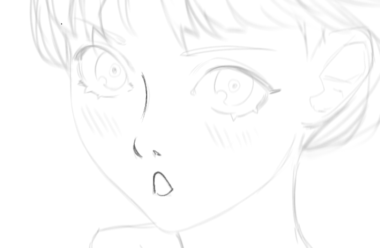
Example sketch:
1. Line Confidence
Let's start with the basics, you've probably seen this many times. But we are going to practice by drawing circles. The idea is that you try to do circles, even if they are not good, in a single stroke, not multiple strokes because that would make it look different. The purpose of this phase is that you feel confident enough to do few lines. This also applies to traditional art, but sadly you cannot press control + Z to erase an error (haha).
・A great way to do it, is simply by going faster when doing lines. Slow lines also make your work look more "shaky", and we don't want that for this part.
・Using your elbow to control the movement instead of your wrist also helps greatly for this kind of task.
Example:
(Left is using a single stroke - Right is using multiple strokes)

Here's another example done when doing lineart on a piece. You have to do it fast and in short strokes for small details, but you can also do bigger lines.
You can always choose to use Stabilization at a high number (50 or 25 is a good start), so long strokes are easier.
Make sure you practice until you are SATISFIED with the way you line. It won't be instant change, but practice makes you better, so don't be discouraged if it doesn't work the first time.
2. Line Thickness/Weight
This is the most common resource for lineart, you can easily add weight to your piece to make it look more intense, or even use it to add literal "weight" to certain objects. In this case, make sure to use brushes that make use of Pressure.
You can use the same circle as before to practice as well. This time i will add different details to make it a better example.
So, there are a few "rules" to apply when adding line weight to your piece.
・Do NOT add more thickness to EVERY single line you do.
・Usually you can apply thickness to convergent lines.
・Depth is a really important thing to consider.
・Shading, you can easily manipulate shadows or light by adding weight to the lines.
・Bolder lines define the silhouette, while thin lines should show the form and volume of your piece (exactly like the depth of it)
This is also a great way to make folds on clothing not look flat and represent depth.
In the example sketch:
3. Be confident, be messy
This part is rather simple, but there's a catch, a lot of people don't seem to realize that being messy can also make your work so much more unique by letting your "mess" flow with your work's environment.
For this example, i will be disregarding previous points and just make common lineart with a brush with no pressure option, because it will flow better with the piece. Adding most of what we learnt will get in the way of our vision and distract us from what we want to show with it.
The best way in my opinion to add that messy look, is to basically pass your brush a second time through every line you feel needs it, but make it a little bit off-center so you can actually see the difference. Making it look more like a sketch but preserving the idea that lineart was done, you can also apply line weight and depth in this step.
It gave it a slight "manga look".
4. Effects
Effects on lineart can change it completely, hiding small details that you may not like or even make the image have some sort of 3D look, it adds softness as well which might be appealing to a lot of people.
・We will start with normal Gaussian Blur. For this, we will need to duplicate our lineart layer and apply some soft Gaussian Blur to the top layer.
You could also change the colour of the "Blur" layer and change it to Multiply, that way it matches your base colours.
Second is,
・Offset from the colours, this will give it a more "painterly" look. It also resembles old comic books and/or contemporary art. You can adjust it by just moving it, but the results are better if using [Free Transform]

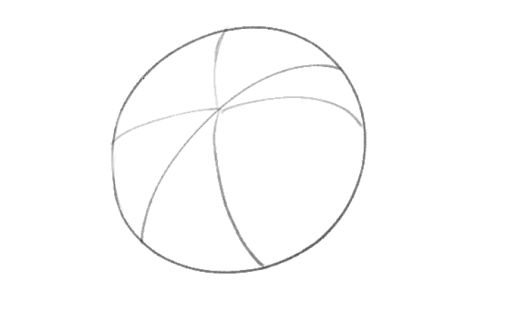
5. Line Shading
This is the difficult part of our tips, because it involves some knowledge in lights and shadows, so always remember to imagine your piece as a 3D model in a 3D space, that way you can manage your dynamic range in a better way.
Think of it as Ambient Occlussion.
As an example i will use this image with forms.
We can now add our lights and shadows depending on a light source you choose, in my case it is on top of the image. So i will add shadows where light wouldn't hit
And now you can add shading to it with a brush of your preference to add texture.
Here's another example, as if the light source was from the left side.
With this bit of information, we start on our example lineart/sketch by adding a light source.
Considering it's on the top right side of our canvas, i will add respective lines to fill later on:
・The character's neck/chest, the face in this case is the one making the shadow considering the light source is on the top right corner.
・On the nose tilted downwards, same as before, the nose itself is creating the shadow
・Below the lips, the lower lip can create this shadow, but the cast shadow can be adjusted to your liking.
・On her face where hair would be touching, this is a personal touch, not many people decide to use it because it can distract you.
・On her hair that will most likely not hit the light. Using the same shapes done for her hair i will add some shadows to the left side of her hair, again because the light source creates the shadow there.
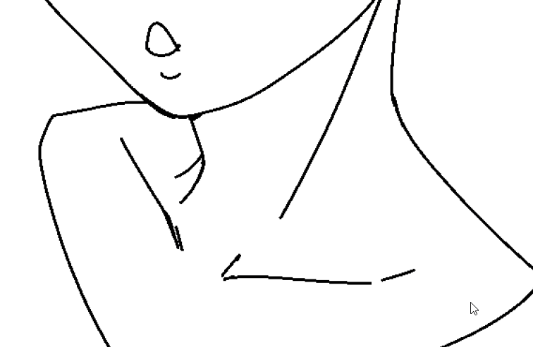
The lines are red to give an idea of what i did.
I will now fill in the spaces with the same colour, don't worry about it yet, we will change it later. You can either decide to use like this or to add a small hatching on the edges of it. Remember to always take a look at your light source to prevent any mistakes.
Or you can choose to add hatching to the shading.
IF you don't feel comfortable with doing the hatching yourself, you can always use brushes that simulate the exact same thing, in this case i will use these brushes to make the example, especially 「ドット混カケアミ」/「Dot Blend cross-hatching」, make sure to use it with no colour enabled, by pressing "C", and by gently pressing around the edges of it.
And both results with the colours changed to black:
You can even add this to your base colours with the glow effect from before for a nice effect!
This isn't professional work, but it still works for small projects. After all, it is all up to you and the practice that comes with it to decide which technique to use. If you are having trouble with the light source, you can always consult images around the internet for reference!
6. Brush Experiments
Using a common G-PEN most of the time isn't the right tool for some people, some people find it difficult to use, so in here we will use different types/kinds of brushes to make you comfortable and also make the whole piece look exciting!. Depending on how you use them, it can change the perspective and interest someone has on your piece.
These are the brushes collected from the ASSETS store that i'll be using to demonstrate the example:
Amazing texture brushes used best for comics/manga, and rough lineart concepts:
Another good texture brush, this time with a Pencil feel to it. It is good for both Lineart and Sketch, best part is that it includes tilt support.
Perfect brush set if you want to create something with a pixel feel to it, for those that love pixel art.
Make sure your canvas size is small enough for it to take effect, i recommend between 200x200px or 100x100px.
You can also explore the ASSETS store to find some interesting brushes that might fit your style!
Remember, you need to feel comfortable with your lineart and don't give up if it doesn't work the first time. It's all about patience and perseverance.
You can find me in these social media links:
Usuarios a los que les gustó esta publicación


Comentario