Simple 3-Steps: Colouring Skin
There are different styles to colour skin (e.g. realistic, semi-realistic).
So, today I'll introduce you to my simple 3 step colouring and show an example for 'flat' colouring and a mixture of it with more 'dimensional' colouring.
◆ TOOLS
----------------So, there's no need to worry about using something fancy!
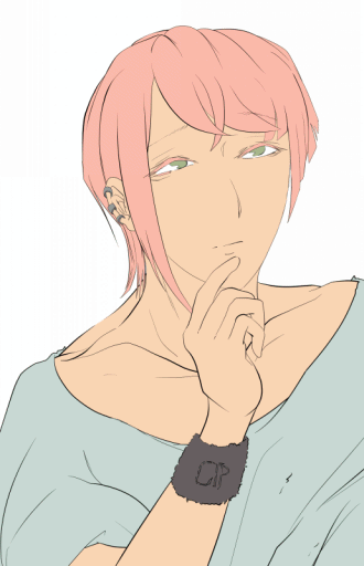
◆ SKIN (Flat)
METHOD: Sharp → Soft

(Since we're aiming for a "flat" look, make sure to keep the shadows line thick!)
With that our "flat" colouring for the skin is done!

◆ SKIN (Flat+Dimensional)
METHOD: Soft→Sharp

【STEP 1 Airbrush】
On a less saturated base colour,
■ Use [Airbrush] for rough shadow placement and add a more saturated colour where heavier shadows will be.
By using a wider and softer line, we can already visualize
were the [higher points] of our object will be and quickly correct/adjust it.
So without spending hours on perfect shapes with one clean line, and afterwards realizing that it does not fit the rest of your drawing, we will start off giving ourselves a broad idea.
【STEP 2 Blend Brush & Airbrush】
■ Use the [Blend Brush] to deepen shadows in hollow spaces and the furthest point from the light source with a darker desaturated colour.
■ Add a more saturated colour with the [Airbrush] to the middle of the object.
(Do not completely cover up the base colour, since an object will reflect a lighter greyish blue at the edges of its deepest shadows!)
■ Reflect the skin's colour in the clothing and use the [Airbrush] to bring in the surrounding objects' colour.
【STEP 3 G-Pen&Blend Brush】
■ Insert [Highlights] using the [G-Pen].
Blend the sharp lines at their edges with the [Blend Brush].
■ Use the [G-Pen] and draw thick unrealistic [Shadows] to keep a look close to "Manga".
【Optional】Use the [Airbrush] to colour in the [Lineart], leaving the lines less visible at brighter points and more visible at darker points.
Repeat these 3-Steps until you've sharpened your [Highlights] and [Shadows] to your desired degree.
With that our "flat" and "dimensional" drawings are done!
For those who might be overwhelmed with these instructions,
Here is another example for you to follow!
I've listed each colour and tool I use, so hopefully it will help you get an idea for colouring
from "rough to sharp".
◆ What Is [Skin colour]? (Tip For Beginner)
As most of you know, our skin has no single colour. Instead we have layer upon layer of something so thin that it simple appears to us to be a warmer or colder tone.
But there is a lot more variety and colours to play with when drawing skin,
Which is why we do not just adjust saturation and brightness.
We use different mixtures of that "single colour" with the natural reds, brown, purples and yellows in our skin.
The colours in our skin are more subtle and things like blood-circulation affects e.g. the redness on our face. We often see this redness visualized as soft puffs of pink in Cartoons.
Take a look at your own face in the mirror, in a room with sufficient natural light.
To get a clearer idea on what it is you are looking for, let me show you 3 basic examples.
【EYES】
For my "flat+dimensional" style, I want to simplify the details of real eyes.
If you look at your own, you'll see that the space around your teardrops has a hint of red. I personally enjoy the look of exaggerating the red, but it is completely enough if you use a thinner brush just around the corner of the eye.
The skin underneath our eyes is usually a lot thinner, thus letting through some of the blue of our veins. The blue beneath layers of skin thus appears purple to us.
The lower skin at the inner corner of our eyes is slightly lifted as it connects to the raised object (nose), thus appearing lighter. Almost like a [natural highlight].
It is by no means required to add these colours to your drawing, but I believe it to give the eyes a more "emotional" appearance, rather than looking like "statues".
【LIPS】
The corners of our mouth are darker as the skin close to the upper lip dents in and casts a shadow beneath.
A mistake some might do, is to completely colour in the lips. But as much as our natural lips might be shades of pink, brown, etc. the colour is not solid and fades out.
(If you forget to fade it out, it might unwillingly cause your character to look like they wear lipstick!)
【Nose】
This is another prefrence of mine and by no means "realistic" or required.
I think adding colour to the tip of the nose just rounds up the overall colours and shadows we've used on our character's face.
(The colours in this example can vary greately as they depend on skin tone, lightning and surrounding colours!)
◆ END
Thank you for reading until the end!
My main appeal for this section is to introduce little easy ways for up-coming artists to bring more life into their drawings.
Perhaps you'll disocver some new realistic details, you'd like to add to your drawing?
Good luck and have fun trying these methods out!


留言