
I already wrote about the reasons for choosing Clip Studio Paint for 2D digital drawing and animation.
This article is about digital drawing techniques and Clip Studio Paint brashes using a cartoon landscape as an example.
Creating a landscape
The history and mood of the picture: We have the beautiful nature of America in Western style. Forest, mountains, waterfall. The characters are an old forester and his daughter. In the distance you can see their house. Forester fishing, his daughter hangs washed clothes. The mood is sunny and calm.
Foreground, background and creating the depth of the landscape: In the foreground are bushes. The midground is a meadow with the characters. In the background is a waterfall, a forest, and a house. In the distance are mountains. Clouds can also help create the impression of depth.
The general color scheme: On a summer day, green forests and meadows prevail. The second color is a clear blue sky. The bright sun from the left adds shades of yellow.
Composition and accents: I created this art for a short animated film in a game. The horizontally elongated image in the film moves to the left of the screen with the forester, to the right side with his daughter. So, this image has two main planes in the composition. Here, the accents are the characters.
Drawing Workflow
1. First step - draft sketch
Rough lines transfer the vision. In Clip Studio Paint, it is convenient to use vector layers.
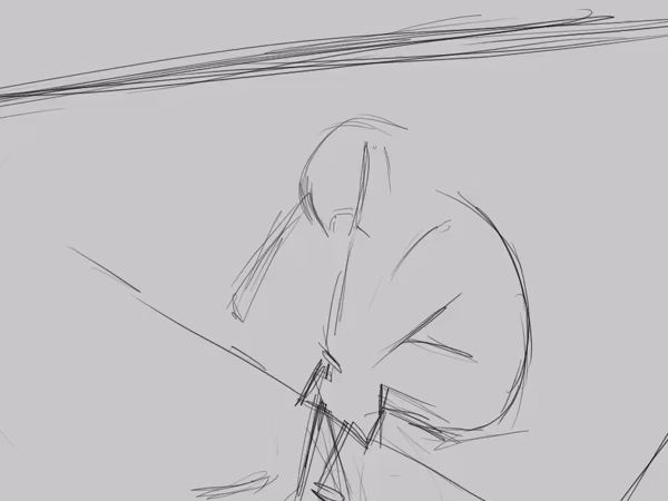
If you really want to learn how to draw, do not draw over photos. Moreover, it is shameful to use the art of other artists in their work. Nevertheless, it is useful to collect photo and art references (for example in Pinterest) and study them. But when starting to draw, I advise you to rely on your own memory without looking at the reference.
2. Line art
The first draft layer is 6-10% transparency. The next vector layer for the contour.

Do not forget to enable "Erase up to intersection" in the Eraser settings.
3. Filling the color with raster layers

I created several Auto-Actions for marking key layers and arranged the buttons in the top panel.
All lower layers marked as draft layers (blue pencil icon) are not counted in the fill.
In the settings of the Fill tool, I turn off Anti-aliasing to avoid artifacts. After filling, I use the Smoothing effect (Filter > Blur > Smoothing, my key Ctrl+) to correct the edge of the fill. Repeated use of this effect does not spoil (does not greatly blur) the edge of the fill. The last step is to use a hard round brush to paint over the remaining small areas.

I use a separate layer for different materials and overlapping details. For the initial fill, I use approximate colors.
4. Almost final adjustment of colors
Next I adjust the colors of the flat layers. The colors are adjusted in comparison with neighboring colors and the overall gamut of the image.
5. Painting drop shadows
First identify the light sources and direction of the light. I use a soft round brush for shadows. Sometimes, it’s appropriate to use Multiply blending mode for shadow layers. In places where objects are touching, the shadow is more dense. I recommend learning from 3D graphics and rendering for the practice of understanding lighting.
6. Shading
I paint the light and dark areas of the objects, creating a 3D effect. In most cases, my favorite shading brush is a pastel brush. It adds roughness and warmth. I do not separate the shading and coloring. My technique is like oil painting.

Flow of painting :
1. Large broad brush strokes.
2. Contrasting (darker and lighter) smaller strokes for details.
3. Blender brush.
7. Reflection in shadows
The color of the reflected light depends on the environment, but sometimes you can move away from this rule depending on the desired effect.
8. Adding textures and materials
I paint textures for metal, wood, stone, etc. I like to draw wood textures. I have a button in the top panel for Soft Light Blending mode and bases colors of stripes.

9. Color for line art
The line color is darker than the primary fill color.

10. Glare, reflexes, small details
11. Environment
At this stage I paint overlapping environmental objects like grass or pebbles, as well as glare glow.

This is the main sequence of drawing. Of course, I can change the order or repeat/add steps depending on the situation.
Landscape brushes!
In the next section, I’ll explain about brushes for landscape elements such as trees and bushes.
The fruit tree consists of at least five layers.
1. The first layer of tree leaves is darker.
2. The second layer is the tree trunk and branches.
3. The third layer of leaves above the branches is a combination of darker and lighter leaves.
4. The fourth layer is apples.
5. And the last layer is leaves covering the apples.

In Clip Studio Paint there are two options for creating a brush tip from a layer - a stamp with a color image, or a brush with the ability to assign two colors, foreground and background color.
Leaf brush
To create brush materials of leaf, you need a gray raster layer.
For color variations in the brush, I use blending color with sub drawing color. I use dark colors for the main color and light for the sub color.
It is possible to come up with several ways to draw a leaf.

The shape of the leaf depends on the type of tree or your inventiveness.
Add blur to the shape using the Gaussian blur filter. This is necessary to eliminate square artifacts when resizing the brush.
Next, paint a shading and texture on the leaf. Clone the layer with several lighting options to randomize the color of the brush.
If the images are in one layer, I use my Auto Action and hotkey (Shift+J) to easily split it into separate layers. It is important not to forget to rename the layers because the materials will have the same name.

Materials are added to the library by simply dragging and dropping a layer. Unfortunately, only one layer at a time.
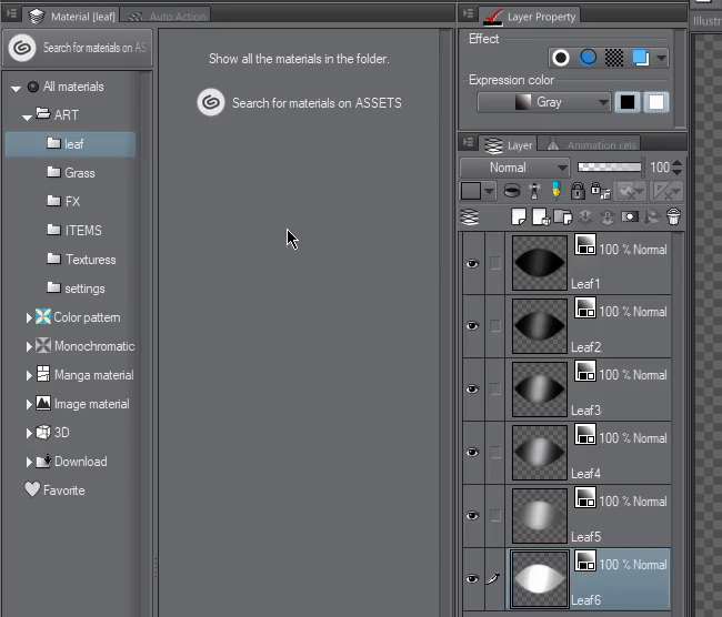
Next, open each material and put two checkmarks. Really, this looks a bit uncomfortable. I hope the developers add batch processing of materials or I will find another way to optimize.
Now we are ready to proceed directly to creating a leaf brush. Usually I duplicate an existing brush and change it.
I use turn on the Random dynamic for the Particle size and Direction.
The number of leaves is adjusted using the Gap option. The size of the brush controls the spread of the leaves.

After setting the brush, do not forget to press "Save all settings as default" button.

Grass
I use the same type of brush to create grass. I start by drawing some variants of grass and erasing the grass base with a soft brush. I can quickly increase the variations using by duplicating and flipping the layers.
To draw beautiful grassy hills, set the Direction of particle to Direction of line, with a slight Random dynamic.
Basic settings in the drawing process:
Brush Size - A small brush size allows you to position the grass pointwise or draw a line of grass. Larger brush size fills more space.
Thickness - Allows you to make grass tall or like a trimmed lawn.
Particle size - The size of each bunch of grass.
Gap - Density of planting.
Apple brush
For an apple brush, I use a color layer.
And I draw an apple with a slight shadow. Next, I duplicate and flip vertically in order to quickly get two variants of an apple with a different direction of the twig. You can also draw more varieties of apples, more green or ripe.

Next, I create materials for the brush just like when creating a leaf brush. For the apple brush, I need more control of position and a variety in size. So I use "One random round" option in the Repeat method. The direction angle is very small 6%.

Bushes
Bushes are also created from color layers. Each stamp is a small bush that consists of leaves, branches, shading. Each bunch of bush has a small shadow to create volume.
For bush leaves, you can choose a different shape or draw leaves manually.

Like a tree, a bush consists of at least two layers, darker and lighter, to achieve a 3D effect. After creating the bush, I use soft lightening and darkening brushes to correct the lighting.
The effect of lighting brushes depends on the color choice.

Typha (cattail reed) design
For the cattail, I draw a simple stroke of a round hardness brush without resizing when pressed. For the stem, I used the Curve tool. The thickness of the vector line can be adjusted later with the Object tool.

I use a noise textured brush to shade the cattail.

The effect of lighting brushes depends on the color choice.

For long leaves, I used a triangular stamp for the brush tip and set the Angle to Direction of line.

There is still a lot of interesting stuff in Clip Studio Paint. I hope everyone is inspired in their own study. You can find the brushes in this tutorial in my Dropbox (To install brushes, simply drag and drop from the explorer to the Sub Tool panel)
Users who liked this post


Comment