
Here Konijnsate again, luckily this month theme is my favorite theme: Retro Style! WooHoo! 🙌. I’ll do my best 🌟
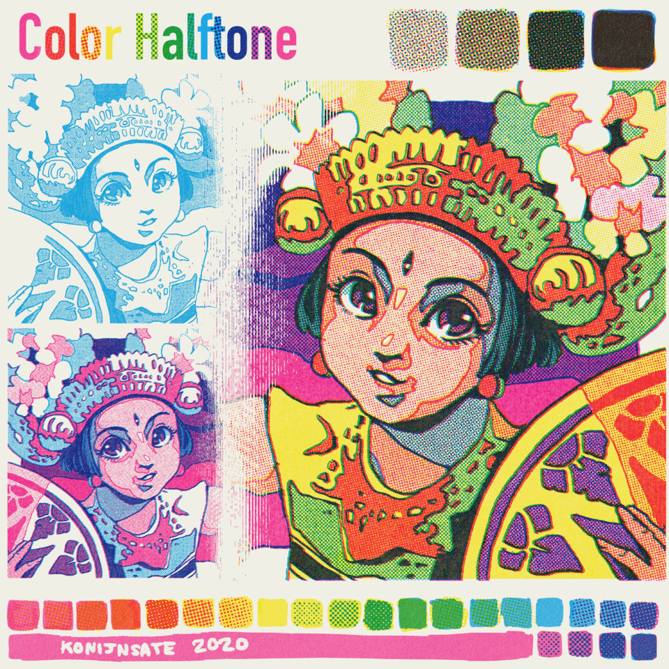
Introduction of Color Halftone
Multicolor Halftone is something you can see on your printing result like this, especially CMYK model printing. But before 1980s the halftones were more visible because the dots size was bigger.

It basically resulted from combination between 3 or 4 halftoned color layers, it became unique charm of vintage comics. The further process of making the printing will be following this link but digitally.
Why is the printing got halftoned? Because full colored printing back then demanded to create full colors result in thousands prints but just in 3 or 4 color layers. Applying each color layers took a lot times and unlike nowadays digital printing, Mixing ink color also wasn’t easy as paint where we can just prepare just 3 tubes of primary colors. Color mixing in ink can only get darker and would need big portion of water if you need brighter color result.
So, to make it efficient, they make it halftoned to control the density of the color so they don’t have to add different portion of water and ink to create various colors. Before 1930s there was a similar technique called Ben Day Dots but I’m not really sure about why they need different term.
See? Just in three colors we can achieve this much of color!
And yes, we gonna use different primary colors that commonly used in fine arts, Red, Yellow, and Blue, or RYB (Not RGB uwu). We use Cyan, Magenta, Yellow, CMY or CMYK instead, the Color Model for Printing that apparently became standard for printing since 1960s. About color will be further explained on last section.

Grunged Halftone
One of most crucial part of retro comics is grunged halftone. Not only giving the retro vibe but also help to avoid moire pattern effect. We gonna explain about moire pattern on the next section.
To be honest I would prefer to just downloading the materials on ClipSTudio ASSETS but unfortunately I don’t find any, so we will just create it manually.
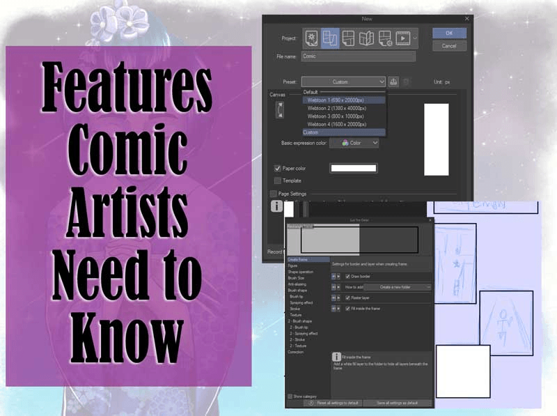
First of all we need to create new canvas in 1200 x 1200 px with 300 Resolution.
Create a black color filled layer, you can just simply use Paint Tool to fill the layer automatically. Then click the Tone Effect symbol.
Decrease the density into 25%, you’ll see the halftone dots appeared.
You’ll gonna repeat the whole process in different density later, but remember that don’t use 50% density because it will look squared instead on circle.
Change the frequency into 27,5 LPI. Remember that in Retro comics, smaller frequency is better, and again it also help to avoid moire pattern.
Then duplicate the halftone layer.
Change the Dot Setting of the duplicated layer into Noise.
And then change the noise size to 150, then rasterize the noise layer.
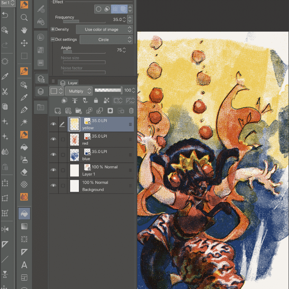
Click the Halftone Effect, then change the frequency into 27,5 LPI. Change the density into 60% or any size that you think better.
Merge down the layer by pressing the symbol pointed on the image below. Then change the Expression color into Monochrome and press the black symbol.
This halftone actually already usable, but in case you want to create it extra grunged then drag a texture layer from Material. I picked Drappled Cloud texture that already available on my ClipStudio Paint EX 1.9.13.
And then create Selection from the Halftone layer you just created.
Then mask the texture layer by pressing the mask symbol pointed on the image below.
Press the monochrome expression color and press the black symbol to eliminate the white color on the layer. Your grunged halftone finally done.
To make your grunged halftone into usable texture layer, you’ll need to register it into Material. Click the halftone layer first, then click Edit, and then Register to Material, and then click Image button.
Checklist the Use for texture button and Tiling button. Press OK when you done and you can check the Material List.
You’ll be need to repeat these process for other shades of halftones.
Halftone Brush
Personally it will be easier to use halftone in brush set because we gonna need to use this much of halftone. Exhausting but once you done you don’t have to be exhausted again to put many setting and keep dragging material textures to your canvas.
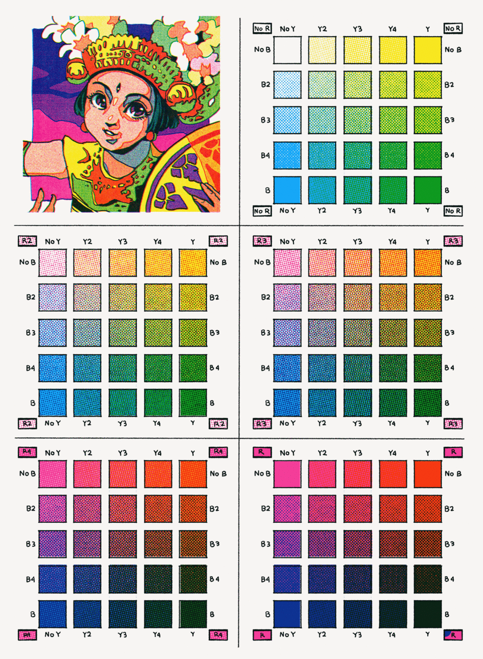
By the way, the brush name R (Red), Y, (Yellow), and B (Blue) were based on 1960-1980s color charts where they still giving color code of pure, unmixed Magenta as Red and Cyan as Blue. Not sure since when CMYK term began to used but feel free if you want to change it as CMY instead.
To create the brush I just simply duplicate any favorite pen brushtool available on my CSP.
Then press ok when this box appeared
Press the subtool detail icon, once this box appeared press texture and add the halftone material you just made.
Increase the density into 100% and change the opacity into Multiply. Checklist the Applyto Each Plot Button.
Duplicate the brush you just modify, then you just need to rotate and change the texture. Remember that the halftone you created is 45 degree, so you just have to add the degree.
Moiré pattern
When you’re working with halftone, Moiré pattern usually means disaster. It is result of interference pattern produced by overlaying similar but slightly offset templates. Moiré pattern can be an unique art but in most case they’ll ruin your work if you don’t control it.
If you often print comic that you create in Clip Studio Paint, you probably already learned that higher frequency of halftone potentially ruin your printing result like this. (85 LPI is actually Frequency for newspaper offset printing, this high frequency isn’t suitable for digital-based format)
That’s why lower frequency below 60 LPI is safest option to avoid Moiré pattern. Also, it is very important to use same frequency of halftone when you are going use more that one halftone layer.
Different frequency of overlapped halftones also cause Moire Effect
Moire Pattern also more likely appeared on two overlapped halftones with different angles, usually below 30 degrees difference. Colored halftone with 30 degrees dfferences considered as ideal because it fits to overlap 3 or 4 color halftones with low potential of moire pattern.
Halftone layers without angle difference actually not really recommended because it resulted inconsistent mixed color when it got offset. But actually still okay if you plan to make effect of printing before 1960s because this model was really used back then especially in Ben Day Dots.
45 degree difference actually ok but it limits the possible color halftones used without creating ugly moire pattern. Although it still eventually used in CMYK halftones.
1960s American printing apparently not quite fond of black halftone combined in CMYK printing, so they would prefer line or crosshatch if they need to. But this method also not frequently used since in most case they used black color just for lineart and beta. Line and crosshatch halftone more often seen in B/W Comic instead Colored Comic.
And last thing is, moire pattern also often visible when you zoom out and zoom in while working on CSP. This actually not big problem if the most important thing is the printing result. The problem also decreased when you saved your canvas into JPEG. But this will become a concern if you trying to resize your canvas.
Making of the Art
There are three types of work you can make from multicolor halftone. First is Lineless CMY, CMY with lineart and CMYK with separate lineart.

For the lineless CMY you can watch this Time-Lapse. CMYK is basically just the lineless CMY with Lineart Layer.
And this one is for the second types. First, prepare your lineart.
Duplicate the lineart layer
Press the Color Effect button and change the color into Magenta
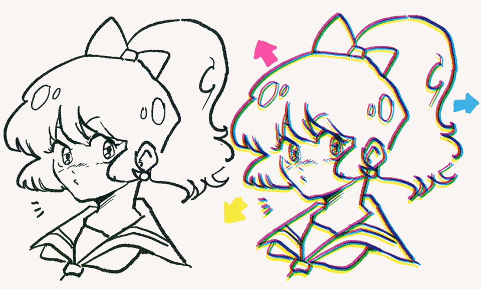
Repeat the process for Cyan and Yellow colors. When you change all layers Opacity into Multiply you’ll see the lineart layer combined into black. (Make sure to turn off the original black lineart layer first)
If you move a bit the colored lineart layers you’ll see this offset image. Quite good to make retro effect but do this after you finished.
You can begin to color in each colored lineart layers using the halftone brush you just create.
But remember to use black foreground color while coloring in each layer.
Color Palette
And the last thing is my favorite. Once your drawing done, you can change the color of the Color Effect to any color to create some nuances or tones. As see, Magenta began to be used since 1960s, it also became iconic color Retro.
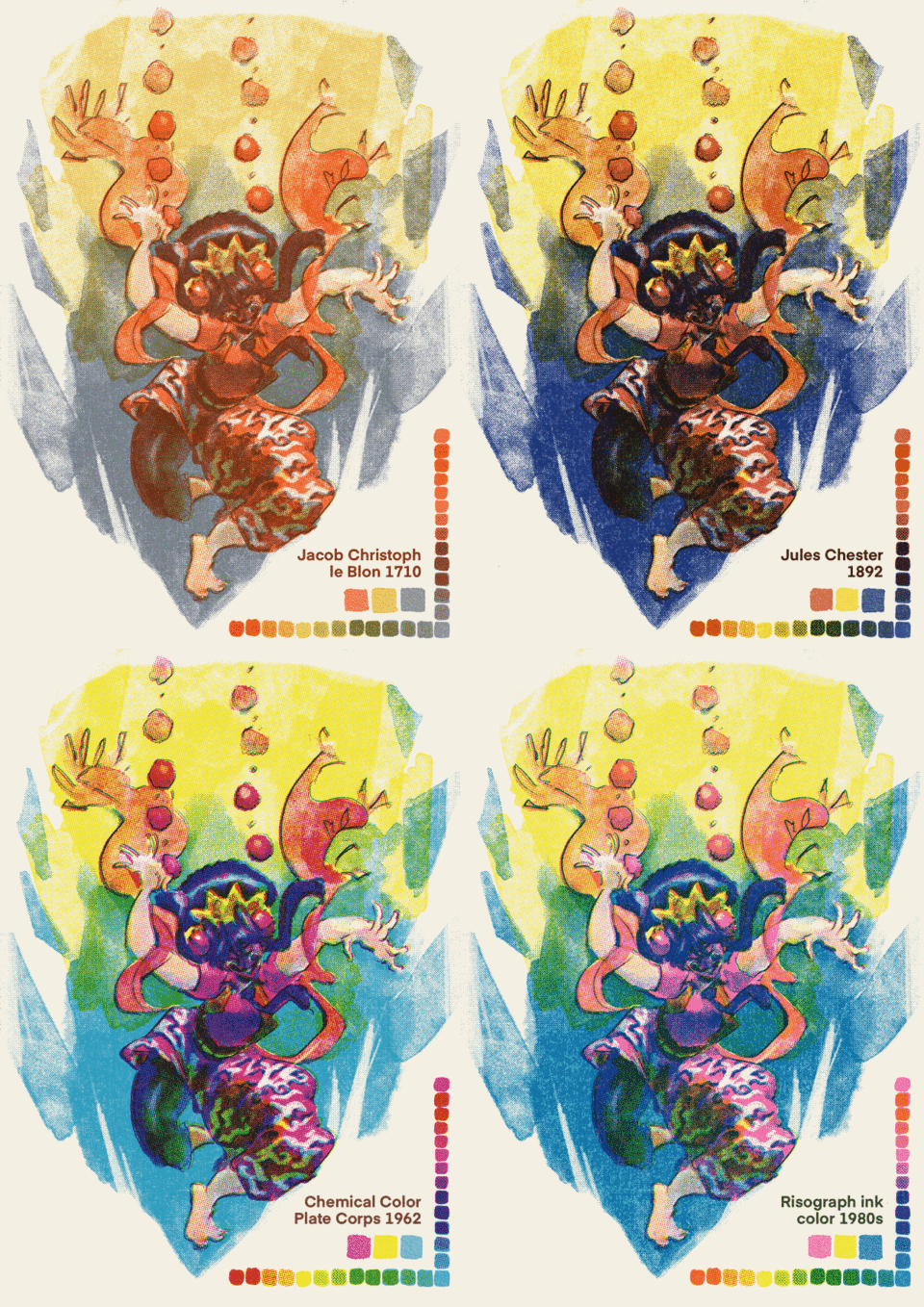
By the way, this artwork created in different method because I was trying to imitate 1890-1920s style. This might be too out of topic to be explained In detail since the monthly theme today is Retro specifically 1960-1980s, but I’ll show a little spoiler GIF.
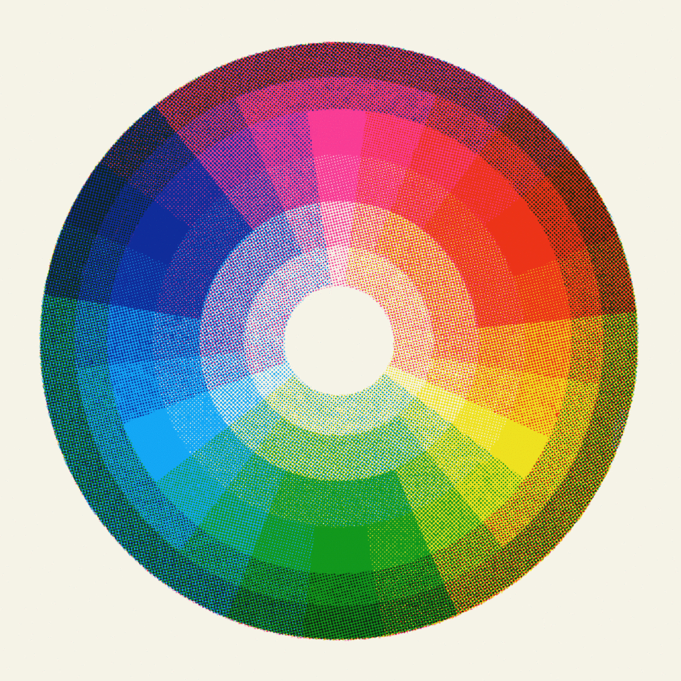
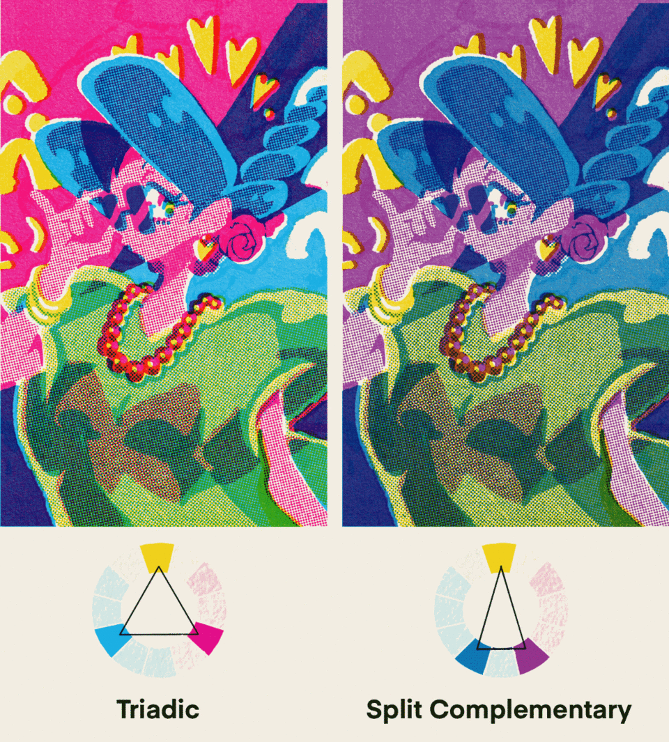
Not only changing the tone or nuance, you can also change entirely colors based on color wheel theory.
Closing
That’s it, I hope this is helpful and feel free to ask me if there is confusing part.

Users who liked this post


Comment