
Youtube Video
This video gives a VERY quick rundown of the things described in this article. It is meant to be more entertaining, while this article is (hopefully) more informative.
Introduction
Hi everyone, this is Linco here with my first Clip Studio Paint tutorial. Today, we are going to be learning some techniques to paint flowers.
Flowers and plants can be a very difficult subject to draw because it is so easy to get lost in vast number of repetitive patterns, and complex form. Don’t worry! It is extremely common to get lost and be unsure of where you are going when drawing anything -- plants and flowers especially. In this tutorial, I will present ways to study drawing flowers and plants, useful knowledge of the structure of many flowers and plants, and some tips in specifically in Clip Studio Paint to aid in digitally drawing flowers and plants.
Let's go!
Summary of Lessons Learned from Plant Studies
In this TIPS tutorial, I walk through three studies that I did to learn more about how to draw plants and flowers. Each study gleaned new information, here at the start I will summarize what I learned in the form of applicable tips for drawing and painting flowers. For those that are interested, read more about how each study informed my practice.
1. Many flowers and plants are delicate, to draw or paint these flowers make use of S and C-curves.
2. Painting flowers and plants is a lot about gradations. Many flowers change colours from their inside to the edges of their petals. Even leaves have subtle gradations, and different areas of a plant (usually near the bottom) can be look older and have a different, usually yellow hint.
3. Related to the last point, many flowers have translucent petals that "catch light" creating almost white edges. Gradations are usually from darker value in the centre to a lighter value near the edges.
4. Dark green leaves as a background to contrast the usually bright and vibrant flowers makes the flowers pop! It doesn't have to be leaves in particular, but they are a very natural background choice.
5. Pay attention not only to the shape of plants and flowers, but also the negative space, the gaps in-between plants, or the gap between petals, gaps between branches of a tree. Focusing on these negative spaces can make the design of your painting more believable, and it can also make painting and drawing a lot easier.
I encourage you to make your own studies of plants and flowers, or any subject that you are interested in. Set out with the goal to observe and learn all about your subject. You can use traditional tools like watercolor, or even be portable with a tablet or iPad using the Clip Studio Paint app.
If you want to see my plant and flower studies, continue on! Otherwise, to see these tips in action see the section Illustrated Example (Peonies).
Studying Plants and Flowers
One of the potential reasons why some people become discouraged from drawing plants and flowers is because they choose very difficult subjects to study right off the bat. It is extremely difficult for instance to study the details of a forest. Different types of trees overlap, branches intersect, a whole cacophony of complex forms that will lead many to simply resort to becoming frustrated, painting or drawing random strokes, or using some techniques for a shortcut and calling it a day.
Don't get me wrong! I think shortcuts and simplifying is very useful when painting. But for me, when I study a subject the goal is to learn about it. I set out to learn about shapes and value arrangement of flowers and plants, things which I can be very attentive of during my studies and will I believe help me to become a better, more intentional artist.
If you want to study the forms of plants and flowers, start with something much simpler and you will learn many things! Let me share with you a few things I have learned from some studies.
This is one quick study I did of a funny looking big leaf plant I saw in a botanical garden. Done in Clip Studio Paint with the default black "Lighter Pencil" tool and the default "Kneaded Eraser" tool.
I thought about what made me feel that this plant gave off a kind of silly vibe. Looking at A the outline of the main leaf, it is built of many S- and C-shaped curves joined together, making a very "wiggle like" contour. I think this aided in how I expressed the plant and it is also event at point C, the smaller leaf.
The shading at point B was used to try to give the effect that the leaf's contour is not the only thing waving back and forth, but also that there are sections of the leaf in shadow, hinting that the leaf is also waving towards and away from the viewer.
Another thing I learned from this study is that, S- and C-shaped curves are used often to describe plants and flowers, very rarely are straight lines used. S and C shaped curves give a sense of delicacy. This is also evident in the stem at point D, despite in real life the stem being more straight, I exaggerated the curve here with the idea to give the top leaf more weight or bounce.
So, if we want to draw flowers and plants that feel fragile, delicate, temporary be sure to use many S and C curves. On the other hand, if you were trying to portray rough tree bark instead, that would be a perfect time to utilize jagged straight lines.
This second study is of a small grouping of flowers sprouting from the ground at a local botanical centre, again done with the "Lighter Pencil" and "Kneaded Eraser" tools in Clip Studio Paint.
These flowers captured my interest because of the large amount of overlap, creating a pyramid-like structure. Point A notes the top of one of these structures. Something that was very recognizable when studying this is that for many flowers, the centre of the flower gradiates outwards into a different colour near the edges. I did not do this study in colour, however for this particular flower the centre was a deep darker magenta compared to the light pink edges. Many flowers catch light" with the edges of their translucent petals, making them lighter on the outside. Increasing the size of the Lighter Pencil tool, I simply dotted the centre at Point A and other flowers to show this gradation.
Point B shows a cast shadow from one petal on an upper layer to a bottom layer, it helped define the form for this cluster of flowers, in real life this did not seem too dark, perhaps because the petals were transmitting some light. Lastly, point C shows a leaf, I notice that having the flowers which are usually bright contrasted with dark green leaves and other foliage really makes flowers pop.
This final study shows a method for trying to study flowers, plants, and trees with more complex forms. A good idea is to draw the subject in silhouette, forgetting about the depth of the subject but focusing instead on the shapes. You can evaluate your study by seeing if the subject is still recognizable with only a filled in silhouette... In my study I don't think this would pass as that recognizable.
When silhouetting, it's important not only to look at what's filled in, but also what's left out. This can help tremendously in plant and flower drawing to get shapes that feel confident, and purposefully designed. At point B, I looked at the gap between the two branches, and drew out my shape with the "Hard Eraser" tool instead.
This was done in Clip Studio Paint with the "G-Pen" and "Fill Bucket" tools. I was trying to silhouette a tree with orange leaves, being surrounded by green trees it stood out. Although I prefer the other two studies above, I do like how I captured the branches such as at Point A, as the tree branches out, the thickness slowly decreases. The branches for this study I feel good about, and less so the bundles of leaves. But as I learned something from this study, I consider it a success!
Illustrated Example (Peonies)
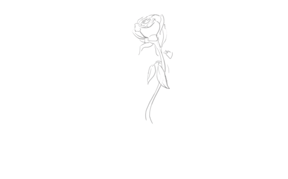
I start off my drawing with a silhouette of the flower. The silhouette is important because it can give so much character to what you are drawing, it defines the shapes in the plant or flower. For instance, is it a prickly plant, does it have rounder petals, triangular petals? These are things that can be identified simply from the silhouette. For the peonies, this silhouette has round petals, some that float like the fabric of a dress.
In the image below, you can see the silhouette was very rough!
The dark green to silhouette the flower will help it "pop" out as it will provide contrast once we start painting in this light pink flower.
If you're curious about the materials used, I simply used a G-Pen set to a relatively deep dark red for the outline, and the 'Oil paint flat brush' provided by Clip Studio Paint.
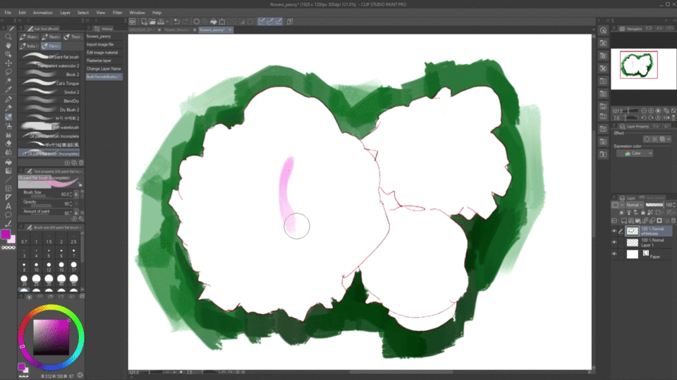
Before we start, if you are curious about my layer structure, here it is. It is not something you have to strictly follow, but it made it convenient for me.
A: I started with the silhouette of the peonese, this was my first layer.
B: These two layers are where I paint in the flower. The lower layer is just a white base, I filled in the silhouette white with the 'Paint Bucket' tool, then the layer ontop is simply clipped to the white base layer, so that I do not accidentally mess up the intentionally designed silhouette. The next image shows the steps for this.
C: Lastly, this is my background layer, I painted in a green outline to remind myself to paint in leaves after.
Use the set up that works best for you, some prefer many layers, some prefer only one! My only recommendation is to NOT to create a layer for each petal. Near the end, I merged all the layers together anyways to do final touches.
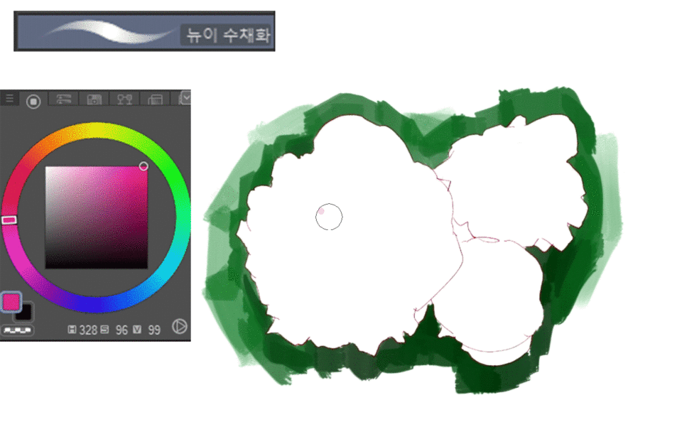
Here's some basic directions to set up a clipped mask layer.
Perform operation A first, fill in your silhouette on another layer with the fill bucket tool using 'Refer other layers' it is coloured in pink just for visibility, however this layer was actually filled in white.
Another way is to use the magic wand tool on the silhouette layer, invert the selection, and fill that in on a new layer.
After you have a layer with a base colour, perform operation B in blue. Create a layer ontop, and click the icon that says 'Clip to Layer Below' Whenever you draw on this blue layer, it will only be visible if it overlaps with the filled layer below!
Now we are ready to paint!
To create a more realistic flower, gradations in colour must be carefully placed to shape the petals and give the painting depth. Remember from the study section, that many flowers catch light in their petals and thus gradate from dark to light, centre to outside. For the peonese, the most saturated deep cool red colours lie in the crevices of the petals, which transitional beautifully to a light pink and white. With digital tools in Clip Studio Paint, I will show you a few methods help you with gradating colours for the petals of a plant. In this painting, I used a combination of all of them, feel free to test each of them out and use the ones that are most appealing to you.
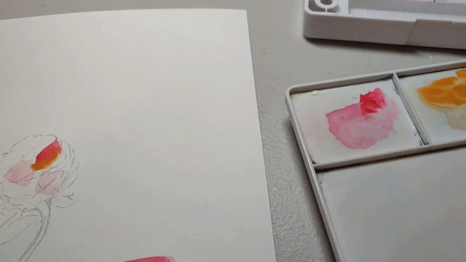
Technique 1: Gradient Brush Technique
In traditional painting, one of the nice ways to create these gradations is an incomplete mixture on a flat brush. One end of the brush is loaded with one colour and the other end is loaded with another colour
In the below gif, I demonstrate this with watercolour.
I will show a way in Clip Studio Paint to change any of your favorite brushes into something that mimics this traditional technique!
Choose one of your favourite brushes and duplicate the tool by right click duplicate tool.
I duplicated Clip Studio Paint’s built in “Oil Paint Flat Brush” and renamed it “Oil Paint Flat Brush (Incomplete)”
Go into sub tool settings, and go to the tab “Starting and ending”
1. Starting and ending: Change to “Blend with sub color”
2. How to specify: Change to “By percentage”
3. Select checkbox Starting: change to 100.0
4. Deselect checkbox Starting and ending by speed.
Lastly, go into the tab “Ink”
1. Blend with sub color: change slider to 100.0
Now, when you use your brush, it will start off with your main selected colour, and the tail end of each stroke will gradate to your secondary colour. In my drawing, I used a few of these strokes with a saturated cool red, and a light pink to define a few petals.
Below is a gif showing the kinds of brush strokes your newly created brush should now create!
(At the very end I also use the 'Transparent watercolor' tool to blend in some edges)
Technique 2: Using Clip Studio Paint's Assets (Watercolour Brushes)
Some brushes in clip studio paint are designed to replicate characteristics of real world water colour brushes. These brushes are useful for flower painting, by adding additional strokes on-top of existing ones, areas become more dark and saturated. Here is a link to the brush that I used for this painting, found in the clip studio paint assets created by community users.
This brush was especially useful for me to add in those very deep cool reds in the middle of the peony flower. By adding brush strokes on top of brush strokes, interesting edges were produced, and the colour "popped out" rather than becoming very muddled which is something that I personally have a bad habit of falling into.
Give it a try! If this brush is not to your taste, there are also plenty of other interesting brushes on Clip Studio Paint's assets page, it is worth some time to explore and experiment!
Technique 3: Using Blend/Airbrush or other Mixing Brushes
The most well known way to create gradations in painting is probably by using an airbrush or blend tool, this breaks down hard edges into softer ones. The ‘Transparent watercolour’ brush that comes with Clip Studio Paint also is a good tool for this. Many readers may be familiar with this already, simply use the colour picker tool on a near edge and airbrush or blend away hard edges to create gradations in colour.
Note: Be careful of overusage of the airbrush which gives a painting a distinctive, muddled look.

Breaking Down the Process
From the silhouette that we created, I simply started painting in, having fun with it and using the techniques mentioned above. The key here is focusing not too much one petal at a time, like we mentioned previously. Instead, I worked at adding some saturated deep cool reds to define some crevices like you can see in the centre of the two flowers.
1. The centre of these flowers has the most amount of colour, so I started there.
2. I started to define some hard edges for crevices and petals. Nothing is final yet we are just starting, you will see many of these shapes change throughout.
For some, myself included, I think it can be intimidating just to have white on the page, a white canvas with so many possibilities. I try to get down some colour as quickly as possible, getting into the flow of painting. So muster up some courage lay down those brush strokes, and keep the mentality that you are always in a block-in stage where you can come back and change things if that's what you want to do.
I worked on one flower at a time, unfortunately, I lost all of the footage for when I worked on the blossomed peony on the left. I approached all flowers the same way however, so let's take a look at how I tackled the top right peony in mid-blossom.
Comparing this image to the previous one, I already changed up this peony, covering up my previous work. I used the created Oil Paint Flat Brush (Incomplete) to define some petals (Technique #1). I set the primary colour to a deeply saturated cool red and the secondary colour to a very light pink. I really like starting off with this brush as it helps me see gradations very quickly with a single brush stroke.
In the process of painting this top right peony, here are some key moments in the process.
1. After the initial lay in, I define some deep cool red areas in the centre of the flower, I remembered to look at the value structure. From the studies remember that many flowers gradate from darker values in the centre to lighter values near the edges. For the peony, the most saturated colours are also present in the crevices of the flower, and there are much deeper crevices not hit by the light near the centre of the flower.
2. Here is another important step near the beginning, notice the white outlines that are starting to be drawn. These were done with the 'G-Pen' tool set on an almost white colour. We talked a lot about methods for gradations, but flowers also have hard edges! I defined my hardest edges with the 'G-Pen' tool. They are coloured in white as the petals catch light, another aspect of flowers we learned in the study section.
3. I start to bring in more saturated and darker reds in the crevices. I continually push the value range for this flower.
Note that after defining the white edges of petals in the previous step, I also define some hard red edges right beside. This is to give depth to those petals, right after the end of a petal should be a crevice. In the image below, I point this out at point A, compare this point between the two side-by-side moments.
4-7. These steps are the refining stages, and can take a varying amount of time. I slowly work away at the flower, the basic structure is now here so I repeat my techniques to build up more intricate detail. I continue to add in more and more crevices of deep cool red and refine these shapes. I continue to define new petals with the white lines from the 'G-Pen' and gradate these petals from a darker value to a lighter value near the edges using techniques (1-3) but primarily 3.
If comparing moment 4 and 7 you will see the most obvious example of this gradation process to define a petal. Comparing points A and B in the below image show how these petals were gradated using a variety of brush strokes.
Now we are done the mid-bloom peony!
The same techniques and steps were again employed for the fully bloomed peony on the left, and the beginning-to-bloom peony on the bottom right.
Adjustments and Layer Masking Techniques
A tendency for me is that when I paint is that the values and colours often I feel become muted. This happens naturally in traditional media too, for instance, with watercolours the colour dulls as the pigment dries and it must be painted over again.
After painting in the flowers, I utilized Clip Studio Paint's "Tonal Correction" and "Layer Mask" techniques to bring in more contrast and finalize the flower painting.
Below flips through A and B, the difference is very clear what we can accomplish through Tonal Correction and Layer Mask techniques! Let's learn how to do this.

To begin start by duplicating the layer with your painting.
1. Right click the layer, select duplicate
Ensure you are on the newly duplicated layer and head to the menu bar
2. Go to 'Edit' -> 'Tonal Correction(D)' -> 'Brightness/Contrast'
3. Adjust the sliders to suit your needs. For me, since I thought my colours were muddled and the flower as a whole was too light, I decreased the brightness and increased the contrast. Check and uncheck the 'Preview' box to highlight the differences.
4. Click 'OK' to apply changes.
Often times, an overall adjustment from the tonal correction, whether it be brightness/saturation or any other filter will have aspects that you like, but some areas may be overdone.
The resulting image from this 'Brightness/Contrast' adjustment is shown below, I liked certain aspects of the change, but other areas I felt were overdone.
The tonal correction was successful in bringing out the contrast that I wanted, however areas like point A were overdone. Here, it looks blood red and kind of scary!
Additionally, there is too much contrast near the edges of the flowers, making the overall picture look unnatural. Near the edges I prefer my original painting before the tonal correction. How can I keep the best of both worlds?
The layer mask can be used to subdue the effects of filters / tonal corrections.
To create a layer mask:
1. Select the layer with the tonal corrections. Click 'Create Layer Mask'.
2. To bring back the original painting in certain areas, ensure you are painting on the Layer Mask.
3. I used the "Soft Eraser" tool to erase areas of the tonal correction and reveal my original painting. However, you can erase areas with any eraser or brush set to a black colour. Paint back the tonal correction with any brush set to a white colour. Feel free to experiment with what works best for you!
4. Check the thumbnail to ensure you are making changes to the layer mask and not the actual layer. Remember, black marks areas where you are revealing the original painting underneath.
After subduing the tonal corrections, painting the flowers is now complete! Before moving onto the background, I will take a rest here and break down some differences in the three flowers that were painted.
Here is a labelled diagram to highlight some areas of importance.
1. The top right peony is in the process of blossoming fully.
Notice how at point B, the deep red comes in the form of a thin line. This helps indicate the structure of the petals and the direction of this flower. The petals here are facing to the right, perhaps pushed aside due to the large fully blossomed peony on the left. Contrast this to closer to the centre of this peony such as at point A, hints of saturated cool red colour are more clustered together and larger.
2. The bottom right flower shows a peony at the beginning stages of blossoming. Here, I used the airbrush technique to get a very smooth gradation at the bottom of the flower at point C. I defined some hard edges with a nearly white "G-Pen" tool, this lower area of the peony is much darker than the upper area, as the light source is from above. What gives this peony life I think is the two petals at point C, separated enough that they give each other room to breath, these two individual petals in my opinion pull the bottom right flower together and help the the viewer make sense of the image. Particularly, it helps show that the other white lines indicate the edges of the closed petals for this peony.
3. The fully blossomed peony was definitely the most difficult.
The layers of petals were large and complex. Note that at D, I used the 'Transparent Watercolor' tool to blend the transition between pink and red to define these petals (Technique #3). Comparatively, near the center at E, exists a bunch of hard edges with crevices and edges of petals, I used a lot of watercolour brushes here repeatedly to darken edges and get a very saturated deep cool red colour (Technique #2).
Background/Leaves
It is up to the artist if they want to just paint the flowers without a background. A pure white background or solid colour background can sometimes be preferable.
In this section, I will show you how I added in a background of leaves to accompany the peony. I decided to add in the background because if you remember the ideas I learned from my studies - having leaves or foliage as a background really makes vibrant flowers pop!
The trick is that the flowers should still be the focus of the image in most cases, so adding in a background that enhances the flowers but is also subtle was my goal.
To start off drawing the backgrounds, I used the already green outline that silhouetted the peony. I expanded outwards from here, painting in brush strokes that taper off to represent the dark side of some leaves.
I wanted to keep the areas just surrounding the peony a darker colour to contrast with the white edges of the petals. This was done very quickly as I wanted to just get rid of the white on the page, and then refine details later.
Filling in the background was done quick and with big brush strokes, take a look at how large of the brush strokes are in these beginning stages (moment 1-4).
I quickly filled to the edges of the canvas, note the far left edge point A and point B on pictures 3 and 4. I wanted to put in some lighter green-yellows as the light will hit the leaves too, such as beside point A. However, I want to keep the edges of the canvas darker, to keep the viewer's focus towards the centre of the picture. So at moment 4, I painted in points A and B a darker green.
My initial idea was to paint in the entire canvas and fill it with leaves and dark foliage. However, midway through after 'moment 4' I changed my mind.
It is okay to change your mind and experiment with whatever you are painting, even if it is late into the process! For me, I didn't like the idea of a completely filled in background because I felt I could not make it interesting. Instead, I started to erase with various white brushes and the 'Kneaded Eraser' tool.
Finally after lots of experimentation, I decided I would go with a silhouetting the right side of the flowers with some leaves that stuck out these are shown at point A, and are refined in between moment 7 and 8.
I also added in a small branch at point B in moment 8. Keeping in mind the light is coming from above, so I used a brown red and a very dark red to show a light and shadow side.
Lastly, it was only at this stage that I started to refine the abstract green background into the form of some leaves. At point C, I started to draw some leaves which you can start to see take shape if you compare moment 7 and moment 8.
If you try to define individual leaves right away for the background, it is common to end up getting overwhelmed, frustrated, and feeling lost, this definitely happens to me.
Finally, here is the finished background. The leaves to the left were refined with some lines using a watercolor brush (Technique #2) to indicate patterns on each leaf. The silhouette on the right side also was refined and again, the bottom and left edge were darkened to keep focus towards the flowers.
If you define a few leaves, the viewer can fill in the res with the less refined brush strokes. Remember the leaves aren't the central focus of the painting (atleast not for this painting) by understanding the focus of your painting you can intentional choose which things to simplify.
It would be fine to stop here, and looking back perhaps I would have! But during the process, the green leaves did not look right to me and I was feeling very disappointed in the background...
Getting a Quick New Look - Tone Curves, Finishing Touches, Layer masks (again)
Often time, in the middle of a painting or sometimes near the end, inspiration can dwindle as you have been staring at the same image for a long time. It is often useful just to get a fresh new look on a painting to see what is possible and potentially inspire some inspiration.
I felt like this during the very end of this painting, the green leaves in the background I did not particularly like, so I used Tone Curves to try and get some inspiration.
"Tone Curves" is another "Tonal Correction(D)" option just like the "Brightness/Contrast" feature that was described when painting the peonese flower. The tone curve instead lets you adjust the colours of the selected layer, changing the amount of expression for reds, blues, and greens.
The process to do a 'tone curve' is very similar to applying 'brightness/saturation' correction! Since my problem was with the background, and I did the background on a separate layer I started by duplicating the background layer and heading to the menu.
1. Duplicate the layer you want to apply the tone curve to.
2. Head to 'Edit' -> 'Tonal Correction(D)' -> 'Tone Curve...'
3. A dialogue box for tone curve appears, adjust tone levels and track changes by checking 'Preview'.
4. Hit 'OK' to apply the Tone Curve.
Point A: This dropdown menu in the tone curve window allows you to change between Red, Blue, and Green curves.
Point B: Click on the graph to create new points. Move created points to change the curve, the input levels on the horizontal axis will be mapped to the output levels on the vertical axis.
Here is the result of the tone curve, just like the 'Brightness/Contrast' tonal correction, there were areas that I really liked such as the hints of magenta in the leaves in the top left, the change in background colour; but there were areas that were overdone. These areas were softened and erased out with the use of a layer mask. Refer to 'Adjustments and Layer Mask Techniques' for a review on how to use a layer mask.
This helped me become satisfied with the background, the green leaves although they complimented the pinkish/red peonies, I felt were distracting to the picture. The magenta background was an unexpected benefit that I decided to keep! I liked how it helped define the edges of the top right peony.
In this painting the tone curve was used to finalize the painting. Often times, I find myself using it in the middle of the painting process to get inspiration for new paths the picture could take. Getting a fresh perspective with different tones helps generate new ideas, but other filters and corrections can also be used to help inspire and give direction to a digital artist. I encourage you to experiment with all the tools available!
Thank You
Thank you for taking the time to read this TIPS article. In the process of the research, studies, creation of pieces, and writing of this project, I have learned an immense amount. Not only did I learn how to paint flowers and plants but also how to be a better artist in general by expressing what worked for me and what did not.
I hope you got out of this article as much as I did writing it. Go out there and smell some flowers (and maybe draw some, too!)
- Linco
Users who liked this post


Comment