
Video
Intro
Well hello there, this is Tamil. Today I wanted to talk about BRUSHES. Sometimes I find great brushes, but I want to tweak them just a little bit. Make it better for my own personal use. That's why I wanted to make this tutorial. There are so many extra function I wish I knew myself when learning CSP.
You can also watch my video to get a more streamlined tutorial if you do not feel like reading :)
Let's get into it!
Free Brushes!
Before we start, while making this tutorial I was tweaking my old brushes I usually use for my own paintings. They are very common regular brushes that I just adjusted to my taste. Just wanted to share them in case anyone would find them useful!
Feel free to do anything with them. Any tip is always appreciated, but not required. Hope u have fun with them.
You can see more once you open it, but there are 6 basic brushes:
Airbrush
Ink
Pencil
Paint
Blend
Erase
I really enjoy using the pencil one for sketching. My favorite brush for sure. Let me know what kind of brushes do you like to use and why. Maybe I should expand my selection.
Getting Started Tools
Before starting to work on brushes and learning more, you need to find and open window tools.
Two main ones we will use are:
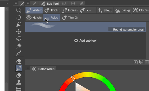
Sub tool
Tool property
Window -> Sub Tool
Window -> Tool Property
Usually they are open by default, but just in case you can't find it. Sometimes workspace gets all confusing, if you did too much, you can always reset it.
Window -> Workspace -> Reset to Default
Sort your brushes
Clip Studio Paint comes with a lot of great default brushes that make it easy to get started. Sometimes it might be overwhelming even. A lot of default brushes I do not use, so I put them all in one folder that I know I will not open. I like to keep my workspace very very clean :)
To start sorting things, just click B for brush. See which ones you like or not. If there is anything you do not need, just drag it into a new folder.
It's pretty easy! Just drag the brush to the edge and it will make a new folder automatically.
Now that we have a separate folder, we can just rename it to anything we want!
To rename, just right click on the folder and select settings. Window will pop up and give you an option to rename it.
I usually name it something really weird, so I can remember that it is the folder I will not use hehe.
It's ok to have brushes you do not want to use. I see a lot of artist make this mistake and trying to learn as many as possible. To be completely honest, I really enjoy sticking to 1-2 brushes when learning so I can get the most out of it. Sometimes it takes me 2-3 months to get used to one brush and use it's full potential! Don't rush it.
Tool Property - Size
Tool property will change depending on the brush you going to pick. It will update as you change to other tools. The first thing I like to get into is size. It's very important to make your brush feel natural.
If you want to add or remove taper to your brush, you can always click the little red button on brush size. This will give you access to brush size control.
As you can see, pen pressure is on, which means the harder you press, the bigger the brush will be.
One the right side you will see minimum value. This means that it will try to give you at least X amount of minimum value before going higher. For example, if it's pen pressure, it will make the brush less thin at the end because it has a minimum now.
The taper is much thicker now.
There is also pressure curve. It is up to personal taste and which type of brush do you want to create, but there are a few main ways to use it.
Click and drag on the line and it will create a pressure point. If you drag it down, it will make your brush "tougher". This means you will need to press harder to get bigger size.
If you put the mount upwards, then it will be easier to create thicker brush. Both of these methods make the brush a bit thicker or thinner overall though. It's not perfect because it will decrease or increase everything all at once.
If you want to make it more sensitive and get a cool taper, then try this graph. This one usually works for me, but I still change it depending on the brush I am using.
Tilt size is a nice feature in case you want to create a brush that feels like a pencil. A lot of pencil if you hold them sideways, becomes thicker and richer in size.
Note that not all styluses support tilt function. Check up on your drawing tablet.
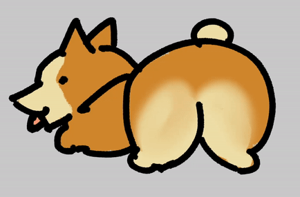
Velocity is one of my favorites! This means speed of your stroke. The faster you make it, the thinner your brush will become. One of the sketches I made for this tutorial was by using default Felt Tip pen.
It's just a quick doodle, but the size variety makes for a more interesting sketch! Just experiment with it when you get the time. Simple sketch brush will be really amazing for it.
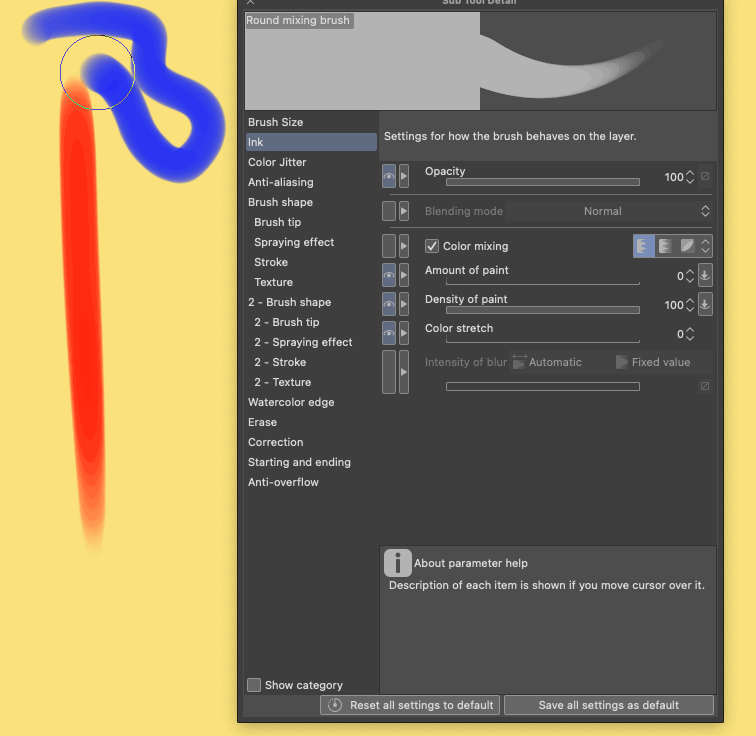
Color mixing brushes
Another great feature that some brushes have is color mixing. There are different ways you can mix color, but where would you find default brushes for color mixing? Most of them are in THICK paint folder :>
I just had to share it! I made it for the "thick" jokes. So far I did not have a chance to use it :D
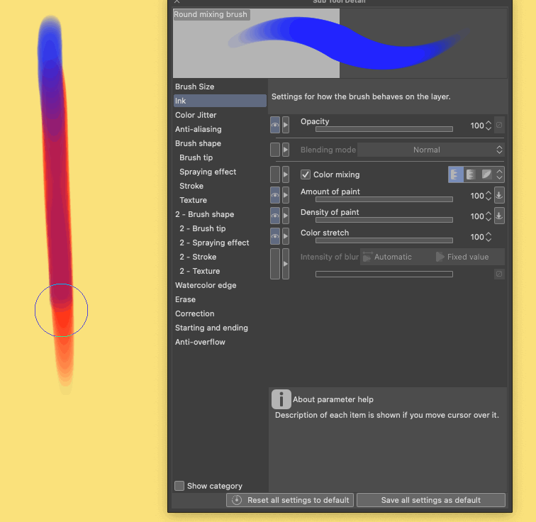
Most of these brushes will mix really well. Two main ones I would recommend trying are Round Mixing brush and Thick Oil Paint.
They both have a different way of mixing too!
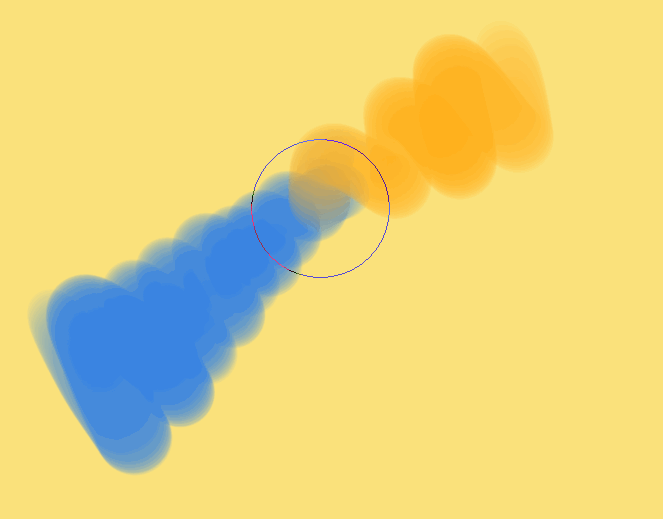
Here is round mixing brush.
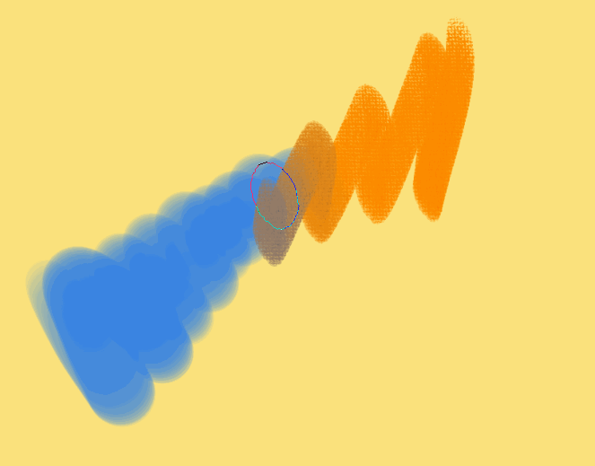
And here is the thick oil paint. You can see that the color is slightly different and texture makes it more interesting to look at.
In this case the color will become more dark and more blue. While round brush will make things more desaturated.
Let's custimize our brush!
These are just the basics that we can access in Tool Property. What about more? Well, there is A LOT more. I will try to cover the things that I like and think you could explore more.
How to access them?
Open any brush -> Go to tool property -> Click the Wrench Icon. It will be at the bottom right.
This will open. There are A LOT of tabs. I do not want to make this tutorial into 20 pages, and I bet you will not want to read 20 pages. To avoid that I will try to cover things that are good to get into if you are just starting out.
the EyE 0_0
The first thing you will notice is the eye in the panel. Why some parameters have the eye and some do not?
This is a really quick shortcut that lets you add the function to your tool property. This way you can save things you really want to use frequently for the future!
If the brush has something you do not want to see for later, you can just click on the eye and remove it.
There are a few things that are probably a must have for every brush. Size, smoothing, opacity. Depending on your workflow you will want to include more things to your brushes. Feel free to experiment.
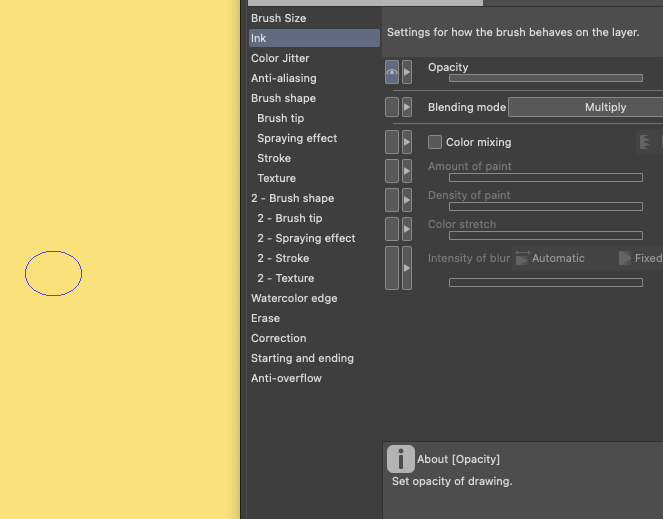
Ink
Ink section is going to be also very important. It has opacity and color mixing options.
Just like with pressure, we have an option to control it with pressure. That is the most standard classic brush you can ever get for digital painting. A hard round brush. Just set opacity to Pen Pressure you and are all set for digital painting.
The next important feature is blending mode. There are many many options there.
If you use the same brush on the same layer, each stroke will be applied with that effect. The possibilities are endless to be honest. I will mention only two that I think might be really worth checking out.
First one is multiply! Have you ever used cheap markers on a paper? If you keep drawing over the same exact spot, it will start turning darker. To imitate a marker in real life you can just create a square shape brush with opacity pressure and multiply. Used to use this method a lot when I was starting out.
I also can recommend trying out overlay and color dodge if you want to add glow and magic to your work. Depending on the brush, you will get different effects.
The other useful mode that I wish other programs would add too ( looking at your PS 0-0 ) is erase blending mode! Simply turn ANY brush you have into eraser!
Oil brush or hard round or watercolor. Anything can be turned into an eraser.
Another one is background, which is right below erase. Basically it will only add things that are behind the paint you already have. If you want to add a quick shape or do not want to mask things, then this is for you!
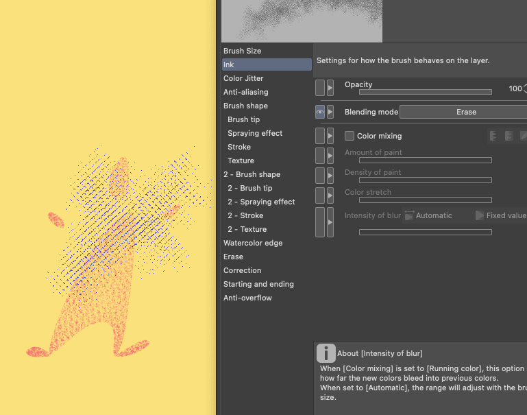
I just picked a halftone brush and used it as an eraser in one click. It's super fast and easy,
Background lets me add a quick fill behind without making a new layer or masking. Really good for quick fixes.
Now that we got this far, what if you messed too much with your brush??? Too many buttons were clicked, it's time to reverse!
Reset your brush
There is a quick way to reset a brush if you did it dirty ^-^
There will be two main buttons at the very bottom of sub tool detail.
Reset all settings to default will make everything about the brush as default. If you want to experiment with the brush you can also make a new brush, which we will cover in a bit.
If you want to save something permanently then clock on Save All settings as default. Anything you do to your brush, will become default after clicking on this. For example if you want to keep erase mode forever. This will be the button.
Color Mixing settings
This is a hard hard setting to explain >.>. For the most part, it is hard because it will always depend on the brush and the effects you want to use for it. I will try to keep it simple for this section.
You can also read the official guide from CSP in case you want go more in depth.
The main parts will be color mixing section. I think that using the first button will be enough for most brushes that are going to be created.
The secret to making the best brush is ... messing with settings :D
I like to crank thing up as much as I can to see what will give me different result.
If everything is ALL maxed.
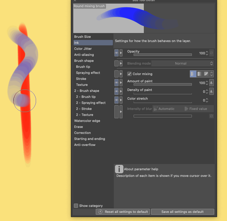
If you only keep amount of paint, you can see that it will add color if my brush will touch other color. Otherwise it will not add paint to the canvas.
Density of paint is adding color before you touch anything before. Once you hit other color, it will use amount of paint.
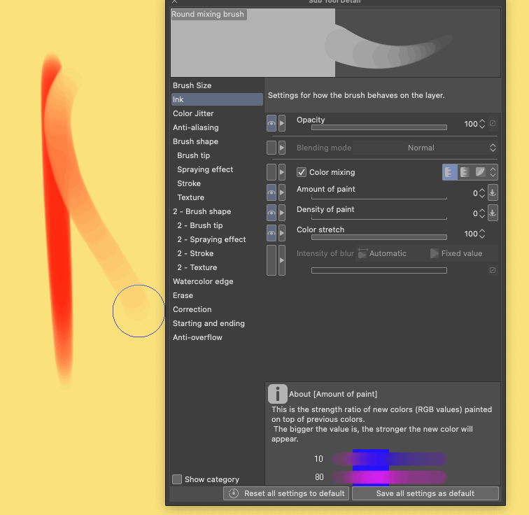
Color Stretch is how far the color will drag once you start mixing and smearing.
This also will depend on the brush shape, and opacity settings and what colors you are using. Overall, I like to keep my color mixing to a small amount. It is easier to mix things if it is only a little bit.
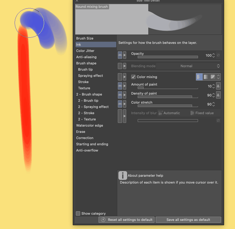
For just a simple hard round brush, I love to keep it simple like this.
Color Jitter
Color jitter is a fun setting if you like variety and messiness to your brushes. Something more traditional.
Change brush tip color will change every single shape that your brush has. If you have a circle shape, then you will get this effect.
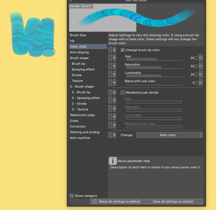
If you keep the numbers pretty low ( 5-15 for example ), it will add a tiny color variation to your painting. If you have color mixing on too, you will get a lot of variety to your colors. I like to use this feature when I want to have fun and not worry about anything on the canvas.
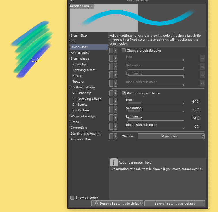
Per stroke will randomize each time you make a new line. This is really really really useful when you want to create texture in your painting. Just keep the numbers low and do cross hatching. This will make for a cool feel if you keep it subtle.
Small cross hatching goes a long way. I am uploading a GIF, so it shows very very strong, but if you reduce the opacity, it's a nice way to color blend and make things more interesting.
Make your own brush! Set Shape
Making your own brushes is super nice in Clip Studio Paint. I recommend starting with something simple and going more advanced later. The main thing is to create a shape of the brush. So how to approach it?
First, make your canvas, and MOST importantly do not forget to set it to Gray. A very important step.
Canvas size depends on your desired brush. I like to keep it small it work better on old computers.
Paint away! What kinda shape you going for? Look at other brushes you like using and what shape do they use. I went with a simple messy triangle for this one.
Once you have the shape ready, go to edit -> register material -> image
1) Name your shape. It will be easy to find later :)
2) Use for Brush tip shape check. Be default that is not on.
3) Set the destination for safety. I usually just stack all things in Download folder since I know it will all be mine.
Pick a standard brush that has the least amount of settings or pick a brush you would like a similar effect.
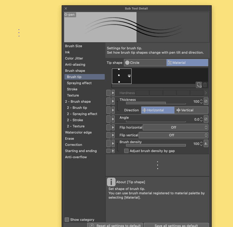
1) Go to SubTool Detail Brush Tip.
2) Go to material and click the little icon for a new shape.
3) Type in search the name of the shape you made.
4) Click on the shape you want and click ok.
There are many default shapes that are fun to explore too if you are curious. CSP has lots of nice stock images there.
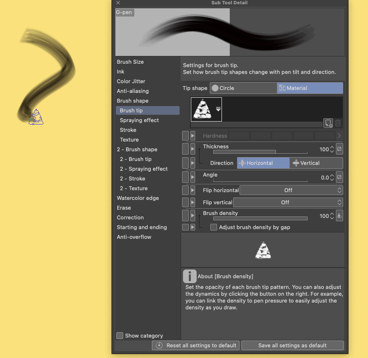
I just used a default hard round brush with opacity to test this shape. It gives off a nice texture to it.
There are more things you can change here in case you want to try them out!
To keep it simple. I will use a square box for this.
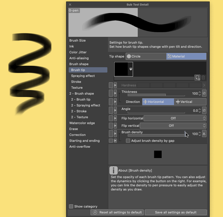
Thickness will make the brush wider and slimmer depending on the numbers. Default is 100. Also if you do not like this effect, you can always switch horizontal to Vertical. It will make the brush change in other direction.
The angle will change the angle of the original shape. Having a slight angle will add more variety to your strokes, especially if you are sketching!
The best part is that change of angle is possible through pen tilt too! If your tablet supports it, then you can tilt the shape you making with your own hand without rotating the canvas.
If I rotate my pen, it gives me a different angle. Really cool if you want some precise work and your brush is angled.
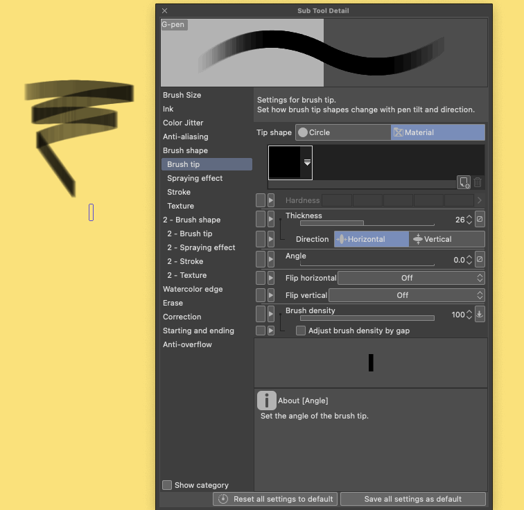
There are more options that are there too. For example, direction of line will let you create patterns or rake brushes. Just 3 dots shape made it possible for me to get nice cross hatch ( or at least It looks nice to me ;D )
Once you happy with the brush you made, just go to Sub Tool and click the little plus icon. This way you can get your brush as a separate tool now.
Boom. Your new brush is ready to be used! At least the basic brush. You can definitely go back and add more settings to it. One of the most important settings is stroke!
Stroke
Stroke will affect how close your brush shape will be put on canvas. If you want to see how it actually works, just set the gap to the first options. This will allow us to experiment with it manually.
To see how far you can push it, just set the number higher.
The more circles you have, the more your computer has to add to your brush. The best number is usually as low as possible, BUT as long as the brush does not look weird.
In this case it is 23! It was set to 10 before, which means we saved at least half of performance for this brush. Usually it's ok to have a low number, but if you have a complicated brush, it will start stuttering the stroke.
So if your brush is slow, maybe check this number to see what you can do with it.
Texture your brush!
Adding texture to your brush will make a huge difference, but just like with color mixing, there is a lot of experimenting. The great part is that CSP provides a lot of textures already.
If you click on none, you will get a list of different texture options to apply. You can also make your own or find some around clip studio paint assets.
I decided to go with a simple paper texture if you want to follow along.
Usually, not a lot happens once you apply the texture. There is a lot more tweaking that goes into it. My go to blending mode is Height. I am just very familiar with it, so I usually just use that.
I also recommend getting an air brush if you want to play around with texture. Usually it is easier to see how it affects the brush in case you never done it before.
I also suggest keeping apply by each plot on! usually makes for a more natural feel.
Other settings will affect the brush, and for the most part, it does what it says. Brightness and contrast will affect the texture image in those terms.
Rotate will move your texture around.
Invert texture will invert black with white, and white with black.
You will also get a live update of your texture up on on preview, so always pay attention to that.
Here are my settings for adding some texture to my G-Pen. I can always save it or just make a separate brush out of this :)
I like keeping texture density and scale small, so that it add more grainy look to it.
Stabilize
Lots of brushes are made for painting, but some need to be more precise. For example, I love to stabilize my ink brushes in CSP. It makes for a better experience when inking.
The correction setting is just for you! Overall, think the main things to see are stabilization and taper.
Stabilization will make your strokes less shakey and more smooth. I only use it if I am doing final inking. It's really restricting when sketching.
Taper will add more of a "tail" to your brush.
I do not use it every time, but it's nice when you want to achieve nice hair line for example.
Final Thoughts
There is a lot more to brushes, and I hope I can make part two some time, but for now that is it :)
Let me know in the comments for video if you have any questions. Also share brushes you love! I hope you learned something. If you want to see more of my art, see links:
Users who liked this post


Comment