
In this article, we will explain theoretically as much as possible how to overlay overlay and how it will be finished.
Since the overlay seems to be like it, I often see that it is used for the time being, so I'd appreciate it if I can help you understand concrete usage.
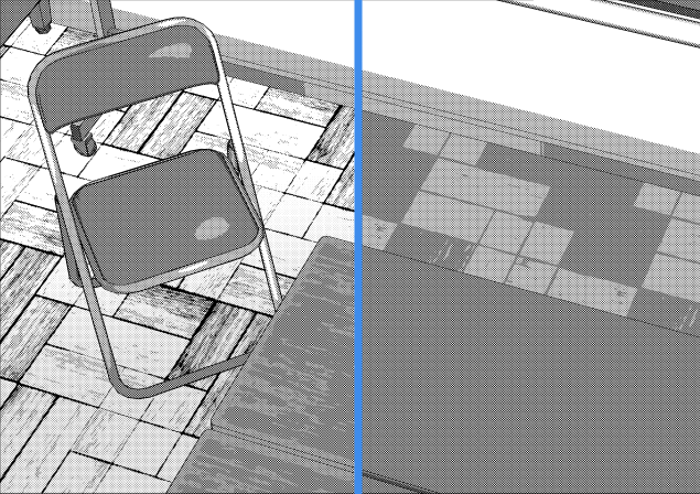
In this article we try to overlay the following illustrations.
[Basic] Neutral color of overlay
Neutral color, roughly speaking, is "a color that can not see any change even if it is synthesized."
The neutral color of the overlay is 50% gray (RGB 128).
Please try painting 50% gray on the overlay with synthetic mode as a trial. No change will occur on the screen.
Let's change the appearance of the screen by changing the hue, saturation, and lightness of the color applied by the overlay with reference to this color.
【Basic】 Brighten the screen
Overlaying gray with higher brightness than neutral color makes the screen brighter. The lightness of the dark part and the overall hue are almost unchanged.
When you do not want to change the overall color tone, it is good to use it when you want to keep the contrast and brighten the screen.
【Basic】 Darken the screen
Overlaying gray with lower lightness than neutral color makes the screen darker. The brightness of the bright part and the overall hue hardly change.
It is good to use it when you want to change the screen darkly while maintaining the contrast when you do not want to change the overall color.
[Basics] Collect screen color tones
If you overlay a color with saturation raised from neutral color, the color tone of the screen is unified with the selected hue, and saturation becomes high at the same time. The lightness of the whole is almost unchanged.
When you want to unify the whole color, it is good to use it when you want to keep the contrast and make the screen vivid.
[Practice] Brighten the screen and summarize the color tone
Overlaying colors with higher lightness than neutral color makes the screen brighter and brighter and gathers tones.
As an example, overlaying a light yellow color.
[Practice] Darken the screen and summarize the color tone
Overlaying colors with lower lightness than neutral color makes the screen darker and brighter and the color tone gathers.
As an example, I applied a dark blue overlay.
【Practice】 Change hue of bright part and dark part at the same time
When overlaying light yellow and dark blue at the same time, the bright part becomes yellowish, the dark part becomes bluish, the whole saturation becomes high.
The technique of bringing the hue of the bright part closer to yellow and the hue of the dark part bluish is called "natural coloring", and it is one of the methods of choosing the hue that light and dark looks naturally. If you are interested please check it.
【Practice】 To express expression expressing light
Applying overlay so that the light yellow is from the top, and the dark blue from the bottom from the bottom, the upper part of the screen is yellowish and bright, the lower part of the screen becomes blue and darker.
You can express like light from the top and shadow on the bottom.
Summary
Overlay is a synthetic mode that makes it easier to look better, but by understanding its mechanism you can achieve the desired effect.
It would be greatly appreciated if the person who read this article can enjoy processing using overlay.
Users who liked this post


Comment