
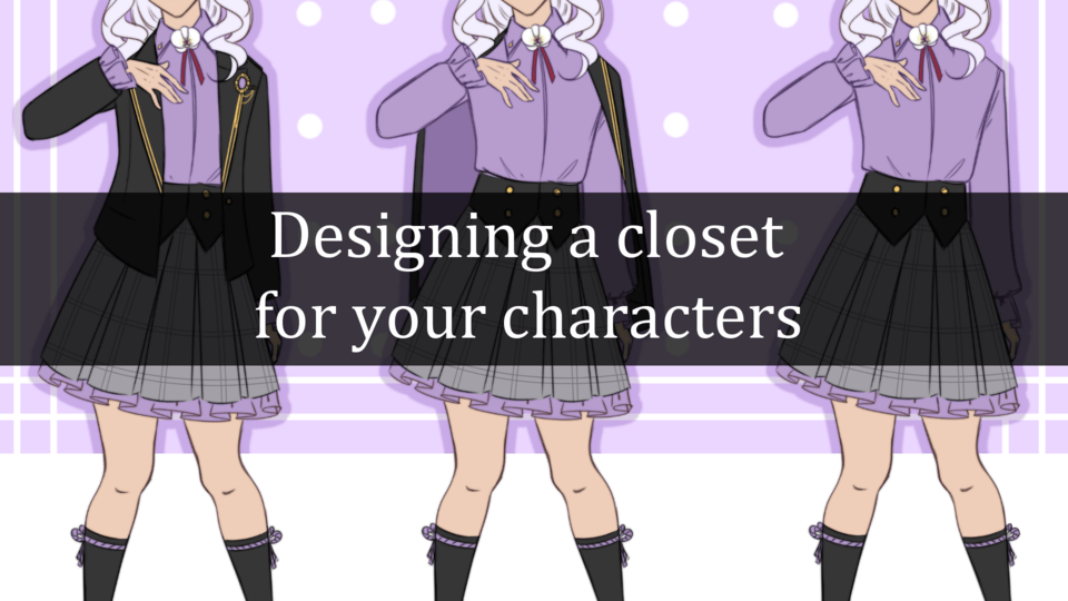
Introduction
Hi, I am takemono7. In this post I will show you a technique I learnt to color a character art. I will also tell about how to use layer mask and selection tool to make it easier to render your artwork.
Need to Know Basic
Before we start, I will introduce you to basic selection tool you need to know. There are many, but we only need few in order to create simple anime art character.
1. Selection Area
The most important tools in selection area category is Lasso Tool.
Because with that we can freely selecting any area in our canvas.
Polyline, works similarly but more rigid, this is more useful for man made object like table.
Rectangle and Ellipse has no use in character drawing, but can be used for simple BG or pattern creation.
Selection pen basically a selection area tools that works like pen brush. Erase selection as its name erase any unneeded selection.
Shrink Selection has no usage in our tutorial.
So, each tools has its usage, so use accordingly. For this tutorial, the best way to select is with Auto Select and Lasso, you can forget the other.
2. Auto Select
The second best thing to have is Auto Select tool. Basically selection area tool in steroid. It automatically select certain area that you click on canvas based on mode you choose.
Auto select tools has 3 modes:
a. Refer to editing layer only -> means it’d only detect area within your active layer. This is only good or useful if you are the type who combine all base color layers into one single layer.
b. Refer to all layers -> should be your default. As it’d detect any area in all layers.
c. Selection for referred layers -> this one should be your 2nd choice as you can just set certain layer, i.e lineart layer for character body as the reference. So, when you want to color certain body part, you can just click anywhere within your character body lineart.
3. Basic Layering
Beside selection area, those tool/button above is VERY IMPORTANT to understand if you want a smooth workflow.
1. Clip Layer button -> must use for coloring technique.
2. Set layer as reference button -> basically make layer as reference, this works with auto tools with selection for referred layer mode.
3. Create New (raster) layer button -> create new layer. You should know this already.
the one beside create new (raster) layer button is if you want vector layer. Vector layer is nice to have but is not important, so we will skip vector.
4. Create Folder layer button -> make your layer organized.
5. Mask layer button -> very important for coloring technique.
First is Clip layer.
This function is a must. It basically make the layer (layer 2) that you clip onto base layer (layer 1) has a limited area. Its limit is what exist on base layer. So, you cannot draw anything outside the border limit of base layer.
Above you can see that when I use rectangle selection area tool to fill that area with pink color, it stays inside the border of (layer 1) black square.
Second is Create layer mask. Very important tool to make coloring EASY.
- Click fill tool (top right).
- Layer 2 is filled with pink color.
due to layer 2 being clipped, the pink color stay inside the border of base layer (layer 1)
- Create the mask button. It’ll create a layer mask.
- Layer mask by default is filled with white color.
To play with layer mask,
- First click the square on the right of layer 2 (the white one in image above is the layer mask).
- You can see there’s a white border when you click that layer mask.
- If you click the pink square, you can see that a white border is now on the left square.
- This white border tells you which side is active.
The trick is that you only color with the layer mask active. So, whatever color you use, it’d stay the same as the layer color (in this sample, layer 2 is pink color). So even if you set your brush color to white, when you play in layer mask, it’ll stay pink.
So the basic rule for coloring is:
- Create Base layer (layer 1)
- Create layer 2 for shadow (this is just example).
- Create layer mask, make sure it’s active, delete it.
- Now use any brush, stroke your brush anyway you want.
Now, to stay organized, Create Folder Layer.
Click the checkmark beside the eye icon. It’d select the layers. Then right click or tap and hold with pen (iPad). Create folder and insert layer.
TA-DA! Now it’s organized. You can make as many folder as necessary.
Above is an example of me coloring with layer mask. I don’t need to note what color I use if I do revision or changes in the future. The color of the layer (which is pink) is the color of my brush stroke.
4. Selection Launcher
From left to right:
1. Turn off your selection
2. Crop your canvas. Only matter when your drawing is finished.
3. Invert selection -> important on base color stage, will be explained in this tutorial later.
4 and 5 -> increase and decrease selection by pixel (you can choose how many pixel). Doesn’t really matter in this tutorial as your god tool is Lasso Tool. But good to know, might be useful for certain case.
6 and 7 -> delete
8 and 9 -> cut and copy.
10 -> important at later stage of liquify, will be explained in this tutorial later.
11 -> Fill tool
The last two is not important.
I am not sure who say this, but it’d be like this:
“I fear not the man who has practiced all selection area tool in csp once, but I fear the man who has practiced Lasso Tool 10,000 times”
So, make basic layering knowledge, lasso tools, and auto select your best friend. Usage of them will be taught in this tutorial later.
Preparation
1. Sketch
First prepare your sketch. Here I will use sketch from my commission piece.
2. Lineart
Now line it the best you can, don’t worry if you want to add minor detail that will eventually be removed or overpaint. What’s important in the first phase of lineart is to put any information that will help you in rendering. Here, you can see that I add details on the knee and hip (which later get removed).
Well, if you want my tips for those with tremor hand when drawing, check the video below. Basically use lasso tool to isolate the line you draw that’s not really shaped as expected and use Free transform and Liquify to shape it. Create new layer each time you want to create new line stroke, edit it with tools above (free transform and liquify), then merge them down. Easy Peasy. Another important thing is that to zoom out the canvas often when you have drawn enough line since what’s matter is what you see from afar since normally nobody gonna zoom in your artwork.
3. Base Color
Selecting character
Now you need to add Base color for the character, first use Auto Select set to Refer to all Layers OR Selection for referred layers. Both works fine for this purpose but for this sample, I will use “Selection for referred layers”.
For your Information you can just click on linearts you have made by holding shift and clicking on each of them, then right click and “Create folder and insert layer” (for iPad, just press and hold the pencil on the screen for few seconds). Once the folder is made set it as reference layer as shown in image above.
Use the auto select tool to select any space OUTSIDE of the character (this is also known as negative space). Press and hold SHIFT then click with auto select tool to add another selection. Then Proceed to use “Lasso Tool”. Press and hold SHIFT to add another free selection with Lasso Tool.
To remove selection, press and hold ALT (windows) or Option in Apple.
You can see your lasso tool has a plus or minus in its icon on the canvas when you press your pen. Plus when you press and hold shift and minus when you press and hold alt.
You can just Press a button that invert selection. So the selection of the negative space (anything that’s not the character), will become a selection of the character. Manually is with Select > Invert selected area (Apple: Cmd+Shift+I).
Use base gray as base color for both character.
Adding Color
Now, use the same technique again. First, select the skin part. Remember:
1. Use Auto select tool (set to “Refer to all Layers” OR “Selection for referred layers”) for the big part.
1.5 You can use expand selected area to make selection area slightly bigger.
2. Lasso tool for manually selecting and deselecting part.
Press SHIFT button to add another selection either with Auto Select Tool or Lasso tool.
And Press ALT/Option to remove selection.
Now do for each body part:
1. Create a new layer
2. Clip to layer below (clip it to the gray base color layer).
Note: you don’t have to use gray as base color layer, you can use any color. I just like gray for the base. Eventually I will change its color as necessary.
3. Create a selection with Auto Select and lasso Tool
4. Fill it with solid color of your choice
4.5 (OPTIONAL) Follow the technique in image below.
5. Once all separate solid color for each body part is done you can either
a) Put them into one layer group named “base color”
b) Merge them all into one layer. I want it simpler so I just merge them all into one layer. But option [a] is preferrable for commission artwork.
Result is as follows:
I add blush on different layer then merged it down into single layer for base color. For commission piece or if you believe you might change the color I suggest you to keep it on separate layers (so one layer for each body part clipped into one Base Gray Layer) and put it into a folder.
You might wonder, hey the eye is more detailed than the other body part in term of rendering. The reason is that I do an eye render first before I do render for other part. Of course the eye layer (or layers in a layer group) is put on top of all part.
[BONUS] Eye Render Tutorial, the Easy Way.
1. Make sure the lineart for eye is exist. Yes you need to have it drawn like sample below.
How to fill Base Color in video. DON’T subscribe to the channel, there’s nothing on it. I’d rather you check my X/IG instead of my youtube.
Now do the same for
1. The Sclera (the white part of the eye)
2. Iris, well basically the colored part of the eye (the video above)
3. The eyeline
4. (opsional) Eye Shadow
Each in their own layer. Group them to make it more organized. Clip them above the base gray layer I taught above (OR above The Folder of Base Color layers if you don’t merge them into one layer).
Now, we go to Simple Eye Render. Follow the steps in video below:
1. After Base Color is done, create a new layer for each base color and clip it into them
2. For simplicity sake and stylistic choice I limit the amount of color I use.
You can draw with different style with this technique too. Use reference of favorite artist if needed.
First, for Sclera create one shadow color > Mask it -> click the mask button on the right side of “shadow 1 for sclera layer” > clear the masked area by pressing delete on keyboard or with on screen delete buton (on the right of REDO button).
Second for the IRIS layer, create 3 layer above it and CLIP them into IRIS layer.
a. Shadow 1 layer -> main shadow
b. Shadow 2 layer -> for PUPIL and as Ambient Occlusion.
c. Reflected Ambient Layer -> Just choose color that’s in opposite direction in Hue circle. Put this in lower opacity.
d. Light Layer
for specular or highlight I suggest you put it above all layer, but for this video I put it above iris layer but NOT CLIPPED into Iris layer.
Rendering/Coloring
A. SHADOW
Steps are as follow:
1. Above the base color you have succesfully created, now create a new layer and clip it. Fill it with any color you want, I suggest to use color that is great when set to multiply for skin shadow. Use this color for example.
2. Set the layer into MULTIPLY
3. Create a layer MASK
Layer > Mask > Mask Selection
or use the shortcut button
4. Click the Masked layer, the WHITE BOX on the side of your shadow layer. Click Delete to clear it.
5. Make sure that Mask button beside the shadow 1 layer is clicked.
6. Start Rendering
But!? Where do I put the shadow and stuff?
1. Here’s the trick, USE CHEAT.
YES A CHEAT.
We have a cheat that’s called REFERENCES So, make sure you ALWAYS HAVE REFERENCES before drawing. Search for reference of lighting condition you want.
Few CHEATS are:
1. Photo Reference
2. 3D model with correct light setup
Professional photo studio is a great reference for light and value. This commission’ client provide me with studio photo reference of the girls.
But what if such photo is nonexistent as you were creating an original pose from random thought. Use 3D Model then.
You can use any 3D model. Clip Studio Paint itself have 3d model, there are many 3D app that I recommend: Magic Poser and Poseit (both are great paid app on android and iOS/iPadOS).
Remember, the great artist Glen Vilppu say:
(I paraphrased this) “You can’t draw what you don’t know”.
Or something… Basically USE REFERENCES!
Even James Gurney use references too, he made a 3d model (REAL Handmade model) and take a photograph of it for his Dinosaurus Art Book. I know this because he showed it in his video on gumroad.
2. Know the fundamental on Lighting
Yes, you need to know the lighting fundamental. Marco Bucci is a great teacher for this and for that you need to know about fundamental.
you might say: “Come on! Just give me the quick tips on how to color!”
3. Cheat once more with Cell Shade Basic
Yes, cheat again, we artist must cheat the correct way.
So in lighting fundamental we can divide a value into 2 family, shadow Family and Light Family.
Shadow Family contains:
a. Main shadow/core shadow/average shadow
b. Reflected Light/Ambient Light -> a light that comes from environtment and reflection of other part near the object.
c. Ambient Occlussion -> Basically a part in shadow where you think it doesn’t get any light or much light from either ambient light or direct light
Light Family contains:
a. Light
b. Midtone/halftone (usually near the main shadow/termination but still is a light family)
c. Highlight/specular (can be diffuse can be specular depending on materials, cloth usually is diffused while metal/reflective material has specularity)
So, how do you cheat with Cell shade basic?
First in cell shade basic we still use reference as guide for lighting BUT we decide what part of light/shadow family joins the “shadow 1 layer”.
The Tips is we don’t conform to reality. YOU DECIDE which part of midtone in reference got ignored and which part of midtone join the main shadow (shadow 1).
Ofc you can add midtone later if you want more realistic lighting, this is optional, but… realism is not that “SIMPLE” as this article was about a simpler coloring. You can do it but you don’t have to.
Technique
So, in nutshell the technique is use lasso tool and fill to create a cell shade basic of the shadow 1 first
OR
Use auto tool set to “refer to editing layer only” if you merged all base color into one layer or just Command Click (or CTRL click) for body part base color layer (if you don’t merged it and put it into group instead) to select skin area for example.
Then use pen tool to shade manually.
Result of Shadow 1:
You can see that I decide to join midtone with mainshadow with cell shade basic which later get smoother (now it become soft shade) with Blend Tool (Mignon Blend tool is MAGIC). Once you get used to it, it’s fun to smooth the “shadow 1” cellshade you create.
TIPS, just do a cellshade first and smooth it later. In video I smooth it pretty fast as it’s short video. In reality, smooth it LATER after the cell shade basic is put into shadow 1 layer.
I will include all the brush at the end of tutorial.
B. AMBIENT OCCLUSION
Ambient occlussion?
In graphics, ambient occlusion is a shadowing technique used to make 3D objects look more realistic by simulating the soft shadows that should naturally occur when indirect or ambient lighting is cast out onto your scene.
Well in drawing it means basically use a shadow 2 layer or AO shadow layer to make certain part of the character body darker.
Just copy paste shadow 1 layer, rename it to shadow 2 and make sure it’s set on multiply too. And empty the layer mask.
The usage of Shadow 2 layer or AO layer is:
1. to give more information about the form of what’s in shadow or
2. to make certain body part that’s near each other and/or unlikely to get good ambient light nor direct light darker
For usage number one, use low opacity or press your pencil minimally. Or brush normally then use very soft eraser to erase darker shade you made as needed.
For usage number 2, use a lasso tool to create a selection of part you want it to be darker then use airbrush to put the AO.
Yes, you can have more detailed shadow by dividing AO into shadow 2 and shadow 3. In which shadow 2 is lighter shadow color than shadow 3 and that shadow 2 only works in area that’s covered by main shadow as a function that will make a form in the shadow clearer. And making the shadow 3 only works in place where there’s really no way “ambient/reflected light” lighting it.
C. REFLECTED LIGHT/AMBIENT LIGHT AND HIGHLIGHT
1. HIGHLIGHT
Well, you want to know something interesting, we can just use one layer for both highlight and ambient.
1. First create new layer
2. Clip it
3. Set layer mode to screen
Another interesting tips is that you can just use EYEDROPPER Tool to select in a part that’s already rendered before with shadow 1 and shadow 2 and use it as color for the highlight.
4. Use pen tool
5. Blend the outer side, you can use any blend tool you like.
6. [optional] Erase with low opacity eraser to make it’s opacity reduced.
7. Note you can make however you want for the highlight/specular.
But if you want to make slightly more realistic, only use SHARPER EDGE on REFLECTIVE material (ie latex clothing) and more dull lower opacity for skin.
Exception is oily or wet skin.
2. AMBIENT/REFLECTED LIGHT
1. In the same layer as Highlight that’s set to screen layer mode, you go eyedrop the environment or any color you want.
2. Make sure it’s a darker color by reducing the luminosity/brightness closer/near to black. How close is up to your preference as different value can give different effect. Experiment.
3. Create a selection using auto select tool or lasso tool
4. Use airbrush or any brush you like
5. [optional] use low opacity eraser to make it less prominent.
Remember the rule: brightest part in shadow famil) is still darker than darkest part in light family.
Well you don’t have to follow the rule. Because if you make it brighter than the darkest part in light family it becomes what we call RIM LIGHT. Which basically means a light source from another angle. And… RIM light is not part of the shadow family. But that’s ok, what’s important is that the render looks good and plausible when you zoom out.
Another method is by:
1. Create a new layer
2. Clip it
3. Set to soft light with 50% opacity
4. eyedropped any ambient color, for example the light blue of sky.
5. Use any brush, and put brush it into body part that’s in shadow that you think ambient light from the sky will reach it.
6. change the hue-sat-luminosity if necessary
FINISHING/OVERPAINT/EDIT
Now that we have render the character we need to do some clean up.
Lineart Coloring
1. Go back to LINEART LAYER
2. Create new layer
3. Clip it
4. Put some darker color on line that’s inside of the body You can leave the outer line black, and only color the inner line. You can color the outer line too if you like.
5. The color is up to you but in nutshell just eyedropper the color result of shadow 2 on skin for this example, reduce the saturation a bit and choose a color that’s closer to black. How dark is up to your preference.
Lineart thinning
1. Create a mask on Lineart layer
2. Use very soft eraser (low opacity) to reduce the opacity/thickness of the lineart in some part.
3. You can also remove certain part that you deem is clear enough without lineart.
Look at the rosario and armpit line.
Specular Light (Highlight) for Eye
If you haven’t done it already, make sure to create a new layer above the lineart layer and use white color to make a specular highlight for the eye.
Color Adjustment and other adjustment.
1. Press command (or ctrl) and click on Base Color layer then SHIFT and command again and click on lineart layer. You will have both base color layer and lineart layer selected.
2. Create new layer in the top. Then right click on that (or for pencil tap and hold) to bring up a menu.
3. New Correction layer > Color Balance or Tone Curve or Hue/Saturation/Luminosity
4. Use whatever you want (one) among them. Adjust accordingly
5. Reduce the opacity of said correction layer as you wish
6. Create another correction layer (what you use is up to you).
Note: You can select certain body part with technique I tell before (auto select or lasso tool) and use color balance to make it warmer or cooler by adjusting the color balance for each (shadow, half tone, and highlight; but usually adjusting the half tone is enough).
This color adjustment is not a must but a good things to know.
In my case I just do:
1. Eyedropper the background color
2. Create new layer above. Select the base color layer and lineart layer.
3. Fill the layer with color you eyedropped.
4. Set layer to COLOR mode OR HUE.
5. Reduce opacity to 10-15%
It might not much but I think it’s way better than the hotter temperature feel render by default. As giving blue hue/color change make it slightly cooler.
Overpaint and Liquify
Sometimes if I feel the finished drawing need some minor shape adjustment, I make a new layer, right click, and “merge visible to new layer”.
Lasso tool part I want to edit, for example head part and press mask button. Then Apply Mask to layer.
(Manually by clicking: Layer > Layer Mask > Mask Selection. Then Layer > Layer Mask > Apply Mask to layer).
Use liquify tool to liquify as needed. You can always repeat this part as necessary.
[Bonus]
Make it more heavenly
1. Disable all background layer/folder and make the background gone from the view
2. New layer
3. Right click or press and hold (apple pencil) > Merge visible to new layer.
4. Filter > Blur > Gaussian Blur > default 6.0
5. Set opacity to 40-45%
Paper effect ?
1. New layer
2. Filter > Render > Perlin Noise > set scale to 1.0
3. Set layer mode to soft light
4. Reduce Opacity to 30-35%
left: no noise
right: noise (perlin noise set to 1, soft light layer mode, 30%)
Additional Tips [Convert to selection layer]
In case you have merged the base color layers and somehow the auto select tool does not works as you want and doing lasso tool every time is time consuming. THERE’S another way to create a quick selection.
Check the video below:
1. Basically just make the selection with auto select tool or lasso tool ONCE,
2. SELECT > Convert to selection layer
3. This newly made layer will work as quick select layer, turn the layer off once you click it and have certain body part selected.
4. Then proceed to render as you want.
FINISHED PIECE
Downloadable Brush
For Blend and Drawing Brush, check it on my twitter page since I can’t link anything else here except YouTube url.
For the Very Soft Eraser, just copy the default soft eraser like image below.
You can use all default brush provided by Clip Studio Paint. But if you want to reach certain effect it is a good idea to get:
- Mignon Blend Brush -> BEST Blend tool for anime style soft shade in my opinion.
- Mignon Hard Brush or Rizdraws Chalk Brush -> for placing shadow be it simple way ala cell shade or even for detailed one (with midtone as you half press the pen and main shadow with full pen pressure).
- For Eraser, very soft eraser above is the best if you want to gently erase shade that’s too opaque. It’s not necessary if you go full cell-shade, but might be useful if you go for cell-shade soft shade combi or full soft shade. You can use other texture or brush as eraser with similar setting to achieve similar effect.
Conclusion
You can use the selection tool provided by clip studio paint to help you create a character render.
Focus on cell shade basic first and blend if you want to go to soft shade style (or combo in which certain part is not soften while others are).
Thank you for your reading. I know this is kinda long, but once you get the hang of it you can finish one character artwork from line - color just in one day, the master I follow do it only in about 2-3 hours.
My Social media is takemono7
Users who liked this post


Comment