
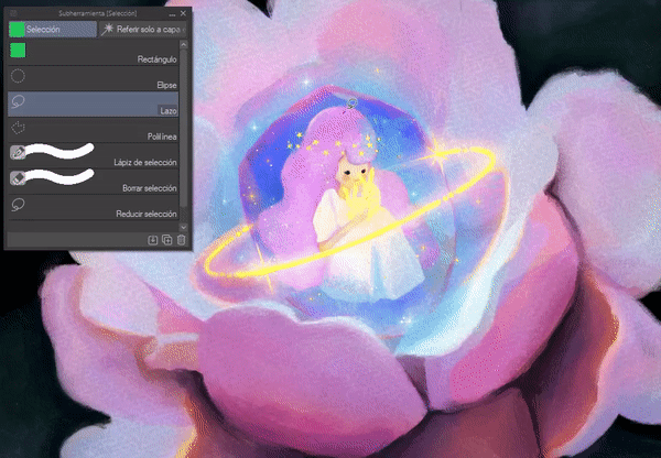
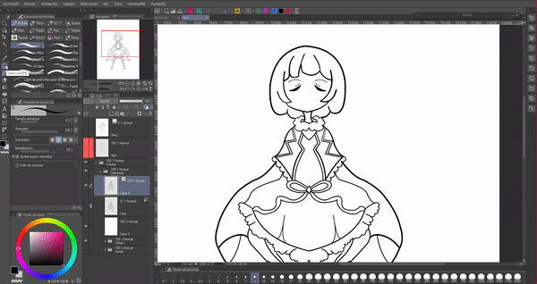
Presentation
Hello!! Welcome, once again. This time we will see some uses that we can give to the selection tool. I can tell you that once you get to know it, you will not stop using it, it is very versatile, especially useful for correcting errors and reducing time. I hope it is useful to you, without further ado...
Let's get started!!
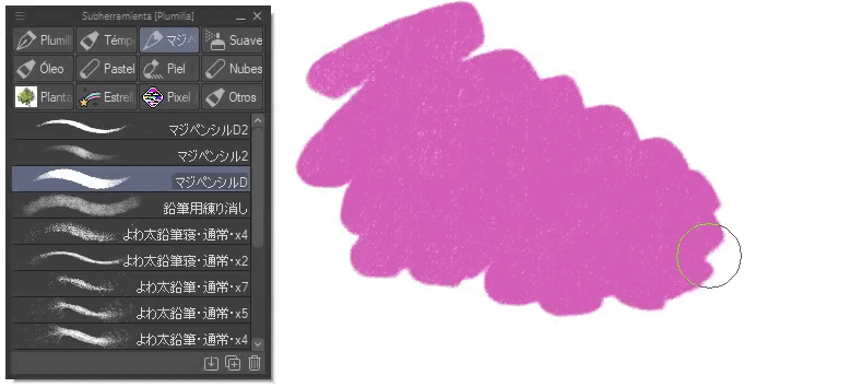
1. Selection tool
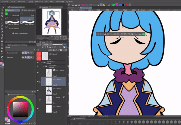
Selection is located in the tools palette, it usually appears with a dotted grid icon. This tool has eight sub tools, which are located in the sub tools palette.
Shortcut: Press the “M” key to call the tool more quickly.
The selection tool allows you to delimit an area to work on, and everything outside that area will not be accessible for editing.
Another palette that we must take into account is “Tool Properties”. In it we will find useful settings to create a new selection, add, delete selection and select from the selection, as well as others.
NOTE: By default it is marked in “New selection”. And in addition, each subtool has this section in that mode.
• MOVE SELECTION
After making a selection we can move it, for them we must appreciate how the cursor sign changes; When the sign has the shape of a square with a cross at the bottom right, moving the selection around the canvas will be possible.
NOTE: This can only be done when the selection mode is set to “New selection”.
• DESELECT
To deselect there are two methods; The first and easiest is to use the “CTRL plus D” keys. And the second is by pressing the first icon of the floating selection menu.
• HIDE SELECTION EDGE
If at any point the selection border is in your way, to hide it we must access the following path: View > Selection border. By clicking on this last option the border will disappear.
NOTE: Even if it disappears, the selection will still be there, and therefore we can make all the modifications like a normal selection. Once that selection is completed, the border will appear again when we use the tool next time.
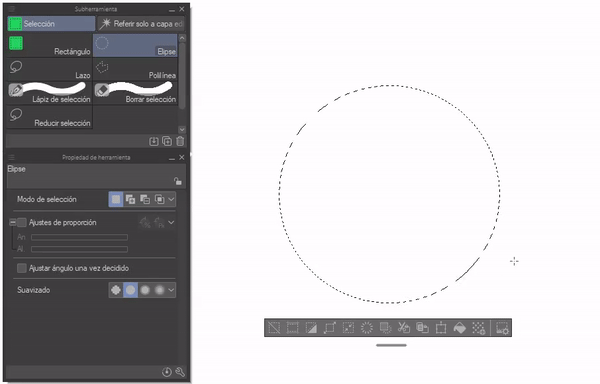
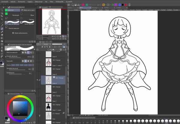
► Manual selection
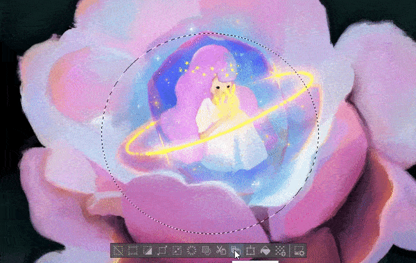
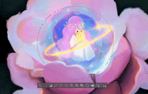
To create a selection manually (in a later section we will see how to create an automatic selection) we can do so using any of the following sub tools: Rectangle, Ellipse, Lasso, Poly line, Selection pencil and Reduce selection.
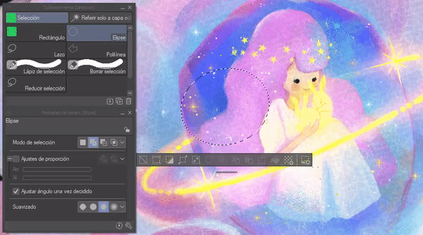
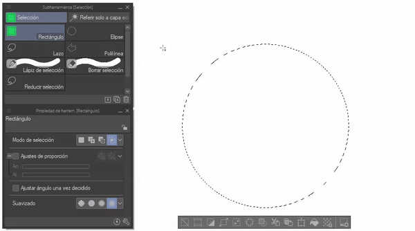
• RECTANGLE AND ELLIPSE
These two tools allow us to select using a predefined shape. Ideal for large selections or for selecting rectangular/square shapes. On the other hand, I recommend the ellipse to create shapes of this type and fill them.
NOTE: If we hold down the SHIFT key, perfect shapes will be created: a perfect square, rectangle or circle.
An example: Create shapes behind our characters.
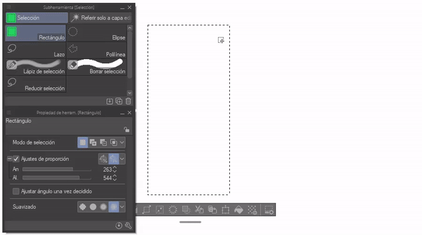
Within the tool properties palette we find two options that are only present in these two subtools: “Proportion adjustments” and “Adjust angle once decided”.
Proportion adjustments: To use this option we only have to click on the corresponding box on the left side; With the “+” sign, sliding bars will be shown where we can choose the dimensions. This is used to determine a specific size of the selection. Within the options there are two sections; The first allows you to choose the “Specified Relationship”.
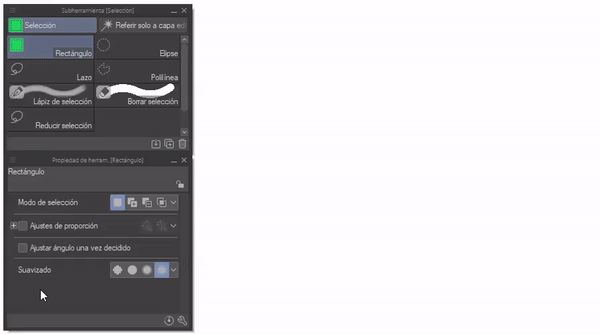
And the other allows “Indicate length”.
Adjust angle once decided: To use it we must create the shape, then we must move the mouse until we have the desired angle.
NOTE: Pressing the SHIFT key the area will rotate 45 degrees.
• LOOP AND POLY LINE
These two, for their part, provide greater control to determine specific areas.
(1) Poly line works with a series of straight lines; We start at one point, then we move to another and mark it; At the end to close the sequence we must click on the starting point.
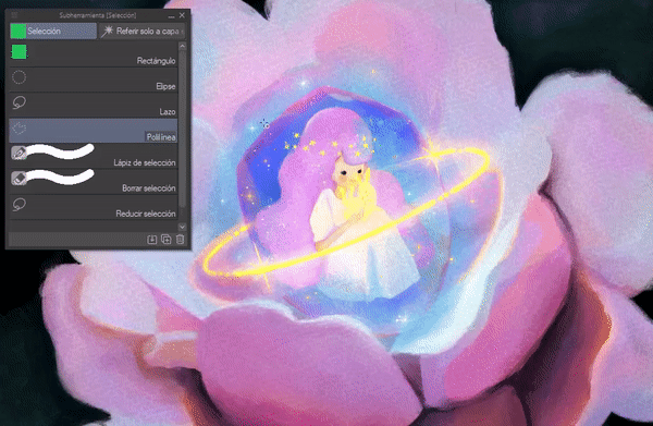
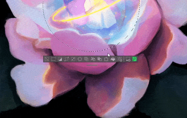
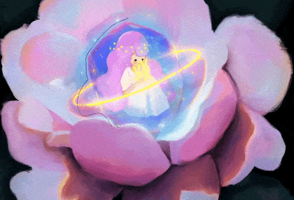
(2) Lasso provides a free selection, in other words we can draw the selection ourselves without using predetermined shapes. This makes selection much easier for us, it is a versatile sub-tool and the most used.
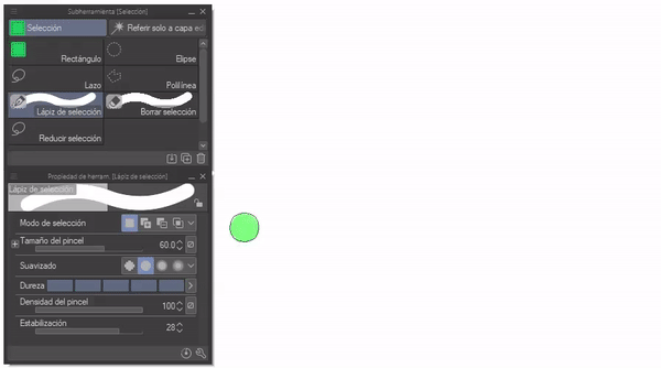
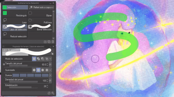
• SELECTION PENCIL
With this tool you can create a selection as if we were using a brush. The width of the selection will correspond to the width of the brush.
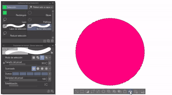
• CLEAR SELECTION
With this sub tool you can erase parts of the selection as if you were using a brush; This is because the selection mode is set to delete (I explain this mode later).
Within the tool properties we find the same ones that a normal brush has, such as: Brush size, softness, hardness, brush density and stabilization. Brush size does what the name says and the stabilizer improves precision when painting.
The smoothing has four levels (none, weak, medium and strong); The stronger it is, the edge of the selection will be smooth.
NOTE: This option is available in all selection sub tools.
Hardness makes the selection blurry; It has five levels, level 1 is the fuzziest and the fifth represents the strongest. This is not noticeable in the selection, it is only evident when it is filled out.
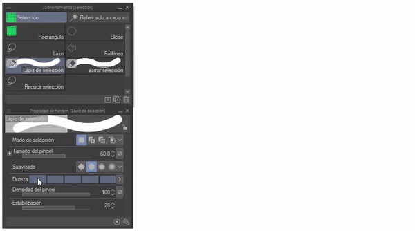
The density of the brush, as its name indicates, modulates the transparency of the selection; Once again, as in the previous one, the effect is not noticeable as such in the selection, until it is filled.
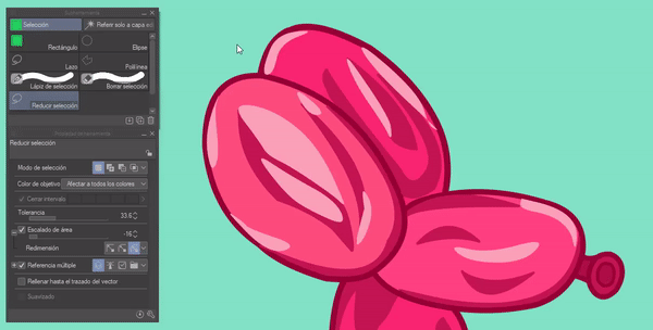
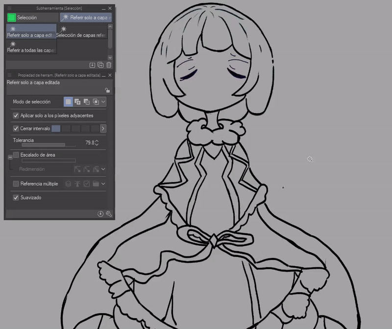
• REDUCE SELECTION
This sub tool allows us to make specific selections; In order to use it properly we must know what its tool properties are. Let's see what functions it has and what they are for.
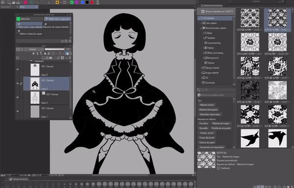
OBJECT COLOR: In this section we find a drop-down menu; These functions allow us to specify what we want to select. Each one of them explains in its name how it works.
• Affects all colors
• Transparent only
• Area surrounded by transparent
• Black only
• Area surrounded by black
• White and transparent only
• Area surrounded by white and transparent
• Treat semi-transparent as transparent
• All areas closed except transparency
• All areas closed, including transparency
Let's see an example: If I select the “Only black” option, all the dark areas of the illustration will be selected.
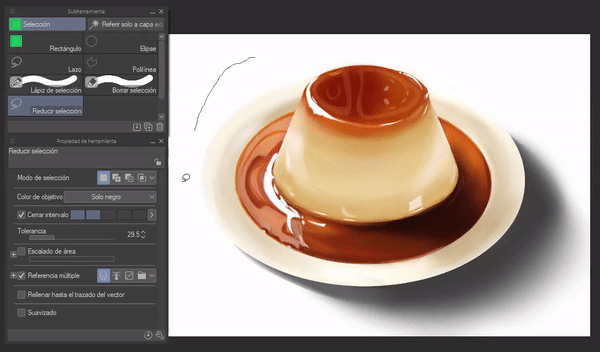
CLOSE INTERVAL AND TOLERANCE
Close interval allows you to ignore small empty spaces between lines, while tolerance allows you to select a larger number of pixels.
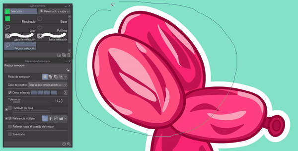
AREA SCALING
This function allows you to expand or reduce the selection; The scaling is between a value of -20 to 20.
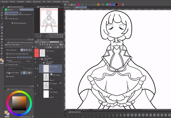
REFER MULTIPLE
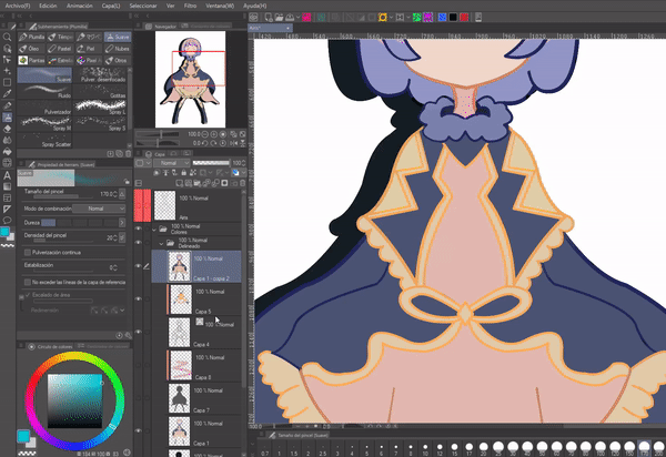
This feature is very useful. Generally speaking, we can create selections no matter what layer we are on. For example: if we make a selection on a different layer than, for example, the line layer, it will not be filled according to the selection unless we activate “All layers”. We can also do it with folders, reference layers and selected layer.
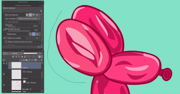
Another thing, if we display the menu by clicking on the cross on the left, a series of options will appear that will allow us to exclude specific layers; Among the options we have: Sketch layers, text, selected layers, paper layer and locked layers.
FILL UP TO VECTOR PATH
This is a feature aimed at vector layers; Its operation is simple, it allows filling up to the center of the vector line. It only works on vector layers.
This is a very good option so that there are no small white lines like those shown in the image below.
► New selection
When this mode is active we can create a selection, but when creating another the previous one will disappear. Only one selection can be generated at a time.

► Add selection
In the previous one we saw that you can only make one selection at a time, but now, with the second option of the selection mode “Add selection” we can have several. It's simple, we change the mode and that's it, we can make several selections or add to the same selection.
Shortcut: If we hold down the SHIFT key we add without the need to change the tool configuration. When the key is released, the configuration will return to its base (if in new selection it will reselect one at a time).
NOTE: Using this mode we can combine the shapes provided by the different sub-tools.
► Remove from selection
As in the previous one, only this removes parts of the selections. Let's say we want to make a donut, we make a circular selection, then we change the delete mode and remove the center with the same ellipse tool.
Shortcut: Holding down the ALT key subtracts.
► Select from selection
In this case, if we have a selection and we activate this function, when we make another one above the first, only the part where both selections overlap will remain, the rest disappears. For example, if we have a circle and we apply a square on top, only the union between the square and circle will remain.
Shortcut: Using the SHIFT plus ALT keys can be used without using the tool panel.
► Automatic selection
We can find the automatic selection in the tools palette, it is in the shape of a bar. This tool is very practical for quickly selecting areas, but it is not highly recommended if you have a style with loose and disjointed lines.
There are three sub-tools, in essence they are the same, but with their “multiple reference” modes adjusted differently, so it is not necessary to explain them, by knowing what each mode is for, we will know what each one does.
This tool allows you to touch an area and everything of that color within the area surrounding the epicenter of the click will automatically be selected. For example: In the image on the right we have everything transparent selected until it hits the black border; while on the left only a certain part of the pink color was selected.
With the “Tool Properties” palette you can modify the interval, tolerance, area scaling, smoothing and multiple reference. These are options that I explained in previous sections.
For example, if we have the minimum interval option and select the figure, if the linear is not well closed when we fill the color it will go out of bounds. But if it has a greater tolerance, that space will be ignored.
REMINDER: With keyboard shortcuts you can: SHIFT (add selection), ALT (delete selection).
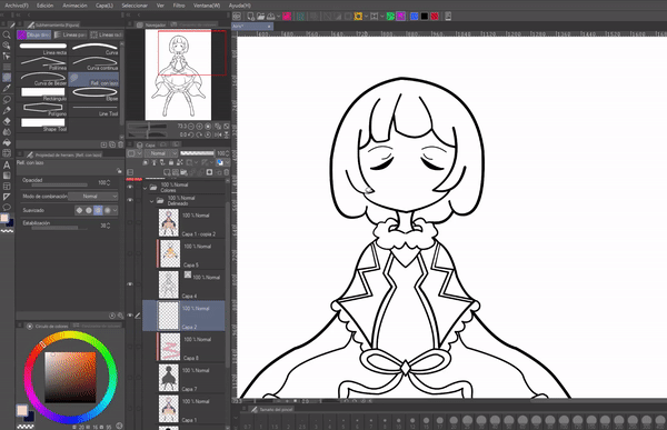
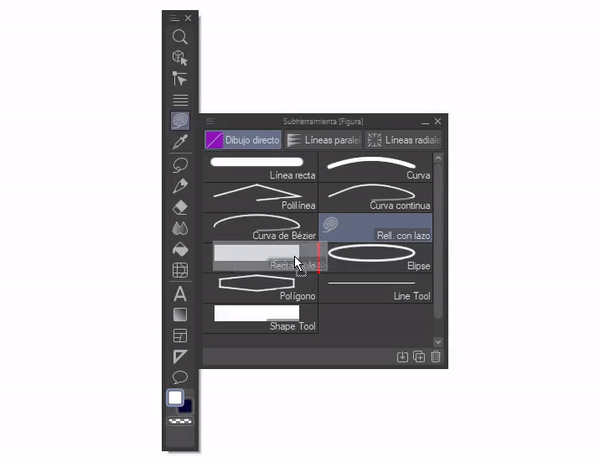
► Filled with bow
As the last selection sub-tool we have “Fill with lasso”; It is unlike the others, we can find it in another section. It is located within the “Figure” subtools.
The tool properties it has are simple, we have: Opacity, combination mode, smoothing and stabilizer.
Now, what can we do with it? Well, its operation is specific. We select as if it were a selection with the normal lasso and it is automatically filled with the color that we have established in the color wheel. With this tool we will not have the floating bar or any of its features.
As for the selection, it must be continuous. If we raise our hand, the selection will automatically close, leaving a straight line between the starting point and where the end was established.
Because my pulse is not very good and it is difficult for me to make continuous lines for a long time, I do not use it to fill in, but I find it extremely useful when erasing quickly.
To delete we must set the color to “Transparency” within the “Color Circle” palette at the bottom left. Ready, now you just have to select what you want and it will be deleted.
• MOVE THE TOOL
If we want this tool to be together with the other selection tools, we must click and hold on it and drag it on top of the selection icon in the tool palette, the icon will turn red, at that moment we will release it. Then we will enter the sub tool palette of the selection tool, there we will take the tool that we moved and following the same process we will move it into the folder where the others are located.
► Floating selection menu
The floating menu is the bar at the bottom of any selection.
If this bar does not appear or you want it to disappear, we can achieve it by accessing the following path: View > Floating selection menu. A check sign will appear and disappear.
This menu offers a shortcut to certain functions useful for selection; Let's see what they are:
(1) Deselect: Exits selection mode.
(2) Crop: Removes everything on the outside of the selection from the canvas.
(3) Invert selected area: The selection becomes everything outside the first one.
(4) Expand selected area: Increases the desired number of pixels to the selection.
(5) Reduce selected area: Reduces the number of desired pixels to the selection.
(6) Delete: Removes everything within the selection from the layer.
(7) Delete part outside the selected area: Removes from the layer everything that is outside the selection.
(8) Cut and Paste: Remove the selected part from the original layer, create a new one above where you place the cut part.
(9) Copy and paste: Generates a copy of the selected part and pastes it on a new layer above it.
Cut, copy and paste are very useful for sectioning layers. For example, if we have a complete sketch or illustration on a single layer, but we want to have certain parts on separate layers, just select, cut/copy and paste.
(10) Scale/Rotate
(11) Fill: A quick way to apply color to everything within a selection.
(12) New plot: Plots are added. A window will appear where you will find all the settings necessary to customize the plot.
(13) Floating selection menu settings: When you click on this option, a window will appear where we can search through all the CLIP STUDIO PAINT tools and add them to the menu.
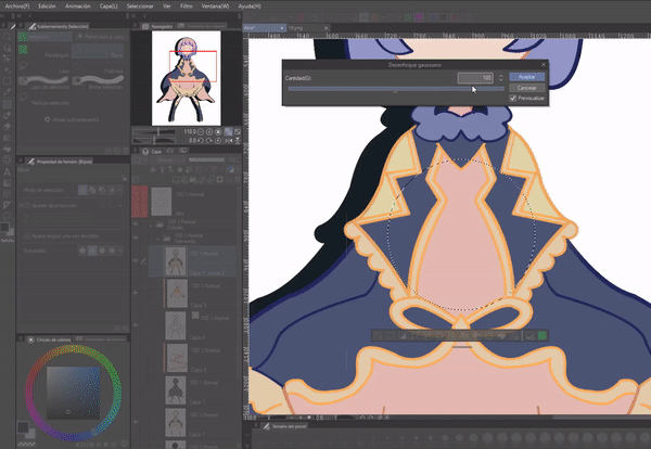
For example: We find and add the Gaussian blur filter option; will appear in the bar, now every time we want to blur what is within the selection we will only click on the function icon.
If we remove this icon, we have two other options to access the settings:
(1) By right clicking on the floating bar a menu will appear, the option we need to access the window is: “Floating selection menu settings”.
(2) In the bar at the top we will go to: View > Floating selection menu settings. This option is only active when “Floating selection menu” is also active.
• DELETE/MOVE ICONS
As for delete you have to right click on the desired icon, a menu will appear where we will find options that will allow us to customize the bar, among them we will find delete. To move the order of the icons there are two ways, the default is to press the “CTRL plus drag” keys or go to the menu explained above and change the option to “Drag” within the submenu “ Change order (T)”.
• MOVE FLOATING BAR
Sometimes when we are selecting, the floating bar appears and gets in the way, we need to remove it without losing the selection. Doing it is very simple. We will have to press and hold the small line at the bottom, now it is just a matter of moving around the canvas.
2. What can we do with the selection tool?
Throughout the explanation about the use of all the sub-tools, some examples of use were presented, now let's see some more applications that we can give to this tool.
► Transform
Sometimes there are parts of the illustrations that are not well proportioned, but it would be very slow and tedious to erase and then repaint; So, for greater convenience, we can select the area we want to correct and then use the transform tool. I advise using the lasso tool for these types of selections.
NOTE: We can use the transform tool through the keys “CTRL plus T”.
Another aspect that we can apply to the selection is rotate, invert, in addition to all the transform functions such as mesh, perspective, etc.
IMPORTANT: The transformation can only be done on the layer where content exists.
REMEMBER: It is also possible to access the transformation mode from the floating selection menu using the corresponding icon; Although with this you can only access the rotation and scaling functions, once you are in this transformation mode, by right clicking on the canvas a menu will appear where we can change between the different transformation modes: Mesh, perspective, free transformation, etc
► Fill
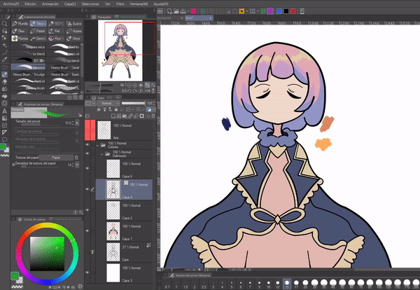
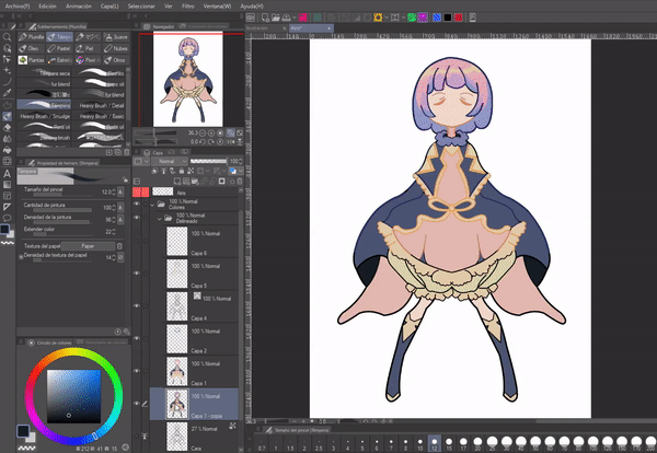
As explained above, this tool is extremely efficient for filling large sections of a solid color. First, you have to select the area, if it is with closed lines it is best to use the automatic selection wand and finally, apply the color with the paint can.
To add color with any selection tool, except for the automatic selection bar, I recommend creating a layer below the lineart, and selecting and filling on it.
If you want to have the color on a separate layer from the line layer using the automatic selection tool, there are two methods:
(1) Change the “Refer Multiple” option to “All Layers” in the tool properties.
(2) Mark the line layer as a reference (lighthouse icon) and put the refer option in “reference layer” (with this second way we will ensure that the color is applied correctly only within the parameters of the referred layers).
NOTE: Refer Multiple is only available for the tools: Auto Selection and Reduce Selection.
In terms of making specific selections, the same process is carried out. In this case, to make the shadows, mark the shapes and then apply the color.
• INVERT SELECTION
If what we want is for the complete figure to be filled and then little by little apply the color with the brushes, without going beyond the limits, we must select the background with the selection wand, then we will invert the selection and apply color with the can Of paint.
► Select layer
By clicking while pressing the “CTRL” key on the layer thumbnail we will select all the pixels it contains.
Uses: (1) From here we can fill it with the paint bucket (this will cause all those pixels to be painted the same color). A quick way to paint all the lineart lines in the same color.
(2) Another way is using the brush, it is a slow way, but it allows you to dedicate a color to each section.
(3) Create shadows: We do the entire process explained above, when the time comes to fill we will do it in a new layer below. Finally, we will move this layer to the angle where the shadow is desired.
NOTE: For this to work well we must have a layer with the color and lines unified. Therefore, it is required to have a copy. It will be on this unified layer where we will apply the selection along with the fill.
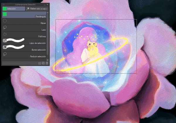
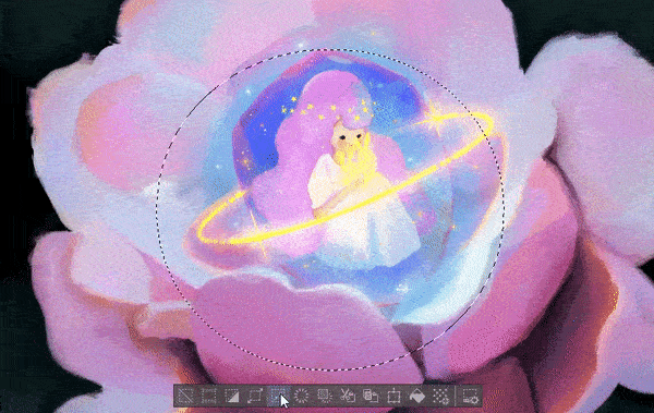
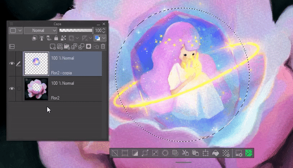
► Layer mask
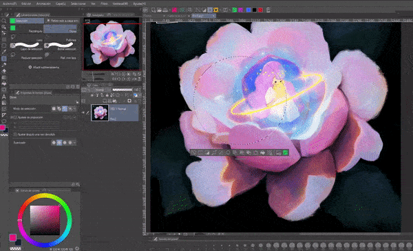
A quick way to use layer masks is to use the selection tools. But why do this? Simple, sometimes we don't want to lose all the information of what is painted, just hide certain parts, and that is precisely what layer masks do, they hide; and with the tool we can hide those parts more quickly. If you want to know more about these masks, I invite you to visit this TIPS:
EXAMPLE: I have my character to whom I want to apply a pattern to his clothes. When I drag the pattern it covers the entire canvas, but to apply it to the clothing area directly what I do is select the clothing, in my case I use “Automatic Selection” to save time. Now I just drag the pattern onto the canvas; As you can see, a new layer is created above with the pattern and a clipping mask, and in the latter you can see how what is not selected is hidden.
I repeat this several times so the pattern looks cut like it would on a garment fabric.
Without a doubt a great help, to hide parts. I especially like to use it for plots because this way I don't lose information, I just hide it with a false crop and if I need to modify later everything will still be there.
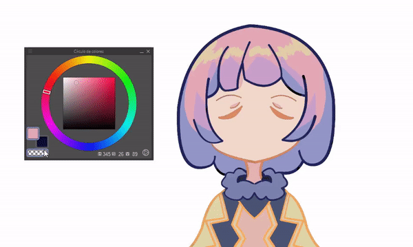
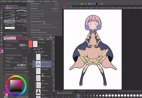
► Select color range
This is a function that I did not explain before, but now the time has come to know it. In the top menu there is a section called “Selection”, if we click on it a series of options will be displayed, most of which have already been explained in previous sections. The one that concerns us now is “Select color range”.
This function selects all pixels of the chosen color. This is used to modify specific colors in a simple and fast way.
When you open it, the following window will appear where you can modulate the tolerance regarding how many pixels will be considered for the selection, the type of selection: New selection, Add or delete and refer to other layers.
With the window open we will choose the type of selection and click on the desired color, then we will accept. Ready, all the areas where that color is will be selected.
To change these colors quickly we will have to use one of the tonal correction tools; In this case I used “Hue/saturation/luminosity” (to open it quickly use the keyboard shortcut “CTRL plus U”). Below I leave a tutorial where I address each of them:
► Filters
Selection is useful to combine with filters when we want to have an effect on a specific area of the illustration. The process is simple, choose a section and apply the filter.
An issue arises with the previous process, when we apply it the blur effect is very hard on the edges, but we can solve it by creating a gradient. This is done using an option seen before: Selection pencil, in its configuration we must set its hardness to the minimum.
There is another method to generate a gradient and this one in particular is the one that allows us to obtain a total blur, without any sudden jump.
To begin, we will create a layer on top, in it we will use the airbrush with its hardness to a minimum and the density of the brush low, with any color we will paint the entire desired area. Now, we will select the layer thumbnail by clicking "CLICK more CTRL". Once selected we will delete the layer where we painted with the airbrush; All that remains is to apply the filter.
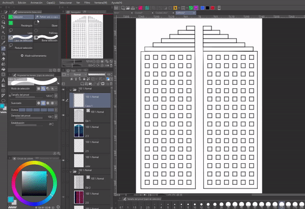
► Degraded
We create a selection, then we apply the gradient inside it. It's simple, but effective. With the selection and gradients we will be able to generate flat illustrations quickly. For example, some buildings:
► Eraser
Lastly, we have an essential functionality, deleting large segments in an instant or several segments dispersed throughout the canvas at the same time.
To do this, we will select the parts to delete, and then press the “DEL” key on the keyboard. Ready, everything disappears.
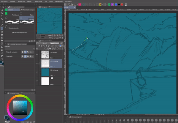
3. Let's paint a landscape
The selection tool is extremely useful in digital illustration, perhaps it is not as ostentatious as the others, but its uses are essential, such as: to transform, something that is done very frequently. The following illustration is made with the lasso tool and the paint can. With it I tried to exemplify the essentiality of the lasso tool. Below is the process:
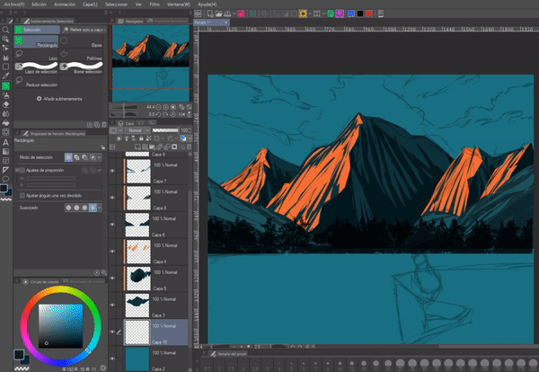
(1) I made a quick sketch of a landscape; The sketches should not be precise or with many details, for example, in this one I put elements like the cat and the cliff that I discarded during the illustration.
NOTE: For the composition I used some resources from the composition rules. If you are interested in learning more about this topic, I invite you to look at another TIPS I made talking about it.
(2) Working with white backgrounds is somewhat annoying, because it distracts the eyes and tires them, it is best to use a gray color. In this case I used a turquoise blue color for the background; color that seems appropriate for the sky. I decided to put this color from the beginning so that it would be my atmospheric reference and based on that, place the others, although I also took help from other color palettes already created.
To illuminate the mountains, select their shape which I filled with the paint can; I separate each plane into different layers, the furthest plane is the first layer after the background and so on. As for the lights and shadows, I generated layers above the base color of each element, I set these layers to “Adjust to lower layer” so as not to have to be so precise with the selection and avoid going out of bounds in the process.
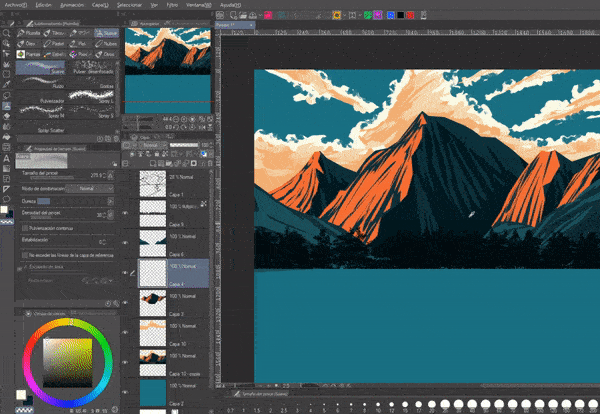
As you can see in the GIF below, with the lasso I make sharp shapes to give the shapes of the textures. I didn't give these shapes much thought, I simply set the lasso tool mode to “Add Selection” and made quick lines in the same direction; Once created I simply filled them in.
As for the mountains, let me explain a little about how to create the shapes of a rock. First, we begin by understanding that rocks are a geometric shape in themselves, they can be grouped rectangles or triangles. When we have its shape, we erode the edges making them irregular.
The second step is to generate the volume; Imagine it as a cube, one side of the face will have better light than the other. To give the mountain a three-dimensional shape, it must be divided into two in a not very linear way, with a certain curvature. In addition, a series of cracks must be made on both sides that will follow the direction of the curvatures. Finally, we decide the direction of the light.
(3) With the clouds I followed the same process, but now, after selecting and filling, use a brush to soften the edges of the color block; It turns out that with the lasso the edges that remain when filling are rigid, but with a stroke of the brush it is solved. Although of course, if your style is rigid, then no problem.
We can simplify the shape of the clouds with a series of circles piled up against each other, but not all of the same size, some huge, others small, so that the contrast of shapes can be seen. After the shape, we put the base color.
TIP: To choose colors for the clouds we must take into account the atmosphere, for example: if it is a sunset, the colors will be orange/pink.
Then we will choose the direction of the light, in this case, the light comes from above, so the lower part of the cloud will be darker, and successively upwards the colors will become lighter. Finally, we gently highlight with colors the shape of the circles that we made at the beginning, but these have to be in some parts showing a fusion between two or more adjacent circles.
(4) The following are details: apply a haze effect with the help of the airbrush in minimum hardness that then blur with the “Blur” tool.
For the water, since I did not want to lose the separation of the layers, I created a copy of all of them and unified them with the purpose of rotating it so that it would act as a mirror. I distorted this copy with the “Liquify” and “Motion Blur” tool, in addition to lowering the opacity. This is what I do to simulate a reflection in the water.
(5) For this penultimate part I used the brush once again to soften the edges of the mountains and the shadows of the clouds. Finally, use a tree brush that is predefined within the program, apply a blur to these trees. I make them a dark color to frame the environment following some composition rules, such as in this case the atmospheric perspective which dictates that when zoomed out we see this object with reduced clarity, value and saturation. The colors in the foreground are very saturated and dark, while those that remain in the background lose saturation, so we must see them with reduced clarity, value and saturation.
I blur the trees with “Gaussian Blur” so that the view focuses on the mountains and ignores the bushes in the foreground to a certain extent.
(6) Finally, I added two textures that I put in “Overlay texture” mode within the layer properties in the “Effect” section. Additionally, I made an adjustment to the global colors with the help of tonal correction tools.
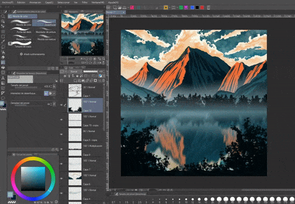
The result is as follows:
Farewell
I hope that what you see in this tutorial is to your liking and that it is helpful to you. Well, without anything to say, thank you for coming this far! ପ(๑•̀ुᴗ•̀ु) ॣ৳৸ᵃᵑᵏ Ꮍ৹੫ᵎ ॣॣ
We won't see you another time ( •⌄• ू ) ✧
Instagram:
Users who liked this post


Comment