
Intro
In this article I’m going to cover how to create an illustration without using lines or inks.
I’m go over creating flat separations, adding texture and choosing brushes, and adding shadows and highlights. There will also be some bonus material on adding a background with low effort at the end of the tutorial.
Creating Separations
I'll be working from a completed sketch.
Before anything else, I create a new folder and name it appropriately. Having things organized into folders saves time later, but it also allows you to simultaneously change the setting of all of the layers inside.
My preferred method of creating separations is with a “lasso fill” tool. When you make a selection, the inside is automatically filled with the current color, and then the area is deselected.
I drop the opacity of the folder so that I can see the shapes in the sketch. Just dropping the opacity of the layer would work, but we’ll be needing multiple layers and that can quickly become frustrating.
Of course you can also use a regular lasso tool. You just need to add the step of filling the selection instead of it being done automatically.
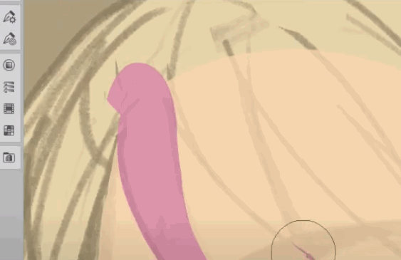
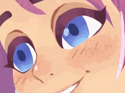
I start with her face. In the beginning, I’m not worried about the facial details like eyes, but just want to fill her skin in.
To work behind an already existing separation, I create a new layer and drag it to the bottom of the folder.
When I have two objects that are the same, like her hand and arm here, I pick a slight variation of the appropriate color to use. This makes it so I can work on each part separately when using the auto select tool.
To create separations for areas that are above your current work, you need to be on the upper layer.
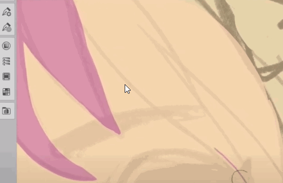
Just like with regular brushes in Clip Studio Paint, filling a selection with transparency is also an option. This is how I clean up the edges of my separations. You can add and remove until you have the exact shape you want.
Let’s look at other methods of drawing in the flat colors. A pen tool at full opacity works pretty well. I know some artists prefer the method of drawing in each part and filling them with a pen instead of selection tools, so if this is more natural feeling, then you should use this method instead!
There is also the option of drawing in the outline, like you would if inking, and then filling the inside with a bucket fill. This was my go to method for a long time. Just make sure your bucket tool can only see the layer you’re on by unchecking “refer multiple”.
When coloring the hair, I fill in the upper parts, like the bangs and pieces that go in front of the face, on the topmost layer. But for pieces that are behind the character’s head, I work on a third layer at the bottom of the folder.
When I’m doing fills for inorganic objects, like the chair, it’s best to use the “polyline” selection tool. Instead of being freehand you define the selections based on points when you click. Double click to close the selection. You can also come back around to the original point.
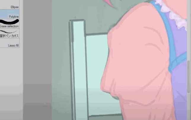
I don’t use this that often, so I just use the basic version and manually fill it. If you are working on a large area using polyline, make sure your selection mode is set to “add” so that you can keep working without having to stop and fill each time.
The polyline selection tool can make some nice edges and if your style is very sharp, then it might be better for you to use most of the time.
For objects that have a lot of soft edges, though, I find it doesn’t work as well for my art. It takes a lot of close together points to get a detailed shape and is more time consuming than free hand for me. If you are just using a mouse though the extra control would probably be really helpful.
So what about separations that meet up at the same edge or are inside of another color?
I just select that color and then work inside of the selection on a new layer. You can use pen or lasso fill tools inside of an existing selection.
Working on a new layer means you can just erase or paint transparency to clean up the shape. Otherwise you need to switch back and forth between colors.
You want to make sure your flat colors read clearly since the silhouette will be carrying the illustration. I deviated from my sketch a bit so that my shapes had less overlap and stood out more.
Before moving onto the next step, I double check that there are no gaps in my colors. By filling the canvas on a lower layer with a contrasting color, you can easily spot parts you missed.
Adding Textures
Let’s look at some ways to add texture to keep the image interesting.
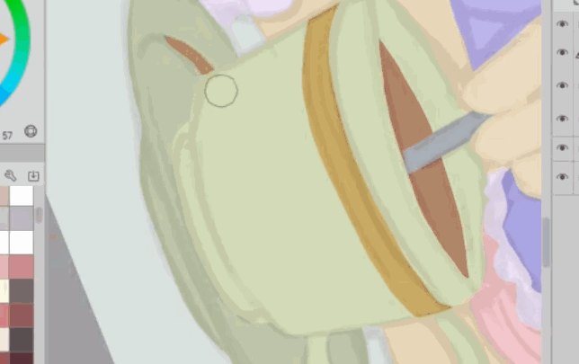
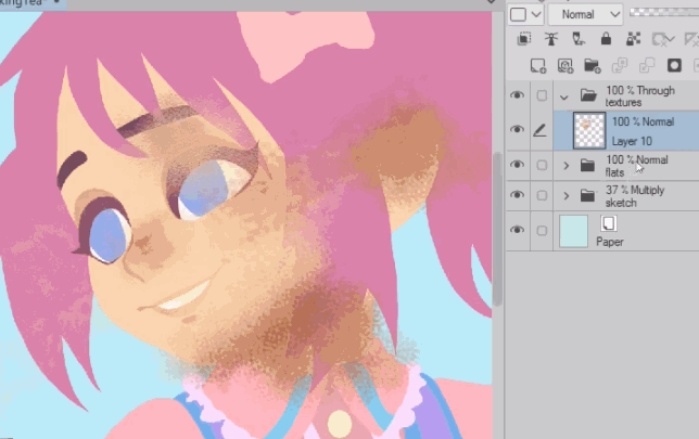
By default Clip Studio Paint comes with some pretty decent textured brushes. These chalk brushes are particularly useful for this because the texture scales with the size of the brush. The noise brush is one of my favorites. Up close this brush looks like a nice spray texture. I use this a lot when painting in this style.
You can see when you reduce the size that it also reduces the size of the brush’s texture. If we were to use an actual “spray” brush in Clip Studio, it would use the brush tip as a particle that is thrown around. This is good for some things, but I find that spray particle brushes don’t actually work very well for creating textures because they get repetitive and create visible patterns.
The best way to find texture brushes that fit your work is to experiment.
Here is how the "noise" brush looks when set at "1000" brush size.
Below is and example of how it looks when I paint back in the base skin color with the the "crayon" brush.
One way you can keep a texture from becoming monotonous is by color picking and mixing in different variations of colors. Also use different brushes in the same area for a more organic look. A lot of the time I make the brush much larger than the section I’m painting so that you can see more of the brush’s shape. This is pretty messy and we want to contain the texture to certain areas instead of flowing everywhere.
So using the Auto Select tool again, I choose the color of where I want to work. If you already have started adding texture, you need to move down to the separations and select from that instead. Then go back up and mask it.
There is a second set of brushes that I like to create texture with. This is a custom set created by another artist and I have it linked below.
You can get more unique textures, by erasing a painted area with a different brush. They kind of combine this way and you have a new pattern that would be difficult to paint otherwise.
Another way to create texture is with blending brushes. These take existing pixels and move them around based on the shape of the brush tip and individual brush settings. Some brushes have blending built in as well, and if they don’t, you can add it.
A lot of brushes will behave differently based on pen pressure. If you have a graphics tablet, it’s worth playing around with and experimenting.
Here I have used blending tools to add texture to a solid stroke I painted in. I also went over it with a textured brush and painted in transparency.
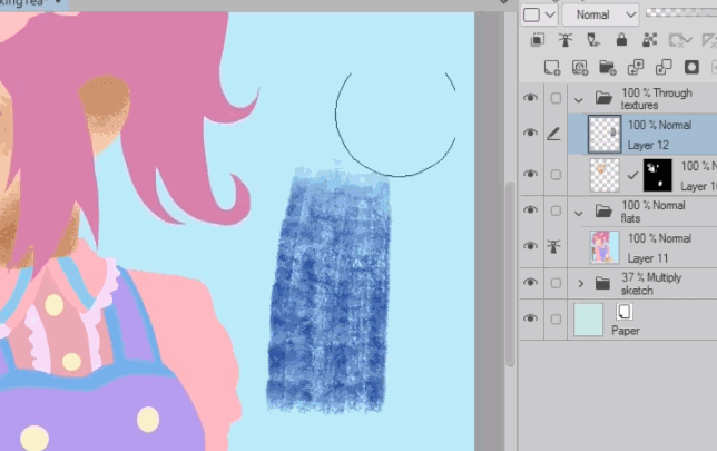
Aside from painting in textures, you can also use image materials. You can drag these from your materials library onto your image, or paste in your own photos if you prefer. Image textures can be easily scaled and set to different blend modes for different looks. You can mask them, and then paint transparency to erase part of the image.
You can combine this with textured brushes for more options. One thing I personally like to do is drop a texture image in, mask it and clear the mask so you can’t see any of it, then paint parts back in. Like this you are painting with the image instead of a particular color. You do have to be on the black and white thumbnail of the mask for this to work. Check your layers if you are having trouble with this technique.
You can use this same method to add patterns and images for use in clothing and backgrounds to add interest to your illustration.
The image materials you use can give a very different look and feeling depending on the layer mode you set it to.
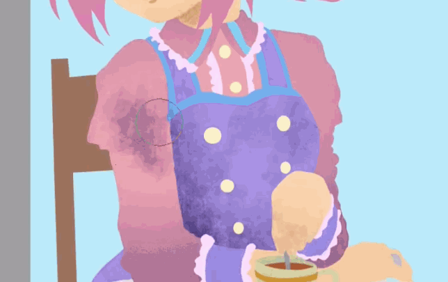
I complete adding the textures, but if you'd like to watch part of it, there is a time-lapse portion in the video at the beginning of the article. I focus on adding texture at the "ends" of objects, like the fingertips, the bottom of the ponytail, around the cup edges and other places.
I experiment with even more brushes, particularly hatching and comic effects as I work. It's important to note that each "part" of the drawing has it's own texture layer that has a layer mask to keep the image clean.
Interior Lines and Shadows
From here on we have the basic foundation laid out. Now we can start to refine the image with shadows and some interior lines for accents.
I bring my original sketch folder to the top and change the layer mode to color burn. You can leave it on normal or multiply with the opacity reduced, but I found color burn helped me see the illustration underneath better this time.
I create a new folder, set it to “through”, and create a new layer. I set the layer mode to multiply since there is where I’ll be doing my shadows.
Just like I did earlier, I use the flat color layer to select her hair, and I start blocking in shadows.
I don’t want to add any further texture with these so I’ll be using the lasso fill tool, and solid pens.
I am only trying to add a little depth to things. This is a lot like cell shading and I’m not wanting soft shading, or to make things feel 3D.
I use a textured chalk brush for the accent lines. It’s really important not to go overboard with the interior line work. Too much clutter in any one spot will unbalance the illustration.
You also want to focus these sparse line on the inside of certain objects, not along the outside edges line an outline. If you find something isn't clear try adding a shadow or highlight instead of an outline.
For the style I want to evoke the same feeling that those beautiful paper cut out illustrations have. Each part of the drawing is a layer that has some light shading and a few lines for readability when things start to get small and hard to see clearly with just silhouettes and depth shadows.
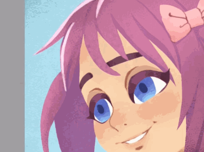
Highlights and refining shapes
Now it’s time to put the final touches on the character.
I like to save highlights as a last step because if I add them too early, I can easily do too much and make it overly shiny or noisy.
This time I’m keeping my folder and layers on “Normal”. My intent is to keep the highlights flat looking.
I use “Darker pencil” because it has a little texture and it doesn't need a lot of pen pressure to be opaque. I usually only need to make one pass to make the color solid.
I chose the upper left for my light source and am just highlighting that side of a few parts of the drawing. There is also some ambient light coming from behind the character.
To get the right color to use, I color pick the base color and use the color wheel to lighten it a bit. I usually slide the hue a bit towards a warmer shade for highlights.
I play around with different colors for the highlights. I want to have enough contrast that they bright spots don't end up being part of the "texture" of the image.
If I notice a shape is not clearly defined, I’ll go back into the shadows and add and edge shadow.
I continue until I’m happy with the illustration.
You could easily call this done, but I wanted to add a quick background to sell the concept.
Bonus
I select the background color and go to my 3D materials. Drag and drop into my selection and it is automatically masked.
There are so many useful 3D backgrounds available on Assets. I downloaded this lounge awhile ago and it’s perfect for the fancy café I want.
To drag anything in a layer mask with the move tool, and keep the mask in place, you need to unlink them first. Then you can freely move the layer content around without changing the mask position.
You can unlink the mask from the layer by clicking the checkmark between them.
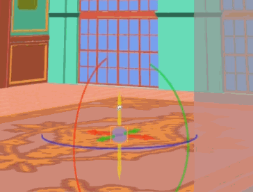
Even though my character is relatively flat, she still exists in a 3D space so I’m trying to line up the horizon line of the 3D background with my character. If you have a mouse or a scroll wheel, you can adjust the field of view of the background by zooming in and out. This only works when you don’t have a model actively selected.
Once I’m happy with the perspective, it’s time to start modifying the 3D props to the art better.
I’m thinking about my composition and that things might be hard to understand as they currently are. So I want to simplify the background.
If you click the little wrench in the bottom toolbar, you’ll bring up the sub tool detail for the model. Everything that is contained in that 3D layer, is in the object list. You can usually hide or move around the parts by selecting them in the scene and clicking the eye, to close it, or by finding it in the object list.
If I’m not sure what something is because it’s in another language, or I’m just having trouble finding it because the list is really long, I will play around by hiding things until I figure out how it’s organized and I can remove what I want from the scene.
When you click a 3D object, it should jump to the object in the list and you can hide it from there. Usually this works, but some things can be hard to select manually because they aren’t fully in view.
If I can, sometimes I just move a piece out of view with the axis handlers.
Now let’s make the background match the character. I drop the opacity of the 3D layer. Then I go to the “tool properties” of the object, scroll down, and I uncheck apply light source.
This already helps a lot because it flattens the background.
Next I create a correction layer above the 3D model so I can alter the colors. I want to pick a soft gradient. I drop the opacity of this a bit.
Then I change the layer mode of the 3d background to multiply so the texture and colors I painted before show through.
I duplicate the 3D layer, and hide the original. Then I right click and rasterize the duplicate layer.
Now this really is a flattened layer that I can modify, or better yet, use as a separation layer to select from.
I make a new layer, set it to screen, and drag it to the top. With the glass color selected, I paint in some light. Piece by piece I work on the background.
I do the same for the shadows and switch back and forth between my multiply and screen layers.
I use texture brushes while doing the shadows and highlights as a way to bypass the texture step and make this go quicker. I use the noise chalk brush almost exclusively.
I add a mask to these layers so that I can work on larger areas without having to select everything from the rasterized model layer.
As a last step, I put all of the background layers into a folder, set it to through, drop the opacity slightly, and name it.
That’s it! I hope this tutorial was useful. Let me know in the comments if you learned anything.
About the Author
My name is FalyneVarger. I have been drawing for most of my life. I started working commercially about 10 years ago and have created artwork for books, games, comics, and more non-commercial commissions than I can remember.
I'm @falynevarger in most places, but you can find me online at any of the links below!
Users who liked this post


Comment