
Introduction
If you stumble across this page, it must mean you are interested in creating a WEBTOON! If so, this is a small tutorial with steps and tricks to creating one. However, I’d first like to introduce myself.
I’d like to keep my real name confidential, but my friends call me by the nickname, Elondo. For an independent learning project, which lasted for around four months, I’ve attempted to learn how to create a WEBTOON and I’d like to share some of the things I’ve learned. Do keep in mind that I am not an experienced creator and I’ve only created one episode.
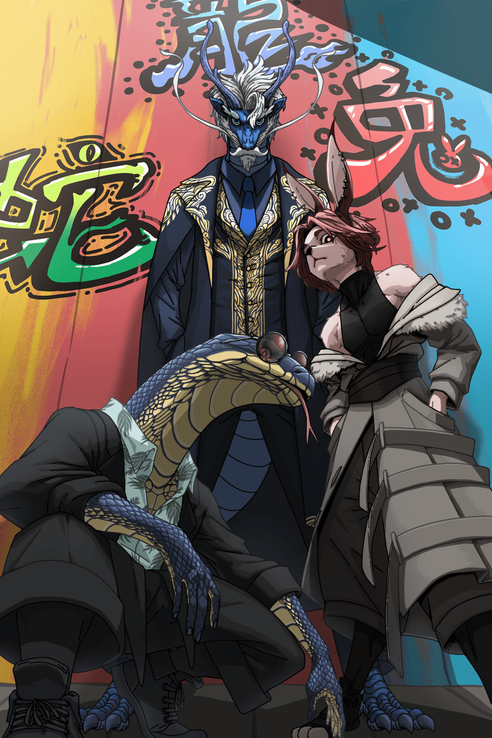
I have been drawing for around five years, so I’d say I’m quite experienced at drawing characters, although I do struggle with backgrounds and perspectives. Below are some examples of my work. I’ve also been reading WEBTOONS for around six years now, meaning that writing and drafting them came intuitively to me. Likewise, it would be a good idea for you to be familiar with WEBTOONS and of course, digital art.
Before you begin...
Remember that creating a WEBTOON is a very challenging and arduous process. It can be really easy for you to get burnt out, so make sure that you have enough motivation before diving into this project. I would suggest that you first try out making a few episodes in advance to get the feel of the process and decide from there whether you have both the ability and the drive to take on this challenge.
Steps to creating a WEBTOON
Planning Out the Story
I’m assuming you already have a story in mind. Now, you just need to outline it. You don’t need to include all the details of your story, but make sure to include all the important events. Make sure you have a beginning, middle, and end. It’s also a good idea to write down some of the scenes you know for sure you want to include, even if it only contributes to the emotional aspect rather than the plot, as it will allow you to see the flow of the story. Also, think about things like character or plot development and remember that good storytelling isn’t just about writing an interesting plot––make sure to include an emotional connection.
TIPS
▶ Stories generally follow a traditional flow of exposition, climax, and resolution. However, not all WEBTOONS have to follow this. For example, comedies oftentimes do not have a rigid plot but are entertaining nonetheless.
▶ If you don’t have an idea for a story yet, there are many ways to find inspiration. I find it helpful to write down any idea––no matter how small––and later combine or build on those ideas. There are also other traditional brainstorming techniques, like finding story prompts or drawing inspiration from other stories you’ve read.
▶ Make your characters relatable for an emotional connection. The more your readers care about your characters, the more likely they will enjoy your story. This can also allow more significant scenarios, such as hardships, more emotionally impactful. I’ll talk more about the characters in the third section.
Choosing an Art Style
This step mostly applies to people who have multiple art styles. Your art style should be chosen depending on your genre or plot. For example, if you’re writing a comedy, your art style should look more on the simpler side. If your genre is action, you might want to consider a more traditional anime art style. Overall, just make sure that the art style you choose complements your genre and plot.
TIPS
▶ While your art style should generally complement the tone of your story, there are some occasions when you can deviate from this. If your story allows it, you could choose an art style that completely contradicts your tone. For example, it is possible to choose a cute art style for a horror genre as the contrast may be psychologically unsettling for readers.
▶ I personally think that the coloring and lighting should be paid more attention to rather than the lineart. People associate a lot of different emotions with colors, such as duller ones being serious or melancholic while more vivid colors being happy or lively. Choosing the right color palette can add to the tone of your WEBTOON.
▶ Make sure that you choose an art style that is simple! As I’ve shown earlier, my usual art style is quite complex and detailed, but in my WEBTOON, as I’ve shown below, I only used cell shading.
Character Design
I personally think that this is an important step to make sure your WEBTOON is memorable for the readers. You should make sure that the appearance of your characters matches their personality and is pleasing to the eye. It’s also a good idea to have a character reference sheet that you can refer to while drawing. The reference sheet should include the base and shading colors, as well as a full-body drawing of your character so it’s easier to ensure that the appearance stays consistent.
TIPS
▶ When you design your characters, make sure to think about their hairstyle, eye shape, and any special features they may have (such as moles or scars). This can allow your readers to get a general idea of their personality. A contrast between appearance and personality can also be powerful, but make sure it’s meaningful.
▶ You should also think about how the character carries themselves. For example, think about how they would walk, where they usually keep their hands, how much space they take up, and other small details.
▶ Of course, colors can have an impact as well. You can choose whether you want to keep your characters’ color schemes consistent with their race, depending on the plot of your story. For instance, if your story includes people from different countries, it might be a good idea to include a physical distinction between them.
▶ You can try to draw silhouettes for your characters to make sure that they have distinctive appearances.
▶ When creating the personality of your characters, make sure that they fit into the actions they took in the story and their backstories and are likable to the readers. Make sure that your characters are relatable by giving them flaws but also traits that make up for them. Of course, not all characters need to be likable, such as the villain (although they still can), but it’s good to give them depth.
My Example
For my reference sheet, I only drew the head of my character, which is a huge regret of mine. I wasted a lot of time constantly scrolling back to my previously drawn panels to check for details in the clothing like the length of the hoodie. Because of this, when you create your reference sheet, make sure to draw the full body of your character.
As you can see here, I’ve also included a color palette at the side, which includes both the base colors and the colors I used for shading. This made it easier for me to keep the colors consistent throughout all my drawings.
Designing the Setting
It’s a good idea to have a layout of the location where your WEBTOON takes place. Of course, while you don’t have to include every single detail, make sure that you have a layout of the more important sceneries for the plot. This can be a place your character always goes to or an important place that creates a lot of emotional impact, which you should put more effort into designing.
TIPS
▶ Try to design settings that are easier to draw, especially if you aren’t so good at backgrounds like me. The interior of the main character’s house that I designed was really simple, which allowed me to draw a lot faster.
▶ Not all settings have to be drawn––you can use different apps, websites, and tools. Some of these include SketchUp, Blender, or even games that allow interior design like The Sims!
My Example
As you can see here, I’ve decided to use The Sims for the design of my character’s house. After this, I just had to choose a perspective I wanted and trace over it, which saved me a lot of time.
Because I’m so inexperienced at drawing backgrounds, I’ve also used the blur tool quite a lot. That way, I just had to draw a basic silhouette without any details and blur it, making it clear where my character was but also saving a lot of time.
Writing the Script
The way you write your script can depend on personal choice. However, I would make sure that it’s clear how each scene would look and write down the dialogue you would add in each scene. Also, make sure to watch out for the number of panels you have to draw in each episode so that each episode is around the same length and you give yourself just enough work.
TIPS
▶ Don’t be afraid to revise your script, even if it means making big changes––after all, when you start drafting and drawing your WEBTOON, it will be a lot more difficult to go back and change it.
▶ Especially if you are certain that you will continue your WEBTOON, it’s a good idea to write the script for a few episodes in advance before you start on the drawing in order to ensure the flow is as desired.
▶ Remember to recognize which scenes are important and which ones are not. For example, if your scene is only purposeful to show a small or subtle action, it’s less significant. For more insignificant scenes, you should usually make them smaller than the more significant ones.
Drafting
This is an important step that allows you to plan out where each panel and text should be, as well as bring your script to life. While the standard size of a WEBTOON is 800x1280px, I personally believe that it’s better to work on a longer canvas as it’s easier to plan out the panels.
TIPS
▶ I would spend more time planning your panel and text positioning rather than drafting each scene. Of course, you should still have a basic outline of how it may look like.
▶ There’s a tool in CSP that allows you to look through the perspective of your reader and what area they would see on their phone. Go to view>on-screen area (webtoon)
▶ After you’re done with the draft, you can export your WEBTOON and upload it on a Google Doc to view it from your phone and see how it currently looks. When exporting the WEBTOON, there’s a feature in CSP that cuts the long strip into the 800x1280px format that WEBTOON uses. You can see this by going to file>export webtoon…
Lineart, Coloring, and Finishing Touches
This is the step that took the longest for me. In this step, when you do the lineart and shading, you don’t need to pay too much attention to them––they don’t have to be perfect. It’s more important that you focus more on the lighting, using tools like multiply, screen, and more. This can make your pieces look more dynamic and interesting as well as set the tone without you having to spend too much time on the shading itself. It can also help distract the readers from drawings you’re not too satisfied with.
After you’re done with the drawing, you need to add in the speech bubbles and the text. In CSP, there are tools for both of those on the left side of the menu. When choosing the size of your text, it’s better for you to experiment. However, to provide a general idea, I used size 12.6 on a 690x20000px canvas. For the font you use, you should also try searching online for possible ideas, but I have linked the ones I used at the bottom of this guide.
TIPS
▶ Make sure to manage your time properly! Don’t procrastinate too much and leave all your drawings on one day because you might hurt your wrists. To give you an idea, one episode took me around 30 hours to draw. Of course, I could have drawn a lot faster with more experience, but you should still have an idea for how long it might take you in total.
▶ While you shouldn’t aim for perfection, your lineart should still be neat so that the base coloring is a lot easier.
▶ Utilizing lighting can also help zoom in on what the focus of the drawing is. For example, if the focus is on the center of the piece, you can try adding a vignette.
▶ Don’t be afraid to overuse some brushes. Some of those brushes can be very subtle and the readers may not even realize you’re using them so much. However, they can also unconsciously help set a mood, make the overall drawing look nicer, or direct your readers’ attention. For example, I used a lot of the splatter brush in my WEBTOON.
My Example
As you can see, the lighting made a huge impact on both of these examples. As I mentioned before, I’m not very good at drawing backgrounds, but the lighting definitely made it look a bit better.
Other tips I haven’t mentioned
▶ Utilize community brushes and materials, as well as the tools in CSP. This can help speed up your drawing process and help with drawing scenes you find difficult. In my WEBTOON, I downloaded a staircase model from CSP assets to trace over as I found it difficult to draw the same staircase from two different perspectives. At the bottom of this guide, I’ve added a few brushes I thought would be useful.
▶ It’s fine to be lazy when drawing, but make sure that it’s justified. What I mean by this is that you can take shortcuts like copying and pasting certain scenes, but you should also include some slight differences to show progression in the story. In my WEBTOON, I also had a lot of spaces with only text, which can be impactful as it shows that those sentences conveyed important information while also being really easy for me to add since I didn’t have to draw anything.
▶ Pinterest! The algorithm makes it really easy to find a desirable reference.
▶ Before you start on your actual WEBTOON, you should try creating a few “practice” episodes first. This will allow you to be more familiar with the process and help you understand strategies and things you should avoid. Your WEBTOON will look a lot better if you get yourself familiar with the process!
▶ Remember to hook the reader with your first three episodes. It should provide a general sense of what your WEBTOON will be like and leave your reader wanting to read more.
▶ It can be really time-saving in the long run if you find reference sheets that show how to draw something from different angles as shown below. It doesn’t have to be just heads––different hands, torso angles, etc, can all be useful.
Final Thoughts
I hope that these tips were helpful! Below I’ve included some useful brushes as well as the link to my WEBTOON. My final tip for you and your journey as a WEBTOON creator is to have fun––remember that this is also supposed to be an enjoyable process, so if you feel burnt out, don’t be afraid to take a break. Good luck on your journey!
Useful Brush IDs
▶ Close and fill tool without gaps (ID: 1759448): a useful lasso-like tool that can be used to easily do the base colors without leaving any blank spaces between the color and the lineart
▶ More Pens & Hinokizaka pens (ID: 1711220): I find the zaka pen from this pack really easy to use. The size of the pen is pressure sensitive, so it allows you to draw faster without having to change the size of the pen each time for different areas of the lineart.
▶ A brush set that draws clouds (ID: 1723992): clouds can be challenging and time-consuming to draw, but this brush pack overcomes this challenge. There are also many different types of clouds as well.
▶ Hair highlights mega pack (ID: 1826539): for me, hair highlights are not exactly time-consuming to draw, but having this brush pack will still save a lot of time since hair highlights need to be drawn so often.
▶ Sunlight brushes (ID: 1610988): used for lighting and can make your overall Webtoon look better since the art generally focuses more on lighting rather than shading
▶ Dust brushes (ID: 1583768): can help create a more emotional or dramatic feel to your Webtoon
Font Link
Link to my WEBTOON
Users who liked this post


Comment