
Yo!
I see you have been drawing quite a bit recently.
But are you ready to step up your LINE ART game? ( `ω´ )ノ
Introduction
Drawing the line art is the 2nd Step in my drawing process and one, that as a decades-long MANGA reader, I’ve always enjoyed the most.
And without colour, you will need to get creative on how to express personalities / characteristics and atmosphere with your black & white drawings!
So, in this tutorial we will tackle how your lineart can become more expressive and we will have a thorough look into the “VECTOR LAYER” function in CSP!
LINE WIDTH - Even or Fluctuating?
Even Line Width
This sort of line art is more practical if you plan on doing very thin lines for a (semi-)3D colouration. They do not function well for MANGA so for this tutorial we will skip them!
Fluctuating Line Width
THIS is what’s today’s main topic.
Ever seen another artist’s MANGA LINE ART and wondered why it looked more expressive?
The answer is easy:
INK
In this day and age, even old-school mangaka have switched over to digital software.
However, the charm of MANGA lies in that hand-drawn ink style.
Clip Studio Assets offers a variety of “ink style pen”.
This is a free one that I like to use!
For a less “rough” texture, try using the following ink pen instead:
So now, let me introduce some MANGA style choices that I like to incorporate into my LINE ART!
LINE WIDTH - Emphazie Characteristics
Besides trying to imitate a hand-drawn ink style, the purpose of playing around with the LINE WIDTH for your MANGA LINEART is that you can use it to emphasize characteristics of a character or an emotion.
Like expressing the chubbiness of our little bird friend here:
Let’s say we have a very fragile young boy. (Perhaps he’s got a mysterious illness that has weakened his body?)
Q: What effect do the following LINE WIDTHS have on your perception of that character?
Answer
1.) Inconsistent LINE WIDTH = unstable, shivering body.
2.) Background (thin lines), character (thick lines) = eyes are guided towards the boy. (focus of attention)
LINE WIDTH may also be used to express the distance of an object to the viewer.
Example
Let your character throw a heavy punch!
Answer
1.) Thick lines: Objects closer to “camera” (with more impact)
2.) Thin lines: Objects more distant to “camera”
This gives our 2D drawing more depth without even using Colour or Screen Tone.
And we do want to keep it 2D!
However, we also still want to offer the reader interesting looking panels that are expressive and enjoyable to look at, so your LINE ART is where your story telling starts.
Everything else like Screen Tones are enhancements of that.
Now, let me use this year’s nengajou 年賀状 to demonstrate how to use VECTOR LAYER to improve your LINE ART process!
VECTOR
VECTOR - LAYER
______________
The main difference between a normal layer and VECTOR LAYER are the so called VECTOR POINTS. A line on a normal layer equals one whole object.
■ Advantage
A line drawn in a VECTOR LAYER consists of multiple VECTOR POINTS which are
individual objects and can be adjusted as such.
Think of it like Hensel & Gretel creating a line by leaving several individual bread crumbs.
CSP offers several tools to use these VECTOR POINTS as a great short cut for beginner and advanced artists.
VECTOR - ERASER
______________
For the hair I always use the process of freely drawing the strokes and then using the VECTOR ERASER to delete those bits that overlap.
■ Advantage
- Quicker erasing process, since one stroke anywhere on the overlapping part will immediately delete it
And since I don’t need to worry about drawing over other lines, this also lets me draw the hair in a more naturally flowing hand movement.
VECTOR POINT - TOOL
CORRECT LINE
______________
The CORRECT LINE tool is located at the bottom of your tool bar.
At first this tool might be intimidating. Don’t worry! There’s no tool that can’t be mastered with enough practice!
CORRECT LINE - Quicker LINE ART
______________
This Sub-Tool is one that I quite frequently use.
It offers quick ways to edit VECTOR POINTS by deleting/moving them, redrawing from one point on and adjusting the LINE WIDTH of specific lines.
CORRECT LINE - Redraw Vector Line Width
______________
No one has perfect pressure control. If a line became too thick compared to surrounding lines, but had just the right shape, rather than erasing & redrawing that line:
Use the Control Point Sub-Tool Redraw Vector Line Width
Q: How does it work?
Conveniently, this tool does not change the LINE WIDTH of all lines adjacent to where you click. It only changes the line from the VECTOR POINT you put your pen on up to the VECTOR POINT you release your pen on.
■ Advantage
In the below example I have not used a pen or eraser. I only used the Redraw Vector Line Width Sub-Tool.
- No switching back and forth between tools
- Quick and clean results (easily adjustable)
Using this Sub-Tool, rather than manually thicken lines, really (immensely) quickened my drawing process. Afterwards I just adjust smaller details, but that’s optional.
CORRECT LINE - Redraw Vector Line
______________
The Sub-Tool Redraw Vector Line works best for me for spots with only one line and adjustments to the the ends of hair strand.
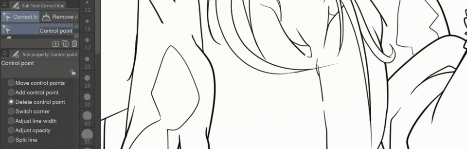
CORRECT LINE - CONTOL POINT - Delete Control Point
______________
The name’s the game. This tool deletes control points. Simple as that.
Simple… But very much helpful when you draw that perfect line, but notice there’s a line just a little bit too long that you could not use the Vector Eraser on.
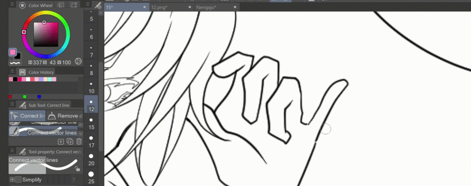
CORRECT LINE - CONNECT VECTOR LINES
______________
This Sub-Tool may be tricky if you’ve got the wrong settings.
Under the Brush Settings, set the Connect Lines sensitivity higher for larger gaps and lower for smaller gaps.

I mainly use this tool for smaller gaps, to quickly correct them.
CORRECT LINE - ADJUST LINE WIDTH - Fix Width
______________
Under the Sub-Tool Adjust Line Width you can find the final tool I’d like to introduce to you: FIX WIDTH
This tool will follow the vector points (lines) and adjust the brush size they’ve been drawn with to the size you set it as.
Example
I adjusted the line size of our drawing from thin to thick and vice versa.
Q: Why are there no gaps between the thin line? Why is the line of the face still thick?
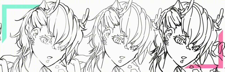
Answer
1.) There are no gaps, because our drawing originally was drawn with thinner lines. Since we used Redraw Vector Line Width to thicken the lines, we did NOT change the Vector Points actual arrangements, only the width of the line connecting them.
2.) Because I had manually drawn the line around his chin thicker with the G-Pen, there are now several individual VECTOR LINES on top of each other, unlike the rest of the LINE ART where it is only a single line.
This is why I recommend that, if you should now decide to work with VECTOR LAYERs, do not use multiple lines to create thickness , but change the width of your lines using the proper Sub-Tools under the Correct Line Tool.
(You can do manual adjustments afterwards on a new VECTOR LAYER if you’d like a rougher look)

This will enable you to play around with the thickness of your LINE ART throughout the whole drawing process. Even during the Screen Tone process you can just say:
“You know what, actually I’d rather do semi 3D colouring for this drawing!Let me make the lines thin again!”
CONCLUSION
I hope this brief intro into my Line Art process withe VECTOR LAYER and my thoughts on expressive Line Art for Manga could help to give you some neat ideas on what you might like to try out next ( ´ω ` )
Let us improve together to create amazing art!
Thank you for your continued support this year!
Users who liked this post


Comment