
Collage is a technique that uses found materials combined with painting. This technique involves the uncertainty caused by ready-made materials and the possibility of not fully matching the picture. However, it can produce visual effects that are difficult to create simply by hand drawing. Used correctly, it can make your illustration creation process more efficient.
This article will share the process from draft conception, material collection, and combining editing with painting, showing how to use collage techniques to create illustrations.
Sample works
This article uses the original characters "Angel and Shadow" as a sample work. Not only is the character itself collage-y, but its background can also use collage materials to create a unified style.
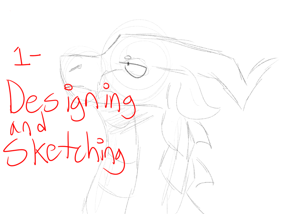
draft
Like most illustrations, we start with a rough sketch.
When drawing a draft, you can use a dip pen or pencil.
Start with a rough idea of the content in the picture.
If there are ready-made character designs available, it will be easier for reference and layout.
Set up your reference layout in the Clip Studio paint interface
To make it easier for you to refer to images at any time, you can change the layout of the interface.
After opening the reference file in Clip Studio Paint, drag the reference file's label to the other side until the red edge appears.
You can drag it to the left and right sides or up and down according to your own usage habits.
The middle axis can be dragged horizontally/vertically according to your own drawing space needs
What should I do if I compress the reference image window to be too small for the purpose of drawing space and cannot clearly see the entire image?
Please use the cursor to click on the label of the reference image, then drag the window from the navigator to the desired position, and drag left and right along the axis below to zoom in on the image.
If there is no navigator on the interface, please select [Navigator] from [Window] >
Or hold down the space bar and drag the cursor directly on the image canvas
When you need to put more than one reference picture, you can arrange them in the same column that is easy to manage.
Illustration sketch completed!
composition
When drawing a draft, you don't need to preset too many specific collage material styles, but separate out the areas where the collage materials are expected to be used. At most, you can mark the rough outline of the object. But you can think ahead about the types of objects that are suitable for inclusion in the picture.
If you can't find a suitable material for collage in the future, you can flexibly replace it at any time.
Color
After the draft is completed, open a dot matrix layer below (or a layer with a "color enhancement" blending effect above)
You can first fill in a layer of background color to determine the overall tone of the picture.
Fill in different color blocks to plan the background color layout of the overall picture. Pay attention to whether the chroma and lightness of the color can create the ideal atmosphere of the picture and whether it can produce the desired focusing effect visually.
In order to effectively highlight the focus of the picture, I divided the composition into several parts:
The red line area is the main focus
The blue line area uses concentrated lines and a sun-like center to focus the line of sight on the center
The black line area reduces the brightness on both sides of the screen, making the center appear brighter
The green line area is a foil element surrounding the main focus point. Just make sure that the color, brightness, and chroma do not take away the main focus point.
The brown line area is where the character stands (based on the settings of this character, I preset it as a treasure chest)
Note: The draft and background color can also be adjusted at any time during the production process
Draw characters using collage technique
Both characters in this work are made with "water-based paint texture" and "cut and paste" effects. The following will explain step by step how to draw.
Draw "shadow" in ink style
"Shadow" is a translucent character with the texture of ink, so we have to use the overlapping properties of ink to depict the layers.
1. Fill the entire character with black
Added independent dot matrix layer. Using the outer outline as a border, fill the entire range of the character with solid black.
Method 1: Use the Lasso Tool + Fill to fill the range (or use [Lasso Smear] in [Direct Draw])
Method 2: Use the dip pen tool to trace the outline, and then use the magic wand (selection tool) to select the closed range and fill it
To make it easier to paint in the future, we create a color mask for this pure black block layer.
Right-click on the thumbnail area of the layer > Based on the selection range of the layer > Create selection range
In this way, you will get the state where the entire periphery of the block is selected as shown in the picture on the right.
Then just click the mask icon below the layer to create a mask shaped like the outer outline!
2. Use the ink pen tool to brush the surface with light black
I use deep obliteration, thin ink smudge, and smudge ink brushes. To lighten the pure black block, select the color in the "Transparent" box. Then you can start painting the solid black blocks.
Try to lighten the light gradually so as not to make the color too light all at once.
You can also increase or decrease the shade by adjusting the opacity in the tool properties.
Got the following results.
If you feel that all the edges of the deep annihilation are too sharp, you can use the [Fiber annihilation dye blend] in the color mixing tool to eliminate local sharp edges.
3. Use the ink pen tool to deepen the local area to create layers
Open a new layer above, hold down ALT+drag the mask of the original black block surface to the new layer.
Use an ink brush of your choice to deepen the black on the edges of the original lines.
Then use the Color Blending Tool to blur the edges of the strokes, being careful not to leave any obvious lines.
Erase the black area above the edge of the hairline.
This will separate the layers.
The rest of the pieces are layered in the same way. If you feel the color is too light somewhere, you can open another layer to render a large area. You can also open several layers to overlap, and finally merge the layers.
4. Add eyes
Add another layer above. And use white to draw the white part of the "shadow" eye.
It is recommended to set the range "inside" the draft line
No need to add borders around eyes and eyeballs
Then lower the opacity of the eye white layer to about 50~55.
"Angel" drawn in watercolor style
For the depiction of "angel", we need to simulate the effect of using watercolor to paint color blocks in different parts and collage them together. Therefore, you should start painting from the bottom + lightest color (for this character, for example, start with his skin color)
The method of drawing is similar to "Shadow", except this time I use watercolor brushes and add color.
You can use [Watercolor Round Pen] or [Watercolor Flat Pen] to create a paper effect
1. Apply base color to the area to be colored
Create a new layer, fill the skin area with the lightest color, and temporarily set the blending mode to Color Boost so you can see the draft.
Note: Even if it is the same skin part, as long as there is a layer difference with other parts (for example, the left arm of this character is in front of the face), it must be drawn in different layers.
2. Apply more tones and gradients to various parts
Here, I use [Watercolor Round Brush] [Watercolor Flat Brush] [Floating Watercolor] and [Preserve Texture Fusion] to draw the light and shade and layers of the skin from light to dark.
Deliberately retaining some brush strokes and sharp edges can make the watercolor texture more realistic
How to draw fingers: First use a watercolor brush such as [Moisture] or [Smooth Watercolor] to draw lines on the fingers (red area)
Then use the color blending tool to blur the outward edge (purple area), and you will get the result as shown on the right.
You can add an appropriate amount of detailed shadows at the edges of separated objects (such as eyebrows and under eyeballs) to create a floating effect when different objects are combined in the picture.
The two characters completed.
Material collection and organization
When collecting materials, please be sure to ensure that the source of the materials can be legally provided for creative and editing use (both free and paid resources are available). Please do not directly use search engines such as Google to randomly crawl images for use.
Downloadable material website sources
Here are a few resources that can be used appropriately for collage materials:
Enter keywords in the search bar to browse the materials you need more quickly.
Click "Details" on the right side of the search bar to quickly find potentially applicable materials according to categories.
Pexels (It is recommended to enter keywords in English. Please read the website's Legal Instructions before downloading images)
Adobe Stock (requires membership account, free download under certain conditions)
British Library Collection (Officially released public use rights, you can select images according to categories)
CGtrader, TURBOSQUID
(Both are 3D model material websites. You can download the model file obj/fbx, and then import the model file from Clip Studio Paint's [File] > [Read] > [3D Data])
(Try to choose a low-poly model to avoid poor software operation)
Categorize materials into categories
You can manage materials in the [Manage Materials] area of Clip Studio by collecting materials with different attributes into the classification folders you create.
Assets found from places other than Clip Studio Assets can be stored in different folders according to their properties.
This will make it easier to search for related materials when you need to use them later.
Edit and collage footage
First, we open a new folder and load all the materials. If the collage materials need to be subdivided, subfolders can be created within this folder.
For the "angel" wings, I chose the following materials:
However, the image must be edited to transform it into a form suitable for this work.
After placing the wings in approximately the correct position, use [Edit] > [Transform] > [Mesh Transform] to adjust the right wing to a shape closer to the draft.
Before deselecting, click [Delete outside selection range] to delete the wings on the other side.
Then press [Copy + Paste] to copy this wing to a new layer.
Use [Flip Left and Right] and [Mesh Transform] to adjust the copied new layer to be close to the draft shape on the other side.
After adjusting, you can merge the layers of the wings on both sides.
Every time you make major edits, it is recommended to keep a copy of the original layer and edit it with the new copied layer
In case the effect is not satisfactory, you can directly delete the unnecessary layers and rewind directly to the previous stage.
Next, use this automatic action tool to make the wings more like prints. Please follow the original author's instructions for usage.
The finished wings effect.
Next, use the following materials to create a background totem:
Just drag the brush directly from the downloaded material field to your brush toolbar to add a new brush directly.
After tinting the foreground and background to your liking and adjusting the brush size, hold down Shift and click on the other side of the screen, then erase the rest so that the brush paints a single pattern.
I felt that the outline was too thin, so I used the layer attribute outline effect.
Click the color box to enter the color selection panel, and press the dropper to select the color you want.
The result after the outer frame is bolded.
Spear materials used in this game:
In the EX version, you can use [Extract Edges] to convert the model into line art
Install the spearhead on the front of the spear and delete the original spearhead.
For the rest, use brush strokes to create approximate materials.
I used the lettering material above and added the ink dyeing of [Moist Watercolor]. Create black edges on both sides.
And add the effects of [Scrape Dot] and [Float] (Delete) to create a broken texture.
Add texture
Sometimes, just color and material mapping are needed to create a collage texture.
After arranging the colors, drag the material onto the canvas (above the color layer)
Select [Texture Synthesis] in the layer effect to create texture.
If you want to add a different material to the totem, select another material and place it on top of the totem, and repeat the above steps.
Then turn on the material layer [Clip with next layer] so that it only affects the range of the totem.
The texture of the totem is also completed.
After that, basically repeat the above steps, import the suitable materials found into the work file, and use tools such as selection, eraser, filter, fill, move and transform to adjust the materials to the ideal position. Or paint with image brushes.
The following are other Clip Studio materials used in this project:
Reconcile materials with drawn images
Finally, we need to make some slight modifications to make the overall picture more harmonious.
In order to make the overall tone more consistent, I changed the background color.
paper cut white background
To make certain objects stand out more, I'll add a layer of white underneath.
Open a new dot matrix layer below the object's layer, use the selection tool to surround the object and fill it with white.
Use [Fold Line Selection] to present straight edges, which can enhance the "paper-cut" style
Copy the white background layer and place it underneath, use [Lock Transparent Object] and fill it with light gray blue.
Move the layer so that it is slightly offset from the white background above, and then use Color Add.
This will create the shadow effect of the paper.
Overall color and material processing
Add a "Color Addition" layer above all the layers and use a soft-edged airbrush to add shadows around and on the character.
Here, the eyes of the two characters are specially masked to eliminate the overall tone shadow in order to highlight the key points of the picture.
Add a new layer of "Linear Burn" on top of all layers, and use [Splash Ink Paint].
Finally, erase the areas you don't want to be covered by splashing ink.
Just retouch the details of the overall picture and you’re done!
time lapse photography
Users who liked this post


Comment