How To Make A WEBTOON: The Ultimate Guide
A Comprehensive Guide by Manny Guevarra
Introduction
Hello, friends! My name is Manny and I am a webcomic artist with 4 published comic series on WEBTOON CANVAS. My main series, "The Mind's Eye," has over 1 million reads and 20K subscribers on the platform. Welcome to my beginner-friendly WEBTOON tutorial, where I will be sharing my tips for success from over 3 years of publishing on WEBTOON CANVAS!
⬇⬇⬇
Have you ever dreamed of creating a WEBTOON, but didn’t know where to start?
In this tutorial, I will provide a step-by-step guide to creating your very first vertical-scroll webcomic in Clip Studio Paint to publish on WEBTOON’s self-publishing platform, WEBTOON CANVAS! On CANVAS, you can set your own publishing schedule and still earn ad revenue while reaching an audience of millions!
What's more, getting started is a lot easier than you might think - especially with the help of tools like Clip Studio Paint!
I have made this tutorial as comprehensive as possible to cover any and all questions you might have about creating a WEBTOON, so feel free to save it and come back to refer to it later! We will be going over all the comic-making steps in the production pipeline, helpful resources from WEBTOON, and how you can use Clip Studio Paint’s various helpful features to create your comic from start to finish - no matter the genre!
Check out the video version of this tutorial below and draw along!
⬇⬇⬇
(UPDATE: Part 2 to the Ultimate Guide is out now! While the first video above covers the entire comic production pipeline, this video covers the "Creating Your WEBTOON" section below, including pre-production such as character design and writing episodes for WEBTOON!)
⬇⬇⬇
Creating Your WEBTOON
Like any creative project, comic series require extensive planning and preparation. The stage before Comic Production is aptly named Pre-Production, or “Pre-Pro.” Depending on the creator and the scope of their unique project, this period can take anywhere from weeks to months or more. My first tip is to really take advantage of this stage, create a healthy buffer of three (3) or more episodes, and plan out the direction of your series to the best of your ability.
During this stage, take the time to brainstorm, script, and create concept art such as character, creature, prop, and environment designs. As you are exploring the world of your story and preparing for the launch of your series, it is also helpful to announce your upcoming project on social media and begin to advertise it with concept art, sketches, WIPs, logos/title cards, panels, art process videos, and other media.
🟩 CHARACTERS 🟩
If you are unsure of where to start when writing your story, I would recommend working on your characters first to create a character-driven narrative. These types of narratives often feel more immersive and believable because they are powered by human emotions, wants, and needs that readers can understand and latch onto.
In a character-driven narrative, the events of the story all tie in to the character development of your cast. This does not mean that your story should not have a strong plot, but that said plot should be driven by your characters’ need to change and grow as people.
To get you started, WEBTOON has published a plethora of resources for creators at all experience levels and in all stages of production! One such resource that is extremely helpful for artists in the character development stage of Pre-Production is the “Character Sheet” below:
▶ TIP: When filling out this sheet, pay particular attention to the “Character’s wants and needs” section. Establishing a contrast between a character’s “wants” and “needs” is the fulcrum of a character-driven narrative; as your story progresses, your characters should move away from the safety net of their “wants” and fulfill their “needs” or duties in their Call to Adventure.
Once you have fleshed out your character, it’s time for the fun part: the character design! Another helpful resource WEBTOON offers is the "Character Design Sheet." This helps keep your character art on model and maintain continuity throughout the drawing process:
▶ TIP: Now that you have gotten to know your character better, be sure to let their personality shine through this design! Are they an attention-seeker who would wear bright, flashy colors, or are they more reserved and seeking to dress in a more muted color palette to shy away from attention? Perhaps they have a warm personality, and would be best suited in warmer yellows, oranges, and pinks?
The "Character Sheet" and "Character Design Sheet" are available for download in PDF format - along with several other helpful resources - on WEBTOON's official website below:
⬇⬇⬇
🟩 STORY 🟩
Once we have a cast of characters, it’s time to create their story! When you imagine writing a story, you may think of a traditional plot outline like the one depicted below:
Following this general structure is a tried and true method that works particularly well for plot-driven narratives. However, if you are struggling to figure out where you want your WEBTOON to start, there is another model that may be helpful. When structuring character-driven narratives, I sometimes take inspiration from Joseph Campbell's model of the "Hero With A Thousand Faces:"
Campbell studied countless myths written throughout history and found that most of their heroes share similar stories: living in an "ordinary world" until they are called to adventure - refusing the call at first until something drives them to "cross the threshold" into a realm of opportunity, learning to wield their true power and facing the ultimate "ordeal" before returning home a hero. Just think of your favorite sci-fi space odyssey or mountain-trekking fantasy and you will find that the "Hero With A Thousand Faces" is all too familiar.
From a writing standpoint, this model is perfect for character-driven narratives, as it forces your character to undergo change and give up their want to stay in the "ordinary world" in order to fulfill the true needs of themselves and others. For example, I created a condensed version of this model to write my WEBTOON Call To Action entry:
Per the Call To Action requirements, this WEBTOON fits its action-filled narrative into one episode. Remember, however, that long-form WEBTOON series are episodic, meaning that you will be intermittently releasing episodes with weekly or greater gaps in between. As such, each episode will need to stand on its own in some way.
▶ TIP: To do this when writing your story, aim to include some level of plot or character development in each episode. This doesn't mean that there has to be an epic battle in every scene, but that each episode contributes to the overarching story in some capacity. This could be an important conversation, or a story beat within that conversation that shifts its tone - a startling revelation, or a quiet, simple thought in which a character reflects on something they've been avoiding. You could introduce a new character, reveal a flashback out of context to leave your audience wondering, or explain a flashback you slipped into an earlier episode. The possibilities are endless!
There are an infinite number of ways to approach storytelling; this is by no means a definitive or “correct” approach - just some tips to think about! Some creators start with the overarching plot of their story and create characters based around roles needed to fit into that narrative. Others take a more visual approach and start off by creating character designs, then fleshing out their character’s personality and motivations after seeing them. In the end, you simply have to find what works best for you!
🟩 HOW LONG DOES IT TAKE? 🟩
As discussed at the beginning of this section, Pre-Production can take anywhere from weeks to months - and, in some cases, years. In my opinion, there is no “right” or “wrong” amount of time you “should” spend on your comic in any stage of Production. However, I would encourage artists at any skill level to publish your series when you feel adequately prepared to do so rather than wait until you feel that your art and story are "perfect."
(Spoiler Alert: There's no such thing as "perfect" when it comes to art!)
We've all heard that art is subjective, but sometimes we're still hard on ourselves. I know I used to give up on things I really wanted to do before I even tried it out, all because I was scared of it not being "perfect." But not only do you not have to be perfect to succeed; on the contrary, readers love seeing improvement in art and story as their favorite WEBTOONs go on and their artists grow along the way!
▶ TIP: So then, how do you know when you’re “adequately prepared” and ready to launch your comic? If you’ve never published a series on WEBTOON CANVAS before, my final tip for this section would be to ensure you are meeting these ten (10) criteria:
(1) Establish a healthy buffer of 3 episodes or more.***
(2) Have finalized character designs for major characters.
(3) Are able to draw those character designs consistently on model and maintain continuity in each panel.
(4) Have a clear vision for the future of your art style (even if you are not 100% satisfied with it right now).
(5) Know main characters' motivations for their actions over the course of your series.
(6) Write a script or script treatment for at least the first season of your series.
(7) Write a basic outline for the remainder of the series.
(8) Have a general resolution or endgame you are working toward.
(9) Are able to commit to a consistent posting schedule, be it daily, weekly, monthly, etc.
(10) Have social media channels prepared to advertise it on, whether you have 1 follower or 1 million.
*** It is a general rule of thumb to launch your series by posting three (3) episodes. This is the case for several reasons. In technicality, this generates an automatic prompt in the WEBTOON UI that asks readers to subscribe after finishing the third episode. In practicality, this enables you to create a solid story “hook” to draw readers into your comic. Furthermore, the first three episodes of your WEBTOON are treated as your “pitch” when read by editors.
Getting Started in Clip Studio Paint
Once you’ve built your narrative, world, and the characters within it to your liking, it’s time to prepare for drawing your comic. Let's create a new project in Clip Studio Paint! First, select [File] > [New]. You can also use the hotkey [Ctrl + N].
When we open this window, we can see several canvas options: Illustration, Webtoon, Comic, Fanzine, and Animation. As the name suggests, the “Webtoon” option is optimal for creating a WEBTOON and taking full advantage of the vertical-scroll format:
The maximum dimensions for file uploads on WEBTOON are 800 x 1280 px. As such, the [Webtoon 3] and [Webtoon 4] Presets are good options for your canvas size when starting out. Personally, I typically have my canvas set to 1600 x 25,600 px at 300 dpi:
I do this for several reasons. It is always a good idea to make your canvas a little bigger than your final image will be; you never want to have to scale your image up when exporting, as it will lose quality. Keeping in mind that the final file width will need to be 800 px when uploaded to WEBTOON, I aim to make the width twice the required amount to ensure high quality.
Additionally, because the final file sizes will be 1280 px long, I also try to keep the length of my files at multiples of 1,280 or 2,560 so that I can gauge how many files I am going to end up with. The maximum number of files allowed in any one CANVAS episode is 100, and the total maximum file size is 20MB.
The CANVAS UI now has a handy feature which automatically slices and reduces images above the maximum dimensions of 800 x 1280 px. There are also several tools we can use to slice our files in Clip Studio Paint that we will discuss later. But between the two, there are many useful tools you can use to prep your files, so don't be afraid to work on a longer canvas to take full advantage of the vertical scroll format!
When using the “Webtoon” setting, Clip Studio also creates a helpful preview of each of your files so that you can keep track of the overall flow of your story! To toggle between files, simply double click each “page.” You can also rearrange pages by simply dragging and dropping them!
Throughout the drawing process, you can preview your drawing as it will appear on a mobile device using Clip Studio Paint’s [On-screen area] feature. Simply go to the [View] menu > [On-screen area (webtoon) (5)].
This provides a handy view of what your comic will look like on various mobile devices, which is what WEBTOON reports that most users read their comics on. As you scroll through your canvas, the preview window will follow. Select this option from the [View] menu again to toggle it off.
Finally, some artists choose to create their comic in the traditional page format and simply reformat the panels for vertical-scroll episodes on WEBTOON. Though drawing the comic in vertical-scroll WEBTOON format allows you to take full advantage of things like impact panels and gutter space, this method can be useful, for example, if you also plan on hosting your own site for your comic, or doing a print run later down the line.
I. Thumbnailing, Storyboarding, and Sketching
Great! Now that we’ve prepped our canvas, let’s start drawing! As we navigate through the Comic Production Pipeline, we'll learn the steps of the comic-making process, as well as the features that Clip Studio Paint offers to help streamline that process.
Whether you are drawing digitally or traditionally, the Comic Production Pipeline generally consists of the following steps: Thumbnailing, Storyboarding, Sketching, Inking, Coloring, Effects, Typography, and Formatting. Because we are making a digital comic in vertical-scroll format, our process may look a little different than traditional comic-making, but the steps are all largely the same.
⬛ THUMBNAILING ⬛
Before storyboarding individual panels, many artists start by Thumbnailing the layout of their pages. Thumbnails are loose sketches that establish the flow of your panels on the page. These are typically small drawings with very minimal details, drawn in quick succession to churn out several different iterations.
▶ TIP: When laying out your panels, here are several helpful things to keep in mind:
(1) WEBTOON aims to create “a cinematic experience” with their vertical-scroll format, wherein comics are meant to be read one panel at a time. Based on a canvas size of 800px wide, WEBTOON recommends having at least 200px of vertical space between panels.
(2) For transitions involving location and scene changes, WEBTOON recommends having at least 600px to 1,000px of vertical space between panels. This Gutter Space can be used to convey a sense of passing time or long distance, and unlike traditional print format, WEBTOON’s vertical-scroll format allows for practically infinite space - so take advantage of it!
(3) Speaking of Gutter Space (the space between closed panels), this is a great place to put things like: (a) weather indicators such as leaves and snow, (b) manga patterns such as sparkles, bubbles, and stars, (c) important motifs to your narrative, and even (d) impactful dialogue that you want to stand on its own.
(4) Because you do not have to fit your panels into the limited space of a traditional comic page, the vertical-scroll format opens up a new realm of possibilities to play with the shapes of your panels. Make sure to vary the height, width, shape, and positioning of your panels, using size to indicate the importance of certain shots.
(5) In that same vein, try playing around with Impact Panels ("open" or borderless panels which take up the entire screen). These types of panels are perfect for highlighting critical moments in a scene such as the introduction of a new character.
Phew! That was a lot of information, but the more you work in the vertical-scroll format, the easier it will become to just go with the flow!
⬛ STORYBOARDING ⬛
Once you’ve selected a set of thumbnails that work for your vision of the scene, it is time to move into the Storyboarding phase. Some artists combine the Thumbnailing and Storyboarding phases, but I like to do the smaller Thumbnails on a separate document first to look at overall flow, then move onto Storyboarding on my final canvas.
It is in the Storyboarding phase that I do the following: (1) configure panels on the final canvas, (2) map out my characters’ blocking, poses, and basic expressions, and (3) place speech bubbles.***
***This is extremely important! I would highly recommend planning out where you will be placing your speech bubbles in this phase so that you do not have to struggle to cram them in later or cover up any artwork. WEBTOON recommends limiting speech bubbles per panel to three (3) or less so as not to crowd the panel.
▶ TIP: To further avoid crowding panels, you can also put speech bubbles and narration boxes in the gutter space. Spacing dialogue out in this way can also help pace your readers, as well as highlight impactful lines.
⬛ SKETCHING ⬛
Once you’ve effectively laid out your page, you can start adding fun details to your scene. Use the Sketching phase to flesh out your characters’ hair, facial features, clothing, props, and other details to set yourself up for success in the inking phase. The cleaner you make your Sketch, the less work you will have to do in the inking phase!
In general, I would recommend using the [Sub Tool: Pencil] or [Sub Tool: Brush] to sketch your panels. When erasing parts of your Sketch, use a soft eraser such as the [Sub Tool: Eraser] > [Tool property: Soft] to feather down the edges.
▶ TIP: You can also use any brush as an eraser by clicking (X) on your keyboard, or selecting the transparent option beneath your color swatches on the bottom left-hand corner of your color wheel.
▶ TIP: Even if you are not going to be drawing your background by hand, it is also useful to sketch out your character’s surroundings and their placement within them. This helps ensure natural-feeling placement and perspective when the background is added, regardless of whether you are drawing it by hand or using assets such as brushes and 3D models.
If you find yourself struggling with backgrounds - or just want to learn about different ways to approach backgrounds for your comic - feel free to check out my recent tutorial on how to create compelling backgrounds:
⬇⬇⬇
Finally, when preparing to ink your Sketch, I would recommend lowering the opacity of your Sketch layer to about 10-18% - or as low as you can set it without straining your eyes - so that you can focus on your lineart.
II. Paneling Your WEBTOON
Now that our panels are sketched out, it's time to get into the real meat of the Production process! Let's start by Paneling, or creating finalized panel borders based on our sketches.
⬛ FRAME BORDER TOOL ⬛
Clip Studio Paint has several great tools for Paneling your comic, but perhaps the most widely used is the [Sub Tool: Frame Border], which can be found near the bottom of your toolbar, or by clicking (U) on your keyboard.
Once you've selected the [Sub Tool: Frame Border], simply click and drag your cursor across the screen to instantly create self-contained panels.
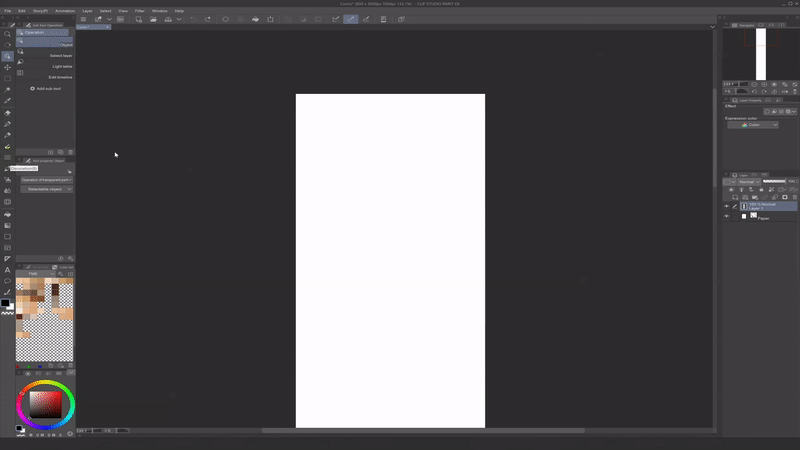
This will automatically generate a Folder for each Frame that acts as a layer mask of sorts. Inside each folder, you can create individual Layers, but everything you draw on them will be contained within the Frame.
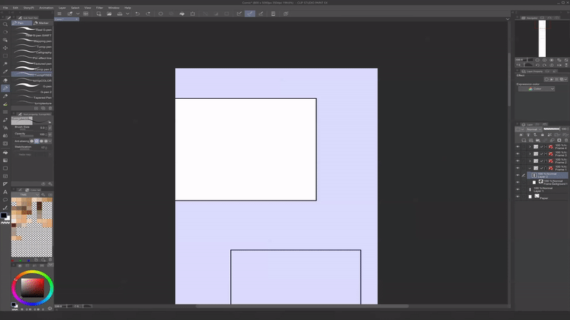
To quickly toggle between Frames, switch to [Sub Tool: Operation] by clicking (O) on your keyboard and select your desired frame. You can also use [Sub Tool: Operation] to resize and transform your Frame by selecting its border.
You can also adjust your Frame by using Control Points, which appear as hollow red squares at the corners of your Frame when deselected, and green red squares when selected. To manipulate Control Points, simply select one and move it using the arrow keys on your keyboard or by dragging them with your mouse.
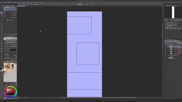
To add a Control Point to your Frame with the [Sub Tool: Operation], simply right click on the Frame and select [Add control point]. You can also delete Control Points in this way.
To split your Frame, use the [Cut frame] option within the [Sub Tool: Border Frame] menu. To use this splicing tool, simply drag it across your frame in your desired direction. The [Divide frame folder] option will split the current Frame's Folder into two, whereas the [Divide frame border] will maintain the current Folders and simply change the border shape.

To draw Impact Panels and other open panels outside of the established Frames, simply draw in a Layer outside of the designated Folders.
III. Inking Your WEBTOON
Now that we've created our Panels, let's move on to the Inking phase!
⬛ INKING ⬛
You may have also heard Inking referred to as “Lining” or the “Lineart phase.” “Inking” refers to the ink used to create lineart in traditional print comic-making. In our case, we will be “inking” our page with a digital pen. Clip Studio Paint offers various [Sub Tool: Pen] presets, including the [G-pen], [Turnip pen], [Textured pen], and others with varying amounts of taper that are good for Inking.
[Sub Tool: Pen] settings such as taper can also be toggled at any time by clicking the Wrench icon, which will take you to the [Sub Tool Detail palette] seen below:
Once you are happy with your Sketch from the previous phase, use it as a guide to line your drawing. In most cases, it is best to close your lineart to make the following coloring stages as seamless as possible; the more closed your lineart is, the easier it is to fill the areas within it.
Even so, your unique art style may call for purposefully open areas between shapes, thin or bold lines, tapered or untapered lines - feel free to play around and see what works best for the desired mood of your story! Purposeful lineart can be a powerful storytelling tool on its own.
⬛ VECTOR LAYERS ⬛
▶ TIP: I recommend drawing your lineart in a Vector Layer. Unlike Raster Layers, Vector Layers do not lose quality when resized or otherwise transformed. To create a Vector Layer, navigate to the [Layer] menu > [New Layer] > [Vector layer...]. You can also do this by selecting the [New vector layer] icon above your Layers as shown below:
In addition to maintaining quality when transformed, Vector Layers are also easy to manipulate using the [Sub Tool: Operation] we discussed earlier.
After selecting [Sub Tool: Operation], or pressing (O) on your keyboard, you can edit the Main Color, Brush Size, and even Brush Shape of all objects on the current Vector Layer using the [Tool property: Object] menu.
When using the [Sub Tool: Operation], you can also transform Vector lines directly by selecting them - similar to the [Sub Tool: Frame Border] discussed above. You can also add, manipulate, and delete Control Points the same way, as well.
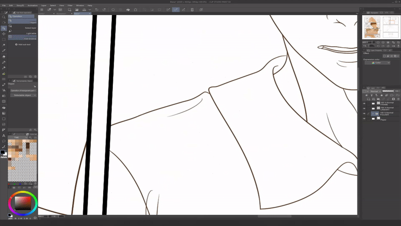
Use the [Sub Tool: Eraser] > [Vector] eraser to easily clean up Vector lines or portions of lines. You can choose which part(s) of your selected line you would like to erase by selecting between the options shown below:
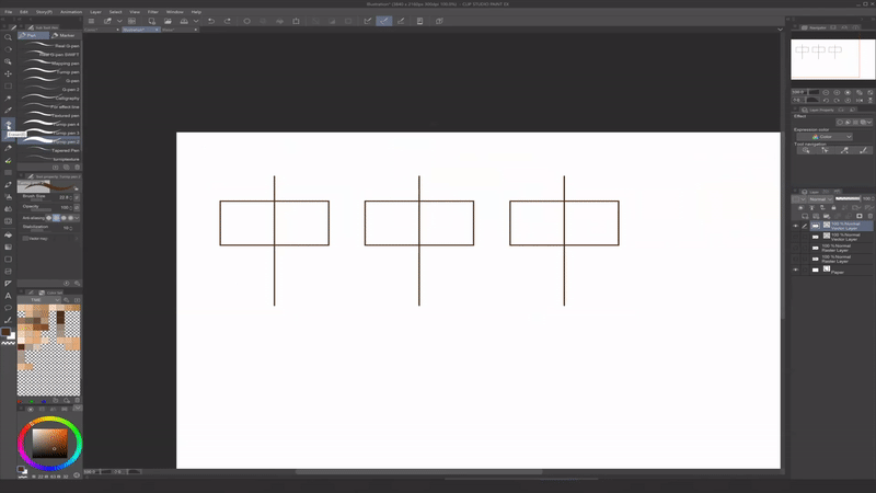
For more Vector Layer tips, check out the full tutorial I recently made for a complete guide!
⬇⬇⬇
▶ TIP: My #1 tip for achieving clean lineart is to work in quick, confident strokes rather than "slow and steady" strokes! The slower you draw, the more you open yourself up to shaky hands and pen jitters. It is a much safer bet to know where your line is going and move quickly, rather than moving slowly and carefully - even if that means having to undo and redraw the line a few times until you get your desired line quality. You could also use pen stabilization, but I find that this yields less organic lines, and it is a much better long-term solution to build organic line confidence.

Vector Layers are excellent for clean and easy lineart. However, I would recommend coloring and further rendering your drawing on a Raster Layer, which is the default Layer option in Clip Studio Paint. Speaking of which- let's add some color!
IV. Coloring Your WEBTOON
The next stage of comic-making is the Coloring stage. In traditional print comic-making, this stage may further be broken down into flatting, toning, rendering, etc. and divided between artists. But regardless of how you approach it, WEBTOON recommends adding some form of color to your comic, as colored comics are typically the ones that perform the best on the platform. And, as you can see, it really helps your art leap from the page!
▶ TIP: When choosing an art style for your comic and deciding how you are going to render your drawings, opt for a style that you know you will be able to keep up with! Because you are typically going to be producing large quantities of panels every single week, you may not be able to fully render your drawings to the same extent you would a detailed illustration.
When I am rendering my comics, I typically stick to flat colors for my character art, letting my lineart and analogous color palette bring the drawings together. I will sometimes moderately render out closeup (CU) and extreme closeup (ECU) shots, especially if they are important moments in the story - but for the most part, I find that flat colors perfectly suffice while still maintaining the mood of the scene. Because of this, I am able to create pages nearly three times as fast as when I rendered out each panel the way I would an illustration. I highly recommend finding a system such as this, as it will allow you to: (1) maintain a consistent posting schedule, (2) avoid burnout in general, and (3) spare your body some extra stress and promote wrist health.
I typically work in warm, analogous color palettes, as I find it best fits the mood of my comics. However, there are an endless number of possibilities when it comes to choosing your palette. Below are just a few:
⬛ COLORING TOOLS ⬛
Once you've selected a color palette you'd like to to use, you can save it in the [Color Set] tab by right-clicking any cel and selecting [Add Color]. From here, you can easily eyedrop your saved colors at any time throughout the illustration process by simply clicking them.
▶ TIP: To adjust the Hue, Saturation, and Luminosity of your colors on any layer, simply click (Ctrl + U) on your keyboard to bring up the HSV slider. You can also use the slider in the form of a clippable Correction Layer by selecting the [Layer] menu > [New Correction Layer(J)] > [Hue/Saturation/Luminosity].
⬛ LAYER BLENDING MODES ⬛
Clip Studio Paint also offers an abundance of Layer Blending Modes, which can be found in the upper-lefthand corner of the [Layer] panel.
These Blending Modes essentially compare colors based on their hue, saturation, and luminosity to create interactions between the selected ("set") layer and the layers below. Said interactions are nondestructive, meaning that they do not permanently alter either layer and can be toggled on and off at any time.
Blending Modes can be a really useful tool for quickly adding light and shadow to your comic! These modes can generally be broken up into the following categories:
When shading comic panels, I typically use low-value, desaturated blues and purples on [Multiply] mode to add faint cel shading to characters. When adding light, I typically use high-value, desaturated yellows and oranges on [Screen] mode for basic highlights such as hair highlights. I then use [Glow Dodge] mode for more vivid and powerful light such as direct sunlight.
V. Helpful Effects in Clip Studio Paint
Almost there! Once we have our panels colored, it's time to add the finishing touches to our page!
Clip Studio Paint has countless Effects that are perfect for comic-making in any genre and can really level up your panels! Let’s go over some of the most commonly-used and impactful effects Clip Studio has available.
⬛ EFFECT LINES ⬛
Whether you are drawing an emotional conversation or an epic fight scene, Effect Lines can capture your reader's attention and direct their focus toward a significant action, expression, character, or prop in a scene.
Clip Studio Paint has several pre-made Effect Lines that can be found in the [Material] menu > [Manga material] > [Effect line].
To apply them to a page, simply drag and drop the Material onto your canvas. You can then rotate, resize, and transform the Material using the [Sub Tool: Operation (O)].
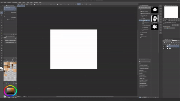
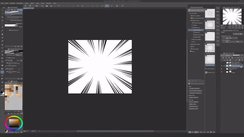
If you would like to customize your Effect Lines, Clip Studio also has [Stream line] and [Saturated line] options under the [Sub Tool: Figure] tool. To use them, simply select the tool, click where you want the center point to be on your canvas, drag your mouse in the direction you want the effect to emanate, and press enter.
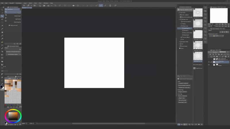
If you would like to apply Blur effects or erase parts of your Effect Lines, simply Rasterize them by right-clicking on the [Layer] and selecting [Rasterize].
(You can also Rasterize layers such as Frame Borders and Vector Layers in this way to further adjust them - though, keep in mind that after doing this, they will not be able to be manipulated using the original parameters.)
⬛ LIQUIFY ⬛
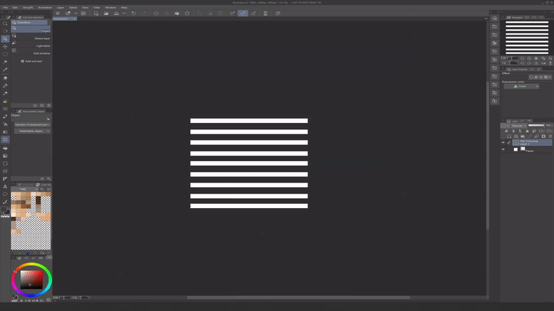
The [Sub Tool: Liquify] tool can be used to correct a drawing by warping and reshaping a specific part of an image. It can accessed by pressing (J) on your keyboard.
Simply trace over the part of the image you would like to warp with your brush, and viola! The warping will only be applied to objects in the current layer. In order, the settings are as follows: Push, Expand, Pinch, Push Left, Push Right, Twirl Clockwise, and Twirl Anti-Clockwise.
⬛ BLUR EFFECTS ⬛
Clip Studio Paint has several awesome Blur Effects available under the [Filter] menu > [Blur]. Some of the most useful Effects for comic-making are: Gaussian blur, Motion blur, and Radial blur.
Radial Blur
The [Radial Blur] effect allows you to select a point of origin and causes all the objects on the selected layer to either radiate toward or away from that point. It can be accessed through the [Filter] menu > [Blur] > [Radial Blur] at the top of your screen. Next, simply drag and place the red "X" wherever you would like the point of origin to be.
This effect is useful for sunlight filtering in, as depicted above, but can also be useful for objects such as the Effect Lines we just discussed.
Motion Blur
The [Motion Blur] effect is excellent for things such as leaves, dust motes, snow, flower petals, and other weather elements you want to depict moving in a designated direction. To use it, simply navigate to the [Filter] menu > [Blur] > [Motion Blur] and select the direction using the [Angle] parameter.
Gaussian Blur
The [Gaussian Blur] effect is what you might think of when you hear the word "blur." This effect uniformly blurs all objects on a selected layer and is excellent for backgrounds or other elements you want to be out-of-focus. To use the effect, navigate to the [Filter] menu > [Blur] > [Gaussian Blur].
▶ TIP: For more accuracy, you can blur edges manually with the [Blend] tool set to Tool Property [Blur]. I often use this to soften some of the edges of the Multiply layer I use when cel shading characters.
▶ TIP: If you are unsure of what Strength to use with the [Gaussian Blur] tool, think of your panel as a cinematic shot. Typically in cinematography, the closer the camera gets to the the subject in focus, the blurrier the background becomes. For example, here is the same image framed as several different shots with varying levels of blur applied to the background:
These effects have become huge timesavers when making comics, so hopefully they will help you in your comic workflow!
VI. Lettering Your WEBTOON
We made it! The final stage of the Comic Production Pipeline that we're going to be covering is the Lettering phase, where things like speech bubbles/word balloons, narration boxes, and onomatopoeia are added to our comic. In the Storyboarding phase, we planned out where our speech bubbles would go; now, it's time to place them using some of the handy tools Clip Studio Paint offers for lettering comics!
⬛ FONT SIZE ⬛
WEBTOON recommends using a font size between 12px to 30px for "standard text" like most dialogue, though this number will of course vary depending on your canvas size, DPI, and even font. All things considered, the general rule of thumb is to make your text readable on both desktop and mobile devices.
Personally, I have found that this means making most speech bubbles about 1/4 to 1/3 the width of my canvas.
When working on a canvas that is 1600 x 25,600 px at 300 dpi, I use a size 14 font and double-check that the text is readable using the [View] menu > [On-screen area (webtoon) (5)] feature we went over in the "Getting Started" section:
⬛ TEXT TOOL ⬛
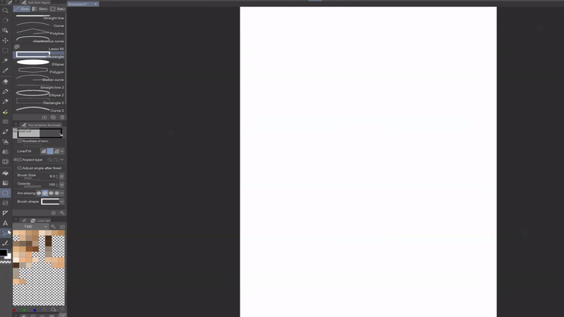
To use the [Sub Tool: Text] tool, simply click (T) once on your keyboard. The tool is also located near the bottom of your toolbar, indicated by a letter icon. Once this tool is selected, you can click anywhere on your canvas and begin typing!
To create a transformable text box, simply type your desired text and click the check mark symbol. You can then free transform your text.
If you want to scale your text uniformly, simply select the [Keep aspect ratio] checkbox. Alternatively, you can hold the (Shift) key when resizing any object to maintain its aspect ratio.
⬛ BALLOON TOOL ⬛
Clip Studio Paint has an abundance of tools for creating speech bubbles, also called "word balloons." The [Sub Tool: Balloon] can also be found near the bottom of your toolbar, or by clicking (T) twice on your keyboard.
To use the tool, simply selected your desired balloon shape, click where you want the balloon to be placed, then drag and release your cursor.
If you already have text typed out, you can place a balloon on top of it to encapsulate the text and merge the two. Alternatively, you can create your balloon first and place the text inside using the [Sub Tool: Text] tool. I prefer this method, as it automatically centers the text within the balloon.
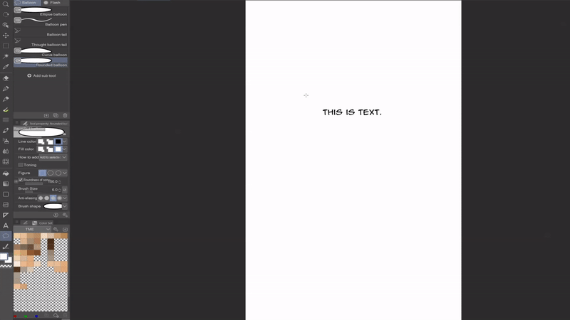
Clip Studio allows you to customize everything from the [Line color] and [Fill color] to the roundness and overall shape of every balloon. To adjust the border width, use the slider marked [Brush size].
The [Curve balloon] tool allows you to customize your balloons by selecting the points of a freeform curve. The [Balloon pen] tool allows you to customize the balloons even further by drawing the shapes freehand.

As with all selectable objects, any type of balloon can be transformed using the [Sub Tool: Operation (O)] tool. Furthermore, just like with the [Sub Tool: Frame Border] and vector objects, balloons can be further modified using the Control Points highlighted in red when the balloon is selected.
⬛ BALLOON TAILS ⬛
Balloon tails show your reader whose dialogue or thoughts we are hearing. There are many different ways to approach balloon tails, but you typically want the tip of your speech balloon tail pointed toward the speaking character's mouth when they are speaking, and the tip of thought balloon tails pointed toward their head when we are listening to their thoughts.
Within the [Sub Tool: Balloon], you can use the [Balloon tail] and [Thought balloon tail] tools to create tails for spoken words and thoughts, respectively. Like the balloons themselves, these objects can be moved using [Sub Tool: Operation (O)].
Clip Studio also gives you several options for the shape of your tail, including Spline, Straight Line, and Polyline. (Note that you can also draw your own tail using the [Balloon pen] tool.)
Many comic artists stylize their speech bubbles - and with all the customization available in Clip Studio Paint, it is very easy to do so! Even so, there are some helpful rules of thumb to abide by - particularly if you are unsure of how to draw certain types of dialogue - that help keep your speech bubbles readable.
▶ TIP: As stated before, when a character is in-frame and talking, the speech bubble tail should be loosely pointed toward their mouth. If their dialogue occupies multiple balloons within the frame, you typically do not need tails on all of them. If they are talking off-screen, the tail can be inverted in their direction. For narration, you typically want to use box-like shapes without tails rather than ellipses. Let's use the main character of my comic, Blaise, as an example:
▶ TIP: Overlapping speech bubbles can help your reader further distinguish between two speakers. Additionally, attaching the balloon tail on the side of the balloon closest to each respective speaker can help the tail placement look more natural.
⬛ ONOMATOPOEIA ⬛
As you can see, Clip Studio Paint's has some powerful text tools. These tools are excellent for not just dialogue, but also sound effects like onomatopoeia (words that phonetically imitate a particular sound like "BOOM," "CRASH," and "POW").
Two tools that I wish I had known about when I started making comics are the [Border effect] and [Mesh Transformation] tools, as they can really level up your game when it comes to things like onomatopoeia:
Border Effect
To create this effect, navigate to the [Layer Property] panel > [Effect] menu > [Border effect]. It is indicated by a hollow circular icon. Once clicked, it will expand a menu that lets you create a border of your desired thickness and color around any object in the current layer.
The [Border effect] tool can be used on any text, raster, or vector layer. In the case of text, I find that it helps separate onomatopoeia and other sound effects from the page.
Mesh Transformation
As is the case with any layer object, there are several ways to transform text, including [Scale/Rotate] (Ctrl + T) and [Free Transform] (Ctrl + Shift + T). But when lettering, my favorite transformation tool to use is the [Mesh Transformation], which can be found under the [Edit] menu > [Transform] menu:
To use this feature, you will first need to rasterize your text layer by right-clicking it and selecting [Rasterize]. After selecting [Mesh Transformation], a grid will appear with articulatable control points that allow you to transform each individual section of the text isolated from the rest.
Typography is certainly an art form in itself and can heavily impact the mood of any scene. Though I am no expert, I have had lots of fun playing around with it throughout my WEBTOON journey, and I hope these tips give you some fun ideas!
With this, we've reached the end of the Comic Production Pipeline! Now, let's finish up and export our WEBTOON.
Publishing to WEBTOON CANVAS
Once we have our episodes fully drawn, we can prepare to upload our series to WEBTOON CANVAS - and thanks to the seamless integration between WEBTOON and Clip Studio Paint, the uploading process is super easy and hassle-free! First, let's go over some finishing touches for our episodes and what assets we'll need to start uploading the series:
🟩 FINISHING UP 🟩
WEBTOON offers its readers weekly installments of cinematic-feeling "episodes," and many WEBTOON CANVAS artists also set episode schedules so that their readers can expect similar periodic installments. As such, your readers will be tuning in intermittently - be it daily, weekly, biweekly, monthly, or whatever you set your schedule to on CANVAS - and it is worth noting that they will likely be reading multiple series in-between and may need a refresher.
Because of this, I recommend including a very brief recap of your previous episode at the top of each new episode, even if it's just a few panels.
The last recommendation I have before exporting your WEBTOON is to create a Title Card and End Card for your episodes. A Title Card typically contains the logo of your series and sometimes contains an author's name or pen name, as well as associated graphics like a chapter cover if applicable:
These can be placed at the top of your episode, after several opening panels, after previous episode recaps, or anywhere you see fit to re-introduce the title and chapter of your WEBTOON (think of it like an opening theme that can excite readers for the episode they're about to read)! They also don't have to be at the top of every episode; I personally prefer to put title cards at the start of new chapters, which are then broken up into individual episodes. It's completely up to you!
Something I do recommend at the end of every episode, however, is an End Card. The contents of End Cards vary greatly between authors, but they typically include important information such as:
(1) A thank-you to your audience for reading this episode.
(2) A reminder to like and comment on the episode, and to subscribe to the series if they enjoyed it.
(3) Where else your audience can find your work on social media.
(4) Any shout-outs such as reading recommendations for fellow CANVAS creators.
(5) Any announcements such as showcasing new projects, hiatus announcements, and changes to your posting schedule.
▶ TIP: I used to make my End Cards pretty long to try and fit in as many announcements and notes as I could at the end of episodes, but I have since shifted to much shorter End Cards that only display the most pertinent information. I would highly recommend keeping your End Cards short and sweet, as this will ensure your readers scroll all the way to the bottom of your episode - which is important, as this is how series views are counted.
🟩 BEFORE YOU PUBLISH CHECKLIST 🟩
Lastly, the "Before You Publish Checklist" is a critical resource, as it provides not only the assets you will need in order to start uploading your series to WEBTOON, but also the dimensions needed for each:
Just like the character sheets discussed at the beginning of the tutorial, the "Before You Publish Checklist" can be downloaded in PDF format through WEBTOON's website below:
⬇⬇⬇
In order to create a series, you will need both the Square and Vertical Series Thumbnails, 1-2 Series Genres, a Series Title, and a Series Summary. Once you have these assets, you can click "Publish" at the upper right-hand corner of your WEBTOON account and enter the necessary information:
To upload the Thumbnails, simply click the gray boxes and select the files you would like to upload. Once you have completed all the required fields for your series, click "Create Series" and you will be taken to the following page, where you can begin to upload your episodes:
Exporting and Uploading Your WEBTOON with Clip Studio Paint
Great! Now that we've finished up our comic, we're ready to export our files! There are several ways to do this; we'll be focusing on the two that I believe to be the most convenient. First, to revisit the WEBTOON upload requirements:
(1) The maximum total file size is 20MB.
(2) The maximum number of files is 100.
(3) Each file needs to be 800px wide x 1200px tall; if not, the WEBTOON UI will splice it to these dimensions.
You can use these parameters to help gauge how long to make your episode and whether your current canvas will fit into one episode. In most cases, these limits shouldn't be a problem, and you will find the episode length to be more than plenty! Once we have our files prepped and ready to go, we can easily upload them through this interface.
⬛ UPLOADING FROM CLIP STUDIO ⬛
The most convenient way to upload your WEBTOON is by selecting "Upload from Clip Studio Paint!"
This will take you to a separate tab, which will trigger a pop-up with the prompt depicted below. On the prompt, we're going to select "Open CLIP STUDIO:"
This will open a list of your recent Clip Studio files. From here, simply select your comic file by double-clicking it and select "OK" when asking if you would like to export:
And voila! Clip Studio will splice and auto-populate your comic files into the WEBTOON interface - it's that simple!
▶ TIP: Before posting your episode, you will have the option to preview how it will read on both PC and mobile. I highly recommend doing this, as myself and many other CANVAS artists have found that this is where we notice continuity errors, typos, and other errors we did not catch previously!
The "Creator's note" section is a nice place to greet your readers, thank them for reading the episode, and put quick reminders of things like upcoming schedule changes, etc. However, if you are delivering an important announcement and want to ensure that the majority of your readers see it, I would recommend including it in the actual episode as part of the End Card!
⬛ EXPORTING AND UPLOADING MANUALLY ⬛
Manually exporting and uploading your episodes is another method made easy by Clip Studio Paint! To use this method, simply navigate to the [File] menu > [Export webtoon] within the application. This will open a panel which allows you specify your desired file format, name, and scale. It also allows you to divide your episodes vertically into 1280 px files, or any other dimension you would like:
Once you have your exported files, simply click "Select file to upload" on the WEBTOON interface. This will open up a File Explorer window, where you can select your newly-exported files and upload them to WEBTOON with no hassle!
And just like that, we're done!
Conclusion
As you can see, Clip Studio Paint makes it easier than ever to create and upload your WEBTOON with seamless integration. What's more, there are new features coming out all the time!
Thank you so much for checking out my step-by-step WEBTOON tutorial. I know it was on the longer side, but I wanted to create a comprehensive guide that you can save and refer back to at any point in the creation process should you need it! I hope this information is helpful to anyone who is looking to create their first WEBTOON - or even current WEBTOON CANVAS artists who are looking for some extra tips and tricks to enhance their workflow!
Finally, here are some additional resources that may help you on your WEBTOON journey! 💚
For more WEBTOON-related resources from WEBTOON Academy!
⬇⬇⬇
For tons of free brushes, models, and other assets to help you at any stage in the drawing process!
⬇⬇⬇
Another site with tons of assets to help you while comic-making!
⬇⬇⬇
For fun comic fonts that can be downloaded and installed into Clip Studio!
⬇⬇⬇
Come say hi!
⬇⬇⬇


Comment