
My name is sdt and I draw illustrations using both analog and digital media.
Here I will explain how to create illustrations with a watercolor, analog-style texture using my own brushes and materials.
Aiming for a new style
Even though they are all called watercolors, the style varies from artist to artist.
Some artists paint pale, fantastical landscapes and still lifes, some create works so realistic they could be mistaken for photographs, some draw characters in pop colors, and some create picture-book style works, sketches, fluid styles using plenty of water, and even thick, careful layering of paint. Any of these works are watercolor if they are painted with watercolors.
With so many different directions to choose from, I first clarify my vision of what kind of watercolor style I want to paint.
Here, the style I usually paint using analog is the basis. I want to express the texture and atmosphere of the type of watercolor paintings I paint digitally.
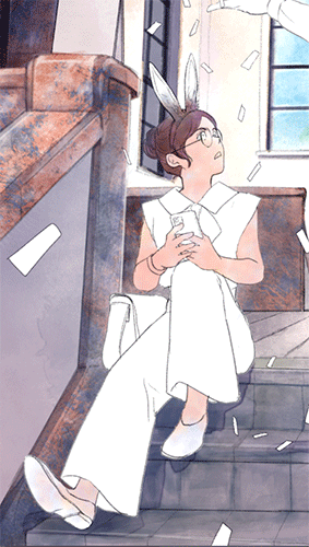
The analog watercolor illustrations I usually draw look something like this.
The illustrations are heavy, with characters, people, backgrounds and small items. There is no beauty in the white space or fresh transparency at all.
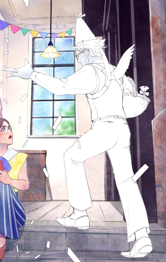
And here is a watercolor-style painting done in CLIP STUDIO PAINT.
It's not completely analog, but I think the nuance is pretty close to analog.
In this article, I will explain how I drew this picture.
This is a text-heavy article, so if you don't want to read it or just want to get the feel of it, I have uploaded a time-lapse to Instagram, so please take a look.
What are watercolor brushes?
When we say "watercolor brushes," I think they can be roughly divided into two types.
(1) Brushes that allow you to paint over and over again, like drawing with a brush.
(2) Brushes that are made by scanning actual watercolor drawings, and are used like stamps to create nuances.
Not all "watercolor brushes" can be categorized into one or the other, but I use these criteria when I draw in a digital environment.
The brushes I'll be using this time are mostly (2). Rather than "painting" with a brush, it's more like coloring with a stamp brush. The concept of what I'm doing is similar to stencils.
Even with a textured brush like (2), if you layer the paint, it just becomes a solid color, so I'm putting texture on the screen like a stamp without painting.
Sketch
Now let's start creating. First, the rough sketch. This time, I'm going to draw a picture without inking the main lines. The rough sketch was drawn with the pencil tool.
Taking photos of stairs and windows is a hobby of mine, so I used the photos I've taken to draw the background.
The lighting model is based on this 3D material.
This painting is divided into background, characters, and confetti.
Layer Composition
I'll explain the layer structure.
Basically, folders are divided by sketch and color.
To create a paper texture, I placed a construction paper layer on top. I'll explain the effect of this at the end, after I've finished coloring.
Now it's time to prepare for coloring.
Place the background color folder on top of the background line art folder and set it to Multiply.
Place the layer that will color the background in the "Background color" folder.
Background color fill
Place the image material "Texture Gradient Dusk" in the "Background Color" folder and set the layer opacity to about 30. By placing this image at the bottom, the overall image will have a vaguely light and dark texture. It's a subtle difference, but trust that the flavor comes from the accumulation of subtle differences.
The color will change as you layer and adjust colors on top, so don't worry too much about it and just place it there as an uneven base.
Mask Description
With "Texture Gradient Dusk" selected, press the "Create Layer Mask" button and a mask will appear.
A mask is a function that allows you to adjust the parts that are displayed, but here you can think of it as something like applying an eraser while keeping the original image intact, allowing you to go back to the original state if you make a mistake.
Select the mask part and create the base of the background.
With the mask selected, erase any areas where color and texture are unnecessary.
Use the eraser tool to erase.
It looks like this after erasing.
Watercolor/analog expression
We will use "(2) Brushes made by scanning actual watercolor drawings, used like stamps to create nuances" explained in the "What are watercolor brushes?" section to create a watercolor/analog texture.
Texture example
Before we start painting, let's talk about what makes it look like watercolor or analog.
Digital painting is based on flat, solid paint, but analog watercolor coloring has the characteristic that it is difficult to achieve a completely uniform finish even when using a single color of paint, and a quick way to recreate this is to make the color uneven. There are many ways to go into detail, but for now we'll just think of it as not being a solid color.
The example below is my own "Buwa: Watercolor Brush." The brush itself has a paper grain texture, so it gives off an uneven, analog-like color tone.
When you apply multiple layers, it just becomes a solid color, so it's not suitable for carefully applying multiple layers on a single layer. This brush is effective for stamp-like drawings.
The basic way to paint is to paint quickly and then erase the excess.
Apply it roughly
erase.
Here's an example of creating a complex color.
I stack one layer on top of the other and paint it equally with red and yellow.
I painted the whole figure for now. I used separate layers for the clothes (blue/red/yellow), but the hair was colored on one layer.
From here, we'll use the layer effects to change the colour of the clothes.
The clothes part is made up of two layers, one painted blue, and one painted red and yellow.
If you change the layer settings of the red and yellow layer, the colour will change in various ways, so it's effective when you want to make changes that don't reflect your own colour sense.
Rather than mixing colors on a single layer, I use one layer per color and layer them to create complex colors. By using separate layers, I can change the density and layer settings, which allows me to change how the colors overlap and the texture.
Here, I'm using bright colors to show the effect, but in actual drawings I often use more subdued colors to add a little nuance.
You can also use a gradient map to create a color separation effect.
Brush drawings with an uneven, analog texture have a wide range of shades, so you can create a variety of colors by adjusting layer settings and color correction, so it's fun to try out different things.
In the image above I used the following gradient map:
Below is a sample I took when I was trying out the effects I could achieve with my own brushes. By using watercolor brushes and applying gradient maps and layer effects, you can achieve a variety of colors and textures.
This time I used my own brush, but CLIP STUDIO PAINT can also use Photoshop brushes, so if you are an Adobe user, you can use watercolor and analog-style brushes officially distributed by Adobe, or watercolor brushes for Photoshop sold on various resource sites, in CLIP STUDIO PAINT. There is a huge amount of accumulated brushes by predecessors, so it may be fun to search for your favorite ones.
https://www.adobe.com/jp/products/photoshop/brushes.html
Brushes used for coloring
The four watercolor brushes we will use this time are as follows.
"Fluffy Paint" is a brush that stamps texture, but with the tip slightly shifted towards painting. It creates a soft drawing with fluffy edges.
Use a larger brush size for painting that creates texture, and a smaller brush size for detailed painting/drawing. I frequently change the brush settings while I'm painting, so you can just think of the initial settings for this brush as being the values that happened to be when I registered the material.
The following "Boa", "Buwa", and "Maru" brushes are used in a stamp-like style.
Painting process
The basic way to paint is
1) Use a large brush and paint the whole thing as if stamping
2) Erase any excess with an eraser or mask
.
You'll adjust the color later anyway, so just fill in as you feel like it.
After painting, you often find yourself thinking, "I wish I could change the color." Unlike with analog, you don't have to get it right in one go, so I think it's fine to use a color correction layer or something to get it as close to your preference as possible.
▼ I layer the colors while thinking about which areas I want to make darker and which areas I want to make lighter.
▼ I drew the black door frame and outside the window on the right.
I painted with a light color, then duplicated the layer and multiplied it to adjust the layer density, or made the brush color transparent and scraped away to adjust the darkness and shading.
▼The patterns on the handrails and pillars of the staircase were drawn using the "Boa", "Maru", and "Buwa" brushes. I started by drawing something that looked like a pattern, then made the brush's drawing color transparent and scraped it away, stacking several layers of roughly drawn images, then multiplying, overlaying, and combining the layers, correcting colors, and applying gradient maps, and stopped when it looked like a stone pattern.
It's similar to what I did in the "Texture Examples" section.
The rough texture on the steps of the staircase was also created with the "Boa" brush.
▼ I create layers for each part I want to brighten, then paint over it with white using the “Buwa” brush or “Maru” brush, then scrape it down, adjust the density, set the layer to glow, and add highlights.
▼ I added shadows and dirt. This was done with the "Soft paint" brush.
It may be hard to see, but I've used white to draw a fluffy air in the middle of the space. This is the "Fuwa" brush.
The shadow parts have a watercolor border-style border in the layer settings.
Pressing the O button in the "Effects" section of the layer properties will add a border to what you've drawn.
You can choose between "Border" and "Watercolor border" for the border style, and if you choose watercolor border, parameters that determine the condition of the border will be displayed so you can set it to your liking.
In this painting, the shadow of the pillar on the right side of the screen is also created by adding a watercolor border using layer effects. The shadow itself is simply painted on with a brush.
For now, this completes the coloring of the background.
Person coloring
Layer Composition
Next we will colour the character.
Let's review the layer structure.
Place the "Character color" folder for coloring on top of the character line art folder, and put the coloring layers into this folder. The folder settings are Multiply, just like for the background.
"Wings" is the folder to put the man's coloring layers, and "Ears" is the folder to put the woman's coloring layers.
We also set the "Character color" folder to "Clip at layer below".
If you press the button indicated by the red square in the image below with the "Character color" folder selected, the color will only be applied to the part of the image in the "Character line art" folder one level below. Folders and layers that are in the "Clipped at layer below" state have a red vertical line on the left side.
Let's compare it with the finished image. If you turn off "Clipping at Layer Below", you can see that the parts of the character that are colored beyond the limit are also displayed.
My method of painting is not to carefully paint inside the line art so as not to go beyond the borders, but rather to "paint all over and erase any excess parts", so by turning on "Clip at Layer Below" I can paint without worrying too much about going beyond the borders.
You could separate the clothes, face, etc. into small parts and clip them, but I think the time it takes to separate the parts and then paint quickly and erase the excess parts with an eraser would take roughly the same amount of time, so I thought it would be fine if only the outside of the character's outline was masked out, so I configured it like this.
Skin painting
I created a "Skin" folder in the "Ears" (female) folder inside the "Character color" folder.
To paint the skin, I create a layer in the skin folder.
The first layer is blue, and I add some pompom colors as I like.
The second layer is yellow. Similarly, add some color.
The third layer is red. I dab the color all over the skin.
Apply a layer mask to the skin folder and use the eraser to erase any parts that are sticking out onto the clothes. By applying a mask to the folder, you can edit all the blue, yellow, and red layers at once.
Adjust the opacity of the layer to adjust the skin color.
Here, I changed the opacity of the blue layer to about 40.
Continue painting other parts in the same manner.
To reiterate, the basic procedure is to place color with the brush and then use the eraser to erase any excess. If you want to create unevenness or shading, set the watercolor brush's drawing color to transparent and scrape off the color you've applied.
I forgot to explain, but the tool I use to erase unnecessary parts is usually the "lasso eraser." It's easy because you can just surround it and erase it.
Paint layer composition gif and explanation
I thought it would be hard to understand if I just pasted an image of the layers, so I made a gif that shows the layers in order. Since it's a gif, the colors have changed a bit, but I hope it helps.
I painted the pants and bag with the "Soft" brush, but filled in the rest with the "Poor" and "Circle" brushes. I placed the colors as I felt, and when I thought the color was too light, instead of painting over it, I duplicated the layer, set it to Multiply, and adjusted the layer density.
For the other character, I also made a gif that displays the layers in order.
The paint layers are separated like this. A color correction layer is sandwiched between the pants, so the color changes several times.
The wings were not painted in with a detailed touch, but rather with a "boa" brush, which was used to apply a small amount of grey, and then the brush's drawing colour was changed to transparent and the grey parts were scraped off a little. So the texture of the wings is drawn in about two strokes.
I used a larger brush size everywhere and stamped the texture in a way that felt like it was just a matter of painting. The socks and soles of the shoes were the only parts that needed detailed painting, and the basket and the white lines on the tricorn hat.
The watercolor border setting is turned on for the shirt colour and the shadow layers.
For the overall shadow parts towards the end, I used the "soft paint" brush to fill in the whole area, set the layer to multiply and scraped off the lighter parts with a lasso eraser to create this shape.
I've finished coloring the background and characters, as well as the confetti, and I've even finished highlights and fine details. I'm also using the pencil tool for parts that I want to draw in more detail.
This basically completes the coloring.
The colors are applied with a brush that has an uneven texture, which reduces sharpness and gives the picture a softer impression.
Adding analog texture
Adding paper texture
From here on, I'll emphasize the "analog feel" a little more. This is the "construction paper" part that I skipped explaining at the beginning.
Prepare a "construction paper" material. Here we used CLIP STUDIO PAINT's official material, but many people have made paper texture materials, so feel free to find one you like and use.
Place the "construction paper" material at the top of the layer and turn on "Texture blending" in the layer properties.
Here's what it looks like when you zoom in.
It has a rough texture.
This paper texture is basically like applying noise to the whole image, so even if you replace the drawing paper image with a noise image or a sandy tone, it will still have a "rough analog-like texture". The degree of roughness is a matter of preference, so try various things. Not only the texture of paper, but also images with rough textures can have an interesting effect that makes you feel like you are using an analog-like texture.
Whether you export an illustration for the web or print it, you will ultimately view the image at a significantly reduced size from the drawing size.
(I forgot to mention that the canvas settings are A4 350dpi.)
The difference in texture depends on the layer settings, but when reduced in size, it is usually a subtle difference that makes you think, "Now that you mention it, the nuance is somehow different." I don't think that people often enlarge large images on the web to look at the details. Even so, the impression changes slightly depending on the paper texture. Let's say that it's the accumulation of subtle differences that gives it flavor.
The sandy tone above is not texture composite, but layer opacity 27 and overlay setting. I used a coarse sandy tone, so I think it would be a bit different if I used a finer sand tone. I used the following materials.
It may depend on the picture, but I personally think that the texture when RGB noise is applied is close to Waterford's fine grain.
When painting with analog watercolors, the characteristics of the paper, brush, and light source when you view the painting will result in variations in shades and colors in the drawing, and it's difficult to achieve a completely flat, solid color. In other words, I think various fluctuations are what give the analog feel.
People with excellent watercolor techniques can create beautiful, flat paintwork and smooth gradations, but with digital coloring, flat is the default, so I think it's natural to find benefits in fluctuations.
I think the reason adding noise gives an "analog feel" is because the range of fluctuations increases slightly.
Color adjustment to create a sense of unevenness
Now that we've finished drawing, we'll use a gradient map to adjust the color tones to our liking.
Add a gradient map layer to the top of the layers.
From the menu, select Layer → New Tonal Correction Layer → Gradient Map.
This time I used a soft gradation.
Adjust the Gradient Map layer:
Set the Gradient Map layer to Overlay and change the Opacity to 30.
Select the mask of the gradient map layer.
Make the drawing color of the "Buwa" brush transparent, and scrape the mask as needed to adjust the color nuances.
Finish
I think I've come close to creating the feel of analog watercolors.
What constitutes a watercolor or analog style is a matter of personal preference, but I've drawn the process of making an illustration as an example.
I hope it will be of some help to your drawing.
Users who liked this post


Comment