
Introduction
Welcome to my helpful guide to beginner's greyscale settings! I'll be covering a majority of Clip Studio's monochrome options with detailed descriptions and images walking you through everything. I hope you find it useful!
The tutorial video is provided below, with additional information and instructions as I guide you through it all.
As a note, all photos and artwork featured in this tutorial are created by me.
Canvas Set Up
To set a canvas up to be grey scale, simply make a new canvas by going to (FILE) -> (NEW) -> (COLOR DROP DOWN BOX) -> (GRAY). This will automatically default all new layers made in the canvas to values of white, grey, and black, meaning you cannot use color (Unless manually enabling color in individual layers.) Through this same method, you can also enable a (MONOCHROME) canvas, in which only black and white is usable.
If you forgot to enable the (GRAY) canvas setting in the beginning, you can still add it in later. To do so, go to (EDIT) -> (CANVAS PROPERTIES) -> (COLOR DROP DOWN BOX) -> (GRAY). If you had been using color prior to this step, all prior layers will still be set to color, while all new layers will default to grey values.
To set individual layers to greyscale or black and white, go to your right side panel (LAYER PROPERTY), click the layer you would like to change, and under (EXPRESSION COLOR) select (GRAY) or (MONOTONE). This is useful if you wish to add pops of color to a grey image to create a “selected saturation pallet,” commonly used to draw focus to an object in a scene and add narrative.
Blending Modes
To access blending modes, select the (BLENDING MODE) drop down box from your layers panel. Then, choose which mode you would like for that layer.
For easy selection of grey values, Clip Studio offers a "Default color set" which has the percentage of grey labeled for each.
Blending modes can at times behave differently with black and white than they do with color. To showcase the various effects, here is a side by side comparison of all Clip Studio blending modes available and how they appear on a layer with 50% grey value, atop a regular greyscale photo layer.
Some blending modes do not function unless the value used is greater or less than 50% grey.
- The blending modes “ Overlay , Soft Light , Vivid Light , Linear Light , and Pin Light “ do not work unless you use less than 50% grey.
- The blending mode “ Hard light “ does not work unless you use above 50% grey.
- The blending modes “ Hue , Saturation , and Color “ do not work on greyscale images and require color to apply effect.
- In order from left to right top row is…
Original Unaltered Photo , Glow Dodge , Add(Glow) , Overlay , Soft Light , Difference , Hard Mix
- In order from left to right bottom row is…
Darker Color , Lighter Color , Subtract , Color Burn , Screen , Exclusion , Multiply
- In order from left to right top row is…
Brightness , Darken , Linear Burn , Lighten , Color Dodge , Add , Hard Light
- In order from left to right bottom row is…
Vivid Light , Linear Light , Pin Light , Divide , Hue , Saturation , Color
Extract Line & LT Conversion
The (EXTRACT LINE) layer setting automatically converts your image to monochrome as a cutout of the original. It does what its name entails; presents only the outlines of your object(s). This is very handy for creating object cutouts from photographs for use in manga and comics. Its process will render the image to look as if it were a drawing, rather than originally a photograph, and thus is a great time saver trick for creating background material for your artwork.
To easily access the (EXTRACT LINE) layer setting, go to (LAYER PROPERTIES) -> (EXTRACT LINE). Then, adjust the individual settings as desired to achieve the best look for your image.
- (Threshold Fill in Black) ; Effects the amount of black present in your object’s cutout. A higher threshold may be useful for creating stronger contrast and an inked appearance.
- (Correction Line Width) ; Adjusts the width of the texture in your cutout. A higher correction line width setting may increase the amount of visible grain, darkening the image.
- (Threshold of Edge) ; Alters the thickness of the cutout lines. A higher value in this setting can result in less visible grain within photo cutouts, though too high of a threshold may erase too much of the line work’s outline.
- (Direction of Detection) ; Changes which directions the cutout occurs from. It is possible to manipulate the thickness of certain cut out lines by fixing specific directions.
- (Extract after Posterization) ; Posterization effects the tones used in the image. With the slider showing different tones, you can correct the value percentages of each to your preferences.
(LT Conversion of Layer) “Allows you to separate a selected layer into lines and tones created on separate layers.” This is a more extensive and adjustable version of the (Extract Line) layer property, and especially useful for specific adjustment of visible tones.
For more technical information on (LT Conversion of Layer), I suggest reviewing Clip Studio’s Manual for the topic at the below link.
You can access (LT Conversion of Layer) by going to (Layer) -> (LT Conversion of Layer)
OR
Going to (Layer Property) -> (Extract Line) -> (Execution of LT Conversion of Layer)
If using the (Extract Line) method of access, the (LT Conversion of Layer) settings will be dominant over the previously set (Extract Line) settings.
When using (LT CONVERSION OF LAYER), more layer options are accessible than when using (EXTRACT LINE). For example, you are able to add (TONE) to your image’s individual posterization values to achieve a more manga or comic styled appearance, add texture, or create simple patterns. These (TONE) additions can be changed later, after the establishment of the initial (LT CONVERSION OF LAYER), by clicking the individual layers that are newly created from the conversion and manually editing their (TONE) effect in the (LAYER PROPERTY).
Cutting out Objects for Manga/Comics
Cutting out objects for manga and comics is easy with Clip Studio’s variety of tools. In this segment, we’ll be cutting out a car and then using (LT Conversion of Layer) on it to make it appear as if it were drawn by hand.
While the (Magic Wand) , (Lasso) , and (Selection Pen) cutout tools that Clip Studio offers are great for extracting objects from simple backgrounds, the example of a car that we have here is set against a complex background with odd lighting. This lack of contrast between the background and our object can confuse the (Magic Wand) tool and make cutting out what we want versus what we don’t want a challenging task. While you could use the (Lasso) or (Selection Pen) tool in this scenario to get the job done, the smooth geometric shapes of the car can give you a rough time when doing straight lines by hand.
A solution to these problems is the (FIGURE) -> (CURVE) tool. Make a new layer on top of your photograph of an object. Then, using a thin line width for easy inverse selection later, use the (CURVE) tool to trace the outline of your car. No need to trace the inside lines, only create the silhouette.
For the wheels, make new layers, one for each wheel. Use the (ELIPSE) tool found under (FIGURE) -> (SUB TOOL) and hold down SHIFT while you drag the shape to obtain a perfect circle. Next, click CTRL+T on keyboard to enable (TRANSFORM), right click , and select (FREE TRANSFORM). Make corrections to each wheel outline circle so that it matches up with the car photo.
Once you have your car outline layers, merge the outline layers so they are all in one layer together in a single lineart above your photograph. Grab the (MAGIC WAND) selection tool, click anywhere outside of your lineart. Inverse that selection via (INVERT SELECTED AREA) on the popup selection panel, now you only have the inside of your car selected.
Toggle to your photograph layer. I advise you make a duplicate of your photograph layer now, in case you made some error in your lineart which may need fixed later by referencing the original photograph.
While the inside of the car is selected and you are on your photograph layer, press the DELETE key, which will reveal only the car cut out.
Turn off the above outline layer so it is no longer visible. Finally, use (LT CONVERSION OF LAYER) on your car photograph cutout and adjust settings as desired to make your car appear as if it were a drawing. Be sure the (PREVIEW) check box is selected so you can review the edits you make before pressing OK.
Tones
Tones are a great way for adding texture and effects to your creation. While commonly seen in manga and comics as a form of greyscale coloring, they can be applied to any form of artwork to give it that extra wow factor.
Clip Studio has many ways to utilize tones to your advantage, and even has a function for removing tones from single layered works.
There’s two ways to access tones in Clip Studio. Method one is going to (LAYER) -> (NEW LAYER) -> (TONE). This way of access will automatically make the a new layer of tone cover the entire canvas, unless you have a selection already established on your image, of which case it will then utilize a LAYER MASK and cover only the selection. The method also gives you access to the tone’s Angle, which is especially useful when using the LINE tone type. You can adjust the settings even after establishing the initial tone via the LAYER PROPERTY panel.
The second method is by going to (LAYER PROPERTY) -> (EFFECT) -> (TONE). This allows you make any pre-existing layer into a tone. You can adjust the individual layer’s tone settings as desired to obtain the perfect balance for your needs.
Method one of access gives you access to settings such as GRADIENT, ANGLE, POSTERIZATION, and REFLECT LAYER OPACITY.
Method two of access gives you access to many of the same settings as method one, (With the exclusion of GRADIENT, ANGLE, POSTERIZATION, and REFLECT LAYER OPACITY). Furthermore, it can turn any pre-existing layer into a tone.
The FREQUENCY setting changes the size of your tone pixels. This can impact how colored in your subject appears. A very large frequency can even make it appear as if there is no tone in use at all, depending on the size of your canvas.
The smaller the frequency, the larger the gap between the tones.
The larger the frequency, the smaller the gap between the tones.
The tone DENSITY has several layer settings, two of which are accessible from method one and method two of tone creation. These are (USE COLOR OF IMAGE) and (USE DENSITY OF IMAGE).
(USE COLOR OF IMAGE) uses the value of your tone layer that you have set, in a solid sheet of tone. The background is not visible from behind the tone, without separately adjusting its OPACITY.
(USE DENSITY OF IMAGE) uses the values of the layer below your tone to impact your tone’s brightness and darkness. The background becomes visible from behind the tone, even without OPACITY adjustment.
To obtain a specific grey value shown below, Clip Studio has further simplified the process and provided you with preset, labeled values of grey available under (COLOR SET) -> (DEFAULT COLOR SET)
(CIRCLE) tone
The percentage of grey that you use effects the tone’s brightness or darkness. The lighter the shade, the farther the tone particles will be from each other, and thus the brighter the tone will appear.
Clip Studio offers 24 different shapes to use for your tone, giving a wide variety of diversity for use in all projects.
(CHERRY THIN) tone
(DIAMOND) tone
(LINE) tone
It’s important to note that if you do not set your canvas to GREY Basic Color Expression and instead have it on COLOR mode, tone values behave differently between colors than they do between grey values.
In the above and below examples of colors, despite using the same tint or same shade for each different color, the tone itself alters in brightness and darkness depending on the individual color. (EX; Red is darker than purple) This can get very confusing, so it is recommended that you use greyscale values for tones so that they stay consistent.
Tones behave differently depending on what BLENDING MODE and DENSITY setting you use. You can utilize this to achieve fun effects for your scene. As mentioned earlier, however, some BLENDING MODES require a value of grey above or below 50% in order to take effect.
I have created a side by side comparison of each BLENDING MODE and how it appears on a solid 50% grey tone to expose the underlying background image.
^
50% Grey :: Frequency 15% :: (Use Color of Image)
- In order from left to right top row is…
Original Unaltered Photo , Glow Dodge , Add(Glow) , Overlay , Soft Light , Difference , Hard Mix
- In order from left to right bottom row is…
Darker Color , Lighter Color , Subtract , Color Burn , Screen , Exclusion , Multiply
^
50% Grey :: Frequency 15% :: (Use Color of Image)
- In order from left to right top row is…
Brightness , Darken , Linear Burn , Lighten , Color Dodge , Add , Hard Light
- In order from left to right bottom row is…
Vivid Light , Linear Light , Pin Light , Divide , Hue , Saturation , Color
^
50% Grey :: Frequency 15% :: (Use Brightness of Image)
- In order from left to right top row is…
Original Unaltered Photo , Glow Dodge , Add(Glow) , Overlay , Soft Light , Difference , Hard Mix
- In order from left to right bottom row is…
Darker Color , Lighter Color , Subtract , Color Burn , Screen , Exclusion , Multiply
^
50% Grey :: Frequency 15% :: (Use Brightness of Image)
- In order from left to right top row is…
Brightness , Darken , Linear Burn , Lighten , Color Dodge , Add , Hard Light
- In order from left to right bottom row is…
Vivid Light , Linear Light , Pin Light , Divide , Hue , Saturation , Color
Clip Studio allows you to remove tone from a single layered image as well. This is useful for traditional, scanned in manga or comic pages, of which you wish to strip them of their tones to expose only the lineart. It is also helpful for cases in which you merge your layers without meaning too, and want to edit the image later on to fix any mistakes.
To remove tone from a single layer go to (EDIT) -> (REMOVE TONES) -> (DELETE TONES FROM SELECTED LAYER)
The (LAYER) -> (NEW LAYER) -> (TONE) method of access provides you with additional options for creating a gradient, viewable under (SELECT) -> (TOOL PROPERTY) -> (FILL SETTINGS) -> (GRADIENT).
To do so, first make a new tone layer. Then, establish a gradient by swapping the fill setting to (GRADIENT) mode. Move the newly formed blue gradient line tool to adjust the direction. Alter the gradient's values by selecting the (SPECIFY COLOR OF GRADIENT) setting and applying your preference. You can even change the shape of your gradient and choose between (STRAIGHT LINE) , (CIRCLE) , or (ELLIPSE).
To further make your gradient tone stand out, a useful function is applying it in combination with a BLENDING MODE.
For the above example, to make the sky pop, I have used the tone gradient setting along with the OVERLAY blending mode.
Drawing a Character with Tones; Step by Step
Before you begin, it can be helpful to check how your character’s color pallet will translate into greyscale. A quick and easy method for doing so is to create a new layer above your reference sheet, fill it with black, and turn the BLENDING MODE to COLOR. This step is handy for confirming that the character’s values have decent contrast, and no two colors translate into the same shade of grey. (Such as having the same shade of hair as you do skin, resulting in the character being a singular value of grey and making it difficult for the viewer to differentiate between hair and skin.)
Create a new canvas, with BASIC EXPRESSION COLOR set to GREY. Adjust the DEFAULT FREQUENCY setting for your tones to compliment your canvas size. This can be adjusted later even if you don’t get it perfect now.
You’ll find it useful to have your reference sheet ready in a new tab so that you can drag and drop that separate canvas onto your artwork for easy review while drawing and color picking.
If you would like a more in-depth tutorial on how to draw anthropomorphic animals and their heads, please check out my guide “Drawing Anthropomorphic Animals.”
- (Step 1) :: Start with a circle. This will be the rough base for where your head will be placed.
- (Step 2) :: On a new layer, draw the top of your character’s muzzle. It can help to envision it like a three dimensional rectangle attached to your circle.
TIP :: The length of your muzzle will vary depending on what species you’re drawing! As Lan, the character I am drawing, is a variety of dragon, I can take liberty with the snout length as there is no real life animal to compare it to. In these instances, the length of a dog’s muzzle is what I prefer to reference.
- (Step 3) :: The bottom of the muzzle is drawn, attaching towards the bottom of the circle. Rather than being a straight line, giving it rounded edges and curve can help make it appear realistic.
- (Step 4) :: Time to draw the eye(s)! The tear duct/caruncle typically begins at the inner edge of the snout. If you’ll be including eyelashes like I will be, take into account for them now and adjust the vertical proportions of the eye accordingly so that there is room.
- (Step 5) :: Loosely following the initial circle you drew in Step 1, form the top and back of the head. If your Step 1 circle got too small, you can take some creative freedom and form a new circle for this step as needed and to size.
- (Step 6) :: Flowing down from the back of the head is the neck. Give it curve, and adjust its positioning to suit the character’s posture and species.
Now that we have the base of our head drawn, we’ll be adding additional details. It is helpful to turn your base layer to a LAYER COLOR now so that the newly added details are easy to see in their initial black sketch.
- (Step 7) :: Add details to your sketch, such as horns and chest definition.
- (Step 8) :: Let’s work on the hair! Make a new layer. Starting from the base of the head, I work my way outwards and layer the hair strands to give a sense of volume. You can see here that turning your base sketch to a LAYER COLOR makes it much easier to add in the hair on top, and distinguish between lines, as the character lines are in blue while the hair is in black.
- (Step 9) :: Finish up your sketch by continuing to add details. This character, Lan, has lots of chest fluff, which greatly covers their neck. You might notice I don’t get too detailed with this hair at this point, as that’ll be primarily done via lineart detailing.
- (Step 10) :: With the 筆 brush to form traditional looking inked lines, I begin on the clean linework in a new layer atop my sketch. Turning the sketch on a LAYER COLOR mode now makes it much easier to see my newly created outlines.
- (Step 11) :: To give the character intensity, I take the time to ink in my main shadows with black using the 筆 brush in a new layer. This makes them appear more imposing, with an aggressive contrast from their otherwise lighter greyscale pallet. This step is optional, and depending on your artwork’s theme, way be best to either incorporate or exclude. For example, a fun and happy scene may appear more heartfelt without the solid bold shadows.
- (Step 12) :: Utilizing the color selector tool to pick colors from my reference sheet and add them into my artwork on a new layer under my lineart, I fill in my character. I also choose a darker shade for the background, to make my lighter tinted character stand out. The TONE is then added by accessing (LAYER PROPER) -> (EFFECT) -> (TONE).
- (Step 13) :: Start highlighting as needed, taking into account the light source direction and the highest points on your character and their hair. Notice that even hightlights have a tone applied to them, to best achieve that traditional manga appearance.
To form gradients in your tones, simply take a soft eraser tool and erase where wanted to get the desired effect. This gives you easy control over the gradients.
Other methods of gradient tone creation include using the GRADIENT (G) tool, or soft brushes.
- (Step 14) :: I use the GRADIENT (G) tool on my background and, with a light value, make sweep from the right side of my canvas where the light source is coming from. This helps to further visualize lighting effects.
Next, I select my base color layer and go to (LAYER PROPERTY) -> (EFFECT) -> (BORDER EFFECT) to create a white boarder around my character. This will help their black lineart to stand out, even against the dark background.
- (Step 15) :: To finish off the artwork, I shade underneath the hair highlights to give a sense of depth. I also apply a tone to my background layer, with the (DOT SETTINGS) -> (LINE).
Our character artwork is complete!
Binarization
The BINARIZATION Clip Studio effect turns any image into black and white. This function is great for artwork or photography studies, creating silhouettes, extracting textures, and making patterns. The extreme simplification of the image also lets you better review the composition.
There are two methods of access for BINARIZATION;
- One being (EDIT) -> (TONE CORRECTIONS) -> (BINARIZATION) which processes the effect on your selected layer only in a somewhat permanent state.
- The other is (LAYER) -> (NEW CORRECTION LAYER) -> (BINARIZATION) which makes a new layer above everything that is adjustable, and turns all layers below it into the BINARIZATION effect.
THRESHOLD adjusts the ratio of black to white, with a higher THRESHHOLD yielding more black.
Monochrome Material
Clip Studio also offers a wide variety of MONOCHROME MATERIAL for you to use in your works. While many of them are pre-downloaded into your software, some require internet access to newly download from the Cloud.
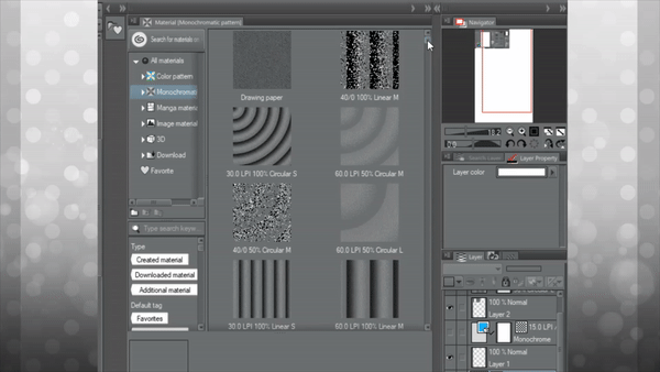
These materials are very useful for your productions, and can just as easily be used for colored works as they can for monochrome. When applied with the prior mentioned techniques such as BLENDING MODES and TONES, they make for a powerful addition to any creator’s toolset.
Many of the materials have blue popups to adjust the content's size, shape, and placement.
End Note
Thank you for reading everyone! This guide is tailored more towards beginners, but there's hopefully some information which can be useful to all skill levels.
Please leave a comment and like if you enjoyed this! 🤍
Users who liked this post


Comment