
When watching this video, please display subtitles in each language.
The explanation in Japanese is easier to read on my blog, so please see here.
Introduction
There are no tricks or ideas in this TIPS, but I will introduce 9 basic operations and bits of knowledge around layers that even veterans don't know.
The first half is about layer palette operations and selection ranges, and the second half is about tonal correction layers.
The contents are plain, but it is important knowledge regardless of the level, from beginners to veterans, so please take a look.
I added subtitles for each language of the video, so please take a look if you like. .
However, I think that this TIPS is easy to understand even without watching the video.
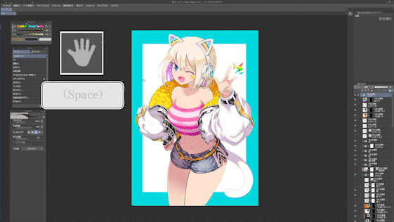
1. Layer palette operation [Hand tool] is convenient
If there are many layers in the layer palette, scrolling with the mouse or moving the bar with the pen is a hassle.
Actually, the layer palette can be moved with the [Hand tool] that appears by pressing the [Space] key.
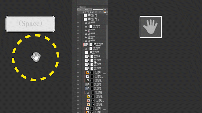
All you have to do is drag the wide orange part of the layer palette with the [Hand tool], so you don't have to switch from the pen to the mouse and use the wheel to scroll, or carefully pinch the thin bar with the pen to move it.
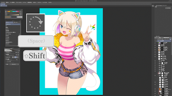
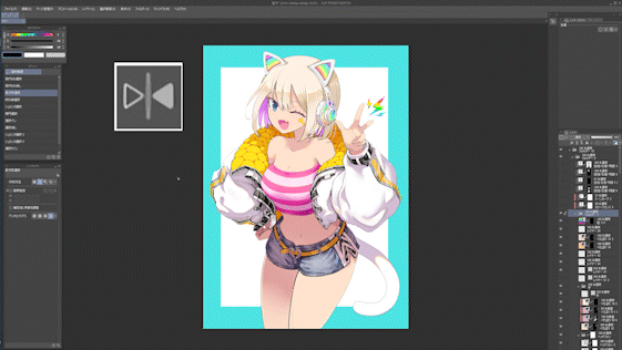
2. Find a layer on the canvas.
If you want to find out where the layer on the screen is, press [Ctrl] and [Shift] together and use the [Layer selection tool] to enclose the part of the canvas you are looking for. You can.
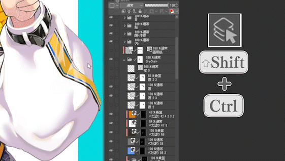
This tool is also useful for finding trash on campus.
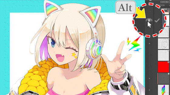
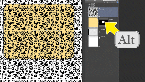
3. Display only one layer
When you want to display only one layer or folder, you can display only that layer by clicking the eye mark in the layer palette while pressing [Alt].
To return, click [Alt] on the eye mark in the same way.
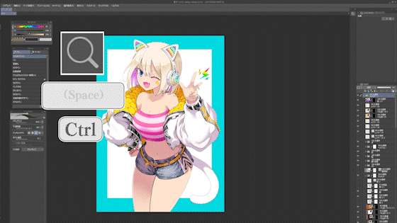
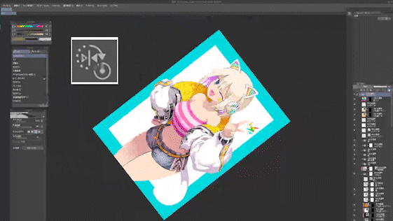
4. Switching to tools related to screen display
Although it is not directly related to the layer palette, I will introduce other tools that you should know about display.
While holding down the [Space] key, it will temporarily switch to the [Hand tool] and you can drag the screen.
If you hold down [Shift] while dragging with [Space], you can temporarily switch to the [Rotation tool] and rotate the screen.
If you hold down [Ctrl] and drag with [Space], you can temporarily switch to the [Zoom Tool] and zoom the screen.
It is convenient to register [Reset Rotation/Mirror] under [Rotate/Mirror] in the [View] menu as a shortcut.
It is convenient to register [Horizontal flip] of [Rotate/Mirror] in the [View] menu as a shortcut.
It is often used when checking the balance between left and right.
Temporarily switching between these tools is recommended because you don't have to move the pen or viewpoint from where you are drawing, so you won't be distracted every time you operate the screen.
Supplement ・Difference in display area due to monitor resolution
This is a supplement about the layer palette. It's about the layer palette and monitor resolution.
The upper image is the FHD 1920 x 1080 monitor screen, and the lower image is the WQHD (2K) 2560 x 1440 monitor screen. Both campus zooms are comparisons in the same state.
Notice the difference in the size of the display area of the layer palette and canvas.
WQHD can display more on the screen, so you can move the layer palette and zoom the canvas less often.
So, if you can afford it, I recommend a WQHD or 4K monitor or LCD tablet.
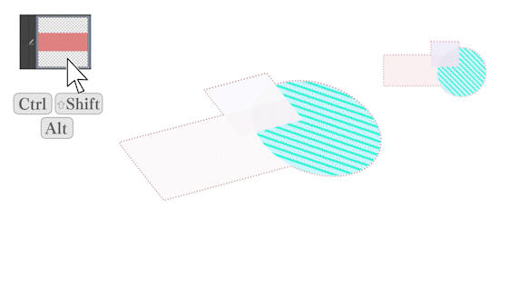
5-1. Create a selection from a layer
Here are some ways to create selections from layers.
In some cases, these can be used to create a selection faster than using the automatic selection tool, so you can save time when applying tones or making masks, so please try using them.
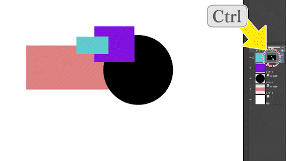
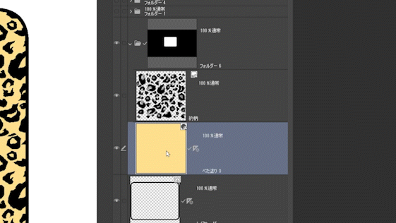
If you click a thumbnail in the layer palette while holding down [Ctrl], you can select the part drawn on that layer.
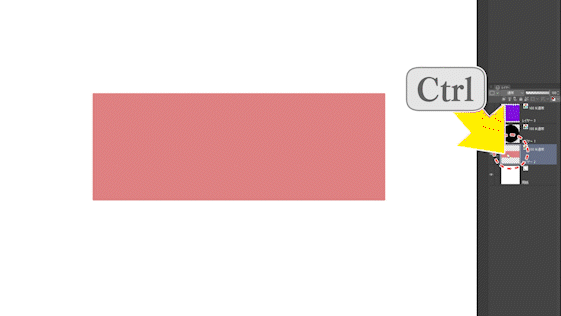
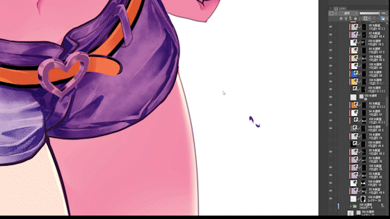
5-2. Add the selection of another layer to the selection.
If you hold down [Ctrl] and [Shift] and click the thumbnail of another layer,
You can add the selection of another layer to the selection of the original layer.
Remember that [Ctrl][Shift] thumbnail click is addition of the selection range. Here, the selection range of the black layer is added to the selection range of the red layer.
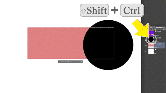
5-2.Removing the selection of another layer from the selection
Also, if you hold down [Ctrl] and [Alt] and click the thumbnail of another layer,
You can erase the selection of another layer from the selection of the original layer.
Remember that [Ctrl][Alt] thumbnail click is subtraction of the selection range. Here I'm erasing the selection of the purple layer from the original selection.
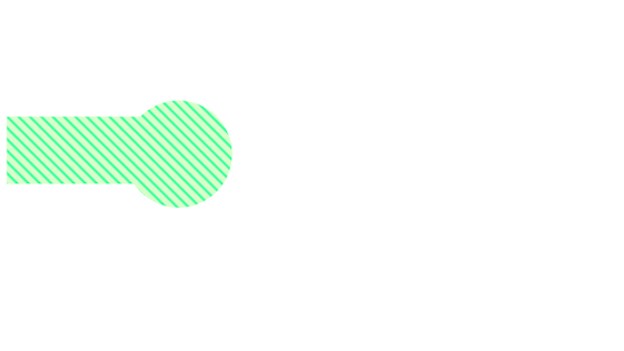
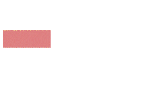
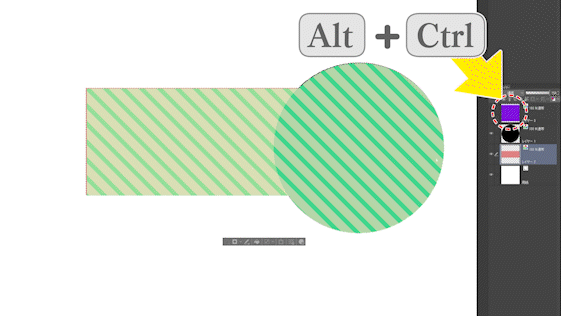
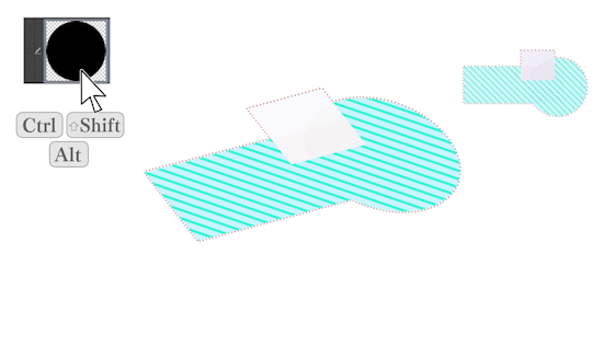
5-3. Select the shared area between the selection and another layer
It's a little confusing, but if you hold down [Ctrl], [Shift] and [Alt] and click on a layer thumbnail, the original selection and the part shared with that layer will be selected.
Supplementally, this is like a cookie dough die cut,
This function cuts out the shape of the clicked layer from the original selection.
It can be said that it is a function that erases the selection area other than the clicked layer.
Here, the selection area other than the common area with the black layer is erased from the original selection area.
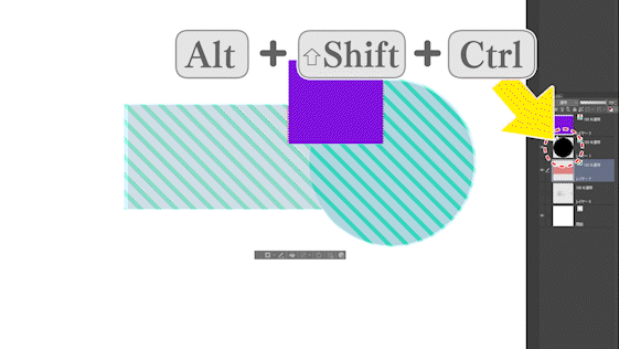
If you click [Ctrl] + [Shift] + [Alt] on another layer in the same way,
Furthermore, you can select only the shared part.
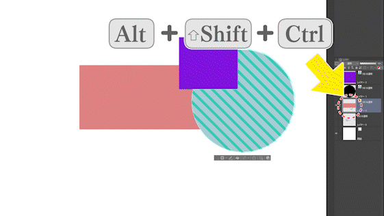
Here, the selection area other than the common area with the red layer is erased from the original selection area.
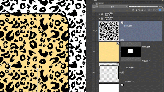
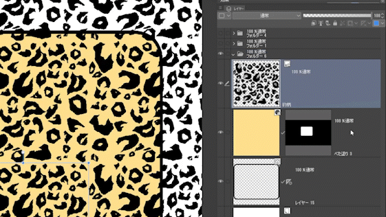
5-4. Create a selection from the solid layer and gradient layer
When making a selection from a solid layer or gradation layer,
Be careful because you click the thumbnail of the layer mask, not the layer.
6. Changing the color of the solid/gradation layer
You can change the color of the solid layer and the 1-2 color gradation layer by selecting the layer and using the object tool to change the color slider.
It is convenient because there is no need to make color corrections in each edit.
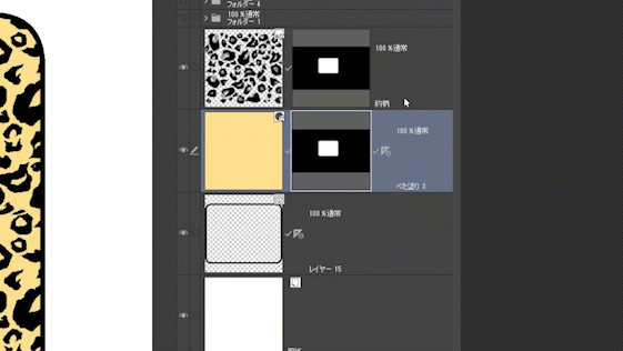
7.Copy of mask and ruler
You can copy the same mask by dragging and dropping it onto another layer while pressing [Alt].
It is convenient because you do not have to make a selection range many times.
Clipping produces similar results if the layers are close together.
You can get the same result by putting the layers in the same folder and masking the folder.
Not only masks but also rulers can be copied in the same way by [Alt] dragging.
Also, if you put layers in the same folder and attach a ruler to the folder, the ruler will be applied to all layers in the folder.
This is useful when drawing cartoon backgrounds.
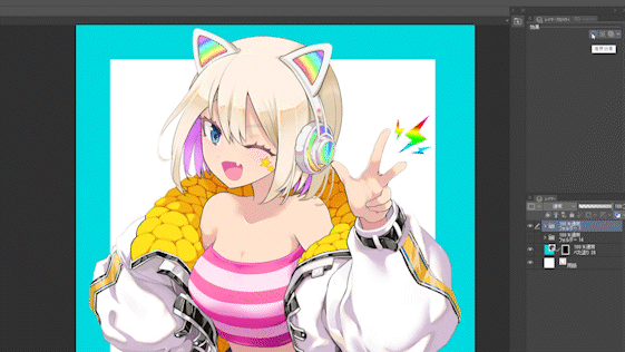
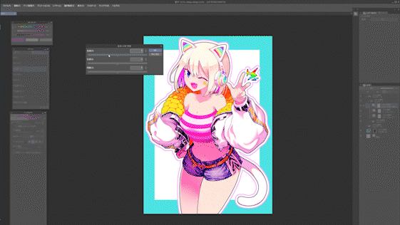
8. Use the border effect "Border" to finish the illustration
Next is the edge of the layer's border effect.
I explained how to use cartoons, line drawings, vector layers and onomatopoeia in my previous videos, so please take a look if you like.
This time, I will introduce an example of how to use it in an illustration.
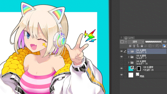
Adding borders to the illustrations in the folder makes the outlines clearer and easier to see.
By the way, this time, after adding the borders, I added the lines of the hands, headphones, jacket collar, etc. with a pen so that they match the thickness of the borders of the outline. The image above is after editing. It's easy to add borders with a single button, but if you don't add touches, the thickness of the lines will be uneven and it won't look good.
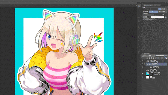
If you put the illustration folder in the folder again and add a border to the folder, you can make the border double. Here, a white border is added to the outside of the original black outline.
Furthermore, if you put the illustration folder in the folder again and add a border to the folder, you can make the border triple. This time, I wanted to make it pop and cute, so I added a pink border. The border color can be changed from [Border color] in the layer property palette.
When you feel that the character is buried in the background,
If you make it a little bit clearer with a black border, or make it clearer with a white border,
It's easy to feel good, so please try it.
However, pay attention to the difference between the outline and the original line drawing, and make corrections and adjustments if necessary.
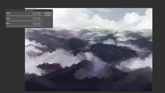
9-1. How to use the tonal correction layer
[Tonal Correction Layer] is a layer that applies various tonal corrections to the layers below it. Unlike [Tonal Correction] in the [Edit] menu, the original layer can be left as it is without processing, and it is characterized by being able to edit again and again. If you hide the layer, you can also check the difference from the original state.
A [Tonal Correction Layer] can be created from [New Tonal Correction Layer] in the [Layer] menu.
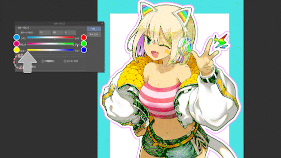
First, let's create a [Color balance] in the [Tonal correction layer].
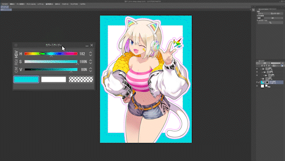
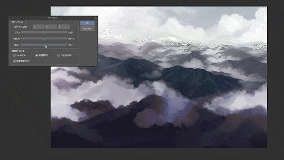
9-2. Color balance
When you create [Color Balance], the following window will appear.
The [Color balance] sliders are divided into CMY (cyan, magenta, yellow) and RGB (red, green, blue), and you can choose whether to approach cold colors or warm colors.
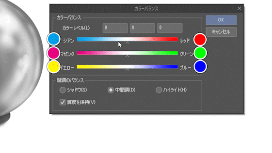
You can also change the color balance separately for shadows, intermediate colors, and highlights. It is different from the [Hue/Saturation/Luminosity] tonal correction in that it can add color even if it is achromatic.
A commonly used adjustment is to make the shadows cooler and the highlights warmer.
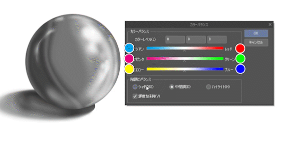
Let's start with the shadows.
First, if you move the top cyan/red slider, it will look like this.
The color components of the shadow are changing toward red and toward cyan.
Now move the magenta/green sliders in the second row and it will look like this.
The color component of the shadow changes to magenta and green.
Next, move the yellow and blue sliders in the third row and it will look like this.
The color component of the shadow changes from yellow to blue.
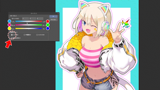
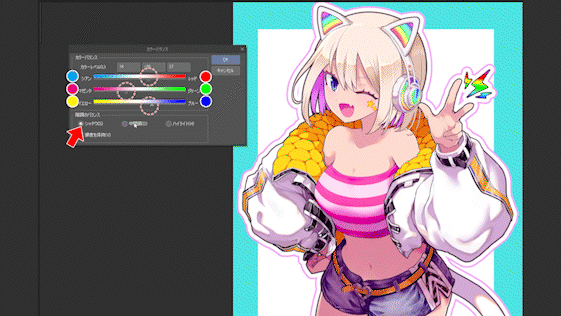
Now let's actually adjust the color balance of the illustration.
For the shadows, I wanted to give the whole illustration a pinkish feel, so I made the magenta stronger.
For the neutral color, I want the highlights to lean toward yellow, so I added a stronger complementary color, blue, to emphasize that.
For the highlights, I made them all warmer and slightly stronger reds and yellows to emphasize the skin tone.
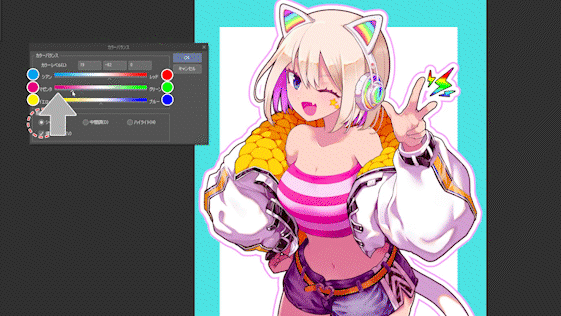
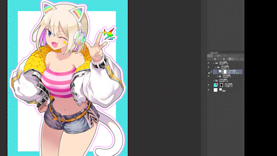
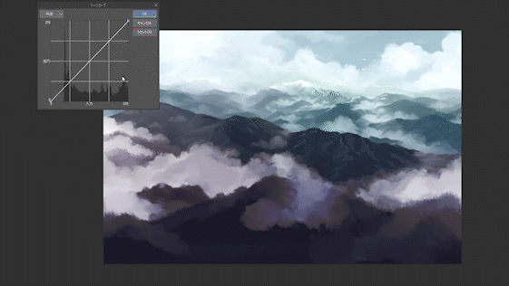
If you hide the [Tonal Correction Layer] and check the difference from the original state, it will look like this.
You can see that the dull colors have become brighter.
In particular, if you apply thick brushes, the color will become muddy, so I think it's useful for adjusting that.
9-2. Re-editing the tonal correction layer
If you want to redo the color tone correction again, double-click the [Color tone correction layer] thumbnail in the layer palette to open a window and edit it again.
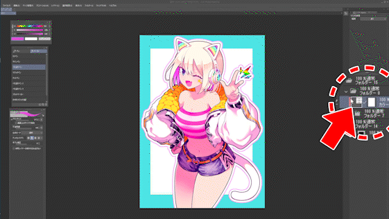
9-3. Masking the tonal correction layer
[Tonal Correction Layer] can be masked and its opacity can be lowered in the same way as a normal layer.
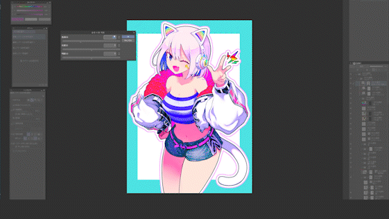
Next, let's change the hue with [Hue/Saturation/Luminosity] on the [Tonal Correction Layer] to create another color variation.
However, since the skin color will change as it is, I create a mask on the [Tonal Correction Layer] only for the skin part.
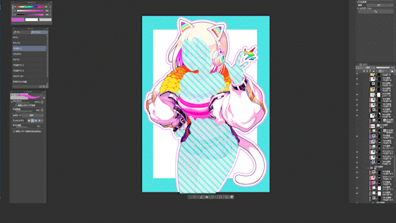
Select the skin layer and subtract the layer of parts such as clothes from the selected area of the skin layer with [Ctrl][Alt] thumbnail click to create a selected area where only the skin is visible. . As shown in the image below, it feels like deleting the green layer from the blue selection.
This is the image where I masked the [Color correction layer] of [Hue/Saturation/Luminosity] only for the skin part.
This makes it easy to create color variations.
In this way, the tonal correction layer can be partially used by masking it, so
In this way, you can instantly create differences in brown skin with a single color tone correction layer.
9-4. Adjust the background with the tonal correction layer
The tonal correction layer is also useful for fine-tuning the background.
This time, I will practice the use of color air perspective.
As a preliminary preparation, divide the selected area into foreground, middle-ground, and background.
If the border is ambiguous, [Quick Mask] and [Selection Layer], which can use opacity, are useful.
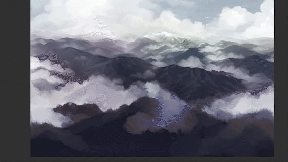
Using the [Hue/Saturation/Luminosity] in the [Tonal Correction Layer], you can reduce the saturation of the distant view and increase the luminosity in an aerial perspective.
In the [Color balance] of the [Color correction layer], you can make the distant view cooler,
Using the [Tone Curve] in the [Tonal Correction Layer], you can lower the contrast of the middle background and reduce the red component to make it look cooler.
As you can adjust from various points like this, it is convenient for final adjustment and difference making.
at the end
I think this time it was all about plain techniques, but there is a difference in the speed of completion in parts other than drawing like this. It's good little by little, so please use it and remember it.
Also, vector layers have been covered many times in past tips, so I won't touch on them this time. See the tips below.
bonus
This time, I uploaded a time-lapse video of the production process of the illustration that appeared in the explanation.
However, it has nothing to do with this TIPS, and there is no explanation or commentary, so I don't think it will be helpful, but if you want to see the production process, please take a look.
Users who liked this post


Comment