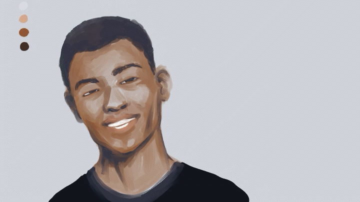
Painting Skin Technique with BONUS color mood tips
Hi everyone, I'd like to share with you how I approach painting skin with additional tips on how to further enhance your skin tones with color moods.
Preparation
As always, do your research on the style of character you want to draw. No matter how good you are, never skip this step. The research will inform you on so many things, but most importantly here, research will give you a starting point on a set of colors you will use.
I like to select at least 1 background color (in this case gray) and 3 skintone colors (light, medium and dark).
Initial Sketch and Sketch Theory
First I bucket fill the background with the color I chose. I do not recommend drawing portraits on white backgrounds because white is reserved for the BRIGHTEST areas of your character. If the background is white, any highlights you put on the face will be dull because it will LOSE to the brightness of the background.
I use my go-to brush, the watercolor brush to lay the foundation of my character. I usually just draw on one layer at this stage. I immediately start using my selected colors to draw the sketch.

Why don't I sketch using traditional linework? I use linework later in my art process.
Why later and not now? If I use linework now, I will end up erasing most of the linework anyway! I'm just trying to be efficient.
Also, there is no color in linework. It forces you to break down your first steps into linework and it postpones color work too late into the process. The shaping, coloring and shading are all tackled in ONE STEP using this method.
That said, if you insist on seeing what a sketch might look like, I've done one below ( I did not use the sketch below for the final artwork).
Clipping Layer Setup
Next, we will set up a "clipping layer" to speed up the drawing process. It's basically the shape of the character on a separate layer that serves as a "boundary edge" and keeps your artwork clean and consistent.
I use the turnip pen. Set anti-aliasing to "none".
I use the turnip pen to create a white cutout of the character. When anti-aliasing is set to "none", you will get a sharp pixelated edge. I like this because this makes for cleaner highlights later.
You can also create this cutout with the lasso tool and bucket fill.
Now put the white cutout layer beneath your sketch.
Click the "clip to layer below" button and you will see a red bar appear to the left of your layer.
With this setup, anything you draw on your sketch layer outside of your cutout layer will not appear. You will have a clean edge as long as all layer above the white cutout layer are set to "clip to layer below".
While the change is harder to notice at this early stage, this frees you up to draw along the edges of the face without the risk of changing the shape of the head / ears / chin / shoulders.
NOTE: If you ever need to edit the white cutout layer, the edit will be reflected in all art layers above the white cutout layer, so that is a time saver as well.
Refinement
Using the airbrush subtool "soft" and all of the 3 skin tones, I soften some of the sharp edges left by the watercolor brush.
Next, I create a new "overlay" layer. Be sure to click "clip at layer below" for this layer as well.
Using the airbrush subtool "soft" and the light skin tone (second from the top), I add some soft highlights on the forehead, nose, cheeks, chin and neck.
(The point here is to eliminate the gray from the face because gray = zombie look.)
Adding Lines (very few though)
At this point I finally add linework but only sparingly.
THE CARDINAL RULE OF FACE DRAWING -- the fewer nose and lip lines you draw, the better!
For the hair, I find that the "Decoration tool" submenu "Hatching" subtool "Gauze" is good for African American hair.
Highlights!
Now add a new layer set to "add glow". Again use the lighter skin tone (second from the top) and use the watercolor brush to add bright spots to the forehead, nose, cheeks, lips, chin and neck.
If the edges look too sharp, blend the edges or use the airbrush "soft" subtool to adjust.

BONUS -- Color Mood version 1
Skin is very translucent and reflective. The more you play with background colors and light, the more the skin of your character comes to life.
After a little bit of research, I found a color mood I wanted to try on this subject.
First, bucket fill your background layer the dark-blue color above.
Next, add a new layer and set it to "multiply". Also click the "clip at layer below" button.
Use the new purple color and using the gradient tool set to "foreground to transparent", drag as shown below (below is just an example):
The resulting effect will be this:
The skin tone now has quite a bit of purple in it, as if it was absorblng some of the background.
However, it is not absorbing the exact blue of the background, it is a slightly purple tone. As you may know in color theory, the eye perceives blue as receding more into the background and purple as closer than blue. Therefore, this works.
The final step is to add a new layer set to "add glow". Again, click "clip at layer below".
Add some highlights to the edge of his face in orange using your favorite pencil tool and a bit of watercolor blending.
Color Mood version 2
There are many types of color moods you can find by searching "portrait color mood" or "colorful portrait photo". Here is another one using a darker background and red and blue.
Try using the technique explained in version 1 to edit the artwork to this color mood.
Final Words
Painting skin is just one aspect of a larger foundation of understanding of anatomy, lighting, composition and Clip Studio Paint. Good luck on your journey and please like if you enjoyed this tutorial! Thank you.


Comentario