
Frame Border Tools
1. The tool icon, it looks like comic panels.
2. There are three tools by default, each comes with similar setting options but different in application:
• [Rectangular frame] > click and drag,
• [Polyline frame] > with every click, you’re adding a new control point that will determine the shape of the frame,
• [Frame border pen] > draw like you would a brush.
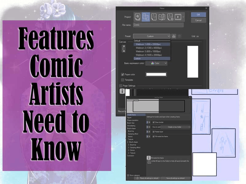
3. [Draw border] makes the border of the frame visible. When turned off, you’ll get a borderless frame. The ruler will be visible by default to let you know where the edges of the panel are.
4. [How to add] refers to what will happen if you add a new frame when there’s an existing frame folder. There are two options:
• [Create new folder] means the new frame border will have its own folder.
• [Add to selected folder] means, if you select the existing panel folder, the new frame border will be added to the folder. If you don’t select any frame folder, a new frame folder will be created instead.
We’ll talk more about [Frame border folder] in a later section.
5. [Raster layer] creates an empty raster layer in the frame folder.
6. [Fill inside the frame] creates a Fill layer inside the frame folder. The fill is white by default—double click the layer icon to change the color.
Great when you’re working with overlapping panels since the Fill blocks the layers beneath the folder.
7. [Aspect type] helps you create panel of certain ratio or sizes. [Specified ratio] helps you create frame of any size in certain ratio and [Specify length] helps you create frames of a certain size. Click the [+] to specify the ratio or length according to your needs.
8. [Brush size] refer to how thick the border will be. [Anti-aliasing] soften the look of the border. I usually turned the [Anti-aliasing] off, especially when drawing full-colored comic because it could make filling the base colors a pain.
9. [Brush shape] enables you to change the shape of the brush from blurred borders, patterned borders to textured borders.
There’s another way to create Frame border. Right click [Layer window] or go to [Layer] > [Frame Border folder]. A simple menu will appear. When you click OK, the frame border will be created on canvas.
The Frame border will fill up your canvas unless you have [Crop mark/Default border] on, the border will overlap with the [Inner border] instead. [Crop mark/Default border] is a set of margins for printing that you get when you create a new comic/fanzine project. It will be covered in the Comic Paneling tutorial.
Custom Frame Border
Add pattern or texture of existing brushes by clicking the icon at the bottom right of the brush’s tool property > Brush shape > [Add to preset].
The added brush will appear in the list > go back to Frame border tool > click the drop down menu of Brush shape > choose the newly added shape > draw the panel.
To create panels of different shapes, click the icon at the bottom right corner of [Rectangle frame] tool. Click [Figure], then make the [Figure] and [Roundness of corner] settings visible.
Now you have the option to create panels in various shapes like circle, ellipse and hexagonal, also the choice to rounding up the sharp corner of the panels.
Frame Border Folder
When you use the tool, it will automatically create a [Frame border folder]. If you select the folder, the surrounding area will be in purple—the area is masked. If you draw inside the folder, only the part inside the folder will be visible.
The [Frame border folder] has:
1. Frame border icon
2. The masked area, featuring the panel(s).
3. A ruler.
Your canvas can look different depending on the layer you select.
1. Selecting a layer outside the folder = normal canvas,
2. Selecting the [Frame border folder] = purple,
3. Selecting a layer inside the [Frame border folder] = lighter purple.
You can move a frame border to and from another [Frame border folder] by selecting the panel using [Object] tool > cut > either select a [Frame border folder] to add the panel to the folder or select any layer other than [Frame border folder] to create a new folder > paste.
Dividing Panels with Cut Frame Border tool
[Cut frame border] is useful when you want to split existing frame borders. It allows you to divide the panels with consistent vertical and horizontal gaps, so that you don’t have to manually measure and align the panels.
There are two tools. [Divide frame folder] put the divided up frame border into different frame folders. [Divide frame border] only divide the frame border and everything stays in that same folder.
Let’s take a look at the settings.
1. [Shape of division] determines how we can divide the panels up. Admittedly, I have only used [Divide by straight line] for my comic projects.
2. [Space of frame border in Preferences] refers to the frame border settings you can find in File (or CSP logo on tablet version) > Preferences > Layer/Frame > Frame Border. I never used it because I prefer to adjust according to what the project needs.
3. [Vertical and Horizontal gutters] are the gaps between the divided up frame borders. In the image below, the green part is the vertical gutter and red the horizontal gutter. Typically the vertical gutter is narrower than the horizontal gutter.
There are more settings for the tool. Access it by clicking the icon at the bottom right corner of the [Tool property] box.
[Snap angle] is a setting I often use. It enables the division to snap at certain angles, making it easy to create straight gutters when you need it. Mine is set to 45 degrees and I turn it off only when I want the panel borders in other angles.
Another setting I sometimes use is [Dividing method]. It’s how the tool manages the divided frame borders:
• [Divide frame folder and duplicate inside layer] will create a new folder of the newly divided frame(s) and copies every single layer inside the original frame folder. This is the default setting for [Divide frame folder],
• [Divide frame folder and create empty folder] creates a new folder for the divided frame(s) but doesn’t copy the layers of the original frame folder. This isn’t the default setting of any of the tools, but I made it the default for my [Divide frame folder],
• [Divide not folder but frame border] will keep the divided frame borders in the same frame folder and is the default setting for [Divide frame border].
Below, the original Frame border folder has a raster layer and a tone layer inside it. You can see the differences between the three options after the frame was divided.
Editing Panels
You can use [Object] tool to edit an existing panel. If you click on a panel, the panel would look like this.
1. Rotate.
2. Resize.
3. Control point. You can change the shape of the panel with these. It works like vector.
4. Extend panel. These yellow triangles extends panel in a certain way. If there’s no other panel in the canvas, it will extend the panel beyond the edge of the canvas.
But, if there are other panels around the panel, it will snap to the edges of the panels around it until there’s no other panel, that’s when it goes beyond the canvas’s edge.
If the panel is extended to where there’s another panel, the extended edge will also snap to the other panel’s edges.
Let’s take a look at the tool property. Here, similar to the tool’s settings, you can turn the border invisible or visible using [Draw border], change the color, the size, and the brush shape of the border. Also, there’s a setting named [Keep gutters aligned].
• [None] means if you change the shape of one panel, the rest of the panels on your canvas won’t be affected.
• [Horizontal & adjacent] means changing the shape of a panel will affect the panels above and below it, along with panels directly next to it. But if you change the panel shape vertically, it won’t affect the other panels not directly next to it. I use this setting all the time.
• [All] means changing the shape of a panel will also affect the other panels vertically on top of what [Horizontal & adjacent] does.
Since the frame is vector, [Correct line] tool also works. Here I used [Correct line width] and [Redraw line width] to change the thickness of the panels.
[Free transform] works as well.
Paneling Basics
Types of Panel
There are many types of comic panels. Here are some That are applicable to both comics and webtoons.
1. Regular
Rectangular or square and doesn’t overlap with other panels. This is the most versatile type—you can use it for anything.
2. Irregular
One or more sides are slanted. The diagonal shape gives the impression of instability, so it’s great for dynamic scenes.
3. Overlapping
Part of the panel overlapped with another panel. Because of how close the panels are, it could be used to show actions that happen one after another.
It’s also used for time skip.
4. Inset
Panel within a larger panel. The panel within can be used to zoom into an important part of the scene or, like the example below, to show a character or an object inside the scene while the bigger panel focuses more on the scenery.
5. Broken
Part of the image in a panel goes out beyond the panel border.
It’s requires a bit of layer management to create this type, but it’s not hard.
1. Put the part that will go beyond the panel above the [Frame border folder]. The rest of the scene can stay inside the [Frame border folder] or anywhere below the folder.
2. Use [Border effect] in [Layer property] to create a border around the image, so that there’s a gap between the image and the [Frame border] to improve visibility.
3. Use layer mask to hide the part that overlaps with the border.
Panel Size
Panel size determines the time readers need to get to the next panel. The bigger, the more time needed and the more attention grabbing the panel is. We can use it to our advantage.
1. Pause/Stall
Because bigger means more time passed inside the panel, you can make the pause longer in bigger panels.
In the scene of awkward silence above, the illustration is the same but the wider panel make it seemed like the silence lasted a tad longer.
You can also make the panel taller, which may work better for webtoons.
2. Impact
Something can be perceived bigger than it’s originally is when it’s compared to something smaller.
Take a look at these panels.
Because the first two panels are big, the last panel seems small in comparison and thus insignificant.
If the first two panels were smaller, the last panel would pop more.
Ideally we use big panel for a scene that is important or impactful. So, when there’s going to be a big panel ahead, try to slip at least one or two small panels for buildup.
Comics Paneling
Margins
When you create a new/fanzine page, you’ll get “crop mark” on your page by default. This is important if you intend to print your work.
Here’s how the crop mark would look in a single page setup.
1. Page/Canvas size
2. Inner border
Also known as “safe area”. The important contents (text, main focus of the panel) should be inside this border. Frame borders automatically snap onto the inner border, making it easy to keep straight.
3. Trim border (crop marks)
When printed, this is supposed to be the edge of the printed page.
4. Bleed border
This is the area that will be trimmed off. 5mm is best, personally. Printing and cutting aren’t always perfect—it’s common for machines to not perfectly cut on the trim line. The Bleed border (also known as “Safety margin”) functions to help prevent gaps between the edge of printed area and the cut line.
This is how the crop mark would look in a double page spread. There’s no Bleed border between the pages.
Different publisher and printer have their own standards, so make sure to find out before sending your file(s). To change the crop mark, click View > “Crop Mark/Default Border settings...”
Panel Layout
Depending on where you are from, you either read from left to right or right to left. It’s important to determine the reading direction before you start designing the panel layout.
As you can see below, the exact same panel layout have totally different reading order depending on the reading direction.
For the sake of consistency, I’m going to stick with Left to Right.
After you know which reading direction you prefer, it’s time to design the layout. You need to consider a few things.
Readability
Good layout is something that the majority of the readers could easily figure out which way to go. Our main goal is to not confuse the reader. No matter how good your story and how awesome your art, it means nothing if the readers are confused. You don’t want the readers busy figuring out which panel comes first instead of being fully engaged in the story.
See the page below and see if you can make sense of the panel reading order.
Have you succeeded? It’s easier to see if the layout works by grouping the panels.
As the creator, I can tell you that the reading direction should be 1-4, A-B, yellow, blue and cyan. But I’m sure there’d be people who think 1-4, yellow, blue, cyan, and A-B make more sense. Unless you intend to confuse your readers, ambiguous layout like this should be avoided.
By adjusting just the cyan and B panels, we get a better layout that look like this:
If you’re not sure if the panel layout works, try grouping the panels. Here’s another example:
Managing the Gutter
The key to readability is managing the [gutter]. There are several ways to separate the panels:
+ 1\.**Grid**=thegutterinthemiddleoffourpanelslooklike(plus).Mostcommonlyusedin4-panelcomics.
Personally, I don’t recommend using this unless for 4-panel comics because it could be confusing to read. It works okay if you like it, but I prefer something more clear cut.
2. Stagger = the gutter between 4 panels is Z-shaped. This is what I prefer to use instead of grid. Just by moving the border a little, you can make sure people read the panels in the order you intended.
3. Blockage = the gutter between 3 panels is T-shaped.
4. Separation = there’s a big gap between the panels. This is often used for time skip.
Tachikiri/Cutoff Panel
It’s common for comic artists to extend panels beyond the Inner border. This type of panel is known as [Tachikiri] or [cutoff panel].
Notice that there’s no panel extended to the middle part of the spread because middle part would be hard to see when the comic book is bound.
Also, make sure that the [tachikiri] extends beyond the [Bleed border] to prevent awkward empty gaps caused by printing/trimming error.
Do not put important part of the panel (focal point or text) in the [Trim area]. As I said before, keep important contents inside the [Inner border].
Double Pages Panel
In the previous section, the middle part between two pages remained untouched, but you can’t avoid drawing it when your panel fill up both pages.
It’s still trim area and would be hard to see when bound, so avoid putting text or vocal points of your art in the middle. For example, see below.
The vocal points are the whale’s face and the little house on to of it so both are inside the [Inner border].
If you have Clip Studio EX, you can see how it’d look like when printed and bound to determine if the placement is right. Right click any area of the comic project window (where multiple pages in the project are shown), then choose [3D Preview for Binding...].
This is how it’d look like when bound. The vocal points can be clearly seen.
This is how it’d look like if the vocal points are in the middle.
Webtoons Paneling
Long strip format is very forgiving and has a ton of leeway. You don’t have to worry about margins, gutter and tachikiri.
I lament the fact that it’s not possible to display the glory of double page spread and that horizontal panels doesn’t work all that well, but that’s about it.
Pacing with Gaps
One of the best things long strip format has is that we can pace the story through the gap of between the panels.
The closer the panels, the faster people would scroll, the quicker the pace. The bigger the gaps, the slower. Here I prepare three version of a scene with different gap sizes.
For fast-paced and intense scenes like action scene and heated debate, it’s best to keep the panels closer together—overlapping the panels makes it even more intense. This is because when the reader scroll even just a bit, there’s another panel, then another one, and another—versus scrolling a bit, one panel, scroll again, next panel. For relaxed scenes, give bigger gaps.
Here I prepare three versions of a scene with different gap sizes.
Did you feel the differences?
Comics to Webtoons
If you’re thinking of publishing both in webtoons and book format, I recommend start with the book format first, then adjust the panels into long strips. The reverse is just... time consuming, to say the least. And, I know I’m not the only one who thinks this way.
When planning the layout in comic format, remember that webtoons work better with vertical panels. While it might not make much difference (impact wise) in book format, it could make a world of difference in webtoons format.
Compare this:
To this:
In comic book format, the first example got big panels and thus very impactful. But, when adapted to webtoons format, it fell flat because the panel size doesn’t translate as well due to width limitation.
And… that’s all! I hope you enjoyed the tutorial and learned something new :)
Usuarios a los que les gustó esta publicación


Comentario