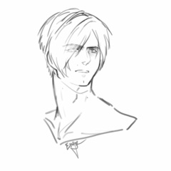
Lineart tips and tricks.
The way our lineart looks is an important part of an illustration. On this tutorial I will share some tips and tricks to give our lineart beautiful effects!
Lineart tips.
Stabilization. When you need to draw a long line and your hand's too shaky, you can use the stabilization feature of the brush (I'm using G pen here).
When you click on the arrow next to the stabilization bar, you can input any number from 0 to 100. The higher the number, the more it will correct your line and the slower you can draw without your hand shaking. On the example above, the first line was drawn using stabilization 13 and the second line was drawn using stabilization 50.
Darkening areas. Some areas, like under the bangs or under certain parts of clothing, are darker by nature. You can help create this effect by making lineart thicker where lines meet, to give it a "shadow" feel.
Vector layer.
I absolutely recommend using vector layers to ink. You can create a vector layer in the layer menu -> new layer -> vector layer, or you can create one faster using the new vector layer icon.
Why vector? There are many benefits that you can check on this video tutorial I made about vector layers:
One of the most important features of vector layers is that you can edit the brush shape with one click. This means you change the way your lineart looks AFTER you're done inking. Just select your vector layer, use the object tool and open the "brush shape" menu to select the kind of lineart you want.
So for example, you can change your lineart from plain ink to a pencil-like feeling without having to ink everything again:
The software comes with many preregistered brush shapes, but you can register even more. Let's learn how using a pencil I really like.
First, download this pencil set from Assets:
After you install the brushes in CSP, pick one of them (I picked Haewol R. Pencil S), go to the subtool detail palette (1) -> Brush shape (2) -> Register to preset (3).
Do these steps for every brush you want to register!
Making 3D objects look hand-drawn (EX-only).
IMPORTANT The following is an EX-only feature.
We just learned how to edit the shape of the brush to give our lineart a different feeling depending on the result we want. This is also helpful to turn the lineart of a 3D model into a lineart that looks hand-drawn.
Let's learn how to do this!
1) We need to download this brush set and register the brush shapes as I explained on the previous section:
2) We find the 3D object we want in the "Material" window and we drag it into the canvas. We set the angle we need.
3) We right-click on the layer of the 3D object and select "LT conversion of layer".
A new window will pop up with the options for the convertion. The important part here is that you mark the "vector layer" option under the "Extract line" menu, and that you enable the preview (right under the Ok and Cancel buttons) so you can see that it looks ok. All other options you should feel free to play with, because each 3D object will need a different setup to look the way you want.
We click Ok and the result will be a new folder with at least two layers inside. The one we're interested in is the "Outline 1" vector layer. We click on it.
4) It's time to edit the lineart. We use the object tool while operating on the Outline 1 layer and we find the brush shapes we want on the list.
We select any of them (I selected the one called へろへろ線, which will make the lines extra wobbly). The result might be that the lineart becomes too thin like this:
Don’t worry, we can fix this. In the same menu of the object tool where we select the brush shape, we can also select the brush size. Raise the number until the thickness is what you want it to be.
Not all brush shapes work well with 3D objects, but this pack is definitely wonderful!
Final touches: lineart color.
100% black lineart might fit some illustrations, but having lineart in different colors definitely makes our illustrations richer. I’m going to show you different methods to color our lineart using this illustration as an example.
Lineart color technique A.
We change the lineart color to a reddish gray (for example, HEX 6B5563), then we change the blending mode of the lineart layer to multiply.
We reduce the opacity of the lineart layer to 50%. We duplicate the lineart layer and we set the blending mode of the one on top to Color burn. We change the color of the color burn layer to a softer one (like HEX 9D738A), and the opacity to 70%. This will make the lineart more vibrant.
Final result close-up:
Lineart color technique B.
We hide the lineart layer by clicking on the little eye that’s to the left of the layer name.
We right-click on the last visible layer we find under the lineart and click on “Merge visible to new layer”.
We make the lineart layer visible again (by clicking where the little eye used to be) and we drag the new layer we created to put it right on top of the lineart layer.
We’re going to apply a strong gaussian blurr to this “merge visible to new layer-layer”. Go to Filter → Blur → Gaussian blur. I applied a strength of 12.
*Some effects like the sparkles on the eyes are not blurred because there’s a layer with them on top of all other layers. Don’t mind them!
Now that we have blurred our “merge visible to new layer-layer”, we click on the clip it at layer below icon. Make sure the actual lineart layer is set to multiply (it doesn’t matter what color the lineart is).
Now the lineart has colors very similar to the ones in the drawing, but most of the time they’ll be too bright.
If you want the lineart to be darker, select the “merge visible to new layer-layer”. Go to Edit → Tonal correction → Hue/Saturation/Luminosity and play with the saturation and luminosity bars until you like the result. Each illustration will require a different setting depending on the colors used, but it’s always raising the saturation (to get brighter colors) and lowering the luminosity (to get darker colors).
You can finish correcting the darkness of the lineart using other options from the tonal correction menu too, like level correction.
Final result close-up:
Lineart color technique C.
For this technique we’re going to use textures and patterns. It’s a bit hard to make it look right, but it’s also a lot of fun.
While having the lineart layer in multiply mode (no matter the color), we drag and drop some texture or pattern right on top of the lineart. I’m going to use an edit I made of one of these textures:
Next we clip it at the lineart layer for an interesting lineart feel.
Close-up:
We can use many different textures and patterns for this! I recommend choosing ones that have a good balance of dark and light parts.
Here are some examples.
Lineart color technique D.
Last but not least, we can manually select the color for each part and paint over the lineart using a new layer clipped at it. this way we can both select from darker to lighter colors, which we couldn’t do while we were on multiply mode (lineart here is left as "normal", not "multiply").
This is what the actual layer looks like if we don’t clip it at the lineart, so you can see the colors I’m using. Don’t mind how creepy it looks!
I hope you found this tutorial useful! Feel free to check my YouTube channel for more tutorials and speedpaints:
Or follow me on my social media to check more of my art.


Commentaire