Simple Hand Lettering
Intro and Notes on My Personal Experience With Hand Lettering and Calligraphy
In this tutorial I cover how I make my poor handwriting look a little better in Clip Studio Paint.
I tried studying traditional calligraphy in my teens, but was disappointed with my results from my unsteady hands and poor ability to control the line weight of my pens. At this young age, I gave up easily. I'm sure this is something many can relate to. If I had put more effort into making my letters pretty, I may have had better results. My handwriting is not the best on paper, but I can do a little better thanks to the vector tools in Clip Studio Paint!
I've since learned to enjoy the process as I can clean up mistakes easily and alter my strokes after they are created. For me this feels similar to the process of creating a painting.
Choose your pen tool
I start out by doing tests of my favorite pens to see which I think fit the feeling of the text I want to write. For this I wanted something delicate, but that has some texture.
It's not super important to choose the right brush from the start. It just helps if you have better control while writing your letters. Since this is a vector layer, we'll actually be able to change the brush type later.
I chose the middle since it had nice variation in pressure sensitivity. You can download this brush from the link below.
Set up the "Paper"
Unless you change the settings, a "Paper" layer is created when you create your canvas. This layer cannot be moved or drawn on. So what is it good for?
Well, it works much like paper in traditional art. If you click the page icon (with the corner folded down), you can change the color of your canvas.
Once you double click the icon a color window will open.
I made my canvas a medium sandstone color.
From here you can also add textures that will "combine" with your brush strokes. you can do this by dragging a monochrome paper texture onto the canvas and selecting the "texture combine" setting in the layer property window.
I'll be skipping this step and applying a different image to my canvas.
I wanted to do create a motivational message that was simple, yet elegant. The starry sky in this image material was a perfect base for me to work from. The link to download this set is also below.
I drag and drop it in from my materials window, and lower the opacity to about 50%.
Then I change the layer mode to "brightness" for the effect you can see below. This isn't the final result I'm looking to achieve, but it gives me a nice space to work within so I can easily see both light or dark lines as I write my text.
Now that our canvas is set up, it's time to write our message!
Using Vector Layers to Easily Manipulate Your Lines
The first thing we need to do is create a "vector layer". This is different from a raster layer because you can edit and scale your lines on the fly without damaging them. No pixelated mess.
There are also a lot of very useful tools that, while they do function with regular raster layers, they work the best with a vector layer. Some are even exclusive to this layer type.
At the top of the layer window, click the paper icon that has a small cube. This will create a new vector layer.
Using the selected pen tool we are going to write out text on the vector layer.
I want my message to read "Dream" in script. I look up a bunch of references online for how I might want to style each letter.
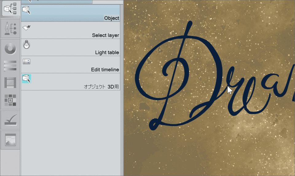
My handwriting is not so great so I drew my D in two strokes. By selecting the "object operator" tool you can select and manipulate each stroke individually. This works a lot like a regular "transform" action, but you can also use the tool to select each point along the line to move it. This will adjust your stroke and redraw it as you adjust the points.
Thicken and Thin Your Lines to Simulate Pen Pressure
I concentrated almost entirely on the shape of my D. It's difficult for me to get my strokes the exact width I want, while also drawing a smooth curve. This ends up looking kind of flat, but that's not a problem!
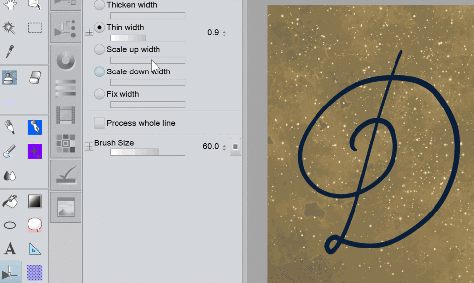
Using the "sub tool correct line" tool, we can make those manipulations I mentioned earlier. This tool icon looks like a triangle and a flat line with a pencil pointed down.
Choose the "correct line width" option to change the thickness of your lines!
Simply draw over the part of the line you want to change the width of. There is a "thicken width" and "thin width" option, as well as scaling up and down. I just used the first two to fix my letter D.
If you only want to affect a small part of the stroke, make sure "process whole line" is unchecked.
This is one of the tools that works with raster lines and color and has a lot of cool uses, but that's another tutorial for another day.

Here's the result after thickening and thinning the lines!
Finish Writing Your Message and Clean it Up
I've established the style for my text with the first letter. Now I can move onto the rest of the word. I write it out, again in a few pieces, as neatly as I can.

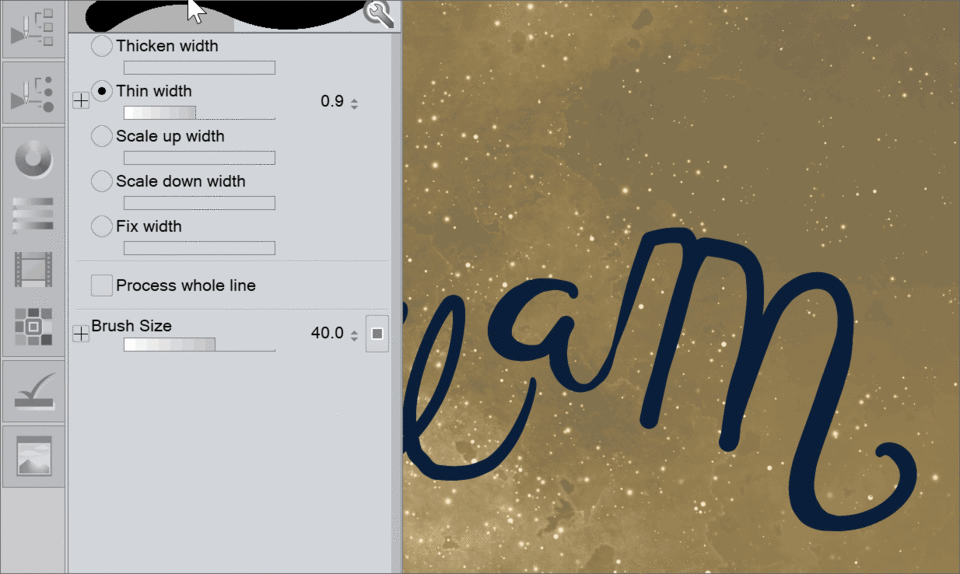
I had poor control over my pressure when I drew my M, but I liked the shape. Instead of trying to fix the skinny bit with the thicken and thin tools, it was much simpler and quicker to use the "fix width" option. You set the pixel size you want your stroke to be, then just draw over the line.
Still, it looks rough. I use the same thicken and thin tool, but also a few other tools to polish up my letters.
One thing that bothered me in the above image was the size of the A and M letters, as well as their distance from the E. These were separate pieces as well, so with the operator tool selected, I held shift while selecting all of the pieces I wanted to move.
I then scaled them using the corner of the manipulator, and moved them into place.

Much better, but it still needs some work.
I adjust the width of each letter. I try to alternate the curves between thin and thick.
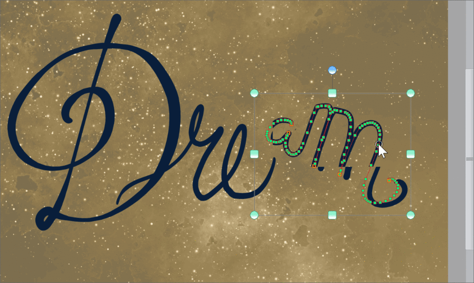
I didn't like the position of a few of my strokes, but some of the letters were in the right place. Moving the entire stroke with the operator tool would have been too much so here I simplify the line with the "Simplify vector line" tool. This is a tool that is exclusive to vector layers. It's also normally stored in the "sub tool correct line" section.
Just like when I changed the width, I just draw over the parts of my vector line that I want to simplify. This takes a line that has a lot of "points" and reduces them. This does slightly change the shape of the curve, but I mostly do this when I want to adjust a point or only move part of a line to this change is negligible.

Once the line is simplified, you can easily move points around with the operator tool. Of course you can move points without this step, but a normal hand drawn stroke has a LOT of points. It would take much longer to move each one and then the result would be more jittery looking without simplifying it.
I continue making adjustments to the thickness of the lines, the position/scale of the letters, and moving the points around until I'm satisfied with the look of my script. As you can see it's changed a lot! One reason I love this particular workflow is that it is fluid and you are not locked into anything. It's so easy to make changes if you get a new idea.
Decorate Your Hand Lettered Art
Now that I'm happy with the way my line art looks, it's time to add shiny things and decorations!
This part is completely optional and there's a lot of room for individual expression here!
I create a new layer under neath of the vector layer and drag a rainbow gradient diagonally. I then scale it up and shift it with the transform tools so only a few of the colors are visible. I then change the layer mode to "overlay", adding some color to the beige starry sky.
It was pretty, but a bit too much (at the time) so I dropped the opacity and decided to focus more on the text.
Since this is a vector layer, we can do even more handy actions like changing the type of brush that we drew with. I liked the pen I used to start with, but it's always fun to test out different brushes to see if something else works better.
To do this, select the operator tool.
Make sure you have nothing selected with the operator tool by clicking off of the canvas space.
Then open the tool property window.
In the window you'll find a "main color" color swatch. This is the color you used when you first drew the lines. You can click this to change the color if you like.
You'll also find a brush size setting. If you adjust this it will resize the strokes of the entire vector layer. I really don't want to do this because it will get rid of all of the line width variation I just added to my text. It can be useful in other cases though.
The last thing we want to pay attention to is the "brush shape" option. Mine looks empty because the brush that I drew this with was not "registered" as a "brush shape". You can click the space if it's empty or not to change the brush that everything was drawn with in a single click.
You'll get a menu pop up that contains every registered brush shape in your particular Clip Studio Paint program. This will vary a lot from user to user based on what you have installed and registered.
Click any of the brushes you like. This can also be pretty fun to play with. Below are a few that I tested out.
And if you have a brush registered that takes both background and foreground color inputs, you can choose new colors for each.
I ended up selecting a brush that was different than what I started with. I wanted something with a little more texture at this point. Sadly I won't be able to link this particular brush here because it was part of a set that I purchased before Assets was available in my region.
If you feel like hunting it down and purchasing though, search online for "Frenden Brushes" and it should come right up!
In the tool property window I changed the line color to white then brought the opacity of my overlay layer all the way back up.
Then I drew little decorations and a swirled underline for the script. This helped bring the image together.
With that my hand lettered motivational message is done!
Closing thoughts
I used all of the same techniques I outlined in this tutorial to draw the heart, dots, and swirls. It's very versatile process that can be applied to anything that needs clean line work. I often use it for inking characters and even backgrounds!
I highly encourage you to explore some of the other options in the line corrections sub tool menu that I did not cover in this tutorial. There's a lot and each one has a use that will make your work easier once you are familiar with them!
I hope that you found this tutorial useful.
Feel free to ask any questions in the comments. This way if I missed something important I can edit the article, or answer your question below for others to read.
Thanks for reading!
About the Author
My name FalyneVarger. I have been drawing for most of my life. I started working commercially about 10 years ago and have created artwork for books, games, comics, and more non-commercial commissions than I can remember.
You can find me online in most art communities under the same name (falynevarger) but here are some links for you!


留言