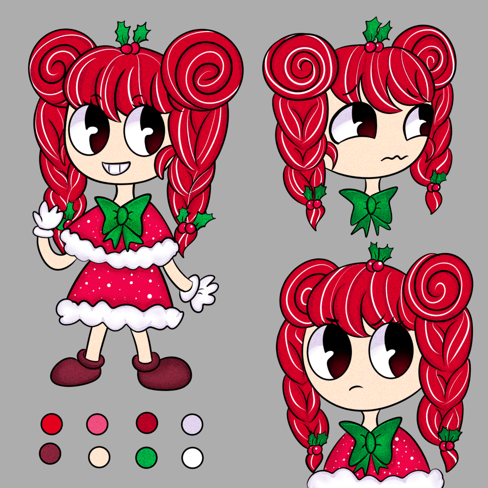
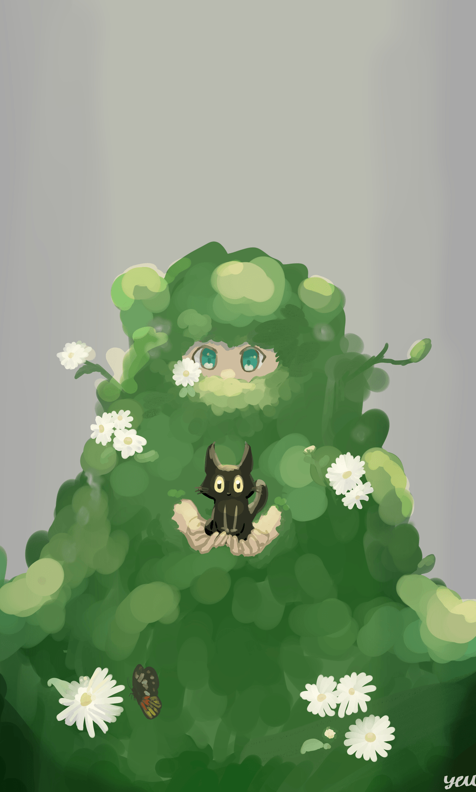
webtoon tips and tricks: Catch the reader's eyes!
Introduction
Heyo! I’m Nokia kitty( ̄^ ̄)ゞ. I've been a comic and illustration maker for over the past 2 years now.
My journey with clip Studio didn’t start too long ago where I didn’t even know what a template or a format was, many times I would find myself to be lost or looking for tutorials to help me figure out stuff. Over time I’ve gained knowledge and help from seeing and experiencing the program.
what’s a webtoon?
These days webtoons and digital comics are getting more and more popular with people all around the world. Some platforms provide readers and artists with a way to express themselves also read interesting stories from all types of creators. overall an area to help artists get more known.
Webtoons are like a small vertical comic that fits your phone and allows it to be portable on the go so you can read it anywhere.
Vertical comics are one long page of panels that’s like a comic but instead of a page form. Many popular artists are moving into making vertical comics.
Webtoon is an online platform that allows artists and authors to publish their stories for free, making it much easier to find a fan base and get more notice than a regular online post.
Many artists and authors spend time vigorously trying to make their webtoon stand out more to the public’s eyes but many may not know what path to take when doing this.
I’m here to get you started on making sure that your webtoon is more unique and new, with some tips and tricks by the time you're done reading this I’m sure that you will have a good idea of where to head with your webtoon.
starting out
I've found out about clip Studio paint by some people that make illusions and comics. Once hearing all these good things about the program I had to go check it out for myself. Ever since I’ve found out about clip Studio paint this program had made such an amazing impact on my comics.
Clip Studio Paint is easy for upcoming artists or even professionals to use, they are made so artists don’t stress out with looking for brushes, constantly having trouble making comic templates, and many more.
With that so Let’s open Clip Studio paint and start up a canvas.
Once greeted on the program press <new>
You should see this pop up on your screen.
After that pops up press <preset>
Scroll down until you see <webtoon>
Then click it.
After that you should have a canvas to start making your webtoon on.
Plan like a master
Storytelling is made up of different aspects than just words. Story boarding is a major formation of comics itself, without storyboards you and the reader won’t even have a clear idea of what’s going on or where the story even starts. When doing this make sure you as an artist know what’s the main focus of what’s going on.
Planning vertical comics has a much more different style than your average 4-coma panel type, with this you need to think about spacing and good Panels that help your story tell itself.
Usually, when I start planning my story I go ahead and make the panels first to get that out the way for I can think more clearly of my story and character placement.
The next step to my work ethic is I go through 3 steps before finishing my sketches.
● Rough sketch
● Simple sketch
● Final sketch
I do all these sketches because there are a lot more than 1 sketch. Artist's eyes improve every time by testing new things out or just redoing something that looks off. When I do these steps I keep going back and figure out my aesthetic I want to promote through the comic.
At many times you get lost in what you want your story to look like or justify what’s really the problem or the high rising point in the comic but you just somehow can’t get the right feel to capture it.
Don’t just make two panels of your characters or whatever’s going on into two panels, try making vertical scroll panels instead.
Making the panel a long scene of what you're trying to capture helps out a lot.
Always Try different camera angles, poses, backgrounds.
If you're having a hard time I recommend the 3d pose option that clip Studio offers.
If you want a 3d figure to help you press <window>
Open <materials>
Scroll down and press <3d>
You should have a materials menu on your screen.
After you see that tap on the figure you want, It should offer you a selection of a 3d male figure and a female figure.
Drag the 3d figure to your canvas and drop it.
With this 3d figure you makes poses from different angles and use it as a guide to help you with poses.
The pace of the story
Many stories tend to progress slowly to get to the rising climax or even sometimes the solving problem.
The pace is a nice view of the story itself. It’s always hard to keep the story at a pace where the reader can comprehend the plot without confusion.
A few tips to keep your pace of the webtoon steady and easy is to follow and make longer scenarios to add up to the final showdown. The reader's instiapation has to be kept.
Not only keeping instapation is important but keeping interest in the story is also important. Without interest, the reader gets bored every time they read it.
Try adding more action, conflict, and drama to spice it up.
Finding your style
When looking at many webtoons you notice their art style or their coloring style if it may be realistic or just CEL shade coloring.
Finding YOUR aesthetic is what’s going to bring more readers and fans to your webtoon. If you're always changing your art style take some time before doing a webtoon to find out what really fits you.
Many artists still struggle with finding out what their art style really is. You should keep trying and testing out new thing that can help you come close to what art style Is like.
backgrounds + SFX
For this I made a mini webtoon to explain how you can use backgrounds to make your webtoon stand out.
When making this mini webtoon I only used one background.
Doing background do have to be to fancy as long it go’s with the mood and theme.
Backgrounds are really a hassle and time-consuming. You have two options: learn perspectives or just don’t do backgrounds.
Well we’ll clip Studio makes stuff so easy I tell you no lie. They have 3d backgrounds and 2d backgrounds that you can use for when you need a nice and very amazing scenery.
If you go to materials and tap on <backgrounds> it should give you a scroll down menu
You should see all types of backgrounds for your use. All you have to do is tap the one you want and drag it to the canvas.
Time to make your webtoon sprinkle!
SFX are just wow where have you been all my life. SFX can be used for word text, it adds a type of dramatic style to the text.
I usually use SFX for action screaming to give the scream more life and dramatic atmosphere to it.
I sometimes use it for text when my font is looking boring.
Scene transitions
If you read webtoon we all know the famous black gradient going to white when something sad or dramatic happens.
There’s at least 4 different types of transitions.
● The gradient
● The sky going down to the background
● The whole page panel
The Gradient is simple it can be used for making happy scenes, sad atmosphere and action. It may only be a gradient, but it can provide a much better atmosphere.
I can not count how many times I’ve seen the sky going down to the background panel. This transition can be used well when opening the first panel to your webtoon. It can be refreshing to see a long panel then just a bunch of panels.
(Not the best example lol but you can find better examples in webtoons)
We all have seen the action scene that takes up the whole page. It brings interest to the story to be honest. I rather personally see a whole long panel then boxes. It keeps the reader's mind entertained.
With said so use whatever transition makes your webtoon balance out.
text bubbles
Text bubbles are really diverse, there is a text bubble for every situation.
You have the action text bubble which indicates that someone is screaming.
You have the cloud bubble which is used for funny or happy situations.
Instead of this....
Try adding text bubbles like this instead.
It makes the panel more comfortable to look at.
Effects and feeling
Effects are like one of the most things I love. Just looking at them and adding it to my story makes it so nice to see.
Adding effects can be an action line that builds on all the current things you’ve added.
Clip Studio has A LOT of effects you can put on your comic.
When using effects and feelings make sure to use the right ones for the right moments. There're three types of lines.
● Speed lines (for running scenes)
● Radical lines (for yelling or action scenes)
● Moving lines (for when something is moving or shaking)
If you use some theses aspects that I mention there's no way your webtoon won't get notice.
Adding felling is what’s gonna pull the reader’s in. Always make sure that your 100% satisfied with your own comic. It’s never bad to scrap comics and start over again. Mindsets are important for artists, you don’t want to be continuing a comic you don’t like.
Make sure to take breaks and don’t push your self to hard.
Conclusion
In addition, when you're doing all these steps, techniques and using some of the tips I offered you will see a huge change in your vertical comics. As someone who struggled with finding out what I need to do to get my webtoon noticed I’m happy to share all the helpful information I can offer to y’all. (๑˃̵ᴗ˂̵)
Thank you!
If you read the whole thing I’m so thankful for you. Not everyday you get to share your knowledge with other people in the webtoon artist community. It makes me happy to see more artists everyday starting their own webcomic.
Anyways I would love if you could like this post and comment what you think of it. This really helps me improve for making more tutorials in the future.
Till next time
-spacetae ^_−☆


留言